
“Why? Why!!? Why me?”
This was figure skater Nancy Kerrigan’s reaction to being attacked by an unknown assailant after a practice session at the U.S. National Figure Skating Championships in 1994. Kerrigan’s ability to compete in the upcoming Winter Olympic Games was thrown into doubt and her main rival, Tonya Harding, was revealed to be part of a coordinated plot to keep Kerrigan from the medal podium.
The month-long scandal was nothing short of a pop culture feeding frenzy. The proverbial Band-Aid was ripped from the knee of a sport widely considered to be genteel—if it was considered a sport at all. This story had it all: a heady brew of class, gender, athletic, and image politics all balanced on a quarter-inch blade.
Fourteen-year-old me was hooked for life.
Kerrigan may well be the most famous person to utter the phrase “why me,” but I definitely said it out loud (okay, I whispered it) when colleagues invited me to teach part of a Fall 2022 workshop about data visualization and data crafting at our library in Salt Lake City.
I had recently taken up sewing and managed to finish a few small, dodgy-looking quilts, but nothing that I would remotely consider data visualization. If anything, they seemed like cautionary tales in how not to use colors and shapes together. I recognized that quilting is a good medium for data visualization and crafting, as it offers many ways to present information: fabric color and pattern, choices of shape, repetition of patterns, and finally, the stitching that holds all the layers together. My head swam with visions of crunching large, meaningful datasets and distilling them into some kind of beautiful fabric design that would no doubt be a complete headache for a beginner to sew.
Still, I agreed to participate alongside colleagues who knitted, cross-stitched, sewed, and wove. Each of us would offer a case study of a different data crafting project. I put off thinking about the data I wanted to visualize for months. I toyed with ideas of temperature quilts, showing water levels in the Great Salt Lake, or other climate or health data (COVID-19 is still with us, after all!). But each time I backed away with feelings of imposter syndrome.
Then it dawned on me, sitting here in a city that hosted yet another Olympic skating scandal: I should craft something about figure skating. When I considered it more closely, I realized World Championship medalists could reveal more about trends in the sport. Unlike the Olympics’ four-year cycle, World Championships are held annually, and its medals are considered more prestigious. They’re also often a better predictor of who will medal at the Olympics. Consider the 1993 Worlds podium: gold went to Oksana Baiul, silver to Surya Bonaly, and bronze to Lu Chen. This mirrors the podium at the 1994 Winter Olympic Games, where Baiul won gold again, Kerrigan got silver, and Chen bronze—a 66% predictor! At the 2021 Worlds, we see the same phenomenon: Anna Shcherbakova won gold, Elizaveta Tuktamysheva silver, and Alexandra Trusova bronze, all Russian women. After their teammate Kamila Valieva faltered at the 2022 Olympics, Shcherbakova and Trusova won gold and silver.
I began looking at SkatingScores, a fan-run database project to “collect and re-publish all of the scoring data from major international competitions made public by the ISU [International Skating Union]”. As a metadata librarian, I also started thinking about data quality hallmarks like consistency, quality, and coverage, and recognized this site had what I needed.
Figure skaters compete in four disciplines: men’s singles, women’s singles, pairs, and ice dance. Medals are awarded to the top three skaters (gold, silver, bronze), who represent their home countries. While SkatingScores offers results going back to 2005, I decided to limit my scope to the past decade, 2013-2022. I used the data available to build a table in Google Sheets showing the countries on the podium in each discipline for this period:

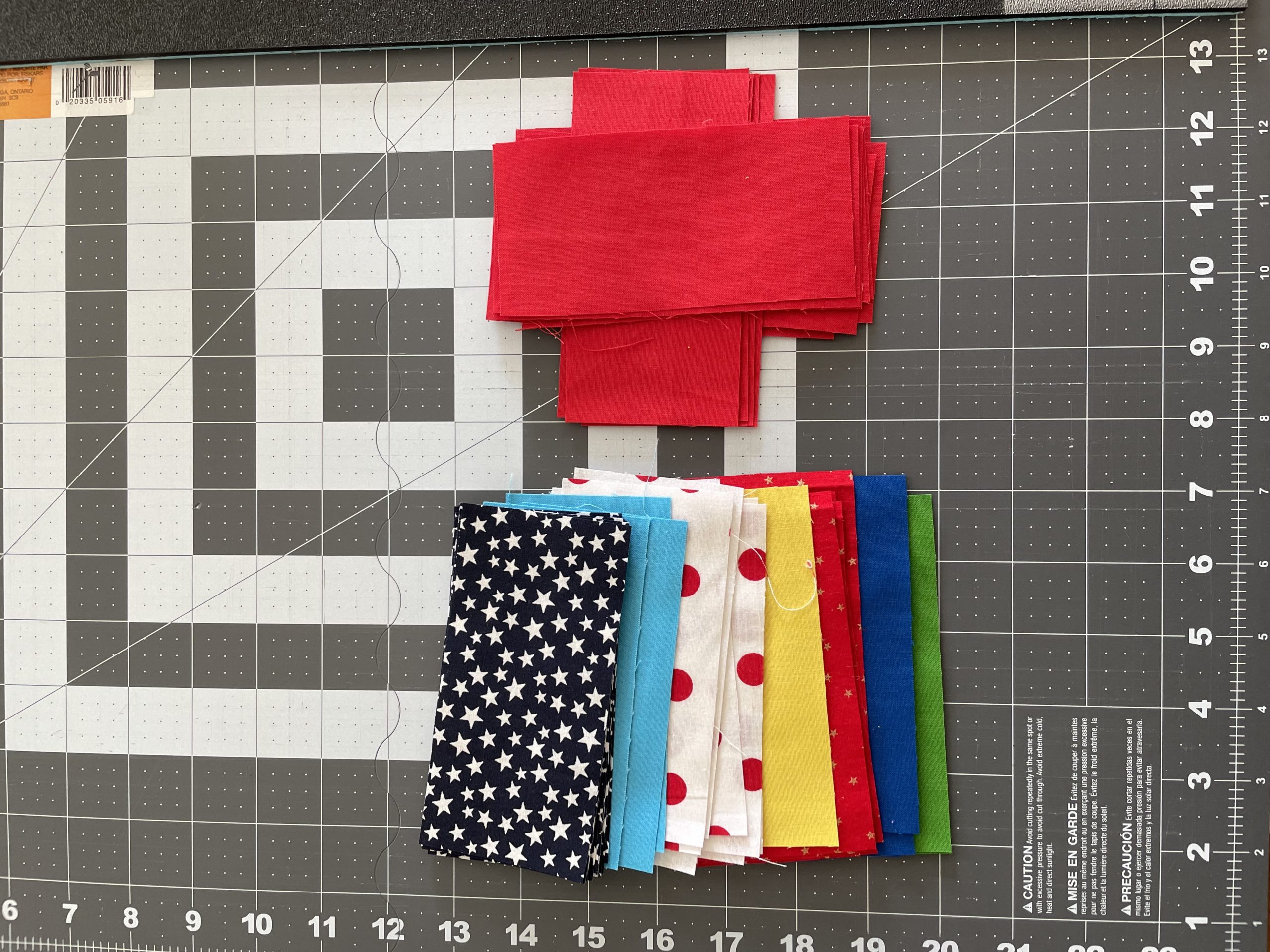
I built a list of unique countries in the table and discovered there are only 12. But the colors in each country’s flag surfaced a challenge: many of them use red, white, and yellow! Adding a dimension of other features such as stars, stripes, and other shapes gave me more options for fabric choices. I ended up with this key:

What was I trying to show with these data, and how to best represent them? Was it the total medal count by country? Total medal count by discipline by country? Was a pie chart showing percentage of medals by country adequate, or would a bar chart be more revealing? For example, some countries are very strong in certain disciplines but not others (Germany, Spain), while some countries have a large number of overall wins (Russia, USA), and others only a single medal (South Korea, Belgium). How could I show 2020’s canceled competition due to COVID-19, when no one won anything?
Another factor was my limited sewing abilities: the idea of making some kind of chart that required sewing on a curve was breaking my brain.
In the end, I decided on a tabular design made up of individual blocks (the smallest design unit in quilting) each representing one discipline per year. It would be four blocks wide, one for each discipline, and 10 rows tall, one for each year.
This design lent itself well to a temporal aspect that would’ve been lost with other chart designs, and also highlighted the differences between disciplines. I sketched it out using colored pencils and thought, “Boy, this is going to be ugly.” But soon enough I was off to the races (Etsy) to find specialty fabrics.

I settled on blocks measuring 8” wide by 4.5” tall, with half the width given to gold, and the remaining half split between silver and bronze (a ratio of 4:2:2). This would make the finished quilt 32” x 45” (81 x 114 cm)—roughly big enough to pull over my face in anguish while watching skating the following season.
Fabrics poured in from shops near and far and, by August, I was busy slicing them into pieces for assembly. (Since the average summer temperature in Salt Lake City hovers around 90°F (32°C), I didn’t mind working in the cool indoors with my sewing machine.) The process was not, shall we say, smooth sewing. With 120 small pieces of fabric to keep straight, I definitely sewed a few in the wrong order and had to reassemble with a closer eye on my key.
I also switched sewing techniques part way through, which inadvertently misaligned a column and forced me to re-sew some blocks. There’s definitely a lesson here for data work: don’t change methodologies midway!
Once the quilt was assembled at full size, the design revealed more than I expected.

Here’s some data observations you might make:
- One team from France (solid blue), has dominated ice dance for the past eight years with five gold medals and a silver.
- Japan (red dots on white) has been very successful in singles (men’s/women’s) but is barely represented in pairs/dance (the reverse is true of Canada for this period).
- Germany was well represented in the first six years by two pairs teams. (Notably, the teams shared a woman skater).
- Russia won five women’s singles gold medals in the past 10 years (four were under one coach, Eteri Tutberidze), and several silvers and bronzes.
- Russia swept 75 percent of World Championship medals in 2021, the year ahead of the Olympics in 2022, where they won six of 15 medals in skating.
This visualization revealed a few shortcomings. First, some of the countries (Belgium, Kazakhstan, for example) are so infrequent it would likely be impossible to decipher who they were without a key. Second, with a small number of colors repeated in so many flags (hello red, white and blue), the color key might not be sustainable if rows were added. For example, Great Britain has an ice dance team, Lilah Fear & Lewis Gibson, on the rise in the 2022-23 season, but solid red, white, and blue have already been taken by Russia, South Korea, and France, respectively. If I were to extend the design, I might have to resort to kitschy flag fabric after all. Aside from the iconic Canadian maple leaf, I took pains to steer clear of busy patterned fabrics. Finally, the fabric I chose for China (red background with gold glitter stars) is very hard to distinguish at a distance from Russia’s solid red.
The painstaking process of assembling this quilt also gave me ample time to reflect on a sport that I’ve followed for almost 30 years now. My interest has shifted over time, from the women in the 1990s to a fallow period in the early 2000s, to men’s and ice dance in the early 2010s through today. (Sorry pairs, I’ve never liked you!) Shallowly, I admit this corresponds somewhat with American skaters’ successes. But nothing defines sports like a good rivalry and ice dance has delivered that in spades over the last decade. Rival teams training side-by-side under expatriate coaches, teams coming out of retirement to prove naysayers wrong, close competitors claiming to be best friends off-ice, top teams breaking up and reforming to suit romantic relationships? Sign me up.

And what of data crafting?
I learned that with the right topic, work can feel effortless. It turns out I’m a better crafter than I gave myself credit for, and I have since moved on to personal projects where I feel confident mixing designs that speak to me. I’ve considered making another skating quilt that visualizes this data in a different, more aesthetically pleasing way. Given numerous criticisms of the sport’s training techniques and younger and younger competitors, another data set to visualize might be the average age of competitors at certain intervals, say Olympic Games since 1994.
No matter what I choose to work on next, the most important lesson is: just start and you will find your way through.

Teresa Hebron
Teresa K. Hebron is Program Director for Mountain West Digital Library at the University of Utah's J. Willard Marriott Library. Her current work and research focus on large-scale metadata aggregation, metadata standards, and digital library administration. Her past work includes integrated library systems support, installation and migration with an emphasis on public-facing web catalogs and discovery systems.
- Teresa Hebron


