
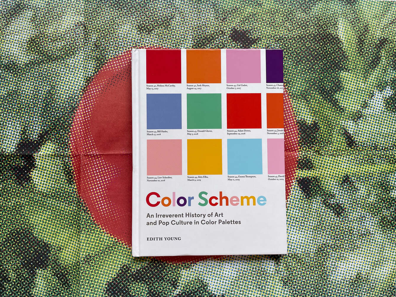
Color Scheme, An Irreverent History of Art and Pop Culture in Color Palettes is not your typical data visualization book. It may be due to the author’s non-conventional background or because the palettes are the data stories themselves. The book presents colors and palettes as systems and ways we can interpret broader abstractions. Each palette feels personal, inviting, and insightful. Most importantly, Color Scheme *sparks joy* and after two years of collective trauma, joy is much needed.
One of my favorite palettes in the book happens to be The pupils of the eyes in Vermeer’s portraits, 1656-72, which, when visualized, showcases the subtle inky olive tones between paintings otherwise obscured. The entire book is full of surprising palettes stemming from art history, contemporary art, and pop culture.
I was thrilled when Edith agreed to this interview for Nightingale about her data and design process.
Simone Betito: Firstly, I’d love to hear a bit about your background and how it led you to your fascination with color and the color palette.
Edith Young: In college, I went to the Cable Car Cinema in Providence one night and saw the 2011 documentary Diana Vreeland: The Eye Has to Travel. The film, which orbits around Vreeland’s career as a magazine editor, and later as the special consultant to the Metropolitan Museum of Art’s Costume Institute, recalls a grandiose passage from D.V., Vreeland’s 1984 autobiography:
“All my life I’ve pursued the perfect red. I can never get painters to mix it for me. It’s exactly as if I’d said, ‘I want Rococo with a spot of Gothic in it and a bit of Buddhist temple’—they have no idea what I’m talking about. About the best red is to copy the color of a child’s cap in any Renaissance portrait.”
Sitting in the dark theatre, I was struck by Vreeland’s idea of perfection in color. Her statement was inexact and somewhat ludicrous, though somehow charming and true, all at once. I immediately had a sense of how the idea could be both debunked and reinforced. I wrote the idea down in my notes app, and, two years later, returned to it one night during my last semester at RISD (Rhode Island School of Design). I did all of the image research and the print took form exactly as I had envisioned it—not a common phenomenon in my creative practice.
I think the concept of this series was informed by studying photography, graphic design, and art history at the same time. In the time I’ve been working on this project, I’ve been: a photography student, a production assistant at a startup, a photographer and photo editor at a media company, a writer and editor at the same media company, and now I work on a bunch of projects across disciplines.
While I have no data visualization background, I’m increasingly curious to learn more and to experiment with how it can dovetail into the work I’m doing these days with visual essays—which, with any luck, is how I’d approach my next book-length project.
SB: In Color Scheme you write: “The color palette offers a facade of order, a way in which to make sense of the world – the satisfaction of information sorted, data visualized, color-interpreted meaning assigned to abstraction.” In many ways, people who build more traditional-style data visualizations are also striving to assign meaning to data points that would otherwise be limited to particularly stringent analytical perspectives or, even, meaningless or difficult to decode at face value. Why do you think the color palette offers a way to make the unknowable viewable?
EY: Because of its aesthetic appeal, the color palette format offers an entry point into something complex like art history, which can feel inaccessible. I think it can even lure someone into it before they realize it’s too late—they’ve already been exposed to art history. A distilled block of color allows you to focus on something small, specific, and solid in a world of a lot of noise, and it doesn’t really require prior knowledge. The themes that I draw attention to reveal interrelated systems and subtle patterns of color, and the color palette was the best methodology I could think of to illustrate that.

SB: What was your data collection process for Color Scheme? Did you make any discoveries about your artistic tendencies, and conversely, did you encounter any obstacles?
EY: I consider coming up with the idea for a palette and then the following research to be the most significant part of the process. I’m selective when it comes to nailing down the kind of idea that embodies particular qualities — the best palettes sound kind of like zingers (e.g., How Pete Davidson dresses from the waist up on Weekend Update, The flesh tones of Lucian Freud’s ex-wives). Once I commit to a concept, the image research can take a few days to find all of the paintings or images I’d like to draw from. For art history, I comb through museum databases to find the source images. For pop culture, it mostly involved looking through the media’s image archives, like the Associated Press. For the Paul Thomas Anderson palette, I binge-watched a bunch of his movies over the course of a weekend, and for Dennis Rodman, I did some fact-checking by watching recordings of games on YouTube. The more extensive palettes required precise folder organization and file naming systems.
I conceptualize the palettes through a highly personal lens. They stem from my own micro-fascinations within certain threads of art history and pop culture. They’re made even more micro by the fact that the twenty new palettes were made in spring 2020, so I was relying on my existing knowledge—there wasn’t room for any of the conceptual serendipity that museum-going or spontaneous socializing offers.
My biggest takeaway on this front is that research and data collection is like a muscle that only gets stronger and more resourceful the more that I use it.
SB: I imagine not all main colours for extraction were clear-cut, especially in an old painting. Did you have a process for deciding the most prominent colour or hue to include in a palette?
EY: Once I’ve aggregated and organized museum-quality reproductions of the painting (or, for pop culture, the photographs where the color and light look most faithful to the scenario where it was captured), I then extract the colors in question. There’s an inherent fallacy embedded in this approach, which I think speaks to the greater wiggliness of color: in an objective sense, I am drawing the color directly from the source material. More subjectively, if you were to zoom in, you’d see that there are a hundred pixels of many similar but slightly different red tones within the red cap. To isolate one isn’t necessarily exact, but it also isn’t untrue. Given this buffet of options, I select the color most representative of what I’m seeing when I look at the painting or image as a whole, the shade I’ll remember when I think back on it, like the platonic ideal of the cap’s color.
Of course, even if they’ve been photographed with a $35,000 Hasselblad camera, there remains the question of how recently these paintings have been restored, how subdued these colors have become over the years, and how much that matters.
SB: I noticed you included a comprehensive index at the back of your book, sorted, with all of the CMYK values in Color Scheme. Were you hoping readers could explore the colors further? Full disclosure: I built a chart with that index (see below)!
EY: I was hoping someone would make a chart of my index! 🙂 Yes, the idea was that, if a designer really gravitated toward a color or a grouping of colors, they could refer to the CMYK values and apply them to their own project.
SB: In specific palettes, like Seascapes and Charles Burchfield’s violets and violas, I noticed that you placed the palettes outside of the standard grid order. Did their differential placement offer alternative perspectives?
EY: I was thinking about the flow of the book, and felt it might need some palettes that functioned like punctuation. I think of these ones you mention like concrete poems — their arrangements and shapes refer back to the subject matter, without straying too far from the gridded arrays.
SB: Some of your palettes are in chronological order, while others are not. When was it important to include that context of time, and alternatively, were there points when it was intentional or less essential for them to be included?
EY: Since I began approaching these as artworks rather than visualizations, the arrangement and balance of color was the reigning organizing principle.
I organized chronologically with the pop culture palettes the most because they tended to be more narrative. It seemed like a more meaningful arc, how Pete Davidson has dressed over the years at the “Weekend Update” desk or the progression of Spike Lee’s eyeglasses from 1989 to 2020.
SB: I noticed the pop culture section had the most saturated palettes. Did you notice any particular trends or patterns once you visualized the data?
EY: Definitely, though many of the pop culture colors come from some of the most blindingly bright spaces we encounter—sports arenas and film and television sets—so that may also have some bearing on why people dress the way they do for those venues. As a generalization, I found that the palettes often looked astonishingly reflective of their era. You could probably tell what decade the title cards in SNL’s second season are from without looking it up. Same with Tonya Harding’s figure skating costumes.

SB: Were there any palettes that brought you more joy or delighted you more than others once they were visualized?
EY: I love John Currin’s blondes and Botero’s beverages both visually and conceptually. They follow through lines that are so characteristic of the artist’s oeuvre, and the palettes are so rich. I love the tropical electricity and variety of the Botero colors, and the Currin palette shows how much range there is in such a niche typology. Another favorite is the full spread of Dennis Rodman’s hair dye, in chronological order over the course of his NBA career.
Color Scheme encapsulates the ethos of data visualization, making the unknowable, the overlooked, visible, all while presenting data in a captivating and enlightening way. I highly recommend this book for the color enthusiast in your life!
Endless thank yous to Edith!
Color Scheme: An Irreverent History of Art and Pop Culture in Color Palettes can be purchased from Indie Bound or your local bookstore.
Explore the colors from Color Scheme in my visualization below:

Simone is a data visualization designer and developer at one of the world's largest clinical trial data companies. She has a Master’s in data visualization from Parsons School of Design. She’s also a proud Franco-Ontarienne, currently based in Brooklyn. Say hi on Instagram or Twitter.
- Simone Betito

- Simone Betito

- Simone Betito


