
In this writing, I discuss how to build a Color Scheme for your data visualization with the freely accessible web app called HCL Wizard. HCL Wizard is a perceptually uniform color selection tool based on the Hue Chroma Luminance (HCL) color model that I discussed in a previous writing on “Color in a Perceptual Uniform Way”. Here, I use an ordinal data example based on the Likert scale of strongly agree, agree, neutral, disagree or strongly disagree to show how HCL Wizard helps you colorize.
A perceptual uniform color scheme might not pass color deficiency tests. This happens to me in my first color scheme selection. I show how to recover from this difficulty using HCL Wizard. Later, I use the Color Blindness Simulation (Coblis) tool to assess color deficiencies in the actual colorized visualization. Coblis allows for importing an actual image into its color deficiency simulator while HCL Wizard shows color deficiencies of its provided “Examples”.
After the selected color scheme is applied to my Likert based data visualization, my final advanced diverging color scheme turns out to be similar to a complementary color harmony that can be created with Adobe Color and a diverging color scheme from ColorBrewer. I also note these similarities and slight differences in this writing. So, let’s get started with a review of the concept of perceptual uniformity.
Perceptual Uniformity
A color space is perceptually uniform if a change of length in any direction of the color space is perceived by a human as the same change. The standard rainbow colormap and the traditional Red Green Blue (RGB) Color Space are non-uniform. A non-uniform perceptual colormap can have stark contrasts when transitioning from one hue to another. In data visualization, these contrasts can be mistaken as changes in the data rather than as transitions in the color palette.

On the left, I show the difference between a non-uniform and a uniform perceptual colormap. Although I show a “perceptual uniform” concept in the second spectrum, the results are not a color model that can be applied consistently for visualization and design purposes.
The Hue-Chroma-Luminance (HCL) color model, in contrast, is perceptually uniform and is thus tailored for human perception. For these reasons, HCL has gained popularity among some data visualization practitioners using Python and the R software language.
HCL uses three dimensions to describe color:
- hue (dominant wavelength)
- chroma (colorfulness, intensity of color as compared to gray)
- luminance (brightness, amount of gray).

On the left, I show a comparison between the RGB and the HCL Color Wheels. The RGB Color Space has sharp variations that can be shown when converted into a Black and White depiction of the rainbow spectrum. The HCL Color Space has nearly constant transitions that show up as an almost smooth Gray spectrum when converted into a Black and White format.
Now that I have discussed some of the color theory behind HCL Wizard, let’s return to using the tool to build a color scheme.
Exploring HCL Wizard
The HCL Wizard web site is based on the efforts of statisticians Ross Ihaka, Paul Murrell, Kurt Homik, Jason C. Fisher, Reto Stauffer, Claus O. Wilke, Claire D. McWhite, and Achim Zeileis, who are experts in the R software language for statistical computing and graphics. The team developed a tool called “colorspace” to address rainbow and non-perceptual uniform colormap concerns noted above. The HCL Wizard web site includes three major tools: Palette Creator, Deficiency Emulator, and Color Picker.
A snapshot of the site is shown below. I have specifically highlighted the Palette Creator tool since I will be using it to build a color scheme.

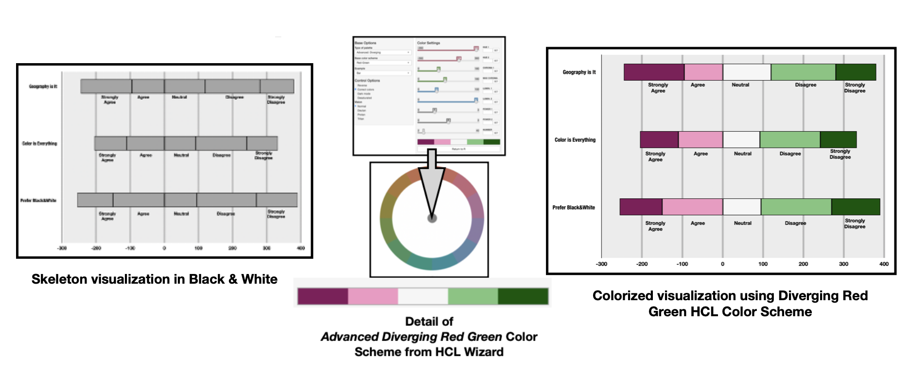
For the purposes of my writing, I am calling their Palette Creator tool “HCL Wizard” and will discuss further how to use this tool for colorizing my specific ordinal data example based on the Likert scale. I show a skeleton of my example, in Black and White, below.

Diving into the Palette Creator
Clicking on the Palette Creator icon, yields a color theme selection system with Base Options that include: Type of palette, Base color scheme, and Example. There are also Control Options that include Visionparameters to address color deficiencies. The Palette Creator interface is shown below.
The system defaults to a Map Example and the Basic: Sequential (multi-hue) Purple-Blue Color Scheme. I describe these parameters in further detail in below.

Selecting a “Type of palette”
The Type of palette allows for selecting between Qualitative, Sequential (single hue), Sequential (multi hue) and Diverging options.
Qualitative Color Schemes are designed for coding categorical information when there is no particular ordering of the data and colors should receive equal perceptual weight. Sequential Color Themes are designed for ordering numeric information where colors progress from low to high (or vice versa). Diverging Color Schemes emphasize quantitative data that progresses outward from a central neutral midpoint to two different color extremes.
For my example based on the scale of strongly agree, agree, neutral, disagree or strongly disagree, the Diverging option is optimal. So, I select the “Basic Diverging” option.

Selecting a “Base color scheme”
Once Diverging is selected as the Type of Palette, the next option is to select a Base Color Scheme. For my example, I chose the Green — Orange option.

Selecting an “Example” visualization
HCL Wizard provides several visualization prototypes under the “Example” menu. Since my Likert visualization will be a bar chart, I chose the “Bar Chart” example. A Bar Chart prototype appears with the Green — Orange Color Scheme.

Working with the Control Options
Under the “Control Options,” I select the Reverse option so that my Color Scheme appears as Orange — Green color scheme .The “Correct colors” button leaves a White background for the data visualization example. I chose to keep the White background and leave the “Correct colors” button selected. HCL Wizard also provides “Dark Mode” and “Desaturated” options that you can explore if you so desire.

Exploring the Vision (Color Deficiency) Options
HCL Wizard includes options for exploring Color Deficiencies. As highlighted in my previous writings on color in data visualization, in humans there are three types of photoreceptors or cones where each is sensitive to different parts of the visual spectrum of light. These three different photoreceptor cone cells combine to facilitate rich color vision. If one or more of the set of cones does not perform properly, a color deficiency results.
A Green cone deficiency is classified as Deuteranopia. A Red cone deficiency is classified as Protanopia. A Blue cone deficiency is classified as Tritanopia. I can select each of these “Vision” options to evaluate the appearance of the Orange — Green prototype under these Color Deficiencies. These results are shown below.
Later, I will use the Color Blindness Simulation (Coblis) tool to assess color deficiencies in the final colorized visualization. Coblis allows for importing an actual image into it color deficiency simulator while HCL Wizard shows color deficiencies of its provided “Examples.”

By looking at the Deuteranopia (Loss of Green Cone) and Protanopia (Loss of Red Cone) simulations, it becomes evident that individuals with these color deficiencies might have difficulty distinguishing between the Orange and Green elements in the Bar Chart Visualization. As a result, I chose another color scheme.

I then select the Red — Green color scheme. I would call this a Magenta — Green Color Scheme, but HCL Wizard names it Red — Green. These results are shown below.

Next, I use the Vision options to perform the Deuteranopia, Protanopia, and Tritanopia Color Deficiency analyses. These results are shown below.

The Deuteranopia (Loss of Green Cone), Protanopia (Loss of Red Cone), Tritanopia (Loss of Blue Cone) simulations indicate that individuals with Deuteranopia and Protanopia Color Deficiencies will likely see a Blue — Yellow Brown Diverging Color Scheme. Individuals with Tritanopia are likely to see a Red — Blue Green Diverging Color Scheme.
The color schemes are not the same as my original Red — Green Diverging design. However, two different colors that form the Diverging Color Scheme are distinguishable. As a result, I proceed with this Red — Green Diverging Color Scheme.

Exporting the Diverging Color Scheme Specifics
The next step is to determine the specific numeric codes for the selected 5 classes of the Red Green Diverging Color Scheme. These specific codes are needed to apply these colors to my Likert Data Visualization example.
HCL Wizard provides an “Export” function with HCL, RGB and Web Hex numeric codes for this purpose. These specifics are shown in the annotated screenshot below.

Applying the Red — Green Diverging Color Scheme
Using the Hex Codes provided by HCL Wizard, it is now time to apply the Red — Green Diverging Color Scheme to my Likert based visualization. The results are shown below.

Checking for Color Deficiency
As a final step, I use the Color Blindness Simulation (Coblis) tool to assess color deficiencies in the actual visualization.

As noted earlier in this writing, Coblis allows for importing an actual image into its color deficiency simulator while HCL Wizard shows Color Deficiencies of its provided “Examples”.
Similar to the HCL Wizard analyses, these Coblis results indicate the color schemes for those with the Deuteranopia and Protanopia Color Deficiencies are a Blue — Yellow Brown Diverging Color Scheme. This is not the same as my original Red — Green design but two different colors are distinguishable. The Tritanopia results show a Red — Blue Color Scheme that, while a slight alternation from my intended design, is a discernible Diverging Color Scheme as well. These results are shown below.

How different color suggestion tools yield a similar color scheme
In my prior writing on “Complements that Diverge — Using a Complementary Color Harmony to build a Diverging Color Scheme”, I also used my Likert data visualization. In that writing, I built a Complementary Color Harmony of Magenta and Green, with Adobe Color, in RGB Color Space. Two colors that oppose each other on the RGB Color Wheel are defined as a Complementary Color Harmony. I also showed the similarities of the Magenta and Green Color Harmony (MG Comp5) to a Diverging Pink Yellow Green (PiYG5) Color Scheme from ColorBrewer. It is now possible to compare these color palettes with my new HCL Red — Green Color Scheme. I show this three-way comparison below.

It is fascinating how these three different approaches to Color Scheme Selection can yield similar results.
Concluding Remarks
This writing has examined how to work with the freely accessible HCL Wizard tool to select Color Schemes for your data visualization. HCL Wizard is a perceptually uniform color selection tool based on the Hue Chroma Luminance (HCL) Color model. I briefly described perceptual uniformity and showed how the original Rainbow Colormap can create artifacts in your data visualization. In addition, Color Deficiency concerns were reviewed. This included a discussion on how HCL Wizard has built in functionality that allows for testing of Deuteranopia (Loss of Green Cone), Protanopia (Loss of Red Cone), and Tritanopia (Loss of Blue Cone).
I used an ordinal data example based on the Likert scale to show how HCL Wizard helps you Colorize. A Diverging Color Scheme where the quantitative data progresses outward from a central neutral midpoint to two different color extremes was ideal for this data example. My first selected Orange — Green color scheme failed color deficiency tests. I then selected a Red — Green color scheme that passed color deficiency screening.

Interestingly, the Red — Green HCL Wizard scheme has similarities to two color schemes from my prior writing on “Complements that Diverge — Using a Complementary Color Harmony to build a Diverging Color Scheme”. There two prior color palettes were (1) a Complementary Color Harmony of Magenta and Green, created with Adobe Color, and (2) a Diverging Pink Yellow Green (PiYG5) color scheme from ColorBrewer. A comparison of these three different color palettes was provided.
There are many approaches to building color schemes for data visualization. This writing has focused on a Hue Chroma Luminance approach with HCL Wizard. For discussions on my approaches to using other color suggestions tools, please see the Medium listing of my prior Nightingale writings as well as my 2016 book on “Applying Color Theory to Digital Media and Visualization” published by CRC Press.

Theresa-Marie Rhyne is a Visualization Consultant with extensive experience in producing and colorizing digital media and visualizations. She has consulted with the Stanford University Visualization Group on a Color Suggestion Prototype System, the Center for Visualization at the University of California at Davis and the Scientific Computing and Imaging Institute at the University of Utah on applying color theory to Ensemble Data Visualization. Prior to her consulting work, she founded two visualization centers: (a) the United States Environmental Protection Agency’s Scientific Visualization Center and (b) the Center for Visualization and Analytics at North Carolina State University.
- Theresa-Marie Rhyne

- Theresa-Marie Rhyne

- Theresa-Marie Rhyne

- Theresa-Marie Rhyne


