
This writing discusses the Hue-Chroma-Luminance (HCL) color space that is tailored to how we see colors as humans. In my previous writings on colorizing data visualizations, I have focused on the Red Yellow Blue (RYB) and the Red Green Blue (RGB) color spaces. The RYB space has a long historical use by artists for mixing paints and dyes in creating visual compositions. The RGB space is based on the concept that Red, Green and Blue (RGB) are the color primaries for viewing displays like what we see on our desktop and mobile devices. Neither RYB nor RGB are perceptually uniform or specifically optimized for the human visual system.
A color space is perceptually uniform if a change of length in any direction X of the color space is perceived by a human as the same change. A non-uniform perceptual colormap can have stark contrasts when transitioning from one hue to another hue. In data visualization, these contrasts can be mistaken as changes in the data rather than as transitions in the color palette. I show the difference between a non-uniform and a uniform perceptual colormap below.

The Hue-Chroma-Luminance (HCL) color model meets the uniform criterion and is thus tailored for human perception. HCL is starting to be favored as the color space of choice by some data visualization practitioners with HCL color space packages appearing for programming languages like D3.js, R and Python. So, I thought it might be helpful to cover HCL from my color geek perspective.
Some background on the parameters of Hue, Chroma and Luminance is provided here. I also show how to build a color scheme with the HCL Colorpicker for data tool and check the results for color deficiency with the Color Blindness Simulator (Coblis). Both of these online apps are freely available for your continued use.
So, let’s get started with a little history on how the HCL Color Space came into being.
Historical account of the HCL Color Space
In the late 1600s, Isaac Newton defined the color spectrum based on his color prism experiments. He also closed the color spectrum into a circle in the early 1700s. The spectrum would become known as the “Rainbow colors” and the circle would evolve into the “Color Wheel”. Since the early stages of color science studies, it was noted that the Rainbow Colormap had inconsistent distances between hues, resulting in non-uniform transitions from one color to another. Below, I show these inconsistencies with what is traditionally considered Newton’s version of the Rainbow color spectrum. Today, the noted Blue color would be called Cyan while the noted Indigo color approaches modern definitions of Blue.

In the late 1800s and early 1900s, Albert H. Munsell, an American artist and educator, began to work on a color order system to establish a systematic order to color classification. He conceived of a three dimenional color sphere as the basis for his system. Using human subjects, Munsell began to study the color sensitivities of our visual system. To his dismay, he came to the conclusion that a color space based on human perception would not be naturally geometrically regular. As an example, Munsell’s human subject experiments showed that a normal color vision person can differentiate between more variances in Red than Blue Green. Munsell abandoned the color sphere concept and proposed a three-dimensional color tree model. The uneven color tree branches are based on equally perceived color differences. I show the Red and Blue Green example below.

Out of this complex situation, he established his orderly and perceptually uniform Munsell Color System. Below I show a diagram of the original Munsell color tree below. You can find more details about this human focused color matching system at the Munsell Color web site.

It turns out that the ColorBrewer tool is based on Munsell’s color system. If you have used that tool for selecting color schemes, you have been working in a perceptual uniform color situation and perhaps were unaware of it.

Similar to the search for Cinderella, other efforts continued to look for orderly color systems based on human perception. The International Commission on Illumination (CIE) was formed in 1913. Since then, its Vision and Colour technical committee has issued several color space standards that are independent of particular lighting or display devices. The first was CIE 1931 Color Space. Chandler Abraham’s 2016 Medium writing on “A Beginners Guide to (CIE) Colorimetry”provides more details on CIE 1931 if you want to dig deeper. Extensive color research showed that CIE 1931 had many perceptual non-uniformities as measured via something called MacAdam ellipses.
As a result, CIE Luv and CIE Lab were officially published in 1976 to more closely approximate human perceptual uniformity. By the 2000s, additional limitations in mapping CIE Luv and CIE Lab specifications to RGB displays were found. This resulted in building of two very similar cylindrical transformations of CIE Luv and CIE Lab to eliminate some of these difficulties. This is when Hue-Chroma-Luminance (HCL) entered the color space arena as a polar coordinate version of either CIE Luv or CIE Lab.
I have covered a lot of “Color Geekdom” here that reflects hundreds of years of study and color research by many individuals. Below, I show the RGB and the HCL Color Wheels and spectrums in order for you to visually compare the difference between the non-uniform (RGB) and the uniform (HCL) perceptual color spaces. When the respective color spectrums are converted to Gray scale diagrams, it is easier to conceptualize the uneven nature of the RGB color space and the nearly consistent nature of the HCL color space.

What do the elements of Hue-Chroma-Luminance (HCL) refer to?
HCL uses three dimensions to describe color:
- hue (dominant wavelength)
- chroma (colorfulness, intensity of color as compared to gray)
- luminance (brightness, amount of gray)
For a specific luminance (L) parameter, all colors resulting from different combinations of hue (H) and chroma ( C ) will have the same level of brightness. This means that when converted to a gray scale, the colors will appear nearly identical. This is shown in the HCL Color Wheel above. This concept of near perceptual uniformity is close to achieving the Cinderella search that has been underway since the days of Munsell’s first observations.
That being said, Munsell still remains correct. The HCL color space that is within the boundaries of the human visual spectrum is oddly shaped and far from geometrically regular. There are also some mapping challenges between HCL and RGB color spaces. It is possible to select an HCL color that cannot be displayed in RGB format. Below I show my screen shots from Michael Horvath’s 3D implementations of the RGB gamut (color range) for the polar coordinate version (polarized) of CIE Luv and polar coordinate version of the (polarized) CIE Lab versions of HCL.

Why is Perceptual Uniformity important in colorizing dataviz?
To understand the importance of perceptual uniformity in colorizing data visualization, it helps to review some recent history. As the data visualization field began to evolve in the 1990s, many visualization tools used the Rainbow Color Map (or a variant called the Jet colormap) as the default color palette in their visual analysis functions. Researchers began to express concerns that data visualized with the Rainbow Color Scheme produced data transitions that can be perceived incorrectly. My earlier figures in this writing try to visually show some of these issues.
Rogowitz and Treinish reported these concerns in their 1998 article, “Data Visualization: The End of the Rainbow” while Borland and Taylor highlighted additional concerns in a 2007 paper, “Rainbow Color Map (Still) Considered Harmful”. Additionally, in 2011, Borkin and her team reported their findings from user studies on the application of various color maps, including the Rainbow Color map, to medical visualization problems. Their paper, “Evaluation of Artery Visualizations of Heart Disease Diagnosis”, noted that a perceptually uniform color map resulted in fewer diagnostic errors than the Rainbow Color map.

Additional writings and blog postings on Rainbow Color Map concerns continued as well as efforts to improve the colormap. They exist even to this day with the October 2020 Crameri, Shephard and Heron writing on “The misuse of colour in science communication” providing a good overview.
As a result of Rainbow Colormap concerns, efforts began to search for replacements of these default colormaps. In 2015, Stefan van der Walt and Nathaniel Smith presented their recommendations for Matplotlib perceptually uniform colormaps at the annual SciPy (Scientific Python) Conference. Their “Viridis” colormap was implemented as the default colormap for Matplotlib. Virdis has also be adopted in Matlab, D3.js, and R. Below I show the original Jet and the recently adopted Virdis default colormaps.

Although a color space is perceptually uniform, individuals with color deficiencies can still have difficulty distinguishing between individual color elements in the color space. I review these issues in the next section of this writing.
Color Deficiency and Perceptual Uniformity
As I have noted in my previous writings on color in data visualization, in humans there are three types of photoreceptors or cones where each is sensitive to different parts of the visual spectrum of light. These three different photoreceptor elements combine to facilitate rich color vision. If one or more of the set of cones does not perform properly, a color deficiency results. A red cone deficiency is classified as Protanopia. A green cone deficiency is classified as Deuteranopia. A blue cone deficiency is classified as Tritanopia. Software is available that simulates color deficiencies.
The figure below shows simulations of how the HCL Color Wheel appears for individuals with Protanopia, Deuteranopia and Tritanopia. I used the freely available Color Blindness Simulator (Coblis) app to create the results for this illustration.

These color deficiency simulations indicate that individuals with Protanopia, Deuteranopia and Tritanopia will likely have difficulty distinguishing between individual colors that compose this HCL color wheel. For specific data visualizations, it is wise to check your color palette and visualization with a color deficiency simulator.
The emergence of HCL Tools for colorizing data visualizations
As noted at the start of this writing, perceptual uniform color suggestion systems are emerging and evolving. Three freely available examples include “I want hue”, “hclwizard.org” and “Colorpicker for data.” I show the websites for each of these tools below.

The default colormap shown in I want hue is a two dimensional slice of the full HCL color spectrum. The tool also includes color deficiency options.

The hclwizard.org web site shows default hue, chroma, and luminance color maps. The web site includes “Palette Creator”, color “Deficiency Emulator” and “Color Picker” tools.

The default colormap shown in Colorpicker for data is the “Viridis” colormap highlighted previously in “Why is Perceptual Uniformity Important in Colorizing Data Visualizations?” section of this writing. A color deficiency option is not built into this tool.
In the next section of this writing, I show how to work with the Colorpicker for data tool to create color schemes for data visualization.
Colorpicker for data
Tristen Brown created the HCL “Colorpicker for data” tool, based on Gregor Alrich’s writing and chroma.js Javascript code. I showed a screen shot of this freely available online app above.
I used “Colorpicker for data” to create my HCL Color Wheel shown previously. To do this, I used the H-L and the Chroma 1.0 default options on the left and drew a straight line in a central location of the HCL Color space. Here, Chroma is kept constant and noted as Chroma 1. The Hue and Luminance parameters change. To build the HCL Color Wheel, I am keeping Luminance constant with a horizontal line that results in only the Hues changing.

To match up with the 12 divisions typically shown in the RGB Color Wheel, I selected 12 color steps for the HCL Color Wheel. Working with “Colorpicker for data”, I clicked on the “+” option on the right to achieve 12 Color swatches. Notice that each Color swatch on the right has a corresponding Hex code. Using these Hex codes, I will be able to colorize future data visualizations.
To match up with the 12 divisions typically shown in the RGB Color Wheel, I selected 12 color steps for the HCL Color Wheel. Using “Colorpicker for data”, I clicked on the “+” option on the right to achieve 12 Color swatches. Notice that each Color swatch on the right has a corresponding Hex code. Using these Hex codes, I will be able to colorize future data visualizations.

I then entered each color hex code into a 12 segmented blank circle to create the “HCL Color Wheel”.

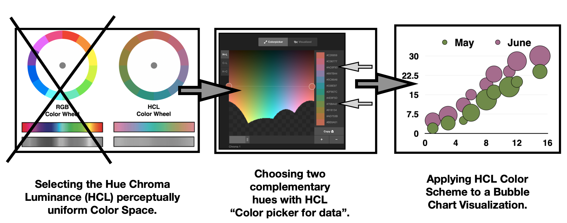
As noted earlier, HCL Colorpicker for data tool does not have a color deficiency test function built into it. In the previous section of this writing, I performed a color deficiency check of this HCL Color Wheel with Coblis. Below, I use these deficiency test results to select a complementary color harmony in HCL color space that has the potential to pass color deficiency. As noted in my earlier writing on “A Matter of Contrasts”, a complementary color harmony is defined as two colors that oppose each other on a Color Wheel. The two hues for this HCL color space example are a Magenta-Purple paired with a Green.

Referring to the Colorpicker for data tool, the Hex code for the Magenta-Purple hue is #AC6F93 and the Hex code for the Green hue is #708A42.

Next, I apply the Magenta-Purple #AC6F93 and Green #708A42 pair to a test Bubble Chart data visualization. These results are shown below.

Finally, I use the Color Blindness Simulator (Coblis) app to test for color deficiencies in my sample Bubble Chart data visualization. Happily, the color deficiency checks indicate that a viewer with Protanopia, Deuteranopia or Tritanopia can effectively distinguish between the two Bubble plots. These results are shown below.

Concluding remarks
In this writing, I have reviewed the Hue-Chroma-Luminance (HCL) color space for selecting colors in your data visualizations. HCL uses three dimensions to describe color: • hue (dominant wavelength); • chroma (colorfulness, intensity of color as compared to gray) and • luminance (brightness, amount of gray). The color space is tailored to how we see colors as humans and is perceptually uniform. The traditional Red Yellow Blue (RYB) and the Red Green Blue (RGB) color spaces are not perceptually uniform. Using the entire RGB color spectrum (sometimes called the Rainbow colormap) in a visualization runs the risk of producing diagnostic errors. Some color schemes built in RGB or RYB space can also produce high contrasts that induce errors in data analyses. My previous “A Matter of Contrasts” writing provided situations where this can occur in RGB color space.

HCL, with its perceptual uniformity, is designed to minimize these distortions. HCL is starting to be favored as the color model of choice by some data visualization practitioners. HCL color space packages are starting to appear for programming languages like D3.js, R and Python. In this writing, I have provided some background on how the HCL color space came into being and depicted its three-dimensional space. The HCL Color Wheel was also diagrammed and compared to the RGB color wheel. Color deficiency issues for the color space were also highlighted.
I noted three freely available HCL color suggestions systems: “I want hue”, “hclwizard.org” and “Colorpicker for data”. I also showed how I worked with the “Colorpicker for data” tool to build my HCL Color Wheel. Finally, I demonstrated how to work with the results from color deficiency tests of the HCL Color Wheel, produced with the Color Blindness Simulator (Coblis), to select hues for a sample data visualization. I used “Colorpicker for data” to determine the specific Hex codes for the selected Magenta-Purple #AC6F93 and Green #708A42 hues. These colors were then applied to a sample Bubble Chart visualization with two data sets. Fortunately, the color deficiency checks for the resulting Bubble Chart visualization indicate that a viewer with Protanopia, Deuteranopia or Tritanopia can effectively distinguish between the two data plots.
There are many approaches to building color schemes for data visualizations. I have featured the HCL Color Space in this particular writing. For additional discussions on my approaches, please see my 2016 book on Applying Color Theory to Digital Media and Visualization published by CRC Press as well as my prior Nightingale articles noted below.

Theresa-Marie Rhyne is a Visualization Consultant with extensive experience in producing and colorizing digital media and visualizations. She has consulted with the Stanford University Visualization Group on a Color Suggestion Prototype System, the Center for Visualization at the University of California at Davis and the Scientific Computing and Imaging Institute at the University of Utah on applying color theory to Ensemble Data Visualization. Prior to her consulting work, she founded two visualization centers: (a) the United States Environmental Protection Agency’s Scientific Visualization Center and (b) the Center for Visualization and Analytics at North Carolina State University.
- Theresa-Marie Rhyne

- Theresa-Marie Rhyne

- Theresa-Marie Rhyne

- Theresa-Marie Rhyne


