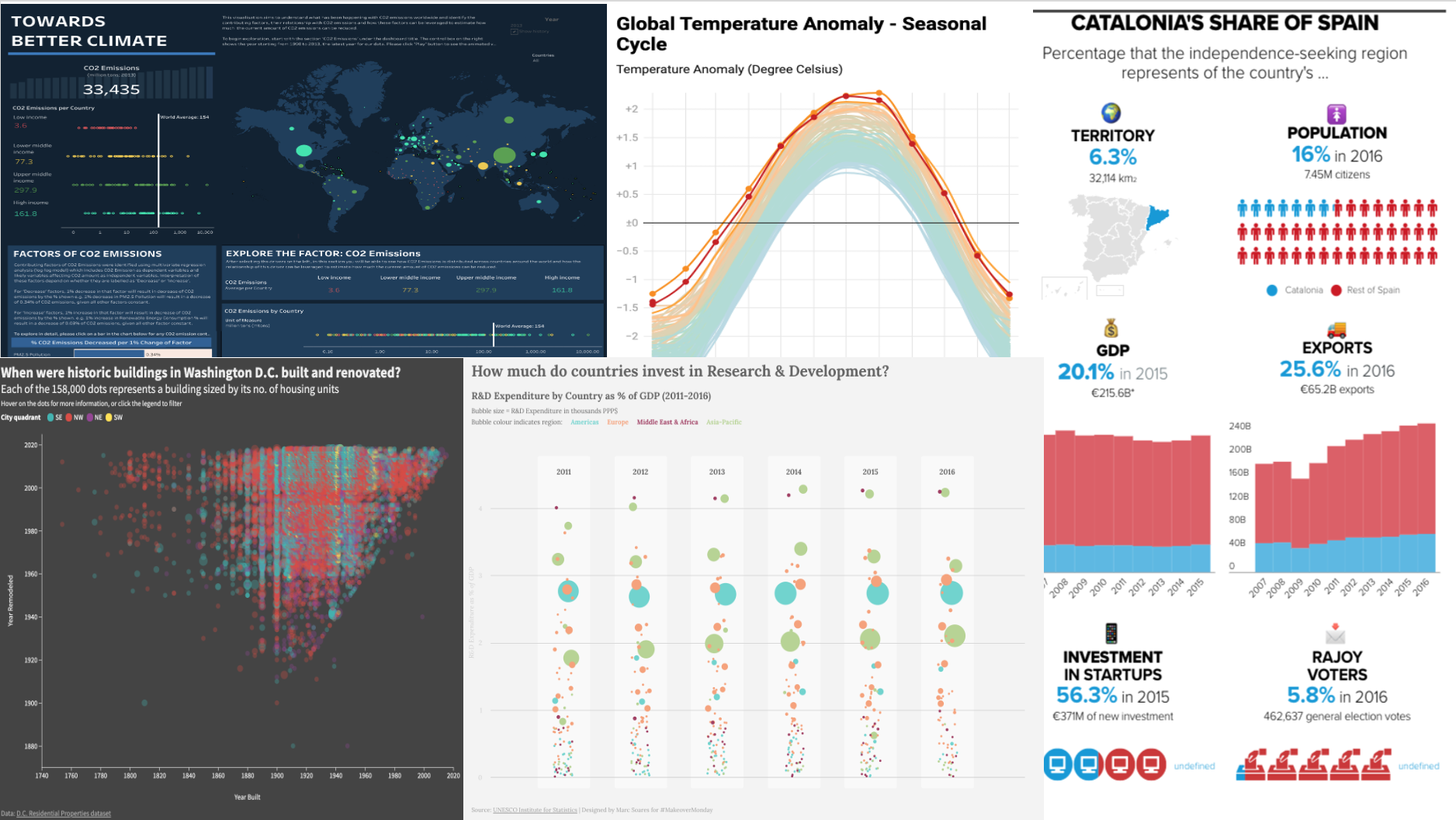
We have used data visualization in some way or other since time immemorial, from early cave paintings to today’s advanced information dashboards. The human eye is drawn to colors and patterns. Our brains crave visual information. In fact, according to MIT, “90% of the information transmitted to our brains is visual.”
Two years ago, I began to recognize the value of isolating insights and driving understanding by developing my visualization skills. But, when I looked at sophisticated vizzes like the ones above, I was worried that I needed to learn extensive coding and obtain training on premium dataviz tools. Instead, I discovered five free tools useful regardless of your coding prowess.
In this article, I review those five free tools by creating a viz in each one using same dataset: Number of Livestock Species of Karnali, Nepal taken from the Ministry of Livestock Development, Organizations on Open Data Nepal.
1. Tableau Public

Tableau is one of the world’s leading analytics platforms. Tableau Public is a popular visualization application that allows you to create a wide range of charts, graphs, maps, and other graphics. The visualizations you create can be conveniently inserted into any web page and can be shared with your friends, organizations, peers in the industry, and so on. Tableau’s public gallery contains a wide ranges of visualizations created by the community. You can play with other vizzes. One of the best things about Tableau is their user community popularly known as #Datafam on Twitter. Everyone I have encountered through #Datafam has offered a helping hand and sincerely seems to want every member of the community to improve despite their proficiency.
Tableau Public is designed for scientists, academics, or anyone who wants to create and explore the journey of data visualization. For anyone looking to share data, collaborate publicly, and learn data visualization inspired by other people’s work, Tableau Public is worth a try.
Pro: Tableau Public is that it offers unparalleled data visualization with fully functional and interactive graphics.
Con: You cannot save your workbook locally and everything you create gets shared publicly on your Tableau Public profile, which limits its usefulness for work based on proprietary data.
Example: Below is a depiction of viz I created in Tableau Public showing the number of livestock species in Karnali, Nepal.

2. Flourish Public

When it comes to storytelling, Flourish tops the list and is ideal for anyone looking to tell stories with data. It enables immersive storytelling rather than more traditional ways of visualizing as tables, diagrams, and dashboards. Unlike Tableau Public, Flourish does not require a desktop edition. It is browser-based. You can choose a wide range of flexible templates from the library. Flourish is typically for social media sharing and website content.
Flourish enables journalists to guide readers through one or more visualizations, animating between views to create a narrative. If you are a journalist and involved in newsrooms, Flourish is worth a try.
Pro: It is super easy to create interactive rotating globes and maps in Flourish.
Con: It doesn’t support adding data from Google Sheets or other online sheets in its free version.
Example: Below is an alternative depiction of my previous viz in Flourish Public regarding the number of livestock species in Karnali, Nepal.

3. Infogram

Infogram is a browser-based visualization platform that offers interactive charts, graphics, infographics, and maps to tell a story and has many free templates from which to choose. In addition to supporting local data uploads, it also supports uploads from Google Sheets, Dropbox, MySQL, and direct JSON data feeds. Infogram provides object animations that allow you to easily zoom, bounce, rotate, fade, and slide objects into your work.
Infogram is for anyone who wants to stand out with data-driven content. If you are a marketer, media company, or strategic business leader, Infogram is worth a try.
Pro: It is easy to create reports, slides, dashboards, email headers, and social media contents in addition to interactive visualizations.
Con: In the free version, when you want to insert interactive charts into your website, you get a large Infogram logo. You have to upgrade to a paid version to remove it.
Example: Here is my Nepalese livestock interactive viz in Infogram.
4. Datawrapper

Datawrapper is a browser-based data analysis tool that can easily transform numerical data from PDFs, CSVs, and web sources into charts and graphs. It requires no sign up and you can get started by selecting the “start creating” button from its landing page. River, a shared platform developed by Datawrapper, helps you to share relevant data, charts, and maps with other users. It also allows users to reuse visualizations made by others.
If you are a journalist, engineer, and other design professional that needs to compile data from a range of native formats, Datawrapper is worth a try.
Pro: Datawrapper is that it is super easy for beginners to understand the process of creating the visualization as it guides you through every step of the process.
Con: Customizing fonts and colors is tough compared to the other tools in this list.
Example: Here are those Nepalese livestock comparisons reimagined in Datawrapper.

5. Google Data Studio

Google Data Studio is a powerful, browser-based analytics and visualization platform. It allows you to generate informative reports and eye-catching dashboards to communicate, interact, and share publicly. If you already have any type of Google account, set up with Google Data Studio is quick and easy.
If you are an engineer or a designer and you frequently use Google products, Google Data Studio is worth a try.
Pro: The ability to combine and view Google Analytics, Google Ads, and Search Console data is fantastic.
Con: Again, there is limited ability to customize compared to other tools on this list.
Example: Below is what my Nepalese livestock visualization looks like when created in Google Data Studio.

Data visualization is not limited to presenting data in a graphical form; it is also a way to weave a story. Of course, there is more than one way to tell a story, depending upon your goals and your audience. Luckily, there are free tool options for a variety of types of visualizations: whether you need a graph or an interactive map or a narrative story. Free tools are designed to be limited in functionality — for trial purposes — but they can be useful resources for both dataviz beginners and experienced practitioners alike. Limited features and no-fee trial versions can help reduce the intimidation factor for beginners. They can also encourage experienced practitioners to branch out with minimal initial investment while exploring paths to further hone their skills.
Mala Deep is a recent graduate of computer science from Kathmandu University. He is currently involved in data visualization and is fascinated by design psychology and human-computer interaction.


