
In this writing, I discuss how to move your data visualization created with a Hue Chroma Luminance (HCL) color scheme to a physical or hard copy in Cyan Magenta Yellow and Key Black (CMYK) color space. While a more expensive solution, the quality of printed hard copy can be improved by adding Pantone inks or dyes directly to your reproduction process. This requires specifying the Pantone colors for your data visualization.
Here, I also show how to determine your Pantone colors with the Pantone Connect app. I will work with an example from the HCL Wizard web application to show how to move from HCL palettes on a display device to CMYK and Pantone colors. The method proposed here works for any HCL based color scheme granted the RGB codes or the Web Hex codes are provided. Let’s get started with a quick review of the Hue Chroma Luminance Color Space and a brief overview of the journey or road map from HCL to CMYK/Pantone.
The Hue Chroma Luminance color space
As discussed in my earlier writing on “Color in a Perceptual Uniform Way,” the Hue-Chroma-Luminance (HCL) color space is tailored to how we see colors as humans. Interestingly, the Red Green Blue (RGB) color space that is frequently used to describe color digital displays is not. How can this be?
Color vision studies dating back to the late 1800s have defined a color space as perceptually uniform if a change of length in any direction X of the color space is perceived by a human as the same change. Below, I show the RGB and the HCL Color Wheels and spectrums in order for you to visually compare the difference between the non-uniform (RGB) and the uniform (HCL) perceptual color spaces. When the respective color spectrums are converted to Gray scale diagrams, it is easier to conceptualize the uneven nature of the RGB color space and the nearly consistent nature of the HCL color space.

Using a non-uniform color spectrum, such as the “Rainbow color map” shown under the RGB Color Wheel above, can produce artifacts in a data visualization that are not due to the data itself but due to the color map. In a 2007 paper entitled, “Rainbow Color Map (Still) Considered Harmful,” Borland and Taylor provide visualization examples that highlight this issue. With their permission, I show the illustration below.

HCL uses three dimensions to describe color:
- hue (dominant wavelength)
- chroma (colorfulness, intensity of color as compared to gray) and
- luminance (brightness, amount of gray)
For a specific luminance (L) parameter, all colors resulting from different combinations of hue (H) and chroma ( C ) will have the same level of brightness. This means that when converted to a gray scale, the colors will appear nearly identical. This is shown in the HCL Color Wheel above.
Building an HCL color scheme with HCL Wizard
While there are several HCL based color scheme selection tools, in this writing, I will focus on the HCL Wizard tool that I described in my previous “Perceptual Uniformity with HCL Wizard” writing. An illustration of the initial user interface to the HCL Wizard Palette tool is shown below.

Selecting the Palette Creator tool yields the default interface for color scheme selection shown below.

To build my example for this writing, I selected the Type of Palette as “Basic: Sequential (multi-hue),” the Base Color Scheme as “Purple-Orange,” the Example as “Mosaic,” and under Color Settings, I chose four colors. These results are shown below.

I name my new visualization as HCL Mosaic. The next step is to check for Color Deficiencies in regard to HCL Mosaic.
Exploring the vision (color deficiency) options
The HCL Wizard tool includes options for examining the Color Deficiencies of its Example color schemes. As highlighted in my previous writings on color in data visualization, in humans there are three types of photoreceptors or cones where each is sensitive to different parts of the visual spectrum of light. These three different photoreceptor cone cells combine to facilitate rich color vision. If one or more of the set of cones does not perform properly, a color deficiency results.
A Green cone deficiency is classified as Deuteranopia. A Red cone deficiency is classified as Protanopia. A Blue cone deficiency is classified as Tritanopia. I can select each of these “Vision” options to evaluate the appearance of the HCL Mosaic prototype under these Color Deficiencies. These results are shown below.

The color schemes for each Color Deficiency type are not the same as my original HCL Mosaic prototype. However the colors that form the resulting mosaic visualization pattern are distinguishable. I can now explore how to create a physical reproduction of this visualization.
Creating a physical reproduction of my “HCL Mosaic” color scheme
Although the HCL color space is tailored to how we see as humans, creating a physical reproduction of my HCL Mosaic color scheme involves converting to between color notations. Physical color reproduction is actually done in the Cyan Magenta Yellow and Key Black (CMYK) color space. My previous writing on “A Split Complement: Moving Beyond the Digital to Produce the Physical” discussed the challenges of transitioning between the RGB color space based on displays to the CMYK color space based on the inks and dyes of color reproduction. A similar situation occurs when moving from an HCL color scheme created in display space to a physical color copy built in CMYK space. Below I show my idealized “HCL to CMYK & Pantone” road map.

Unfortunately, this is not possible today. Presently, to go from HCL to CMYK requires visiting RGB or Web Hex color notations on the journey. So, let’s examine which color codes can be found directly in HCL Wizard.
Locating the RGB and hex codes in HCL Wizard
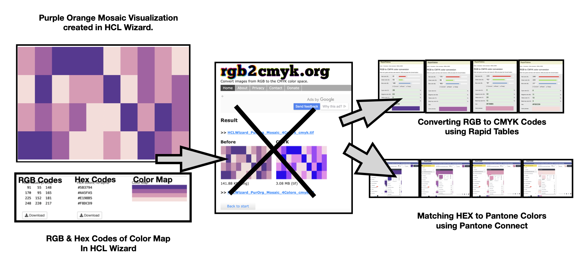
Given my HCL Mosaic color scheme, I can use the “Export” function in Palette Creator to locate the corresponding RGB and Hex codes in HCL Wizard. These results are shown below.

Moving from the RGB Space to CMYK space with a PNG or JPEG image
In order to support printing of my “HCL Mosaic” visualization, I need to convert my HCL Mosaic visualization from RGB Color Space to CMYK Color Space. One simple way to perform this task is to enter a PNG or JPEG image of the visualization into the freely available utility entitled rgb2cmyk.org. Below I show the CMYK TIFF results of entering a Red Yellow Blue JPEG example into rgb2cmyk.org.

Given these promising results, I entered a PNG file of my “HCL Mosaic” visualization into rgb2cmyk to obtain a CMYK TIFF conversion. These results are shown below.

To my dismay, these are not the results I had anticipated. The designated CMYK colors are completely different from my original “HCL Mosaic” composition. This is shown in the image above. This is not a desirable solution for me.
Converting the RGB codes into CMYK codes
My next approach is to enter the RGB Codes for each color, individually, into the freely available Rapid Tables “RGB to CMYK color conversion” tools. I can compare the RGB to CMYK conversion for each color specified. These results are shown below.

Notice that I can also match the Hex codes from the CMYK conversions with the original Hex shown for each color in HCL Wizard. These Hex codes match up and I am satisfied with the resulting CMYK conversion. I can now use the CMYK codes for a physical or hard copy reproduction of my HCL Mosaic color scheme.
Working Pantone inks for printed reproduction
In general, CMYK reproductions lack the luster of digital visualizations created in HCL or RGB color spaces. One solution is to introduce Pantone inks into the physical reproduction. This increases the expense of color printing but in some situations is the desired and optimal approach. My previous writing on “Connecting Pantone with Data Viz: Expand your color toolbox with the Pantone Connect app” discussed in detail Pantone solutions in RGB Color space.
Here, I show how to use the Pantone Connect app to find corresponding Pantone colors for my HCL Mosaic color scheme. This can be done by entering RGB, CMYK, Hex or LAB codes of a given color into the Pantone Connect app to obtain a corresponding Pantone match. Since only one number sequence needed to be entered, I decided to use Hex codes. The resulting Pantone matches are shown below.

Below, I show a CMYK print of “HCL Mosaic”. The CMYK version lacks some of the color luster of the original HCL version. This is typical of display to print transfers as I noted in my prior writing on “A Split Complement: Moving Beyond the Digital to Produce the Physical”. Otherwise, the results of progressing from HCL to print using the noted CMYK codes from Rapid Tables “RGB to CMYK color conversion” tools are very respectable. Using Pantone inks for color printing can achieve an even closer match to the original “HCL Mosaic” color scheme. As indicated previously, the use of Pantone inks will likely yield a more costly physical reproduction process.

Concluding remarks
Here, I have shown how to transition a data visualization created in the Hue Chroma Luminance (HCL) color space on a display device to a physical or hard copy reproduction based on the Cyan Magenta Yellow and Key Black (CMYK) color model. I entered the corresponding Red Green Blue (RGB) color codes for my HCL Mosaic color scheme into the Rapid Tables “RGB to CMYK color conversion” utility to achieve these results. A similar procedure, with Hex codes, was also performed with the Pantone Connect app. This resulted in locating corresponding Pantone colors for my HCL Mosaic color scheme. I also showed how using an PNG or JPEG image conversion tool like rgb2cmyk.org yielded unexpected results for my HCL Mosaic. Previously, I did achieve near matching results using a Red Yellow Blue (RYB) image shown in this writing. You might want to experiment with your own PNG or JPEG images. A summary flow chart of my efforts is shown below.

There are many approaches to building color schemes for data visualization. This writing has examined converting an HCL color scheme into CMYK codes for hard copy reproduction. For discussions on my other approaches to using color suggestion tools, please see some of my prior Nightingale writings that are noted below as well as my 2016 book on “Applying Color Theory to Digital Media and Visualization” published by CRC Press.

Theresa-Marie Rhyne is a Visualization Consultant with extensive experience in producing and colorizing digital media and visualizations. She has consulted with the Stanford University Visualization Group on a Color Suggestion Prototype System, the Center for Visualization at the University of California at Davis and the Scientific Computing and Imaging Institute at the University of Utah on applying color theory to Ensemble Data Visualization. Prior to her consulting work, she founded two visualization centers: (a) the United States Environmental Protection Agency’s Scientific Visualization Center and (b) the Center for Visualization and Analytics at North Carolina State University.
- Theresa-Marie Rhyne

- Theresa-Marie Rhyne

- Theresa-Marie Rhyne

- Theresa-Marie Rhyne


