
In this writing, I discuss ways to use Pantone’s 2023 Color of the Year, Viva Magenta to colorize your data visualizations. I create two bar chart visualizations with Viva Magenta and its specified Pantone complementary color, Waterfall. Let’s get started by reviewing Pantone’s Color of the Year concept.
Pantone’s Color of the Year Concept:
The Pantone company produces the Pantone Matching System (PMS) and the Pantone Fashion, Home + Interiors (FHI) System, proprietary color spaces. PMS is used primarily in graphics for printing, packaging, and digital media. FHI is used in a wide range of other industries including fashion, cosmetics, fabric, plastics, and paints. When Pantone PMS inks are applied to a physical color reproduction process, it is often possible to match the colors of your digital data visualization exactly to the print output.. I highlighted this journey from digital to hard copy in a previous Nightingale writing.

Since 2000, the Pantone Color Institute began defining a “Color of the Year” from its inventory of PMS and FHI colors. The color for a given year is selected by a secret panel after considering color trend analyses that span the entertainment industry, all areas of design, fine art shows and collections, social media, new technologies, emerging materials, and textures as well as lifestyles and socio-economic conditions. On December 1, 2022, Viva Magenta (Pantone 18-1750) was announced as the 2023 Pantone Color of the Year.
Pantone’s Color of the Year has influenced the development of products and consumer decisions in areas like graphic design, product packaging, fashion, industrial design, and home furnishings. As a result, in my visualization practice, I like to build and keep in inventory color schemes that correspond to the designated Pantone Color of the Year. Last year, I covered the 2022 Pantone Color of the Year if you would like to view that discussion.
Finding Viva Magenta’s Hex Code
In working with digital color, it is helpful to know the Hex code that corresponds to Viva Magenta (Pantone 18-1750). For those unfamiliar with the concept, a color Hex code is a Hexadecimal way to represent a color in RGB format by combining amounts of Red, Green, and Blue to note that specific color. A Google search on “viva magenta Hex code” yields the following result: #BE3455.
I also used the free version of the Pantone Connect tool to produce the official Pantone results below. Pantone Connect tends to work best with the Chrome web browser. I have found several hang-ups using Safari. The free version of Pantone Connect is very limited since Pantone hopes you will subscribe to its paid subscription services. Fortunately, for the Pantone Color of the Year, data about the Hex code and color harmonies are provided.

Some Color Harmony Basics
Color harmony is the process of choosing colors on a color wheel that work well together in the composition of an image. Like concepts in music, these harmonies are based around color cords on the color wheel that helps to provide common guidelines for how color hues will work together. In the rich history of color theory, Stanton Macdonald-Wright and Morgan Russell defined a concept called “Synchromism” based on the notion that color has similarities to music. Synchromism is meant to be defined as “with color” as Symphony means “with sound.” The artists also defined scales and color harmony in terms of this concept.

with its own scales and harmony.
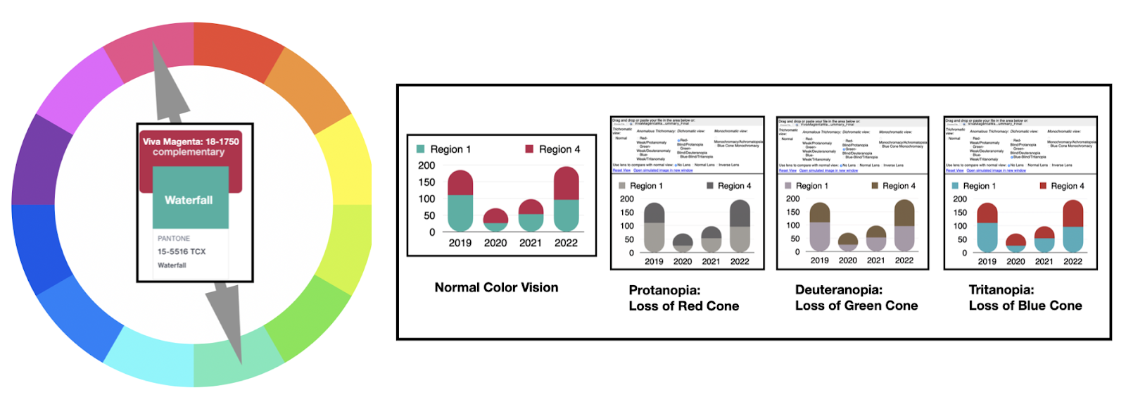
Two common and frequently used color spaces for building color wheels are the traditional Red-Yellow-Blue (RYB) color space used by painters for centuries and the Red-Green-Blue (RGB) color space frequently used for desktop and mobile display devices. Each color space yields slightly different Color Harmony results for colorizing a visualization. Below, I show a comparison of the two differing color spaces using the complementary harmony for Viva Magenta below. A complementary color harmony refers to two colors that oppose each other on the Color Wheel. The color opposing Magenta on the RYB color wheel is Yellow Green. In RGB color space, the color opposing Red Magenta is Green Cyan. Pantone Connect notes this Cyan Green color as “Waterfall”. For the remainder of this writing, I will focus on the RGB color space where the Viva Magenta and Waterfall colors are complements as specified in Pantone Connect. The RYB and RGB color wheels with complementary pairs are shown below. I also depict the Pantone Viva Magenta and Waterfall complementary colors with the RGB wheel.

Using a Google Search, I determine that the Hex code for Pantone Waterfall 15-5516 is #3AB0A2.
My Process of Colorizing a Data Visualization

In a previous Nightingale writing, I defined a five-stage process for colorizing a data visualization. The ring diagram of this process is shown above. The five steps are:
- Establish data classes for visualization and key color for visualization
- Select color rule, and color harmony per criteria of your data
- Build a color scheme. A color suggestion tool might be helpful
- Check and revise due to color deficiency, contrasts, or any pre-existing conditions
- Apply color scheme to data visualization. Some modifications might result.
Let’s follow this process to apply Viva Magenta and Waterfall to data visualization examples.
Applying Viva Magenta and Waterfall to Data Visualizations:
1. Establish data classes for visualization and key color for visualization.

For my example, I have sales data for two regions (Region 1 and Region 4) for a four-year period (2019 – 2022). I want to examine the overall sales picture of Region 1 and 4 combined and explore how Region 4 sales compare to Region 1 sales. For the overall sales, I plan to use a stacked bar chart that shows Region 1 and Region 4 data combined. For the performance comparison of Region 1 with Region 4, I plan to use a bar chart for the Region 4 data with a line chart of the Region 1 over top.
My key colors are Viva Magenta for Region 4 and Waterfall for Region 1. The corresponding color Hex codes are Viva Magenta 18-1750 (#BE3455) and Waterfall 15-5516 (#3AB0A2).
2. Select color rule, and color harmony per criteria of your data.
Using Pantone Connect, I determined that Waterfall is the Pantone complement to the 2023 Color of the Year, Viva Magenta in RGB color space.

3. Build a color scheme. A color suggestion tool might be helpful.
For these examples, we have a two-data class color scheme of Viva Magenta and Waterfall as shown below.

4. Check and revise due to color deficiency, contrasts, or any pre-existing conditions.
As noted in my prior Nightingale writings on color, humans have three types of photoreceptors or cones. Each is sensitive to different parts of the visual spectrum of light to facilitate rich color vision. A red cone deficiency is classified as Protanopia. A green cone deficiency is classified as Deuteranopia. A blue cone deficiency is classified as Tritanopia. Software is available that simulates color deficiencies. The Color Blindness Simulator (Coblis) tool is a freely available online app that serves this purpose.
Let’s use Coblis to examine how the Viva Magenta and Waterfall two-class color scheme appears under Protanopia, Deuteranopia and Tritanopia color deficiency tests. I show these results below.

The results of the color deficiency checks indicate that individuals with Protanopia and Deuteranopia are unlikely to see the Viva Magenta and Waterfall color combination but can differentiate between the two colors they view. Individuals with Tritanopia are likely to view two colors similar to Viva Magenta and Waterfall. As a result, the Viva Magenta and Waterfall two-class color scheme pass color deficiency tests.
5. Apply color scheme to data visualization. Some modifications might result.
Now, let’s apply the Viva Magenta and Waterfall two-class color scheme to a stacked bar chart that shows Region 1 and Region 4 data combined. I show these results below.

To be more confident in addressing color deficiency, I run the stacked bar chart through Coblis tests. I show these results below.

Like the earlier two-class color scheme analysis, those with Protanopia and Deuteranopia are unlikely to see the Viva Magenta and Waterfall color combination but can differentiate between the two colors they view. Individuals with Tritanopia are likely to view two colors similar to Viva Magenta and Waterfall. The stacked bar chart passes color deficiency tests.
Next, I explore how Region 4 sales compare to Region 1 sales. Using the previous Viva Magenta and Waterfall color combination. I build a data visualization with a bar chart for the Region 4 data with a line chart of the Region 1 over top. These results are shown below.

The results from color deficiency tests on this data visualization are shown below. Like the previous Viva Magenta and Waterfall two-class color scheme and stacked bar chart analysis, the bar chart with line example passes color deficiency tests.

Concluding Remarks:

In this writing, I have shown how to use the 2023 Pantone Color of the Year, Viva Magenta, and its complement, Waterfall, to create a two-data class color scheme for data visualization. The resulting color scheme passed the Color Blindness Simulator (Coblis) color deficiency tests. I then applied the Viva Magenta and Waterfall color scheme to two bar chart visualizations. The first data visualization was a stacked bar chart of sales data from two regions, Region 1 and Region 4. The second analysis compared Region 4 sales with Region 1 sales by using a Viva Magenta bar chart for Region 4 data and a Waterfall line chart for Region 1 data. Happily, both data visualization examples passed color deficiency checks.
The process of colorizing data visualizations and graphic designs can produce fascinating results. I have tried to share an approach to using the Pantone Color of the Year with its complement here. You will likely make your discoveries while creating color schemes for your projects. For additional discussions on my approaches with various color suggestion tools, please see my prior Nightingale writings as well as my 2016 book on “Applying Color Theory to Digital Media and Visualization” published by CRC Press.

Theresa-Marie Rhyne is a Visualization Consultant with extensive experience in producing and colorizing digital media and visualizations. She has consulted with the Stanford University Visualization Group on a Color Suggestion Prototype System, the Center for Visualization at the University of California at Davis and the Scientific Computing and Imaging Institute at the University of Utah on applying color theory to Ensemble Data Visualization. Prior to her consulting work, she founded two visualization centers: (a) the United States Environmental Protection Agency’s Scientific Visualization Center and (b) the Center for Visualization and Analytics at North Carolina State University.
- Theresa-Marie Rhyne

- Theresa-Marie Rhyne

- Theresa-Marie Rhyne

- Theresa-Marie Rhyne


