
Starting anything new can be daunting. This past year, I set out to improve my skills and confidence in data visualization. A topic that sounded intimidating, scary and somewhat out of my reach. Although I am trained in visual communication design and work as a product designer, the “data” part was what scared me the most. In this article, I will provide some tips and guidance that I learned this past year, and that I wish I had a year ago. I hope that it may help you create your own journey and upskill in this field much quicker.
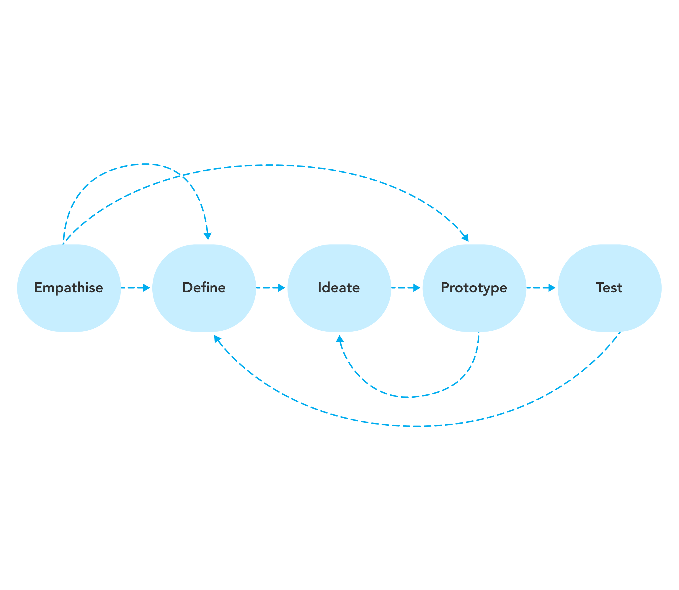
To make things fun, I will use the design thinking process to guide you through a method of honing your skills in this field.
Start with empathy
As a designer, we always start with the person’s needs and wants on the other side of the screen or product. This time around you’ll be the one under the microscope. You’ll have to do some introspection to better understand your own gaps in knowledge and areas for improvement. By understanding these it will be easier to identify a goal to focus on, build a journey to understanding, and gain confidence in this field. Here are a few methods that might help you in your reflection:
Find the why
Such a simple word, but with so much power behind it. Simon Sinek, the writer of the book Find Your Why said it best – “Every one of us has a WHY, a deep-seated purpose, cause or belief that is the source of our passion and inspiration.” It is not an easy task to find your reason for wanting to do data visualization, but I would implore you to try.
Analyze the emotion
When you think of this journey ahead, what do you feel? Inspired? Anxious? Both? If you are used to analyzing your emotions, you might already be aware that they can be layered and complex. But it can provide us with many insights into our own lives. Take some time to identify your emotions by using this emotion wheel. Tease out your knotted chain of emotions and follow them to better understand where your own gaps in knowledge may lie. Oftentimes our fear is what we need to fight.

Define your skill gap
Compared to the previous step, this one will be a walk in the park. After diving deeper into your own psyche, it is time to do something practical. Define the “problem(s)” to solve or in this case the skill(s) to gain.
First, find a few job advertisements that describe your ideal position. This could range from data visual designer to data analyst. If you’re not sure what position you might want, start by reading through various options, then narrow down to one or two that best describe your ideal day-to-day. Write down the skills that you need to fill this position, lack in your own analysis and/or do not feel confident in.
The second step might require you to step out of your comfort zone as you expand your network. Identify five to ten people with your ideal job title and read through their Linkedin profiles. As before, start writing down the skills that you lack compared to this person(s) or that you do not feel as confident in. The key is also to look out for patterns across profiles and general cross-over with the ideal job advertisement you identified earlier.
Try not to feel overwhelmed at this stage as it is now time to narrow down the scope. After going “broad” to find a range of skills that you lack or that you do not feel confident in, it is time to prioritise. The priority order of the skills will depend on your context and immediate needs. If you already know the priority you can list them in order, or else use a simple Priority Matrix to identify the skills that you will be working on first.

Ideate on your learning path
Now that you have identified a few core skills to improve on, it is time to go a bit broader again. Ideate on what you might do to grow your confidence in the skill(s) you identified earlier. This is the fun part of the journey by exploring all your options. Deep dive in areas that make you feel comfortable, but don’t be afraid to deviate or explore the less traveled path.
Join the community
If there was one piece of advice that you take away from this article, it should be to join the online community. When I discovered the Data Visualization Society, my journey was catapulted forward. I found advice, resources, guidance and support that I direly needed. Not to mention the amazing people I met along the way. Joining their mentoring program also provided me with the tools and confidence I needed to start actively practicing data visualization. My mentor, Sarah Bartlett, was absolutely pivotal in my growth this past year and I’ll be forever grateful. Other online communities can be found on social media platforms, such as Twitter and Instagram. I would suggest following hashtags, people and groups relevant to your own journey. That might range from tools (#Tableau, #PowerBI, #GGPlot) to generic terms (#DataVisualisation, #dataviz, #informationdesign, #DataFam).
Join events and workshops
The events and workshops that you join will depend on your specific area(s) of interest and your available budget. There are loads of fun online and in-person events to choose from. The Data Visualization Society has a public calendar that displays events, ranging in a variety of topics. There are also plenty of conferences to choose from, but some big hitters include IEEE VIS, Tableau conference, and Data festival. Always keep an eye out on social media or for announcements in the community as new events pop up regularly.
Learn a new tool
Depending on the skill gap you identified earlier, you might want to dive deeper into a specific tool(s). There are many tools to pick from when it comes to data visualization and choosing one that suits your needs can be difficult. My advice would be to identify the tool that would best suit your needs and use case. For example, if you are expected to only do the design part of the process – you can use Illustrator or Figma. However, if you need to get into the data you might want something more fully rounded like Tableau. In the book Good Charts by Scott Berinato, you can also find a great table summarizing the tools available, as shown below.

Personally, I found Tableau to be a great tool to learn how to manipulate and present data in an interactive way. No coding skills are required for using this tool and there is a free version to start with that allows you to do some really advanced visualizations. I took Tableau for data scientists by Matt Francis and found that a great starting point. There are also many additional resources on the topic online. Some include Andy Kriebel’s blog VizWiz, Sarah loves data’s blog, and the Play Fair Data Blog. Tableau also has its own community events and a section where you can explore other people’s public work in detail.
Get some reading material
I find having an excuse to get a new book as one of the best parts of learning something new. In terms of data visualization, there are more than enough options to choose from. Keep in mind that many of the data visualization books are in the style of a reference book, meaning that you would want to refer back to some of the information on a regular basis. So depending on your situation, you might want a digital or physical book. In the Data Visualisation Society, Lydia Gibson shared her list of recommendations which I found really useful.
Personally, I would recommend Good Charts by Scott Berinato, Storytelling with Data: A Data Visualization Guide for Business Professionals by Cole Nussbaumer Knaflic and The Data Visualization Sketchbook by Stephanie Evergreen.
Other than that there are also some great online resources which I would highly recommend you bookmark. Nightingale, the Data Visualisation Society community driven blog, is a great resource for continuous learning. There is also Storytelling with Data’s blog which is a good resource for honing your skills. Additionally, Information is Beautiful, Flowing Data, and Visualising Data are perfect for inspiration. Lastly, Junk Charts is a great place to learn what not to do and how to critically look at improving data visualization.
Do an online course
Depending on the skills gap defined earlier, this part might look slightly different to you. In the past year I pursued many avenues and did more than five online courses to upskill in data visualization. Out of all of these paths, I found dataliteracy.com, by Ben and Becky Jones, the most useful. Their courses require no coding experience, provide a great basis for data literacy, are practical and can be applied immediately. If I had to go back in time, I would have started my journey here. I also found doing statistics and probabilities on Khan Academy very useful to understand calculations in more depth and to help communicate about data more effectively.
If you’re interested in exploring other resources, there are many platforms that offer visualization courses for free or for a price. Kaggle offers a free basic course, while Coursera, LinkedIn, EdX and Udemy offer a variety of courses at a small to large cost.
Start with the prototype!
After exploring a variety of different paths and resources, it is time to set the course and build out your “prototype” learning journey. Set your SMART goals based on what you believe will be the most beneficial, and iterate on the process.
Along the way, you might want to deep dive into more specific areas of data visualizations. For example, getting a better understanding of the process for data visualization, improving your visual vocabulary, learning about accessibility in context of data visualization or getting to grips with color usage when visualizing data. Just keep exploring and staying inquisitive!
Test your skills

The best thing you can do to retain your knowledge and improve your data visualization skillset is to practice and get feedback on your visualizations. As a designer by trade, it was refreshing to find that the general data visualization community is also keen on this fact. There are a variety of inspiring online community challenges that help motivate you to keep practicing. Makeover Mondays, Back 2 Viz Basics and Storytelling with Data Community are great examples and a perfect place to start. There are also a few more specialized challenges, like Prepping Data and the Iron Viz challenge.
When you have filled some of those knowledge gaps, it is time to embrace the challenge and beat the imposter syndrome. It is time to show the word and get feedback. It is a daunting thought – but honestly, the best way to learn. Just know that the community is there to help, guide and build you up!
Thank you for reading
I found writing this article really helpful in concluding the first part of my journey, and my hope is that it provide people with a little bit of a starting point. If you have any other suggestions or helpful tips, please feel free to reach out. Thank you again!

Daleen Rabe is a senior product designer at Learnosity, an education technology company that specialises in assessment technology. She is interested in the intersection of data visualisation and education, and an accessibility and design system enthusiast.
- Daleen Rabe


