
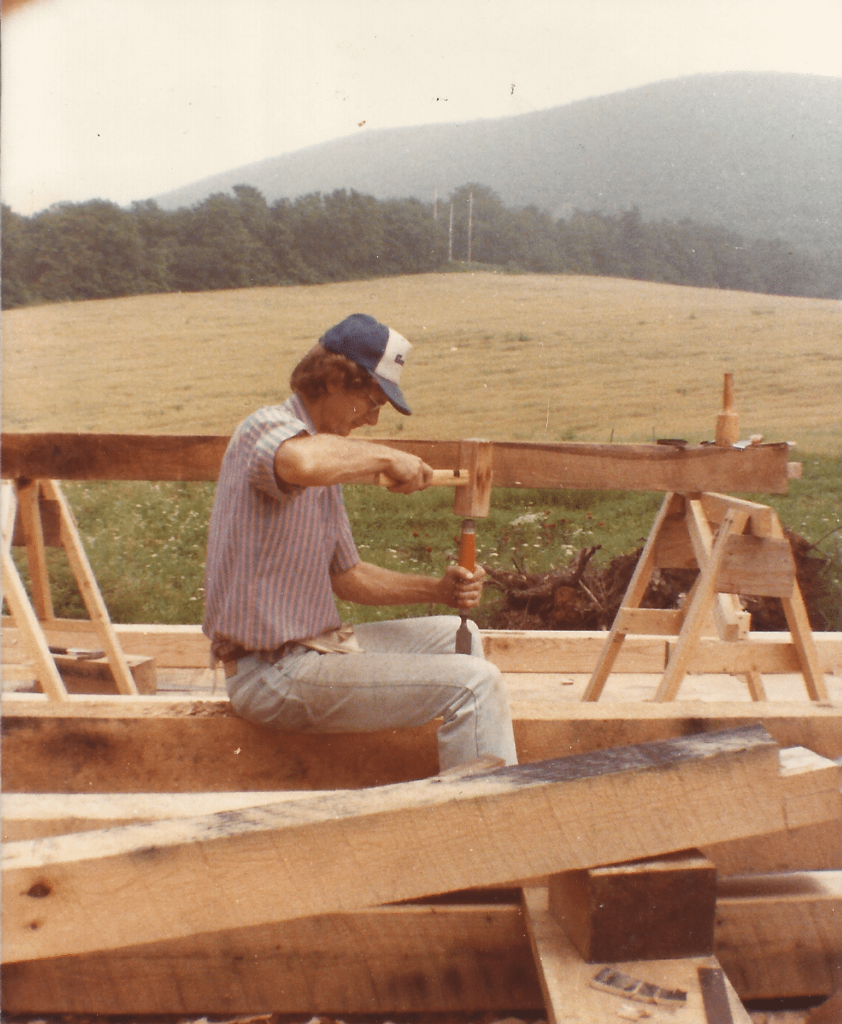
In 1984, when my parents were searching for their first home together, my dad decided the best solution — given their limited budget — was to build one himself. So he picked up some books, started reading, gathered some friends, and set to work.
Without any formal training, my father managed to design and build a beautiful home, which my parents still enjoy to this day. Growing up, this all seemed normal to me and shaped my mind-set accordingly. I figured if you want to build a computer, then buy some computer parts, read the manuals, and start building. You want to learn how to swim? Read some articles, then get in the pool and practice. So it’s no surprise that when I decided I wanted to make better graphs for my academic research, I picked up a book and started reading. That book — Show Me the Numbers by Stephen Few — opened my eyes to the idea that there was an entire discipline devoted to understanding how to communicate information visually, and that this was something I could learn.
Like building a house, data visualization comprises a set of skills that can be learned. But the process of going from novice to master builder (or master visualizer in our case), can be fraught with tears, late nights, and many failures. In this series of essays, I will recount my own journey over the last three years from a lab tech with a microbiology degree, to a self-taught, award-winning visualization designer and developer. Along the way, I will share all the things I wish I had known during my journey, and give you a road map to building your own successful career in data visualization.
To paraphrase Francis Gagnon, my path to data visualization was common in that it was totally unique. When I started university, I had a plan. I loved research and science, so I began my degree in microbiology while doing research in a botany lab. I was fortunate to be given the freedom to pursue my own research, and I spent as much time as I could in the lab designing projects and carrying out experiments. I was fascinated by numbers, so between my biochemistry and genetics courses, I snuck in as many math and statistics courses as possible.
After a few years of struggling with wet-bench experiments (pipetting and doing biochemistry all day), I wondered if I could use computer simulations to help answer my research questions. Thus began my foray into bioinformatics, which led me to learning how to code with R. Learning to code was a revelation. Over the next year, I spent every free second teaching myself how to code, studying data science, and using my newfound skills to investigate any interesting topic I could find. Eventually, these skills landed me a new job at the University of Pennsylvania focusing on data analytics and visualization. I was still doing research, but now my job was 100% computer based, and about half of my time was spent designing and coding visualizations.
As the joke goes, in academia you learn more and more about less and less until you know everything about nothing. After many years doing research, that feeling really started to bother me. I wanted to research all kinds of topics instead of focusing on just one, and I was discouraged by the lack of impact I felt my work was having. I wanted to do work that would help educate and influence the general public, not just the handful of other researchers who look at paywalled journal articles. So with inspiration from places like The New York Times and The Pudding, I set out to develop my storytelling skills and learn JavaScript and D3. I worked hard to improve my web development and D3 skills, making more projects and building my portfolio along the way. Those projects, which I thought of as just a learning exercise, landed me my current job as a senior data visualization analyst at Fidelity, where I focus on visual design and storytelling within our data visualization team.
Sounds easy, right? Well, those three paragraphs summarize my recent history into a nice little tale of triumph, but the real story is more like a roller coaster full of struggles, late nights, and heaps of failure. Those paragraphs also gloss over the gritty details of how you actually go about learning the myriad skills required to visualize data, and the steps to turn those skills into a successful career.
One way to build your skills and launch your career is to go to school for data visualization. This was quite rare just a few years ago because of the newness of data visualization as a recognized field. But times are changing, and there are now several postgraduate programs in information design, data visualization, and related topics. This may be the perfect route for some. However, if you are one of the many people that are unable or uninterested in returning to school, but are bewildered by the path to a career in data visualization, I hope these essays can demystify the process and guide you on a path to success. The first step in our process is to understand what data visualization is, what the prerequisites are, and what we need to focus on to achieve our learning goals.
The data visualization triangle
Whether by coincidence or convergence, the skills required for house building, and the skills required for data visualization are much the same. Both practices are interdisciplinary, and both are made up of the same three skills: data, design, and tools.

In building a house, data comes in the form of engineering principles and calculations; design encompasses architectural and interior design; and tools make up not only the physical tools you use but also the construction methods. In data visualization, data incorporates data collection methods, data structures, how to manipulate data, basic statistics, how to use data to evaluate a hypothesis, and more; design mainly pertains to the principles of layout, typography, color, and usability; and tools often includes code, but this does not have to be the case — there are many successful data visualization specialists who use tools like vector design programs, BI tools (Tableau, etc.), or pen and paper to make their visualizations. If mastering three disciplines (each of which is a whole field of its own) seems daunting, here are several considerations to put you at ease.
First, you do not need to be an expert in all three of these fields (or even in one of them). You will learn bits and pieces that apply to your own projects and will have areas of strength and weakness.
Second, you don’t have to go it alone. Although it may not seem this way from the outside, the truth is that most of the awesome dataviz rockstars you look up to get significant help from their peers, and lean heavily on others for advice or collaboration. If you’re a young designer with an idea for a web-based visualization, go seek out a web developer at a similar career point and propose a collaboration; chances are they’ll jump at the chance to work with a designer and you can help teach each other along the way. The Data Visualization Society Slack is a great place to connect with other early career folks that may have complementary skills and be eager to collaborate.
Finally, think about the skills you already have. Chances are, if you’re reading this article, you have some background in design, data, or development. Lean on those skills initially, and branch out from there. Even if you don’t come from one of these backgrounds, you likely have some specialized domain knowledge, and the one skill I believe is the only must-have to get into data visualization: a deep sense of curiosity that you can leverage to ask interesting questions.
Let’s revisit my story from above to see how my own career evolved along the data visualization triangle. It all began when I was a toddler. As soon as I could talk I pestered my parents with an endless stream of questions about how things worked and why the world is the way that it is. (The book The Way Things Work was one of my most-prized possessions as a kid.) My mom loves to tell the story of one morning when I was three years old and she was trying to get me to preschool so she could go to work, but I refused to get in the car until she explained how it worked — how it really worked. So she opened the hood, got my dad on the phone, and held me up so I could look at the guts while my dad explained the mechanics and operation of an internal combustion engine. As I grew up, I maintained this annoying curiosity and channeled it into various part-time passions through the years. I ended up formalizing my question-asking obsession into a career in research and picked up some useful statistics and numeracy along the way.
At this point I felt comfortable with my data skills, but I needed a way to efficiently apply them to new data sets, so I started down the path of tools by learning to code in R and then JavaScript. For about a year I did nothing but work on my code and data skills, and it showed. Most of my charts during this period were ugly and poorly designed (see below). Only in the last couple years did I become interested in design, and only in the past year did I start to formalize my skills by studying typography, color, layout, and usability design.

My path was data → tools → design, but yours may well be different. The point is that as you traverse the triangle, picking up skills in various areas, you will still be doing data visualization along the way. You don’t need to learn everything at once, and by breaking down your education into smaller more defined areas, you can focus on building deeper expertise in one area without becoming overwhelmed by the deluge of potential skills you could learn.
Now that I have explained what it takes to build a career in data visualization, you’re likely wondering how to actually learn all these skills. This essay summarized my own learning journey, and introduced the skills required for data visualization. In the next essays in this series, I will go more in-depth on challenges I faced and how I overcame them. I will discuss the nitty-gritty of acquiring the skills laid out above, and how to leverage them into a successful career while maintaining your sanity.
Will Chase is a designer and developer focused on data storytelling and visualization. You can find his work at https://www.williamrchase.com/ and connect with him on Twitter @W_R_Chase.
- Will Chase

- Will Chase

- Will Chase


