
In my first essay, I touted my status as a “self-taught” designer and developer — this was a lie. Or rather, a mischaracterization, for almost no one is self-taught. Perhaps you can remain truly self-taught if you stick to books — this is how I got my start, and I still recommend this path. Books give you a stable base and an introduction to the terminology, which will be immensely helpful before diving in head first. But eventually you will have to venture outside the confines of books and tutorials, and learn by doing.
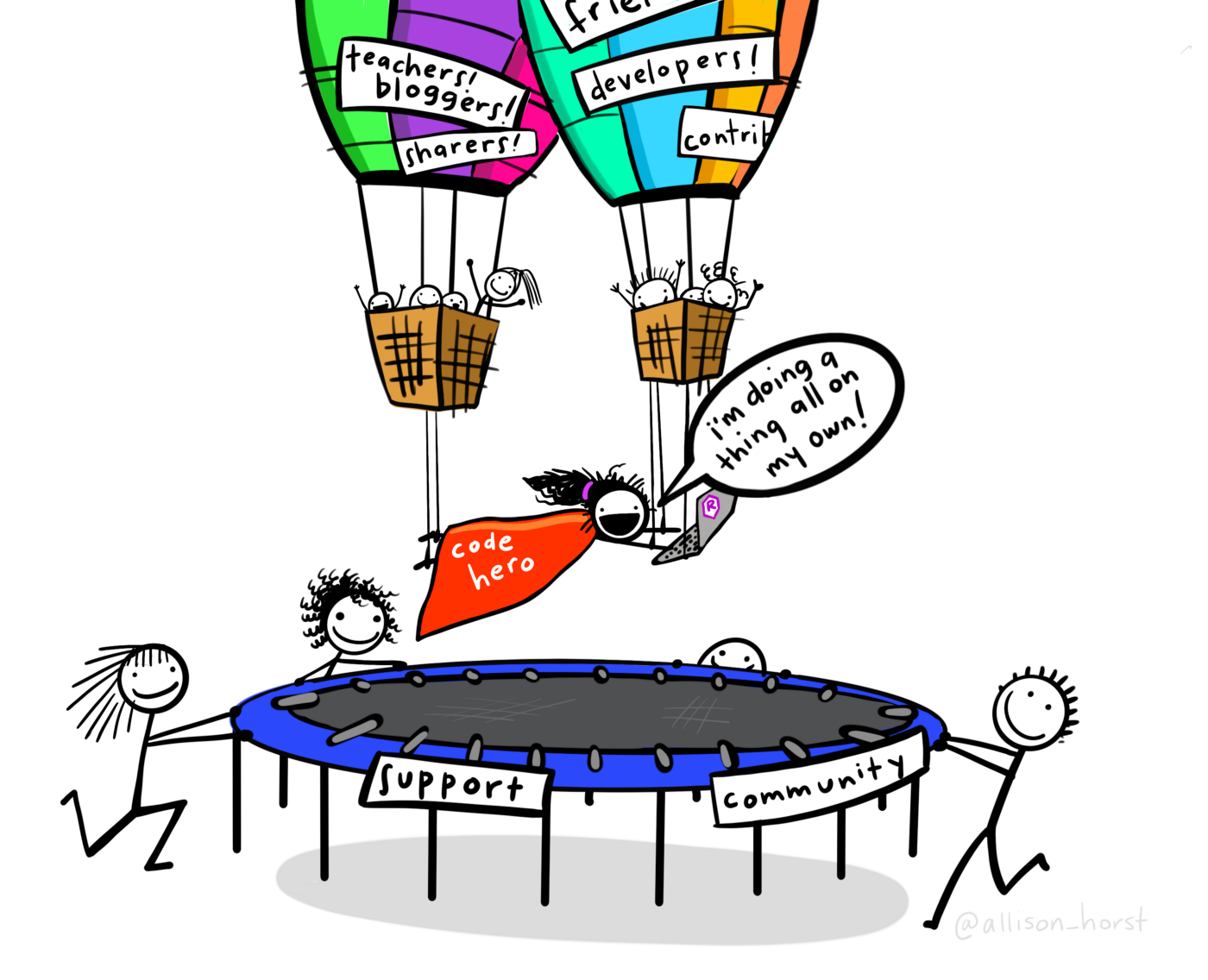
As my dad noted about his experience building our house: “The books can say do X, Y, and Z, but when it comes to actually putting hammer to nail, things are always different.” The same applies in data visualization. When you leave the world of theory and start building your first big project, you will inevitably run into bugs in your code, unknown design territory, or problems that your books just didn’t cover. This is when you turn to your community and the incredible ecosystem of free resources that is now at our fingertips in the form of blog posts, StackOverflow answers, YouTube tutorials, slack groups, and our mentors and friends. Ask almost anyone that is “self-taught” and they will admit none of it would have been possible without the incredible wealth of free resources contributed by the community. So following the lead of Steph Locke, I now call myself “community-taught.”
In my last essay on building a career in dataviz, I outlined the three skills essential to data visualization: data, design, and tools. In this essay, I will discuss how to actually learn these skills, including my own experience, specific tips, and where to find all of those amazing community resources. Learning dataviz requires doing dataviz—here are some tips to get you started.
Choosing learning projects
The projects you choose while learning are crucial to building a successful career in dataviz. The first consideration is what you want to learn from a project. You will learn the most by choosing projects that challenge you in an area in which you are lacking. Think back to the data visualization triangle (design, data, and tools) and consider what skills you already have that can help you, and what areas you need to explore further.
It’s also important to consider the scale of projects. I suggest choosing a mix of smaller, more manageable projects—the type of thing you could finish in a few hours—and larger projects that might take weeks or months. Smaller projects are useful for learning new tools or practicing specific skills, and there are great resources such as TidyTuesday or Makeover Monday that provide weekly data and a community to tackle these projects. Larger projects should be more personalized and in-depth, as these are the projects you will highlight most in your portfolio.
For larger projects, it’s important to choose something unique. There are heaps of pre-packaged tutorials and data (I’m looking at you, Titanic survivors dataset) that you can use, but the current dataviz environment is too crowded for these projects to stand out. A personalized project will help you to make a name for yourself and will ultimately allow you to be much more engaged in the project. One great way to ensure this personalization is by collecting your own data. Collecting your own data will let you learn the data inside and out, understanding the shortcomings and uncertainties in the data. In a similar vein to collecting personalized data, you should choose something that matters to you, something you’re deeply curious about. The lifecycle of every major project starts out with huge excitement, but quickly descends into frustration. Behold, one of the most truthful and accurate infographics I’ve seen, on the emotional journey you will traverse during these projects:

That bridge crossing the dark swamp of despair is crucial and although it will always be a battle, passion and curiosity for your subject will help drive you across when the going gets tough.
These projects should be personal and engaging to you, but don’t need to be about some earth-shattering insight or super serious topic. Some of the best projects I’ve seen just come from a deep dive into your favorite TV show, movie, or a quirky passion. Are you weirdly obsessed with knitting? A poster visualizing knitting patterns would be fascinating. Do you like rap music? I would love to see a visual history of rap battles (in fact, I might take that idea ?). For an excellent example of how to learn through fun personal projects, see this brilliant talk by Ryan Timpe.
Ultimately, a project is what you make it, and the process more than the end result will determine how much you learn and how far a project gets you. There is no perfect topic that will resonate with everyone, but by choosing something that excites you, you will have more motivation to turn it into something you’re proud of. You don’t have to find the perfect topic so much as make the topic you choose the right one through process, energy, and dedication.
Honing your data skills
Mathematical anxiety is a widespread affliction — and not without good reason. Math can be hard and numbers can be intimidating. So it’s good news that to become fluent with data, you don’t need to be good at math. Instead, you need to ask good questions, collect obsessively, and become a master data wrangler.
So much of understanding data is just asking the right questions. This includes the initial question, but also the questions you ask about your data: Is this source trustworthy? Is my data incomplete? Can this data actually answer this question? This practice of constantly interrogating your data with a careful skepticism is likely the most important aspect of working with data. If you can understand the potential and limits of your data, you will be set up for success. Learning this skill comes from much practice and case study, but there are a few resources that can help. How Charts Lie, by Alberto Cairo, and Avoiding Data Pitfalls, by Ben Jones are both excellent books that will get you started on asking these questions. Of course, to effectively interrogate data, you need to collect it in the first place.
Collecting data is a hugely underrated skill, but one of the most important in your dataviz repertoire. As you go through the process of data collection, you will encounter problems, forks in the path, and be forced to make the hundreds of little decisions that go into building a dataset. Eric William Lin gave a talk at a DVS meetup last year about all of these decisions and how we think about translating information to data to visuals. Along with all these decisions, you will have to think about how to structure your data and how you might reshape it later. Finally, you will learn numerous tools and data collection methods—from databases to APIs to old fashioned manual data collection. Once you’ve painstakingly assembled your beautiful dataset, you may excitedly charge right into a visualization tool, but that excitement will deflate when you inevitably realize your data isn’t in the right format.
The skill of joining, filtering, and reshaping your data to fit a particular shape is often called data wrangling. There are numerous techniques in data wrangling — the aforementioned joins, pivots, clever filtering, and mutating — but all of it comes down to visualizing the path from your current data format to the desired output. When I was just a fledgling data wrangler, I often found the chasm between raw data and filtered data daunting, but by breaking the task down into elementary steps, you can tackle one piece at a time and the whole ordeal becomes more manageable. Here’s my strategy when I come up against a daunting data wrangling problem:
- Get out a pen and paper
- Draw your current data format
- Draw your desired data format
- Try to work out the elementary steps to get from what you have to what you want
You can work backwards or forwards or both, but the key is breaking it down into manageable steps (Eg, 1. filter with X, 2. sort by Y, 3. pivot to long, 4. etc.) There are many tools you can use to accomplish these steps (Excel, SQL, Python + Pandas, R, etc.), but if you’re new to all of this, I strongly recommend R and the Tidyverse. I’m a noted R fanatic, so perhaps I’m biased, but I truly think it is the best language for tabular data wrangling — and the most beginner-friendly. The book R for Data Science is an excellent guide that will walk you through the theory and practice of data wrangling and basic statistics in R.
Above all else, becoming a master data wrangler is a matter of practice. The more you practice the more techniques you’ll add to your bag of tricks, and the better you’ll become at visualizing the path from raw data to desired output. At first it can be frustrating (I would often spend hours on what seemed like simple data wrangling tasks), but with sufficient practice you’ll see a new problem and start recognizing patterns, realizing places you can fit in a trick you remember, or knowing the appropriate technique to fix a particular data issue.
Mastering tools
There’s an eternal divide between people who argue that tools don’t matter, and those who think they’re critical. Both are right. It’s important to learn to think in a tool-agnostic way, but in reality, tools place big constraints on what you can produce — it’s just not possible to make a scrollytelling web app with Excel. So, it’s important to identify the correct tools to accomplish the type of work you want to make. For many people this will include a coding language.
Learning to code is a journey that will differ for everyone, but there are two pieces of advice I can lend from my own personal experience. First, eliminate any distractions to allow you to focus on coding and data visualization. When you sit down for the first time ready to code you’ll probably go to install the language you’re using, maybe an interpreter or compiler, or an IDE — some way to actually write, inspect, and run your code. Unfortunately, in many cases, you’ll give up out of frustration before you get to write any actual code. Some languages [*cough* Python *cough*] are notoriously difficult to even install properly. If you’re doing web programming, you’ll have to worry about setting up web servers, importing packages, or linking to some outside data source or API. And with every language you’ll run into the aggravating minutiae of file paths, interpreter issues, and version problems. Troubleshooting these issues is tricky even for seasoned developers, and is about as enjoyable as a root canal. Online cloud editors are a great way to sidestep these pesky issues and make for a much more friendly introduction to coding. For coding in Python you can boot up a Jupyter notebook, for R you can use Rstudio Cloud, and for JavaScript you can use Observable. Although you’ll eventually need to set up a local development environment, I suggest putting that task off until you’re more comfortable with coding, lest your first experience be one of frustration and pain.
My second piece of advice is to focus on projects and draw on numerous learning sources. I’ve never been able to go through a coding book cover to cover, or follow an entire online course without getting bored halfway through. Instead, my strategy is to focus on accomplishing a goal and building a project (large or small), and learn the code as I go. I do reference online courses (I particularly love YouTube tutorials) and books, but more often I reach for blog posts and browse other people’s code on GitHub or a public code notebook. And if you just can’t find the answer on your own, that’s when it’s time to call on your community, posing questions on Slack, a user group, or Twitter (more on developing a community in the next essay).
Demystifying design
For many people — especially quantitative thinkers — design seems like a mystical art where you either “have an eye for it” or don’t. While it’s true that there is more artistry and room for interpretation in design than in something like arithmetic, these are still skills that can be learned by anyone. The fundamentals of design are no more mystical than the fundamentals of algebra, and learning some basic guidelines will improve the attractiveness and usability of your charts immensely. I gave a talk at Rstudio::conf summarizing these fundamentals for a quantitative audience, but there are a few points that bear repeating or expanding here.
The talk covers the three pillars of design: layout, typography, and color — and this is what I recommend studying when developing your design skills, but with some caveats. Firstly, when you begin your study, you will quickly see that there is a gap between traditional design teachings, which may be geared towards graphic or web design, and how you interpret and apply those principles to data visualization. Some of that interpretation will come down to you, but there are resources that can help. I love Sam Parsons’s blog, which focuses on how to apply certain design principles to data visualization, and Duncan Geere has some wonderful articles on the topic as well. My own blog has occasional ramblings on the subject, and Lisa Charlotte Rost at DataWrapper also has several very applicable and helpful posts. Secondly, it’s important to understand that there is a level of interpretation in design, and the guidelines are just that: guidelines, not rules. In my talk on dataviz design, most of the suggestions I give are aimed at making clean modern charts (minimalist style), but if you wanted to build a more historically styled chart, or something with a different tone and feel you would apply these principles differently.
To actually learn these skills, I like traditional design books combined with a wide inspiration network. To get started, here are some of my favorite books and learning resources:
- If you design anything that users can interact with, I highly recommend The Design of Everyday Things, by Don Norman. It’s a classic in usability design and essential reading for anyone designing things that humans use.
- For typography I love Practical Typography by Matthew Butterick. It’s a free online book that covers basically everything you need to know about typography (at least for an entry level) in a very concise and straightforward way. It’s so good I keep it on my bookmarks bar!
- For layout, there are few resources directly applicable for data visualization, but if you make any posters, infographics, or web graphics, I highly recommend studying grid systems — I like Making and Breaking the Grid.
- For improving your color sensibilities, I don’t have any favorite books. Instead, I prefer to just take in a huge amount of inspiration — I’m constantly snapping pictures when I walk outside, or screenshots when I see any color combination I like. Then when it comes time for a color palette, I go to my inspiration folder, see if there’s anything I like, and start tweaking the colors until I’m pleased. Developing a good sense of color is something that takes lots of time and practice.
As I illustrated with color, finding inspiration for your designs is hugely important. The best advice I can give to someone trying to improve the aesthetics and design of their graphics is to take in a large breadth of inspiration. On Twitter I follow traditional designers, web designers, digital artists, illustrators, painters, architects, bot accounts that retweet weird fungi and fruit pictures, and the list goes on. In my free time, instead of scrolling through Facebook, I like to browse Pinterest or Dribbble for design ideas. Inspiration comes from many places, and by casting a wide net, you expose yourself to ideas, trends, and design concepts you may never have thought could apply to dataviz.
Becoming a storyteller
Humans are natural storytellers, and with data storytelling being the latest buzzword, perhaps it’s odd that I left it out of my data visualization triangle. I made this decision because storytelling is not required in many types of data visualization. It’s trendy these days to call everything under the sun a “data story,” but as Josh Smith argued recently, most “data stories” are not such. One reason for this is that sometimes dataviz is just reporting the numbers in a visual format, but it’s also because there’s a lack of understanding of what a story really is, and how to craft a good one.
I love listening to audiobooks, and I often take the opportunity to learn something through the Great Courses series (audio lectures given by university professors). A few years ago I started listening to Great Mythologies of the World, 31 hours of mythologies and analysis from cultures across the globe. One of the central themes from this study was that most myths share a common structure. Indeed, this is the foundation of one of the best known theories on storytelling: Joseph Campbell’s monomyth and the Hero’s Journey. This theory breaks down all stories into a common structure with component parts— call to adventure, ordeal, resurrection, etc. Since Campbell, there have been several adaptations and expansions to the theory, and if you want to become a better storyteller, this is a good place to start. Study the theory and then look at how it’s applied in your favorite books, movies, TV shows, and podcasts. (This American Life and other narrative podcasts are excellent material for studying storytelling.)
After studying traditional storytelling, you will undoubtedly notice patterns among stories, but the question remains: How do you apply these patterns and techniques to data storytelling? To make the transition from traditional to visual or data-driven storytelling, I recommend two books: Understanding Comics by Scott McCloud is essential reading on the theory, psychology, and techniques of visual storytelling, and it’s a work of art in its own right; and INFO WE TRUST is a tour de force on data storytelling from RJ Andrews, who used the term “data storyteller” long before it was a buzzword. Both of these books bridge the gap, covering aspects of traditional storytelling theory and psychology, but also showing how those techniques are applied in real world visual stories.
All of the books and theory I’ve mentioned so far can get you far, but I have to admit that I didn’t learn from books alone — I had a head start on data storytelling from my career in scientific research. You may think of academic papers as dry and dense, but the best ones read like engaging narratives, and this technique of presenting your research as a data story is increasingly taught to young scientists. The techniques used by great science communicators are the same ones that you can leverage to craft engaging data stories. One of the best ways to learn is through imitation, by studying popular science books, TV specials, or documentaries. I especially love the RadioLab podcast, which consistently comes up with novel and engaging ways to communicate complex data-driven topics. Honing the craft of data storytelling takes practice, but mastering it will elevate your work beyond mere reporting, allowing you to engage with your audience and create work with a lasting impact.
Converting your skills to a career
So far, I’ve discussed what it takes to become a data visualizer and how to gain those skills. But you can be the most skilled dataviz guru in the world and it wont make a lot of difference if you can’t use those skills to reach your audience and build your career. In my next essay I will discuss the sometimes uncomfortable, but always important skills of networking, self-promotion, and career building.
Will Chase is a designer and developer focused on data storytelling and visualization. You can find his work at https://www.williamrchase.com/ and connect with him on Twitter @W_R_Chase.
- Will Chase

- Will Chase

- Will Chase


