
This content originally appeared as part of The ‘Gale newsletter.
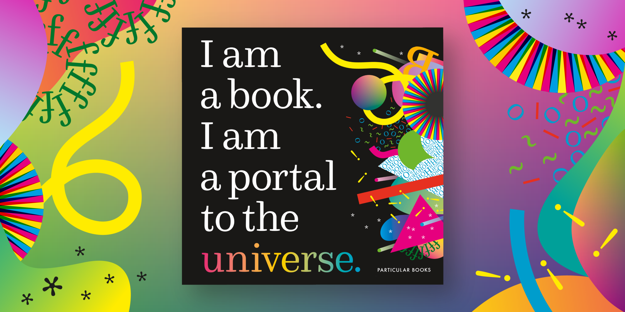
This issue’s installment of “Three Questions With …” is a double feature! Today we’re chatting with Stefanie Posavec and Miriam Quick, co-authors of a new all-ages dataviz book, ‘I am a book. I am a portal to the universe.’ Stefanie is a designer, artist, and author who explores playful approaches to data communication. She has now written three books, including Dear Data (co-authored with Giorgia Lupi). Miriam is a data journalist and researcher specializing in information visualization. ‘I am a book’ is her first book.
1. If you could be any type of chart, what would you be?
Stefanie: A tree diagram because I like drawing them and I like their organic aesthetic, they have been a constant in my more creative data practice since the very beginning (almost 15 years ago, eek!).
Miriam: A spectrogram. I first got interested in data visualisation through analysing musical audio for my PhD and spectrograms were among the first charts I used.
2. If you were stuck on a desert island, what viz would you want to create and what would you use to make it?
Stefanie: Maybe creating a massive typology of collected shells and smooth sea stones could be a good way to pass the time waiting for a ship 🙂
Miriam: I’d need something practical that would help me survive. I’d be eating a lot of fish, so I’d track the number, species, and size of my daily catches along with info on the weather, wind direction, and so on to try to better understand the patterns in my environment. I’d weave the data into baskets or sleeping mats made of leaves — practical and durable data objects!
3. What is one visualization that has inspired you?
Stefanie: Martin Wattenberg’s Shape of Song visualisations, where he used arc diagrams to show repeating sequences in music. When studying for my MA Communication Design many moons ago, I had this project stuck in my sketchbook as a visual reference of how elegant and beautiful a visualisation could be … it sparked my interested in creating work that (as the old cliché goes) ‘makes the invisible visible’ even before I really knew what data visualisation was, or that it was a possible career option!
Miriam: One Angry Bird by Periscopic. Using data on facial expressions, it visualises the emotional arcs of presidential inaugural addresses as these wonderful featherlike structures. It’s a great example of how a subtle and original approach can still tell a strong story. Trump is a very angry man, that’s clear.
Claire Santoro is an information designer with a passion for energy and sustainability. For 10 years, Claire has worked with governmental agencies, non-profit organizations, and higher education to accelerate climate action by communicating complex information in an engaging, approachable way. Claire holds an M.S. in environmental science from the University of Michigan.
- Claire Santoro

- Claire Santoro

- Claire Santoro

- Claire Santoro


