
In my previous “Colorizing a Visualization” writing, I covered the analogous and complementary color harmonies. Today, I will discuss a hybrid of the two harmonies called the Analogous Complementary Color Harmony. This is also called an accented analogous color harmony.
In this example, the online Adobe Color tool facilitates the building of this harmony in the key of Blue. The resulting Accentuated Blue harmony is applied to a scatter plot with a line visualization that fails color deficiency tests.
Analogous as well as Analogous Complementary Color Harmonies run the risk of failing color deficiency tests since the resulting color themes include multiple colors next to or adjacent to each other on the Color Wheel. This increases the difficulty in distinguishing between color elements in a visualization for normal color vision as well as color deficient individuals.
In this writing, an approach to salvaging a visualization that fails a color deficiency test is shown. This situation is likely to happen to you in your practice of visualization. This issue is addressed by using a different geometric element or shape for each data set in addition to the Accentuated Blue color scheme. The differences in color are enhanced using Geometry based changes to overcome the failing color deficiency tests. That is to say, encoding categories using shape or size.

Fundamentals of an Analogous Complementary Color Harmony
In visualizing quantitative information, there is frequently a need to include the average, median, historical context or other trends in multiple data sets. The trend is frequently distinguished from the other data elements. An Analogous Complementary or Accented Analogous Color Harmony is an effective color theme for achieving this. This Color Harmony includes one Complementary color opposing a set of colors all in the same Analogous family. The trend data can be colorized in the Complementary hue with the remaining data sets colorized with the Analogous hues. To visually understand the fundamentals of the Analogous Complementary Color Harmony, I depict an Analogous Color Harmony and the Complementary Color Harmony separately below.
The Analogous Color Harmony refers to colors that are adjacent or next to each other on the Color Wheel. While the Complementary Color Harmony represents colors that oppose or are across from each other on the Color Wheel. Using Adobe Color, a web-based app for creating color themes, I depict both in the Key of Blue: #121EFF.

The Analogous Color Theme consists of a Cyan #0595FF, three Blues (#054CE8, #121EFF, #3705EB), and Purple #8005FF as shown on the left.
While the Complementary Color Theme consists of three Blues (#121EFF, #2B36FF, #060FB3) and two Yellows (#B38F00, #FFCF12). The Yellow #FFCF12 represents the pure complement to Blue #121EFF.
The Red-Green-Blue (RGB) Color Wheel is used in these examples and is based on the concept that R, G, and B are the color primaries for viewing displays like what we see on our desktop and mobile devices.
Creating the Analogous Complementary Color Harmony
Since Adobe Color does not provide a specific Analogous Complementary Color Harmony, the next steps involve building this color theme.

Starting with the Analogous Color Harmony for the Key of Blue #121EFF, Step 1 is to transition from an Analogous Harmony option to a Custom Harmony in Adobe Color.

Step 2 is to move the second Blue #054CEB on the left to the center of the Color Wheel to produce a neutral White #FFFFF.

Step 3 is to move the second Blue #3705E8 from the right to correspond to the Yellow #FFCF12 pure complementary color. This yields the Analogous Complementary Harmony in Adobe Color.

To summarize our results, an enlarged Color Wheel of the Analogous Complementary or the “Accentuated Blue” Harmony is shown to the left.
There are three analogous colors of Cyan #0595FF, Blue #121EFF and Purple #8005FF with a complementary Yellow #FFCF12. Each of these colors will be used in a Scatter Plot with a Line visualization below.
Applying Accentuated Blue to a Scatter Plot Visualization
Now, let’s apply the “Accentuated Blue” theme to our chart. In this example, I do not label the X or Y axes as would be done in a formal visualization. My efforts here are to focus on the color and shape elements of the composition.

Here, the Scatter Plot with Line example is used where data points from the three data sets are plotted as equal sized circles.Each data set is assigned an individual color of Cyan #0595FF, Blue #121EFF, and Purple #8005FF, respectively. A straight Yellow #FFCF12 line superimposes the Scatter Plot and represents the average of all three data sets. You may notice that the Blue #121EFF circle is occluded by the Cyan #0595FF circle at step 12 on the X axis.
Software tools such as Microsoft Excel or Word, Apple Numbers or Pages, Google Docs, Tableau Software and many others can help generate this example.
Evaluating the Scatter Plot for Color Deficiencies
In humans, there are three types of photoreceptors or cones where each is sensitive to different parts of the visual spectrum of light to facilitate rich color vision. If one or more of the set of cones does not perform properly, a color deficiency results. A Red cone deficiency is classified as protanopia. A Green cone deficiency is classified as deuteranopia. A Blue cone deficiency is classified as tritanopia.
For the Scatter Plot with Line visualization here, I use the online Color Blindness Simulator, Coblis, to check for color deficiencies. These results are shown below.

These tests indicate that individuals with color deficiencies can see the line but may have difficulty distinguishing between the three circle data sets in the Accentuated Blue scatter plot with line visualization. The June Blue #121EFF and July Purple #8005FF data points appear similar in color for the Protanopia and Deuteranopia deficiency checks. There is also the issue, noted earlier, of the Blue #121EFF circle being hidden by the Cyan #0595FF circle at step 12 in the Scatter Plot.
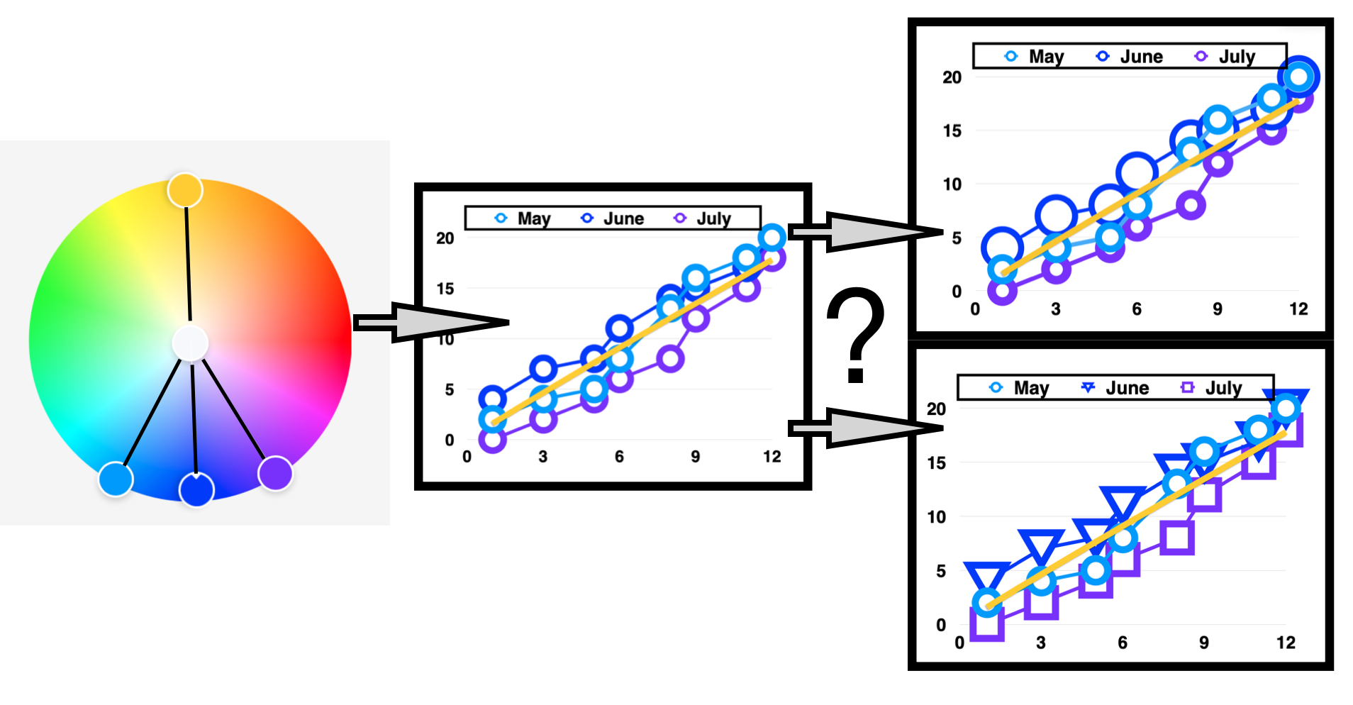
As a result, let’s try a redesign of the Scatter Plot with Line chart where the size of the circles, i.e. the geometry, varies for each data set in addition to the Accentuated Blue color scheme.
Redesign of the Scatter Plot: Varying the Circle Sizes
A redesigned Scatter Plot with Line visualization using the Accentuated Blue color theme is shown below. Circles of different sizes are assigned to the three data sets in addition to a unique color of Cyan #0595FF, Blue #121EFF or Purple #8005FF. As with the earlier visualization, a straight Yellow #FFCF12 line represents the average of the data.

By redesigning this Scatter Plot with Line visualization, it is easier to distinguish elements in each of the three data sets. This is especially true for cases where the data points overlapped on the plot. The redesign based on color deficiency needs also assists with the data occlusion issue. The May or Cyan #0595FF circle at Step 12 on the X axis is no longer hiding the June or Blue #121EFF circle.
For the redesigned Scatter Plot with Line chart shown above, the online Color Blindness Simulator, Coblis, is used again to recheck for color deficiencies. These results are shown below.

The redesigned Accentuated Blue Scatter Plot with Line visualization allows individuals with color deficiencies to more easily distinguish between the three data variables. The chart still fails when the Coblis simulator is applied. The June Blue #121EFF and July Purple #8005FF data points appear similar in color for the Protanopia and Deuteranopia deficiency checks. However individuals with color deficiencies can note the differences between the data sets according to the variances in circle sizes. The color elements are enhanced with geometry to address the failing color deficiency tests.
Alternative Redesign of the Scatter Plot: Varying the Types of Geometries
Another alternative for redesigning the Scatter Plot with Line chart is to vary the types of geometries as well as the color elements for each of the three data variables. An example of this alternative redesign is shown below. For further emphasis, I have also varied the sizes for each geometry among the three data sets.

For this alternative redesign, the online Color Blindness Simulator, Coblis, is used again to recheck for color deficiencies. These results are shown below.

The particular Scatter Plot with Line chart also fails when the Coblis simulator is applied. The June Blue #121EFF and July Purple #8005FF data points appear similar in color for the Protanopia and Deuteranopia deficiency checks. For this design option, individuals with color deficiencies can distinguish between the three data sets according to the varying geometries.
Concluding Remarks
In this writing, an advanced color theme, known in traditional color theory as the Analogous Complementary Color Harmony, was created in the Key of Blue #121EFF. The color theme includes three Analogous colors, Cyan #0595FF, Blue #121EFF and Purple #8005FF with a Complementary color of Yellow #FFCF12. Adobe Color, a free online tool, was used to create this color theme in a step by step process and the result was named “Accentuated Blue”.
Accentuate Blue was then applied to creating a Scatter Plot with Line visualization using Cyan #0595FF, Blue #121EFF and Purple #8005FF circles to represent the three data sets. The average of the months was represented as a straight line in Yellow #FFCF12. Unfortunately, when run through the online Color Blindness Simulator, Coblis, the Scatter Plot with Line chart failed color deficiency tests. As a result, the visualization was redesigned with two options that focus on varying geometric properties between each data set. The final choice is your or your clients preference.

(1) Color and Size of Circles vary for each data set.
(2) Color and geometry vary for each data set.
Using Adobe Color or another color design tool, you can create similar color themes that can be applied to data visualizations and checked for color deficiency tools like Coblis. Both Adobe Color and Coblis are freely available online tools for your continued use. For additional discussions on my varied approaches to building color schemes for data visualization, please see my 2016 book on “Applying Color Theory to Digital Media and Visualization” published by CRC Press.

About the Author
Theresa-Marie Rhyne is a Visualization Consultant with extensive experience in producing and colorizing digital media and visualizations. She has consulted with the Stanford University Visualization Group on a Color Suggestion Prototype System, the Center for Visualization at the University of California at Davis and the Scientific Computing and Imaging Institute at the University of Utah on applying color theory to Ensemble Data Visualization. Prior to her consulting work, she founded two visualization centers: (a) the United States Environmental Protection Agency’s Scientific Visualization Center and (b) the Center for Visualization and Analytics at North Carolina State University.

Theresa-Marie Rhyne is a Visualization Consultant with extensive experience in producing and colorizing digital media and visualizations. She has consulted with the Stanford University Visualization Group on a Color Suggestion Prototype System, the Center for Visualization at the University of California at Davis and the Scientific Computing and Imaging Institute at the University of Utah on applying color theory to Ensemble Data Visualization. Prior to her consulting work, she founded two visualization centers: (a) the United States Environmental Protection Agency’s Scientific Visualization Center and (b) the Center for Visualization and Analytics at North Carolina State University.
- Theresa-Marie Rhyne

- Theresa-Marie Rhyne

- Theresa-Marie Rhyne

- Theresa-Marie Rhyne


