
Very often the combination of blue and yellow suggests the color green. In this writing I provide a different perspective on this combination. I discuss how to use blue and yellow as complementary colors in a data visualization. I will focus on the specific color combination associated with the Ukrainian flag since it is currently receiving much attention. The results are unexpected and exciting in terms of color deficiency simulations. Let’s get started by exploring how blue and yellow might be complementary colors in color theory and then examine the official Ukrainian blue and yellow colors.
The difference between a painters’ and a display color space
First, some background on the centuries old concept of Color Harmony. Color harmony is the process of choosing colors that work well together in the composition of an image. Like concepts in music, these harmonies are based around color combinations on the Color Wheel that help to provide common guidelines for how color hues will work together. Color wheels are tools that depict color relationships by organizing colors in a circle to visualize how the hues relate to each other.
The two common and frequently used color spaces for building color wheels are the traditional Red Yellow Blue (RYB) color space used by painters for centuries and the Red Green Blue (RGB) color space frequently used for desktop and mobile display devices. I show these color wheels below.

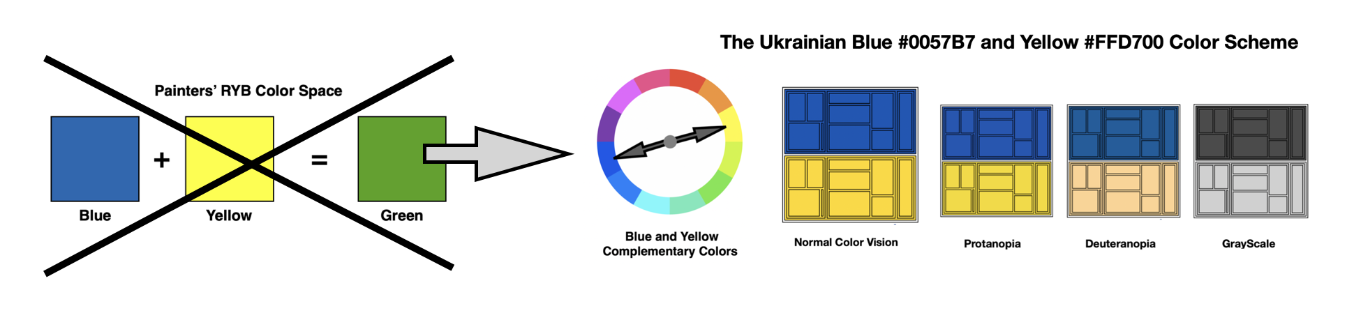
The painters’ color space defines primary colors to be red, yellow, and blue (RYB). In childhood, many of us learned how to mix yellow and blue paints to produce the color green. In contrast, the display color space is based on color lights where the primary colors are red, green, and blue (RGB). With color lights, red and green combine to produce yellow. Combining blue and yellow in this display color space produces white light. Below, I visually show how these color spaces differ when mixing blue and yellow colors.

The RYB color model is called a subtractive color model since when the red, yellow, and blue paints are mixed together, the result will be black. The RGB color model is defined as an additive color model where the combination of red, green, and blue lights produce white light. There is also an inverse color model to RGB. It is the Cyan, Magenta and Yellow (CMY) color model used for printing that is also a subtractive model since the inks combine to produce black. The CMY model is most often referred to as CMYK where the K stands for “key black.” During the color printing process, key black ink is frequently used for creating the text of the document, The cyan, magenta, and yellow inks are combined and registered against key black to produce the color illustrations.
Interestingly, the RGB color model and the CMY color model have a complementary relationship. Red is the complement of cyan, green is the complement of magenta, blue is the complement of yellow and white is the complement of black in their respective color spaces. The same color wheel thus applies for both RGB and CMY color spaces. I show this complementary relationship in the diagram below.

Blue and yellow colors directly oppose each other on the RGB (or CMY) color wheel. This is called a complementary color harmony. I show these results below.

Now that I have shown that blue and yellow are complementary colors on the RGB / CMY color wheel, let’s explore the specification of colors that define the flag of Ukraine.
The official blue and yellow colors of the flag of Ukraine
According to the Constitution of Ukraine – Article 20, the official flag of the country is composed of two equally sized horizontal bands of blue and yellow. The specific colors are noted in the technical specification DSTU 4512:2006. The blue is Pantone 2935 C where C refers to Coated Paper and has a corresponding Hex code of #0057B7. The yellow is Pantone 012 C and has a corresponding Hex code of #FFD700. A color Hex code is a hexadecimal way to represent a color in RGB format by combining amounts of red, green, and blue to note that specific color. Below I show a representation of the flag of Ukraine with the corresponding Pantone colors and Hex codes.

For those unfamiliar with Pantone color specifications, here is a brief discussion. The Pantone company produces inks and dyes for color reproduction in Cyan Magenta Yellow (CMY) color space. Their two main proprietary color libraries are the Pantone Matching System (PMS) and the Pantone Fashion, Home + Interiors (FHI) System. PMS is used primarily in graphics for printing, packaging, and digital media. FHI is used in a wide range of other industries including fashion, cosmetics, fabric, plastics, and paints. For the specific Ukrainian colors, Blue Pantone 2935 C and Yellow Pantone 012 C are available in PMS format for graphic designs on paper. There is also a corresponding FHI format for producing textiles such as the physical flag of the country.
Now that I have shown that the blue and yellow colors in the flag of Ukraine form a complementary color harmony in RGB /CMY space, let’s apply this color scheme to some data visualization examples.
Applying blue and yellow complements to a bubble chart data visualization
Initially, I will apply the Ukrainian blue and yellow complementary color scheme to a test bubble chart visualization. These results are shown below.

The Ukrainian blue #0057B7 and yellow #FFD700 complementary pair applied to a bubble chart data visualization.
Checking the bubble chart visualization for color deficiencies
My next step is to use the Color Blindness Simulator (Coblis) software to run a color deficiency check on my blue – yellow bubble chart visualization. As noted in my prior Nightingale writings on color, humans have three types of photoreceptors or cones. Each is sensitive to different parts of the visual spectrum of light to facilitate rich color vision. A red cone deficiency is classified as Protanopia. A green cone deficiency is classified as Deuteranopia. A blue cone deficiency is classified as Tritanopia. It is estimated that 99 percent of color blindness cases are related to red-green color deficiencies. Available software, such as Coblis, simulates Protanopia, Deuteranopia and Tritanopia deficiencies. I show the Coblis evaluation of my blue–yellow bubble chart visualization below.

The results of the color deficiency tests are very exciting. Individuals with Protanopia and Deuteranopia can view the Ukrainian blue and yellow complementary color combination in a similar way to the original Normal Color Vision design. This means that most individuals with these red-green cone color deficiencies will be able to view something close to the original color scheme design. Additionally, individuals with Tritanopia (blue cone deficiency) can detect two distinct colors. The blue-yellow complementary scheme is effective in displaying color differences between these two datasets.
Exploring the blue and yellow combination with Viz Palette
I can use the specific Hex codes of Ukrainian Blue #0057B7 and Yellow #FFD700 to enter the colors into Viz Palette. This allows me to view additional data visualization layouts. Elijah Meeks and Susie Lu built their freely available Viz Palette app for this purpose. The online app can also quickly be used for Protanopia and Deuteranopia color deficiency evaluations. The results of entering the Ukrainian blue #0057B7 and yellow #FFD700 colors into Viz Palette and performing Protanopia and Deuteranopia color deficiency checks are shown below.

Again, it is shown that individuals with Protanopia and Deuteranopia can view the Viz Palette examples using the Ukrainian blue and yellow complementary color scheme in a similar way to the original Normal Color Vision design.
Viz Palette facilitates examining a grayscale version of the data visualization examples created with the Ukrainian blue and yellow complementary color scheme. I show these results below.

The results indicate that the data visualizations with the Ukrainian blue and yellow color scheme can successfully convert to grayscale examples where the two data sets can be easily distinguished. This allows for retaining the original visualization concepts if a color reproduction is impossible.
Concluding remarks

In this writing, I have shown that Ukrainian blue and yellow is a complementary color scheme in the red, green, and blue (RGB) color space. When applied to data visualization examples, most sighted individuals can distinguish between the respective blue and yellow data variables. Color deficiency simulations of data visualization examples showed that individuals with red-green color deficiencies will likely see a color scheme like the original Ukrainian Blue #0057B7 and Yellow #FFD700 combination. It is estimated that 99 percent of color blindness cases are related to red-green color deficiencies. Additionally, a data visualization with the Ukrainian blue and yellow color scheme easily converts to a grayscale version where the blue variables are a dark gray and the yellow variables are a light gray. The basic concept of the data visualization is retained when moving from the Ukrainian blue and yellow color scheme to a grayscale version.
The colors of the flag of a nation are a source of great pride and significant meaning. The same is true of the colors of a favorite sports team or institution. Examining the Ukrainian blue and yellow color scheme has inspired me to consider additional evaluations of these types of color combinations in the future. The process of colorizing data visualizations and graphic designs can yield unexpected and exciting results. You might make your own unique discoveries while creating color schemes for your projects. I have shown one of mine here. For additional discussions on my approaches with various color suggestion tools, please see my 2016 book on Applying Color Theory to Digital Media and Visualization published by CRC Press.

Theresa-Marie Rhyne is a Visualization Consultant with extensive experience in producing and colorizing digital media and visualizations. She has consulted with the Stanford University Visualization Group on a Color Suggestion Prototype System, the Center for Visualization at the University of California at Davis and the Scientific Computing and Imaging Institute at the University of Utah on applying color theory to Ensemble Data Visualization. Prior to her consulting work, she founded two visualization centers: (a) the United States Environmental Protection Agency’s Scientific Visualization Center and (b) the Center for Visualization and Analytics at North Carolina State University.
- Theresa-Marie Rhyne

- Theresa-Marie Rhyne

- Theresa-Marie Rhyne

- Theresa-Marie Rhyne


