
There are situations in data visualization where your client asks you to build a color scheme around a specific color and also contrast data values above and below a specific midpoint. A diverging color scheme is ideal, but you do not know the second color to pair against your client’s designated color.
This situation happens with the Pantone 2022 Color of the Year. As noted in my January 2022 writing, PANTONE 17-3938 Very Peri was announced as Pantone’s 2022 Color of the Year. Stepping beyond its twenty-one tradition of selecting a Color of the Year from its existing Pantone Matching System (PMS), Pantone created the new Very Peri color for 2022. I want to have a Very Peri diverging color scheme handy to depict data trends related to happenings during the 2022 year. In this writing, I describe my journey to create a Very Peri diverging scheme.

A typical diverging scheme pairs a sequential progression of two different hues that are separated in the middle by a shared light color. In my earlier article on “Very Peri Pantone 2022 for Your Visualizations,” I created a Very Peri sequential color scheme. The next steps in progressing toward a diverging color scheme are to: (1) find a second color to pair with Very Peri; (2) build a single hue sequential progression based on this second color, and (3) fuse the Very Peri and second color sequences together with a light color midpoint to create a diverging color scheme. Let’s get started by remembering some basics about color schemes for data visualization and related color harmonies.
Color schemes for data visualization
Colorizing tools for data visualization classify color schemes according to three types of data: sequential, diverging and qualitative. Cynthia Brewer initiated these concepts with ColorBrewer and diagramed the color scheme types in her “Color Guidelines for Mapping and Visualization” writing. Sequential color themes are designed for ordering numeric information where colors progress from low to high (or vice versa). Diverging color schemes emphasize quantitative data that progresses outward from a central neutral midpoint to two different color extremes. Qualitative color schemes are designed for coding categorical information when there is no designated ordering of the data and colors should receive equal perceptual weight.

In this writing, I am building a diverging color scheme with the new Very Peri color. Returning to the Very Peri color scheme I built in my previous Nightingale article, this sequence included four colors that progressed from light to dark. The colors noted by their hex codes are #DFDFF7, #9496F7, #6667AB (Very Peri), and #484978. A quick note to those unfamiliar, a color hex code is a hexadecimal way to represent a color in RGB format. This Very Peri sequential color scheme is shown below.

In addition to this Very Peri sequence, my objective here is to search for a second single hue color sequence to contrast with the Very Peri sequence and complete the resulting diverging color scheme.
The concept of Color Harmony

Color Harmony is the process of choosing colors on a color wheel that work well together in the composition of an image. Similar to concepts in music, these harmonies are based around color combinations on the color wheel that help to provide common guidelines for how color hues will work together. This set of visual fundamentals evolved from Isaac Newton closing the linear color spectrum into a circle in the early 1700s. Over the centuries, artists and color scientists amplified his concept to include color harmonies.
Two common and frequently used color spaces for building color wheels are the traditional Red-Yellow-Blue (RYB) color space used by painters for centuries and the Red-Green-Blue (RGB) color space frequently used for desktop and mobile display devices. Each color space yields slightly different Color Harmony results when colorizing a visualization. Below, I show a comparison of the two differing color spaces using the complementary harmony for the Very Peri family of purples below. A complementary color harmony refers to two colors that oppose each other on the Color Wheel. The color opposite purple on the RYB color wheel is yellow while the color opposite purple on the RGB color wheel is yellow green.

One approach to finding the second color for my Very Peri diverging color scheme would be to either use a color in the yellow (RYB complement) or yellow-green (RGB complement) families. In a previous Nightingale piece, I showed how to build a diverging color scheme from a complementary color harmony. Let’s use a similar approach here and see what the Pantone Connect tool might officially recommend as the complementary color in the Pantone Matching System (PMS).
Using the free version of Pantone Connect
Pantone recommends going to Pantone Connect to obtain the RGB and Hex codes for Very Peri 17-3938 as well as view its color harmonies. It is asked that you register with your email to access the “free” version of Pantone Connect. After doing that, Pantone Connect appears. Clicking on the digital Very Peri color swatch yields the screen shown below. Clicking on the Color Data item provides the RGB 102,103,171 and Hex #6667AB codes. Currently, since Very Peri 17-3938 is a newly created color, this is the best method to locate these color codes. To assist me in creating a Very Peri diverging color scheme, I also searched for Pantone’s complement to the Very Peri color. This was found by clicking on the Harmonies item also noted below.

Pantone Connect indicated the complementary color was Sweet Pea 15-0531. Below I show the results of selecting Harmonies in Pantone Connect. After examining Sweet Pea 15-0531, a yellow-green color, I decided that I did not want to create my Very Peri diverging scheme with the Sweet Pea color. This forced me to consider another strategy. For the Very Peri diverging scheme, I required a second color that contrasted with Very Peri, but the second color did not have to be the exact complementary color.
I began to examine other colors noted in the listing of Harmonies. I decided to select a green color to contrast with Very Peri for my diverging color scheme. Pantone Connect listed “Green Tea” as a split complementary color and “Shamrock” as a Triadic color. I selected Shamrock 15-6432. I show these results below.

When I selected Color Data for the Pantone’s Shamrock 15-6432 color, Pantone Connect asked me to consider the “paid” version of its color suggestion tool. Since I want to remain with the “free” version, I decided to perform a Google search for the Hex code of Pantone’s Shamrock 15-6432 color. Since Shamrock 15-6432 was inventoried in the Pantone Matching System (PMS), I was confident a Google search would find the Hex code. The Google search indicated #77A670. I show these results below.

To be a little more visually confident of this result, I performed a Google search on the color hex code #77A670. This search provided an image with the RGB (119, 166, 112) numbers and other color data for hex code #77A670 that matched up with Pantone Shamrock 15-6432. These results are shown below.

Building my Shamrock color sequence
Using my previous approach for building the Very Peri color sequence, I created the Shamrock color sequence with Adobe Color. My first step was to build a monochromatic color harmony. As noted in a previous Nightingale writing, a monochromatic color harmony combines one hue (a 100 percent saturated color) with various tints, tones and shades of that hue to create a color scheme. A tint is defined as a hue mixed with White while a tone is designated as a hue mixed with Gray and a shade is created when a hue is mixed with Black. Similar to Very Peri, Shamrock is actually a tone in this monochromatic color harmony. I show these results below.

On the Color Wheel, a monochromatic Color Harmony consists of colors that form a straight line from the center of the wheel to the outside edge of the wheel. My first step in creating the Shamrock monochromatic harmony was to access Adobe Color and select the Monochromatic color harmony. My results are shown below.

I then entered Shamrock’s Hex code of #77A670 as the center color in the set of five colors. This resulted in a Shamrock Monochromatic color harmony as shown below.

My next step was to position the “Shamrock Mono” color scheme into a sequence as shown below.

I then eliminated the remaining Green color to yield a four class single hue sequential color scheme with the Hex codes noted as #ADF2A2, #52B543, #77A670 (Shamrock), and #52734D. I named this color scheme “Shamrock Sequence” and show these results below.

The result was a Shamrock Sequence of colors that was a single hue sequential color scheme. Below, I show the sequence outside of the Adobe Color tool.

Joining Very Peri and Shamrock sequences for a diverging color scheme
My next step was to join the Very Peri and Shamrock sequences together for a diverging color scheme. I also required a midpoint color. I decided to make this color White (#FFFFFF). To add the midpoint color, I returned to Adobe Color and the Shamrock Sequence. I selected the “Custom” option under “Color Harmonies”. This allowed me to replace the eliminated Green color with White (#FFFFFF) and shift the Shamrock Sequence to the right. I show these results below.

I then combined the Very Peri sequence and the Shamrock sequence with a White midpoint together. To do this, I flipped the direction of the Very Peri sequence. This allowed both sequences to transition from light to dark at the White midpoint. These efforts yielded a nine-step diverging color scheme. I show these results below.

This resulted in my Very Peri diverging color scheme that could be applied to data visualization. I decided to apply my new color scheme to an example area chart.
My process of colorizing a data visualization

In a previous Nightingale writing, I defined a five-stage process for colorizing a data visualization. The ring diagram of this process is shown above. The five steps are:
- Establish data classes for visualization and key color for visualization
- Select color rule, color harmony per criteria of your data
- Build color scheme. A color suggestion tool might be helpful
- Check and revise due to color deficiency, contrasts, or any pre-existing conditions
- Apply color scheme to data visualization. Some modifications might result.
I decided to use this process to apply Very Peri diverging to an area chart visualization.
Applying Very Peri diverging to a data visualization
- Establish data classes for visualization and key color for visualization
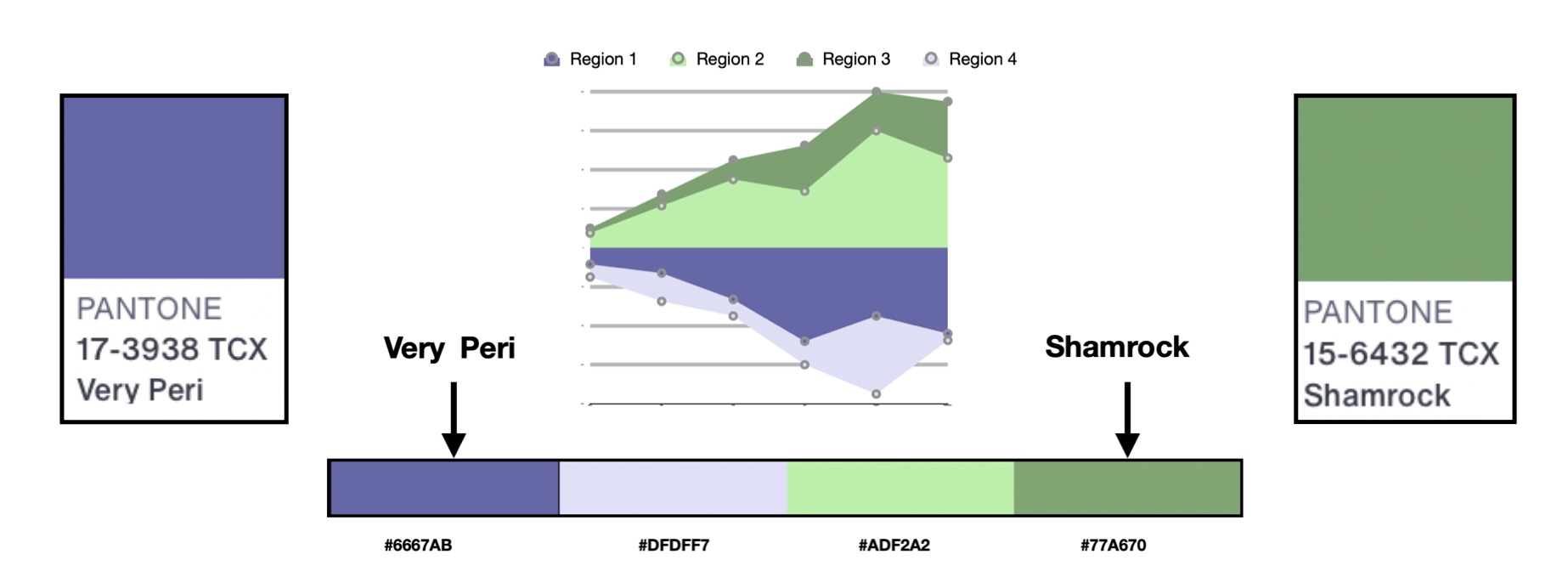
For my example, I had sales data for four regions over a six-month period. Regions 1 and 4 had comparable products while Regions 2 and 3 had comparable products. To emphasize this relationship, I wanted to create an area chart with Regions 1 and 4 having negative values below the X-axis and Regions 2 and 3 having positive values above the X-axis. I show this data below.
My key colors were Very Peri and Shamrock.
2. Select color rule, color harmony per criteria of your data.
My new Very Peri diverging was selected to emphasize the Region 1 and 4 comparison as well as the Region 2 and 3 comparison.
3. Build color scheme. A color suggestion tool might be helpful.
The Very Peri diverging color scheme needed to be modified to support four data classes.

I used Adobe Color to help make these modifications. Since Adobe Color required five colors in its array, I placed the White Midpoint as the final color on the right while using the color suggestion tool. I show these results below.

4. Check and revise due to color deficiency, contrasts, or any pre-existing conditions.
As noted in my prior Nightingale writings on color, humans have three types of photoreceptors or cones. Each is sensitive to different parts of the visual spectrum of light to facilitate rich color vision. A red cone deficiency is classified as Protanopia. A green cone deficiency is classified as Deuteranopia. A blue cone deficiency is classified as Tritanopia.
Adobe Color provides “Color Blindness” accessibility checks for evaluating their five color themes. If the color theme does not pass color deficiency checks, the colors in the theme can be repositioned to pass the checks. I used these functions for my Very Peri Diverging color scheme.
To find the “Color Blindness” checks, I selected the “Accessibility” option and located the “Color Blind Safe” function. These results are shown below.

The results indicated “No Conflicts Found. Swatches are Color Blind Safe” for Deuteranopia, Protanopia, and Tritanopia color deficiencies. Very Peri diverging had passed these color deficiency checks. The resulting four step Very Peri diverging color scheme is shown below.

5. Apply color scheme to data visualization. Some modifications might result.
Next, I apply my four step Very Peri Diverging color scheme to an area chart of the sales data. I show these results below.

Prior experiences with color schemes demonstrated to me that there are situations where a color scheme can change in appearance when applied to actual data. As a result, I used the Color Blindness Simulator (Coblis) software to run a final color deficiency check on the area chart visualization. These results are shown below.

The area chart example with Very Peri diverging color scheme passed color deficiency checks. Although individuals with color deficiencies will not view my actual color scheme design, they can distinguish four different colors.
Concluding remarks

As shown above, I now have a diverging color scheme based on Very Peri 17-3938, Pantone’s 2022 Color of the Year. This adventure started with my previously created Very Peri sequential color scheme and involved the search for a second color to pair with Very Peri. Pantone’s Shamrock 15-6432 became that second color. A diverging scheme pairs a sequential progression of two different hues that are separated in the middle by a shared light color. My journey encompassed building a Shamrock sequence to contrast against the Very Peri sequence and selecting White as the midpoint color in my diverging sequence.
The freely available Adobe Color tool for building color schemes and the Color Blindness Simulator (Coblis) for checking color deficiency helped me along the way. I used the free version of Pantone Connect for reference information regarding the color harmonies for Very Peri and its #6667AB color hex code. Pantone Connect required me to use its paid version for the color data of Shamrock. Fortunately, a Google Search yielded #77A670 as Shamrock’s color hex code. Using my Process of Colorizing a Data Visualization, I applied Very Peri Diverging to an area chart visualization example.There are many ways to approach building color schemes for data visualization. I have shown a specific method here and worked with the recently released 2022 Pantone Color of the Year, Very Peri. The pairing of Pantone’s Very Peri with Pantone’s Shamrock for a diverging color scheme was my specific preference. You might select another set of colors in building your own diverging color scheme. For further discussion on my approaches with other color suggestion tools, please see my book on Applying Color Theory to Digital Media and Visualization published by CRC Press.

Theresa-Marie Rhyne is a Visualization Consultant with extensive experience in producing and colorizing digital media and visualizations. She has consulted with the Stanford University Visualization Group on a Color Suggestion Prototype System, the Center for Visualization at the University of California at Davis and the Scientific Computing and Imaging Institute at the University of Utah on applying color theory to Ensemble Data Visualization. Prior to her consulting work, she founded two visualization centers: (a) the United States Environmental Protection Agency’s Scientific Visualization Center and (b) the Center for Visualization and Analytics at North Carolina State University.
- Theresa-Marie Rhyne

- Theresa-Marie Rhyne

- Theresa-Marie Rhyne

- Theresa-Marie Rhyne


