
As the world changed over the past two years, more and more of my friends took to handcrafts like quilting and knitting as a counterbalance for our Zoom-filled, remote-work lives. In stitching together a new way of living, forms of data visualization I’d not previously thought about as dataviz—sewing diagrams and knitting instructions—made me recall stories about my immigrant family members who needed to sew for survival. Textile work is still a path to the income needed for survival around the globe, but textile work and other “women’s work” were also subjects for early data visualizations—time and motion studies—marketed as a way to optimize worker and homemaker productivity.
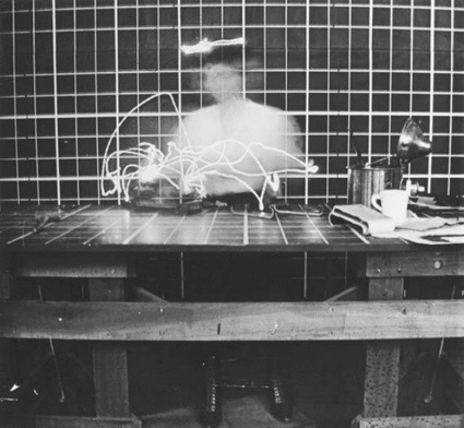
This haunting image was part of a time and motion study done by Frank and Lillian Gilbreth, and I think their visualizations are as relevant today as they were when they were made. Issues facing those using data visualization in support of automation include potential worker displacement, privacy concerns, and management accountability. These same issues were raised when the Gilbreths went to market with their approach to worker optimization. Before we discuss those issues, let’s take a step back in time for background on time and motion studies.
Back to the beginning: time and motion studies in the late 19th and early 20th century
Eadweard Muybridge can be considered the father of the use of photographic images for time and motion studies. His series “Animal Locomotion” provided a path to using still images in sequence to explore movement—not just in animals, but also in humans. The technologies he developed would later be used to support what came to be known as “The Efficiency Movement,” a trend across industrial societies in the early 20th century. The movement sought to identify and eliminate waste across many dimensions of society, and to develop and implement best practices. Frederick Winslow Taylor, a leading and controversial advocate for work efficiency, proposed that a worker’s individual efforts be analyzed “scientifically.” He did this with a stopwatch to capture the time it took for every component of the work performed, and then used the findings to purportedly identify an optimal way of working.
Taylor did not use photography in his analyses, but his sometimes-partners in research, Frank and Lillian Gilbreth, did. They called this photographic approach “micromotion studies.” By affixing lights to a worker, then filming the worker’s activity against a Muybridge-like gridded background while a chronometer recorded the time, the Gilbreths could time the worker’s motions with some precision. They then could aggregate optimal motions and settings into what they called the “One Best Way.”
There remain questions about the accuracy of the data and analyses used by Taylor and the Gilbreths, and whether the success of “scientific management” was more a triumph of marketing than an actual realization of efficiency, but there’s no question about their influence.
The Gilbreths further extended these photographic visualizations to the work women did in the home, and they had an expansive vision. In “Motion Study In the Household: Reducing the Cost of Work In Effort and Time,” Frank Gilbreth wrote,
“Motion study is but a small part of scientific management. Through her interest in motion study, the housewife will inevitably become interested in scientific management, and will carry all its methods of increasing efficiency into her chosen work. Through the spirit of co-operation must result ultimately a national and an international bureau, where the data of household management can be collected, conserved, arranged and distributed.”
Lillian Gilbreth applied these approaches in their home life with variable success, but with enough success that she was able to help parent their children while managing the family’s consulting business and while pursuing multiple doctorates. After Frank’s sudden death in 1924, Lillian continued to consult, study, and publish, often focusing on women’s work in the home. In 1927, she published The Home-Maker and Her Job, on the ways in which women could be more efficient, and in doing so obtain for themselves “happiness minutes.”
Her approaches to what she called the “Kitchen Practical” influenced architects and appliance manufacturers. Gilbreth streamlined the work performed in the kitchen, and showed through visual analysis her new design approach saved roughly six times the number of steps taken. The end result, however, did not deliver on the promise of “happiness minutes.”
There is little evidence that Gilbreth and other efficiency experts’ time-saving prescriptions increased women’s leisure time. Despite research, applied analytics and visualizations, a survey of housework time studies between 1920-1970 concludes there was no decrease in time spent on housework by those women who do not work outside the home. If there was time saved, it was likely consumed by expectations for higher levels of cleanliness and more attentive childcare. We can conjecture that, for women who did work outside the home, the time saved by automating housework was absorbed by the time demands of their workplace.
Women’s work was simply work, and the Gilbreths’ cameras and visualizations fundamentally changed nothing about the volume of their labor.
Data visualization and automation fueled an industrial revolution in the home
Just like the societal issues wrought by the industrial revolution of the 1800s, the industrial revolution in the home—fostered in part by the Gilbreths’ time and motion visualizations—brought issues of worker displacement, privacy concerns, and accountability. The servants who supported daily life in a middle-class home were no longer essential, displaced by electrical appliances like the refrigerator and the iron. The visualization studies themselves raised issues about the relationship between the data source (the worker), the system of consumption (the workers’ management), and who would own and benefit from the data. Unions fought to try to ensure that workers could control the data used, and to hold management accountable to their workers. But when it came to housework, there seems to be no accountability between those who promoted “women’s work” efficiency and the women who were expected to adopt those approaches.
When we visualize women’s work to unravel waste, what’s revealed?
I started exploring this topic because the Gilbreths’ visualization, their micromotion study of a woman working, brought something into focus for me. There’s a tension between the use of visualization to instruct and clarify, and the use of visualization to change the relationship of the doer with regards to the thing done.
In the former, like the best visualization and data storytelling work done today, the visualization is centered on the person(s) seeking direction and insight. In the latter, as in the Gilbreth image, the visualization obscures the person doing, and centers on the thing done.
That’s one reason I think that workers found visualizations intended to optimize their work alarming; no matter how Lillian Gilbreth and others positioned and marketed these studies as ways to improve the quality of a worker’s life, it’s the work that’s in focus, not the worker.
By abstracting out the work performed by the worker, repetitive subtasks can more easily be identified, optimized—and perhaps automated. In this abstraction process and its resulting data visualizations, the individual worker is aggregated and effectively erased. As businesses seek more productivity, the individual worker augments a system optimized for commercial ends, rather than the system augmenting the worker. And contrary to how these time and motion studies have been marketed, the advantages for the business only sometimes translate into benefits, while reducing the worker to a mere data source.
To make the innovative value of the Gilbreths’ work explicit for modern data visualization practitioners, I think the Gilbreths’ early visualizations are precursors to the use of data visualization in streaming analytics workflows. For example, by using computer vision and AI / machine learning processes for data analytics, vehicles in motion can be tracked and analyzed visually.

And the issues facing those developing visualizations using modern applications of time and motion studies are similar to those of Gilbreth’s time—privacy, consent, ownership of the data generated by the observations. If people are involved, such as the drivers and owners of those vehicles visualized in the .gif, are those people in a position to give informed consent? And if they were aware they were being recorded, and gave consent, do they receive any benefits from contributing their data?
Circling back to my original question, did data visualization—specifically the sort used by Frank and Lillian Gilbreth—erase the woman from “women’s work”?
In seeking insights, the specific and personal is lost when quantitative data is centered.
I think that seeking the “One Best Way” did erase women and their lived experiences, especially when we see how little positive difference the pursuit of efficiency made for women.
The image I shared at the beginning—one where a specific woman’s identity is obscured, while her movement is illuminated—encapsulates the complexities facing data visualization and analytics professionals. To rebalance our Zoom-isolated world by taking up knitting and crafting brings us full circle with our foremothers, and leads to bigger questions. At what cost, and at whose cost, have we purchased our leisure time and our hobbies? Can we use data to visualize the price we personally pay for ever-more efficiency—and is this approach to living sustainable? How might women in technology bring the innovative light and insights needed?
As I sit here lit by the cool glow of my monitor, writing as the dark winter days slowly shift towards the light of spring—if the woman is erased, and the only trace left is the visualized light of her tracked work in motion—what can we see by that light?

Lori Witzel is Director of Research for Data Management and Analytics at TIBCO. She develops and shares perspectives on improving business outcomes through digital transformation, human-centered artificial intelligence, and data literacy. Providing guidance for business people on topical issues such as AI regulation, trust and transparency, and sustainability, she helps customers get more value from data while managing risk. Lori collaborates with partners and others within and beyond TIBCO as part of TIBCO’s global thought leadership team.
- Lori Witzel


