
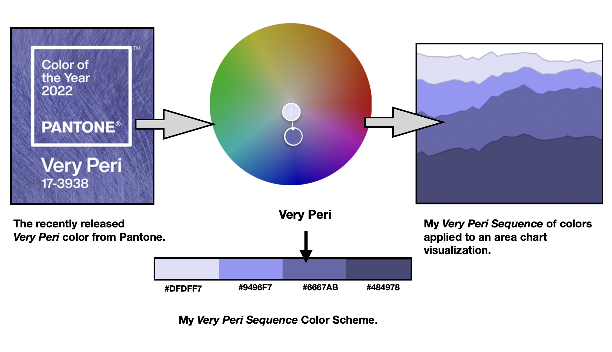
In early December 2021, Very Peri was announced as the 2022 Pantone Color of the Year. Today, let’s explore how to integrate this new color into a sequential-specific color theme for data visualization.

I will use the free Adobe Color tool to create this custom color scheme. Adobe Color provides several types of Color Harmonies for a specified color. Color harmonies are based around combinations on the color wheel that help to provide guidelines for how color hues will work together As noted in my prior writing on “Harmonic Resolution – Translating Color Harmony into Data Color Schemes,” a monochromatic color harmony can transition into a single hue sequential color scheme for data visualization. In this writing, I will also use the free Viz Palette app to explore how various types of data visualizations might appear with my new “Very Peri Sequence” color scheme.
Let’s get started by looking at how the Pantone Color of the Year is selected and reviewing a few Color Harmony fundamentals.
Selecting the Pantone Color of the Year

The Pantone company produces the Pantone Matching System (PMS) and the Pantone Fashion, Home + Interiors (FHI) System, proprietary color spaces. PMS is used primarily in graphics for printing, packaging, and digital media. FHI is used in a wide range of other industries including fashion, cosmetics, fabric, plastics, and paints. When Pantone PMS inks are applied to a physical color reproduction process, it is frequently possible to accurately match the colors from your digital data visualization to hard copy output. I highlighted this journey from digital to hard copy in my Nightingale writing on “Getting Physical with Perceptual Uniform Color Schemes: The Journey from HCL to CMYK and Pantone.”
Starting in 2000, the Pantone Color Institute began defining a “Color of the Year” from the existing inventory of PMS and FHI colors. Surprisingly, for 2022, the Institute broke with this tradition and defined a new color, PANTONE 17-3938 Very Peri, as their Pantone Color of the Year.
The color for a given year is selected by a secret panel after giving consideration to color trend analyses that span the entertainment industry, all areas of design, fine art shows and collections, social media, new technologies, emerging materials and textures as well as lifestyles and socio-economic conditions. Pantone’s Color of the Year can influence the development of products and consumer decisions in areas like graphic design, product packaging, fashion, industrial design and home furnishings. As a result, in my visualization practice, I have found it prudent to build and keep in inventory color schemes that correspond to the designated Pantone Color of the Year.
Some color harmony basics
As noted in a prior writing, color harmony is the process of choosing colors on a color wheel that work well together in the composition of an image. Similar to concepts in music, these harmonies are based around color cords on the color wheel that help to provide common guidelines for how color hues will work together. In the rich history of color theory, Stanton Macdonald-Wright and Morgan Russell defined a concept called “Synchromism” based on the notion that color has similarities to music. Synchromism is meant to be defined as “with color” as Symphony means “with sound.” The artists also defined scales and color harmony in terms of this concept.

A monochromatic color harmony combines one hue (a 100 percent saturated color) with various tints, tones and shades of that hue to create a color scheme. A tint is defined as a hue mixed with White while a tone is designated as a hue mixed with Gray and a shade is created when a hue is mixed with Black. On the Color Wheel, a monochromatic Color Harmony consists of colors that form a straight line from the center of the wheel to the outside edge of the wheel.
The Very Peri color is actually a tone of the Blue-Purple hue. Pantone phrases it more eloquently by noting Very Peri as having “the qualities of Blues, yet possessing Violet-Red undertones.” As a result, I created a monochromatic color scheme like the one shown below.

Later, I will show how I used Adobe Color to establish this Very Peri monochromatic harmony. For now, let’s review my “Process of Colorizing a Data Visualization” that will facilitate translating the monochromatic color harmony into a sequential color scheme for data visualization.
My process of colorizing a data visualization

In a previous Nightingale writing, I defined a five stage process for colorizing a data visualization. The ring diagram of this process is shown above. The five steps are:
- Establish data classes for visualization and key color for visualization
- Select color rule, color harmony per criteria of your data
- Build color scheme. A color suggestion tool might be helpful
- Check and revise due to color deficiency, contrasts, or any pre-existing conditions
- Apply color scheme to data visualization. Some modifications might result.
Notice that my choice for colorizing Step #3 in the ring above is in the same family of Very Peri colors. A happy coincidence indeed.
Let’s use this five-stage process to build a Very Peri sequential scheme for data visualization, starting with Adobe Color. As noted earlier, for step #5. I will use the freely available Viz Palette tool to examine how various types of information visualizations might look with the new Very Peri theme.
Phase #1: Establish data classes for visualization and key color for visualization.

The Pantone Color for 2022, Very Peri, is the key color here. My first step is to locate the RGB and Hex codes for Very Peri. The Pantone website recommends going to Pantone Connect to obtain these codes. Pantone asks that you register with your email to access the “free” version of Pantone Connect. After doing that, Pantone Connect appears. Clicking on the digital Very Peri color swatch yields the screen shown below.

Clicking on the Color Data item provides the RGB 102, 103, 171 and Hex #6667AB codes. Using your own color calibration methods or devices might produce different RGB and Hex results. I recommend using the specific codes noted by the color manufacturer, in this case Pantone. These Pantone Connect results are shown below.

Pantone Connect is encouraging you to upgrade to a paid for premium version. For the purposes of obtaining color data codes, we do not need to consider the premium version.
Since Adobe Color will provide an initial set of five colors, I will establish a data class range as being between one and five.
Phase #2: Select color rule, color harmony per criteria of your data.

I will be translating the Very Peri monochromatic color harmony into a sequential color scheme for data visualization.
Phase #3: Build color scheme. A color suggestion tool might be helpful.
Below, I diagram the steps I chose to build a Very Peri single hue sequential color scheme with the online Adobe Color tool.
My first step was to access the Adobe Color tool (color.adobe.com) and select the Monochromatic color harmony. My results are shown below.

I then entered Very Peri’s Hex code of #6667AB as the center color in the set of five colors. This resulted in a Very Peri monochromatic color harmony as shown below.

My next step was to position the “Very Peri Mono” color scheme into a sequence as shown below.

I then eliminated the Gray color to yield a 4 Class Single Hue Sequential Color Scheme with the Hex codes noted below. I named this color scheme “Very Peri Sequence.”

Phase #4: Check and revise due to color deficiency, contrasts, or any pre-existing conditions.
As noted in my prior Nightingale writings on color, humans have three types of photoreceptors or cones. Each is sensitive to different parts of the visual spectrum of light to facilitate rich color vision. A red cone deficiency is classified as Protanopia. A green cone deficiency is classified as Deuteranopia. A blue cone deficiency is classified as Tritanopia.
Adobe Color provides “Color Blindness” accessibility checks for evaluating their five color themes. If the color theme does not pass color deficiency checks, the colors in the theme can be repositioned to pass the checks. I use these functions for my Very Peri Sequence color scheme.
To find the “Color Blindness” checks, I selected the “Accessibility” option and located the “Color Blind Safe” function. These results are shown below.

The results were shown as “No Conflicts Found. Swatches are Color Blind Safe” for Deuteranopia, Protanopia, and Tritanopia color deficiencies. The Very Peri Sequence passed these color deficiency checks.
Phase #5: Apply color scheme to data visualization. Some modifications might result.
Next, I used Viz Palette to examine how the Very Peri Sequence might appear with data visualization examples. These results are shown below.

I decided to look more closely at the Area Chart example where the Very Peri Sequence was applied.

I then used the Color Blindness Simulator (Coblis) software to run a color deficiency check on the area chart visualization example. These results are shown below.

Concluding Remarks

As shown above, I now have a Very Peri Sequence of colors that is a single hue sequential color scheme. Using my five-stage process for colorizing a data visualization, I started with the Adobe Color software and built a Very Peri monochromatic color harmony (Very Peri Mono). From there, I translated Very Peri Mono into a four data class color sequence that I named “Very Peri Sequence.” My next step was to check for color deficiency issues using Adobe Color’s Accessibility Color Blindness functions. The “Very Peri Sequence” passed these checks with “no color conflicts found.” From there, I entered the color codes from the “Very Peri Sequence” into Viz Palette to assess how Very Peri Sequence might appear with information visualization examples. I examined the Area Chart more closely and ran it through the Color Blindness Simulator (Coblis) software for a color deficiency check on this visualization example. My Very Peri Area Chart passed these color deficiency checks.
There are many ways to approach building color schemes for data visualization. I have shown a specific method here and worked with the recently released 2022 Pantone Color of the Year, Very Peri. You might want to try to create your own sequential color scheme with another Pantone color or any other favorite color of your choice. For further discussion on my approaches with other color suggestion tools, please see my 2016 book on Applying Color Theory to Digital Media and Visualization published by CRC Press.

Theresa-Marie Rhyne is a Visualization Consultant with extensive experience in producing and colorizing digital media and visualizations. She has consulted with the Stanford University Visualization Group on a Color Suggestion Prototype System, the Center for Visualization at the University of California at Davis and the Scientific Computing and Imaging Institute at the University of Utah on applying color theory to Ensemble Data Visualization. Prior to her consulting work, she founded two visualization centers: (a) the United States Environmental Protection Agency’s Scientific Visualization Center and (b) the Center for Visualization and Analytics at North Carolina State University.
- Theresa-Marie Rhyne

- Theresa-Marie Rhyne

- Theresa-Marie Rhyne

- Theresa-Marie Rhyne


