
In this writing, I discuss how to work with a Triad color harmony to create a qualitative color scheme. Qualitative color schemes use colors to label different categories of data. There are no implied magnitude differences between each of the categories. This might be a mapping of different routes on a subway, equivalent steps on a flow chart, or types of vegetables in a market are examples of visualizing qualitative data. In building the color scheme, there should be no large variances in lightness or saturation of colors since that can signify importance or preference for a particular category. All colors in the scheme need to be distinctive and distinguishable from one another for both normal color vision and color deficiency individuals.
In general, it is not difficult to build a color theme to support up to four categories that can be considered color blind safe. My previous writing on “Double Complements for a Visualization” highlights an example of a color theme with four different colors that pass color deficiency tests. However, as noted by Joachim Goedhart in his writing on “Data Visualization with Flying Colors”, moving to ranges between five and eight colors becomes extremely challenging. After eight colors, even normal color vision individuals find it difficult to distinguish between all colors in the color palette. In this writing, I explore the challenge of encoding five categories with five distinct colors. The result is a five color qualitative theme that is unable to sufficiently address color deficiencies. I then show how I handle this difficulty with numeric labeling.
My approach to handling a five-color qualitative color theme
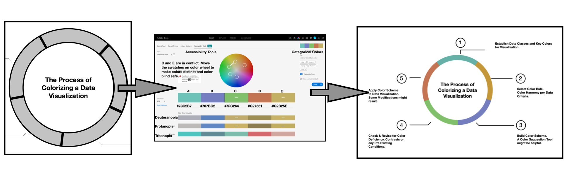
I begin by developing a prototype concept, in black and white, of my visualization that requires a color theme with five colors. This is a circular flow chart that depicts “The Process of Colorizing a Visualization”. This chart shows the five-step process I have found to be helpful in colorizing data visualizations. Since the steps in this process are not always linear but interact and intertwine with each other, I use a ring to depict the stages.

These steps are:
- Establish Data Classes for Visualization and Key Color for Visualization;
- Select Color Rule, Color Harmony per Criteria of your Data;
- Build Color Scheme. A Color Suggestion Tool might be helpful;
- Check & Revise due to Color Deficiency, Contrasts or any Pre-Existing Conditions;
- Apply Color Theme to Data Visualization. Some Modifications Might Result.
From here, I begin my journey of building a Qualitative color theme to colorize this flow chart.
As a first step, I use the Adobe Color app to create a Triad Color Harmony with three equally spaced colors on the Color Wheel. Next, I select two different colors that are an evenly distributed between the Triad colors on the Color Wheel. This yields the five-color theme to support five categories of data. From there, the Accessibility Tools function of the app is used to check and modify the resulting color theme to address color deficiency concerns. The new Qualitative color theme is then applied to my flow chart.

As an extra step of caution, I evaluate the resulting visualization for color deficiency by using Coblis — the Color Blindness Simulator. Unfortunately, my categorical data visualization fails the Coblis checks. I then work to enhance the visualization with numeric labeling to support color deficiency concerns.
Let’s start the colorizing process by reviewing the Triad Color Harmony and showing how the harmony can help start a Qualitative color theme.
Reviewing Triad Color Concepts:

A triad color harmony consists of three colors evenly spaced on the Color Wheel. In this example, I will be using the Triad Color Harmony of Green, Purple and Orange based on the Red-Yellow-Blue (RYB) painters color space. I show this Color Harmony on the left.
Eventually, I will need two more Colors for a five Color Scheme. The Triad Color harmony facilities easy insertion of these two additions.
Color Harmony is the process of choosing colors on a Color Wheel that work well together in the composition of an image. Similar to concepts in music, these harmonies are based around color combinations on the Color Wheel that help to provide common guidelines for how color hues will work together. There are two commonly used color spaces. The Red-Yellow-Blue (RYB) Color Space is used by artists to mix Color paints in real time. There is also the Red Green Blue color space that is based on the concept that Red, Green and Blue (RGB) are the Color Primaries for viewing displays like what we see on our desktop and mobile devices.

A comparison of the two differing Color Wheels is shown on the left. In building a qualitative Color Theme, the objective is to minimize differences in lightness or saturation of colors. Either Color Space is suitable for achieving this intent.
Building a Triad Color Harmony with Adobe Color
Color Wheel based selection tools, like Adobe Color, automatically calculate a Triad Color Harmony by insuring a 120-degree separation between selected color elements. Let’s examine this process step by step. The first step in building a Triad Color Harmony with Adobe Color is to select a Key or Base color. For these efforts, I will select a Green noted in Web Hex notation as #7FC264. Entering #7FC264 as the middle color in Adobe Color yields a family of Greens to form an Analogous Color Harmony.

As noted in my previous “Adjacent to Each Other” writing, an Analogous Color Harmony is defined as three or more Colors that are next to each other on the Color Wheel. The resulting Analogous Harmony in the Key of Green #7FC264 is shown on the left.

The next step is to select the Triad option under the “Apply Color Harmony Rule” menu in Adobe Color. The result is a Purple #787BC2, Green #7FC264, and Orange #C27551 Triad Color Harmony. These results are shown on the left.
Each of these Colors are of equivalent lightness and are distinguishable from each other. A three category Qualitative Color Scheme is possible with this Triad color harmony.

Next, I added this Triad of Purple #787BC2, Green #7FC264, and Orange #C27551 combination to “The Process of Colorizing a Visualization” diagram on the left.

The next step is to locate two other Colors to create the five category Qualitative Color Scheme for this visualization. Returning to the Adobe Color app, I select the “Custom” option under the “Apply Color Harmony Rule” menu to reposition and locate two new distinct Colors.

With the Custom option selected, I modify the far left (A) Color to be Green #7FC264 and the far right (E) Color to be Orange #C27551. This intermediate step allows for repositioning the A and E Colors, respectively, to create five distinct Colors of equivalent lightness. This step is shown on the left.

Next, I manually reposition the (A) Color to be a Cyan #70C2B7 and the (E) Color to be a Yellow #C2B25E on the Color Wheel. This yields five Colors that are of equivalent lightness and distinguishable from each other. Results are shown on the left.
I then save this new Color Theme as Categorical Colors in my Adobe Library. My next step is to check Categorical Colors for Color Deficiency concerns.
Evaluating for color deficiencies with Adobe Color
As noted in my prior Nightingale writings on Color, humans have three types of photoreceptors or cones. Each is sensitive to different parts of the visual spectrum of light to facilitate rich Color vision. A red cone deficiency is classified as Protanopia. A green cone deficiency is classified as Deuteranopia. A blue cone deficiency is classified as Tritanopia. Software is available that simulates these Color Deficiencies.
Adobe Color provides an “Accessibility Tools” function that includes Protanopia, Deuteranopia and Tritanopia evaluations of Color Themes. This allows for conducting preliminary Color Deficiency tests before actual visualizations are created. If a Color Theme fails Color Deficiency checks, Adobe Color provides suggestions for adjusting the five colors to pass the tests.

On the left, I show the initial Color Deficiency tests for Categorical Colors using the Adobe Color Accessibility Tools. The tests indicate a conflict between the( C ) Color of Green #7FC264 and the ( E ) Color of Yellow #C2B25E.

I manually reposition the ( E ) Color to be a Yellow #C2AD3D to create a “color blind safe” theme. I then resave the Categorical Colors theme with the following distinct and equivalent lightness Colors: Cyan #70C2B7, Purple #787BC2, Green #7FC264, Orange #C27551, and Yellow #C2AD3D.

The next step is to add the new Cyan #70C2B7 and new Yellow #C2AD3D Colors of the Categorical Colors theme to the prototype visualization. These results are shown on the left.
Evaluating for color deficiencies with Coblis
To be careful, I use the online Color Blindness Simulator, Coblis, to check for Color Deficiencies in the completely colorized version of The Process of Colorizing a Visualization. These results, shown below, indicate individuals with Protanopia and Deuteranopia could have trouble distinguishing between Green #7FC264 and Yellow #C2AD3D while individuals with Tritanopia could have trouble distinguishing between Cyan #70C2B7 and Green #7FC264. These results are shown below.

Labeling the visualization with numbers to address color deficiencies
To address the potential Color Deficiency concerns noted by Coblis, I add numbers 1 through 5 to correspond to the five steps of The Process of Coloring a Data Visualization diagram. This produces a double encoded visualization where the viewer can refer to the five steps of the process by either numbers or Colors. In short, I have enhanced the visualization with labeling to support Color Deficiency concerns. Interestingly, the addition of numbers also clarifies the circular visualization by clearly denoting each step in the process. I also refined the text layout and streamlined the circle display for a final presentation. The resulting annotated visualization is shown below.

Some thoughts on my five-step colorization process
The five step “Process of Colorizing a Data Visualization” that I have outlined in this writing is based on my years of experience. During the days of Covid-19, it has been my good fortune to write about some of these experiences in Nightingale. I have described how to use specific Color selection tools and discussed the application of various Color Harmonies to data visualization during this year.
In 2020, I also had the opportunity to contribute to a research paper entitled: “Ten simple rules to colorize biological data visualization” by Georges Hattab, myself and Dominik Heider. Participating in this collaboration helped me ponder various approaches to colorizing data.
One day, in late December 2020, I realized that there was a consistent process of coloring data visualizations that I could outline and diagram. Now, I have shared it with you in this writing.
The first step of deciding what Color to start a data visualization begins your adventure of storytelling. Your client can give suggestions, you can chose a Color based on the conventions of the discipline under study or you can strike out on your own novel path. The second step of selecting a Color Rule or Harmony and the third step of building a Color Scheme become a trial and error process. I specifically highlighted aspects of this decision making process in my writing on “Choosing Your Color Impact”. The fourth step of checking for Color Deficiencies can significantly change the final data visualization. It is a step that can require persistence in finding a solution to address the deficiencies encountered. Some of these challenges are noted in this current writing. The final and fifth step of applying a Color Scheme to the data visualization is often like opening a Birthday present. It is full of surprise and wonder to see the data visualization completely colorized.
Concluding remarks
In this writing, I have discussed my approach to building a five category Qualitative Color Scheme for a circular flow chart that depicts “The Process of Colorizing a Visualization”. Qualitative Color schemes use distinctive and distinguishable Colors to label different categories of data such as the five steps in my example. There are no implied magnitude differences between each of the categories. Each step is important and should be respected. Each distinct Color is intended to convey that sense of equality,
I used Adobe Color to build my Categorical Colors theme. The initial step was to create a Triad Color Scheme in the key of Green #7FC264 with Purple #787BC2 and Orange #C27551 based on the Red-Yellow-Blue (RYB) Color Space. The next step was to locate two other distinct Colors to create the five category Qualitative Color Scheme. My initial Categorical Colors theme was modified to support Color Deficiency concerns as noted by the Adobe Accessibility tools function. The final five Categorical Colors are Cyan #70C2B7, Purple #787BC2, Green #7FC264, Orange #C27551, and Yellow #C2AD3D.
My Categorical Colors theme appears to be borderline when it comes to passing color deficiency tests. The Color theme is successful under the Adobe Color Accessibility tools function. However, when applied to the actual circular flow chart visualization, the final results do not appear to pass the Color Blindness Simulator, Coblis, tests. As a result, I labeled the visualization with numeric labeling for each step in the flow chart to support potential Color Deficiency concerns. I also refined the text layout and streamlined the circle display for final presentation. The Coblis Color Deficiency results for the Final “The Process of Colorizing a Visualization” diagram are shown below.

The visualization still does not pass Coblis tests but the numeric labeling provides clarity for those with Color Deficiencies. The enumeration also provides an enhancement for specifying each phase of the 5 steps process.
There are many approaches to building Color Schemes for data visualizations. I have featured one approach here to building a Qualitative Color Scheme to support the five steps in my diagram of The Process of Coloring a Data Visualization. As you practice visualization, you will find appropriate solutions that work for you. For additional discussions on my approaches, please see my 2016 book on “Applying Color Theory to Digital Media and Visualization” published by CRC Press as well as some of my prior Nightingale articles noted below.

Theresa-Marie Rhyne is a Visualization Consultant with extensive experience in producing and colorizing digital media and visualizations. She has consulted with the Stanford University Visualization Group on a Color Suggestion Prototype System, the Center for Visualization at the University of California at Davis and the Scientific Computing and Imaging Institute at the University of Utah on applying color theory to Ensemble Data Visualization. Prior to her consulting work, she founded two visualization centers: (a) the United States Environmental Protection Agency’s Scientific Visualization Center and (b) the Center for Visualization and Analytics at North Carolina State University.
- Theresa-Marie Rhyne

- Theresa-Marie Rhyne

- Theresa-Marie Rhyne

- Theresa-Marie Rhyne


