
On December 10th, 2020, I presented my Master’s thesis over Zoom to a panel of guests and other members of my cohort in the Data Analytics and Visualization program at MICA. 15 months of long days and longer nights came to an end with a 22-minute PowerPoint presentation called Birds and Birding at Patterson Park (see it here, if you’d like), summarizing as best I could the journey from concept to final product of four posters. Then I watched two more of my cohort mates present (wonderfully), before the Zoom room closed out, and I was done with school. Forever.
The weeks leading up to that presentation involved check-ins with the cohort, and more often than not, I showed up to these check-ins with what appeared to be entirely new work, as if each week I’d scrapped the previous week’s efforts and just started over. Which I had.
My creative process, whether it’s painting, writing, or data visualization, is often something like: intense work -> self doubt -> start over -> intense work -> self doubt -> start over -> intense work -> self doubt -> return to original idea with fresh eyes -> finish project.
The project is always better for the constant iterations. All the failed ideas, bad mock-ups, useless drafts, it turns out, fuel a better, more robust final piece. Of course, there’s always something else that could be done, added, cut, changed, trimmed, adjusted, explained, morphed, shifted, and on and on. At some point you just have to stop.
Deadlines help with the issue of persistent iteration. Knowing that at 8PM on December 10th I’d be presenting these posters whether I thought they were totally done or not was helpful in guiding the final designs and choices. What wasn’t helpful was that I started working on all this months before hand. For my creative process (and maybe yours?), having a lot of time to work on something is more a curse than a blessing.
The journey from idea to final posters for this thesis presentation is a perfect example of why.
NO birds
All the way up and through the summer, I was committed to the idea of not doing my thesis on birds. I had done several vizzes using eBird data, both personally and throughout the Masters program, and wanted to challenge myself to do something fresh. On top of that, I also wanted to learn an entirely new programming language from the ground up (d3.js). I didn’t know what data I was going to use, but I was confident in what data I wouldn’t use. NO. BIRDS.
In early August, my family experienced an unexpected tragedy when my father passed away. Instantly, school went from being my top life priority to being of little importance at all. I considered taking a leave of absence, which was a bit heartbreaking because we were so close to being done. I felt that I had no mental space at all to deal with school, and that delaying it until the Spring was going to be my only option.
Unless I went with birds. Bird data is data I know and know well. I know how to clean it, how to look at it, how to find insights, and mutate it as needed.
And let’s face it: I love birds, birding, and Patterson Park. What better way to channel my grief than straight into something I love? Falling back to birds, I realized, was not a failure. I have all the time in the world to visualize new data when this is all over. And I knew that Dad wouldn’t have wanted to see me put off graduating on account of him. He’d want me to push forward, so that’s what I decided to do.

OK. So birds. So what?
I’ve got data, I am familiar with it, and I know what story to tell, right?. I’ll visualize the birds and birding at a favorite local hot spot, Patterson Park. What birds have visited, when, and how many people saw them? Seems good enough to me…
A great deal of time was spent prepping the data, which could be an article of its own, so I won’t spend any time on that here, besides mentioning that, in the end, I narrowed an initial dataset of 10,000,000+ rows down to ~52,000, containing bird sightings at the park from 2009–2019. Columns included things like Observation Date, Observer ID, Observation Count, Species, Family, Order and other related data joined onto eBird checklist data. Below is an example of an eBird checklist that I submitted in May of 2019, to give an idea of what a checklist looks like from the front end of eBird.org.

Boldly moving forward
At this point, I was confident in the direction of my thesis, so confident that the below nightmare is the only sketch I did before moving forward with much of the work that needed to be done.

Astute observers will note that the title of that poster sketch is ‘The Birds of Lake Roland.’ This is because, initially, I was going to create these posters for five different parks in Baltimore/Maryland. They would have a large, abstract shape of some kind in the middle (a stacked area chart, most likely) tracking bird abundance over time, and various interesting small multiples all around it.
I’ve got my data, I’ve got a sketch, and a few other key things:
Stakeholders: Patterson Park Audubon Society & MD/DC Audubon
Audience: Park Visitors
Tools: R, Adobe Illustrator
That’s enough planning, right? Let’s get to work.
I whipped up a quick version of my theorized area chart.

This tracks the average sightings of orders of birds over the time period, by week. It’s close to what I imagined, but doesn’t feel exactly right (or interesting).

So, I tried it as a streamgraph, which seems to more accurately represent what I had in my mind for the giant abstract shape.
The big problem here, though, is that streamgraphs really benefit from interactivity, of which my printed posters would have none.
My initial thought of the anchoring shape in the middle of these posters was quickly falling apart.
B̶o̶l̶d̶l̶y̶ Blindly moving forward
It was hard to let go of this idea of a large abstract shape, maybe because I’m stubborn, or because I so dearly love abstract expressionist art. Data as rich as bird data has many opportunities for truly stunning data art.

The above radial chart, which shows every bird to visit the park, colored by family, was fascinating to me, if unreadable. I spent a lot of my time trying to make it work, though, because who wouldn’t? It looks so cool! Below is the same chart, but broken out by family, and colored by species.

Gosh, that is mesmerizing. It reminded me of other small multiple posters that had been big inspirations to me, like the Jannson Product Portfolio by Nadieh Bremer. If I put the time in to what I’d made here, maybe I could get output just as strong.
But it didn’t feel right. Is a big poster that just showed the birds enough? What if there was a way to highlight certain birds, or families of birds, in context to the rest?

Returning to the original radial, I’ve highlighted only one species of bird in blue, creating a data fingerprint. No two fingerprints are alike. Below is another version of that, with multiple species colored in.

It really felt like I was getting somewhere, but in the end, it felt a bit too much like data art, and nearly impossible to extract out any true insight.
So what would a dendrogram look like? A nice, reliable, clean dendrogram.

Color in the different families, get labels in there. Not bad, though it’s a bit too regal for my tastes. How about an arc diagram?

Now that is more like it! Look at that arc diagram! It’s whimsical, magical, down right poetic! So what if it looks a bit like a horse’s tail, it’s magnificent!
But does this work for our audience? Who was that again?
(…park visitors…)
Who am I kidding? Let’s turn it on its side, make it pink, and toss some timelines on there of warbler abundance. Now we’re getting somewhere!

Spoiler: we’re not.
Visually, things were getting closer and closer to an aesthetic that I found appealing, but further and further away from anything that I felt was worth reading, especially from a broad array of potential visitors to a park.
How could I bring ideas like this into a poster that told them something at least a little bit interesting?
Below, I’ve placed our giant bloom-shaped viz at the top, surrounded by a radial bar chart tracking the cumulative total families of bird that arrived at the park, by week. Below this, in order of weekly arrival, visitors can follow each family exploded out into its own bloomy radial.

Here I go one level deeper. How does something similar to that work with only one family? In this instance, warblers. It’s interesting, and pretty, though poses its own challenges, and feels a bit impersonal as well.

Here’s a poster with every single bird at the park.

It has 47 colors.
This version tracks when a species first arrives at the park. The longest lines represent the families of bird that first arrived, and the shortest those that arrived last.

It, too, has 47 colors.
It was around this time I began to wonder if I wasn’t just trying to create a minimalist abstract painting.

The next one is neat because it sort of looks like a bird…if you tilt your head a little and also get only four hours of sleep for a week straight.

Maybe a different approach would be wise — let’s dig into checklist data a bit:

I don’t really know what the end game was here, so here’s a bunch of them thrown together? Clearly, I was feeling a bit lost in the birds at this point.

These images are all among the more than 200 various iterations I threw against the wall in search of a through line I had originally been so confident I knew.

I was lost.

At this point, my thesis was around the corner and I felt as if I hadn’t even begun. I had poured my heart and soul into these images, and now, looking at where I was, it felt like I had wasted my time. There was no story here, or rather, the story that was here was so big and so broad that it felt underserved by what I had prepared.
I wanted to give up.
I nearly did.
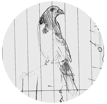
But one night, after a long conversation with my wife, we recalled the magnificent prints of John James Audubon’s Birds of America. Below is one of those prints, of a Black-throated Blue Warbler.

I created two new images, data-homages to these prints. One of a Cedar Waxwing and another of a Yellow Warbler.


At last, I felt like I was making progress, or at least approaching something that felt honest.
So, with all the work behind me, I still had to ask: what’s the story? What ties all of this together?
As it was, regardless of the data being filtered to only Patterson Park, these posters could have been for any park in the world. What was something distinct to Patterson Park that these posters could convey?
The answer, I realized, was five special birds.


The Baltimore Oriole, Black-throated Blue Warbler, Chimney Swift, Wood Thrush, and American Woodcock are Patterson Park’s Priority Birds, birds identified as those which would be most impacted by the Patterson Park Audubon Center’s conservation efforts.
Well, wouldn’t you know? I found my through line.
Bringing it all together
The final posters include many elements that were present in earlier iterations, but many more landed on the cutting room floor.
A Priority at the Park
The first poster highlights the priority birds themselves, listing how many birders have reported them, how many checklists they’ve appeared on, and how many weeks, on average, they are present at Patterson Park. The radials I’ve been so interested in make their appearance here, as abundance guides. Beside each bird is a quick tip for how to find them. I’ve also included a slope chart, which allows us to see if there has been any noticeable change in average sightings of each species from 2009 through 2019.

The Birds of Patterson Park
The dendrogram makes a return here, but as a radial. The radial shape removed the regal aspect that wasn’t as appealing to me, while maintaining a readable chart that viewers can use to identify species, family, and order information about the birds at the park. Our priority birds are colored in for easy viewing. On the left, I decided to take a bit of a data risk (how successful this was is up in the air) and include versions of the bloomy radials from way back at the start, with only the priority birds filled in, and the remainder of that species’ family as lines.

When They Are Here
This is where the big poster of every bird found its way into the visual. Rather than assign a color to each family or bird, I colored only the priority birds. This way, viewers can dig into the birds they may be interested in, but the story of priority birds is preserved.

A Guestbook for the Park
My personal favorite of the group, this poster explores checklist data, with a special emphasis not only on the priority birds, but also on select rare sightings during the date range. I’ve included a bar chart specifically related to the priority birds, as well as a series of histograms tracking the increase in checklist submissions over time.

Birds and Birding at Patterson Park

I’m quite happy with where these landed, in the end. There’s much that could be improved about each poster, but at some point with projects like this, you just have to step back and call it a day. I think what’s here is strong, and I know that it wouldn’t be as strong if it hadn’t been for all the painstaking iterations that came before them.
There were a lot of ideas throughout this process that I loved that simply did not serve the story well enough to stick (see my beloved arc diagram earlier). In posters like this, which also include minimal copy, the visualizations must carry the weight of the story. Kurt Vonnegut famously gave the advice that, in fiction, each sentence must either reveal character or advance the story.
That concept is just as true for data visualization. Is your visualization element advancing your story or revealing the character of the data? If both answers are no, let it go. Your finished product will be better for it.
Happy vizzing!
Cory Cone is a bird watching, horror writing, data vizzing, dad living in Baltimore, Maryland. His short horror fiction has been published in various anthologies and magazines, including the esteemed Borderlands series. He graduated with his Masters degree in Data Analytics and Visualization in December, 2020.
- Cory Cone


