
As noted previously in “Colorizing a Visualization,” Color Harmony is the process of choosing colors on a Color Wheel that work well together in the composition of an image. Similar to concepts in music, these harmonies are based around color cords on the Color Wheel that help to provide common guidelines for how color hues will work together. In the rich history of Color Theory, Stanton Macdonald-Wright and Morgan Russell defined a concept called “Synchromism” based on the notion that color has similarities to music. Synchromism is meant to be defined as “with color” as Symphony means “with sound.” The artists also defined scales and color harmony in terms of this concept.

In this writeup, their terminology is used to discuss the “Blues of Color Harmony” where a monochromatic color harmony is built in the key of Blue. Adobe Color, a web-based app for creating color themes, is used to build the color harmony that is applied to a pie chart example. Next, the Blue monochromatic Color Harmony (Blue Mono) is transferred into the Viz Palette tool to view how other types of information visualizations will look with the color theme. Color deficiencies of the Blue Mono are then assessed. Finally, I show how a monochromatic Color Harmony is similar to the sequential color scheme concept in the ColorBrewer tool.

Monochromatic Color Harmony in the Key of Blue

A monochromatic Color Harmony combines one hue (a 100% saturated color) with various tints, tones and shades of that hue to create a color scheme. A tint is defined as a hue mixed with White while a tone is a designated as a hue mixed with Gray and a shade is created when a hue is mixed with Black.
On the Color Wheel, a monochromatic Color Harmony consists of colors that form a straight line from the center of the wheel to the outside edge of the wheel. A Color Harmony in the key of Blue is built around one Blue. The “key of Blue” concept can be applied to many kinds of Color Harmonies.
This Blue Mono example focuses on the monochromatic case as shown in the illustration.
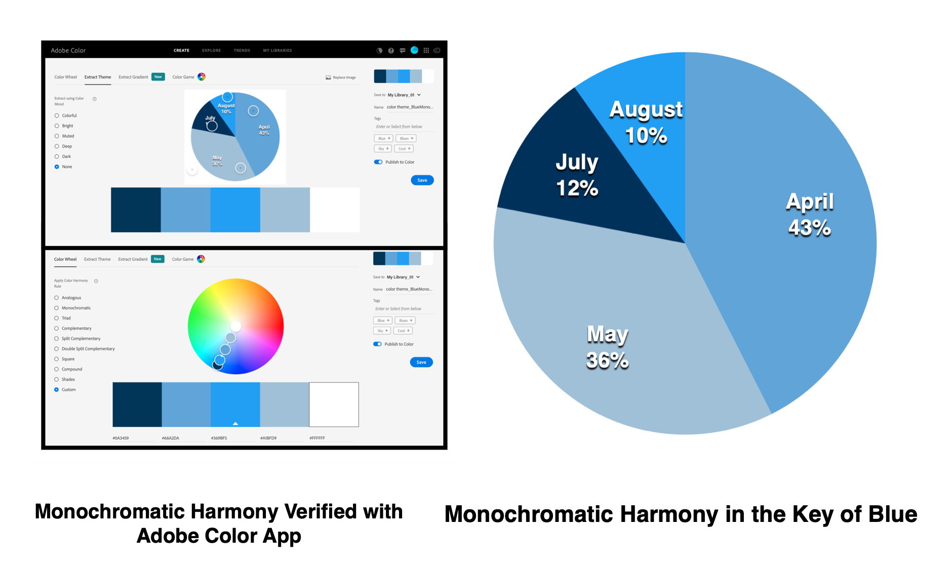
Using Adobe Color to Create the Blue Mono Color Scheme
Adobe Color is a web app for creating and sharing color schemes or themes. This app can be used to extract colors from an image or to build a Color Harmony directly. By selecting the “Color Wheel” option in Adobe Color, various Color Harmonies are shown including “Monochromatic”. A Blue Monochromatic Color Harmony generated with Adobe Color is shown below.

Adobe Color also references the colors for a given theme in Web Hex, RGB, and other color notations. This indexing becomes helpful for entering the color data into a specific visualization tool or computer code. After setting up a free Adobe account, a color theme can also be stored for future visualization design efforts.
A pie chart visualization can quickly help us assess how our Blue Mono harmony appears in practice. Software tools such as Microsoft Excel or Word, Apple Numbers or Pages, Google Docs, Tableau Software and many others can help generate this example.

Using Viz Palette to Evaluate Additional Information Visualization Options
Viz Palette is an effective color assessment tool for information visualizations. Using the previously saved “BlueMono” color theme from Adobe Color, the Web Hex codes of the Hue (#369BF5), Tint (A3C4D9), Tone (6AA5D9) and Shade (#043259) can be entered into Viz Palette. The process is shown below. In this figure, an Adobe Color image is superimposed over Viz Palette. This allows you to see where the Web Hex codes are noted in Adobe Color that are then entered into Viz Palette. This would not appear in the normal view of Viz Palette.

Viz Palette allows us to quickly assess how the Blue Monochromatic Color Harmony might appear in various information visualization options. The complete results are shown below.

Using Viz Palette to Evaluate Color Deficiencies
As highlighted in my earlier article on “Colorizing a Visualization”, in humans there are three types of photoreceptors or cones where each is sensitive to different parts of the visual spectrum of light to facilitate rich color vision.
If one or more of the set of cones does not perform properly, a color deficiency results. A red cone deficiency is classified as protanopia. A green cone deficiency is classified as deuteranopia. A blue cone deficiency is classified as tritanopia. Approximately 4 percent of the population has a color deficiency with protanopia and deuteranopia being the most common.
Software is available that simulates color deficiencies. Viz Palette can quickly be used for protanopia and deuteranopia color deficiency simulations. These results are shown below.

Although individuals with these deficiencies will view the information visualization examples in slightly different hues than the original Blue monochromatic color harmony design, the differences in the visual data display and its respective elements can be differentiated.
Similarities between Monochromatic Color Harmony and Single Hue Sequential Color Schemes
Previously, Michael Yi provided an excellent Nightingale discussion on “How to Choose Colors for Your Data Visualization” (October 24, 2019) based on the Sequential, Diverging and Qualitative color scheme concepts developed by Cynthia Brewer for the ColorBrewer tool. A sequential color scheme is optimized for ordered data that progresses from low to high values. The figure below shows a Single Hue sequential color scheme with 4 classes in the Key of Blue from ColorBrewer. Geographic boundaries are removed to emphasize the color regions.

For a Sequential color scheme in ColorBrewer, light colors are intended to correspond to low data values with dark colors corresponding to high data values. A Single Hue Sequential Color Scheme in ColorBrewer is similar to a Monochromatic Color Harmony. Both focus on a single hue (color) and its respective tints, tones and shades. A Monochromatic Color Harmony is formed with these elements. While in a Single Hue Sequential Color Scheme, the color progression is from a tint (light color) to a tone (medium color) to a shade (dark color). This comparison between a Blue Mono Color Harmony and a Blue Single Hue Sequential Scheme is shown below.

Concluding Remarks
This article has focused on the monochromatic Color Harmony, specifically in the key of Blue, and how it can be applied to select information visualizations. All of the color analysis software tools featured in this article are freely available for you to try yourself.
As I noted in my earlier article on “Colorizing a Visualization”, there are many approaches for building color schemes for data visualizations. In future Nightingale writings, I plan to highlight how to apply color theory to scientific data visualization.
About the Author
Theresa-Marie Rhyne is a Visualization Consultant with extensive experience in producing and colorizing digital media and visualizations. She has consulted with the Stanford University Visualization Group on a Color Suggestion Prototype System, the Center for Visualization at the University of California at Davis and the Scientific Computing and Imaging Institute at the University of Utah on applying color theory to Ensemble Data Visualization. Prior to her consulting work, she founded two visualization centers: (a) the United States Environmental Protection Agency’s Scientific Visualization Center and (b) the Center for Visualization and Analytics at North Carolina State University. Her book on “Applying Color Theory to Digital Media and Visualization” was published by CRC Press in November 2016.

Theresa-Marie Rhyne is a Visualization Consultant with extensive experience in producing and colorizing digital media and visualizations. She has consulted with the Stanford University Visualization Group on a Color Suggestion Prototype System, the Center for Visualization at the University of California at Davis and the Scientific Computing and Imaging Institute at the University of Utah on applying color theory to Ensemble Data Visualization. Prior to her consulting work, she founded two visualization centers: (a) the United States Environmental Protection Agency’s Scientific Visualization Center and (b) the Center for Visualization and Analytics at North Carolina State University.
- Theresa-Marie Rhyne

- Theresa-Marie Rhyne

- Theresa-Marie Rhyne

- Theresa-Marie Rhyne


