
The flow chart above diagrams the process of colorizing a visualization using blank templates from the Interaction of Color app, an invaluable tool both for learning about color and for designing visualizations. Before I get into that, though, I need to explain Color Harmony, a methodology for choosing colors that work together in creating an image. As examples, I’ll demonstrate how I’ve used Interaction of Color to build color schemes for a treemap visualization and a bubble chart. After that, you’ll see how one of our examples fails to address color deficiency and how to address this issue by using text in addition to a color scheme.
Interaction of Color is available for the iPad in the App Store. There is a free trial version and a complete version for purchase that costs $13.99. Another tool used in this exploration of color is Adobe Capture, which I use for verifying Color Harmonies. This is a free app available online from Apple’s App Store and Google’s Google Play site. The app works on Android, iPhone and iPad devices. Information visualization examples are created with Tableau Public and Coblis — Color Blindness Simulator is used to evaluate our visualization examples for color deficiency considerations.
Color Harmony
First, some background on the centuries old concept of Color Harmony. Color Harmony is the process of choosing colors that work well together in the composition of an image. Similar to concepts in music, these harmonies are based around color combinations on the Color Wheel that help to provide common guidelines for how color hues will work together. Color Wheels are tools that depict color relationships by organizing colors in a circle to visualize how the hues relate to each other. Isaac Newton is credited with creating the Color Wheel concept when he closed the linear color spectrum into a color circle in the early 1700s. Over the centuries, artists and color scientists amplified his concept to include color harmonies. Below we show the Red-Green-Blue Color Wheel based on the concept that Red, Green and Blue (RGB) are the color primaries for viewing displays like what we see on our mobile devices.

Two colors that oppose one another on the Color Wheel are considered to form a complementary Color Harmony. Three colors that are adjacent to each other on the Color Wheel form an analogous Color Harmony. There are many more Color Harmony fundamentals, but we will focus on these two basic ones in an illustration below.

Color Deficiency Issues
Color vision is possible due the cones or photoreceptors in the retina of our eyes. In humans, the existence of three types of photoreceptors or cones where each is sensitive to different parts of the visual spectrum of light provides for a rich color vision. The first set of cones absorbs long waves of light in the Red range. The second set of cones absorbs middle waves of light in the Green range. The third set of cones absorbs short waves of light in the Blue range. If one or more of the cones does not perform properly, a color deficiency results. A red cone deficiency is classified as protanopia. A green cone deficiency is classified as deuteranopia. A blue cone deficiency is classified as tritanopia.
There are online tools or apps that attempt to simulate color deficiencies and allow us to check how our visualizations might be viewed by the approximately 4 percent of the population that might have a color deficiency. For our visualization examples here, we use the online Color Blindness Simulator, Coblis, to check for color deficiencies. In addition to modifying a color scheme that fails a color deficiency test, another way to help viewers easily comprehend a visualization is to present the data with double or more visual channels. Using both text and color to redundantly label data elements is one method of applying this concept, which you will see in both of our examples below. This becomes especially helpful in Example 2.
Interactions of Color
In 2013, Yale University Press released an app for the iPad based on the book Interaction of Color. The book was originally published by Josef Albers fifty years prior in 1963. The mobile tool is designed to be a near-digital replica of the book, including the implementation of the original Bakersville typeface and layout of the text columns with twenty-first century upgrades such as an interactive color wheel. The app provides blank templates that serve as exercises for you to directly and interactively learn the concepts Albers discusses. Original examples are provided but you can create your own designs. The app was designed and implemented by Potion Design Studio under the direction of Yale University Press and the Josef and Annie Albers Foundation. Josef Albers designed the Interaction of Color book as a handbook and teaching aid to explain complex color theory concepts to artists, instructors and students. The app extends the case studies further by allowing for you to create you own interactive color studies.
Below, we’ll see how the app can extend beyond a learning experience and be used to aid in designing visualizations. First, with an approach that uses the Interaction of Color to build a color scheme for a Treemap visualization. Next, using Interaction of Color to create a color scheme for a Bubble Chart. Interaction of Color provides us with templates that allow us to layout color concepts while we are working with the computational code for a data visualization.
Example 1: A complementary color scheme for a Treemap
In Information Visualization, a treemap permits the display of hierarchical data by creating a set of nested rectangles. Each branch of the tree is defined with a rectangle and tiled with smaller rectangles that represent sub-branches. Color and size dimensions of rectangles are correlated with the tree structure. This allows for seeing patterns in a data set that would be challenging to find in other ways. Treemaps can handle the display of thousands of items simultaneously.
We begin with a template from the Interaction of Color designed to explore graduation of color or the progression of equal steps between light and dark. Using this blank template, we can build a Cyan and Orange color scheme that allows us to simulate a tree map visualization of two variables.

Our Cyan-Blue and Orange Color Harmony, that we created with the Albers App, is defined as a complementary Color Harmony. We can show this below by using the Adobe Capture app for the iPhone to depict our color harmony.

Our next step is to apply our Cyan-Blue and Orange complementary color harmony to visualizing a data set as a Tree Map. Tableau Public, a freely available tool for building information visualizations from data sets, lets us create our example below. In addition to color, we add text in our treemap visualization to label the observed data.

This three step approach allows us to experiment first with the colors, then consider them in the context of the color wheel to see if they have color harmony, and finally to apply them to our target visualization.

Our final step is to check for color deficiency with a Color Blindness Simulator like Coblis. Here are the results for our treemap.

These Coblis results indicate that even if our audience included members with color deficiencies, they would be able to see color differences in the color scheme we have designed.
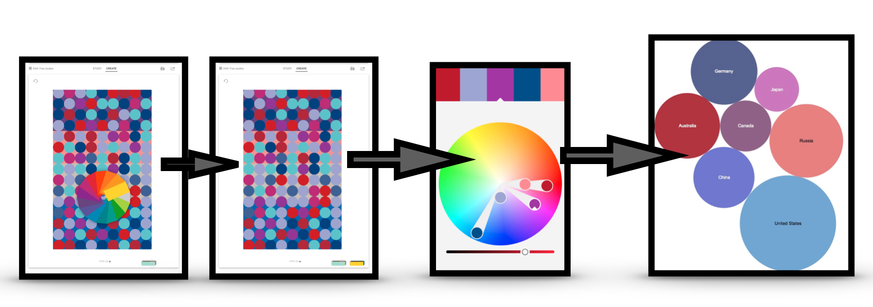
Example 2: An analogous Color scheme for a Bubble Chart
A bubble chart is a data visualization technique where multiple circles (bubbles) are displayed in a two-dimensional plot. It is considered a generalized version of a scatter plot where the dots are replaced with bubbles. Frequently, a bubble chart depicts the values of three numeric variables: the observed data are shown as a circles or bubbles with the horizontal and vertical positions depicting the values of two variables.
To develop our bubble chart color scheme, we notice that one of the templates in Interaction of Color is composed of a series of circles. Using the blank template, we experiment with selecting a color scheme and determine how the color elements interact with varying backgrounds. Rather than a complementary scheme, we decide to explore the analogous Color Harmony principle where we select colors adjacent to each other on the Color Wheel. In this case, the analogous scheme will be Red, Blue and Purple as shown below.

Next, we further verify our analogous color by using Adobe Capture.

In our next step, we apply our Red, Purple and Blue analogous Color Harmony to visualizing a data set as a bubble chart. We’re again using Tableau Public to create the example below. In addition to color, we add text in our bubble chart to label the observed data.

The process is similar, with an added step in the Interaction of Color phase.

Our final step is to check for color deficiency with the Color Blindness Simulator tool, Coblis.

Concluding Remarks
There are many approaches to building color schemes for data visualizations. In addition to the examples shown here, Michael Yi provides an excellent Nightingale discussion on “How to Choose Colors for Your Data Visualization” (October 24, 2019) based on the Sequential, Diverging and Qualitative color scheme concepts developed by Cynthia Brewer for the ColorBrewer tool. For further discussion on my approaches, please see my 2016 book on “Applying Color Theory to Digital Media and Visualization” published by CRC Press.

Theresa-Marie Rhyne is a Visualization Consultant with extensive experience in producing and colorizing digital media and visualizations. She has consulted with the Stanford University Visualization Group on a Color Suggestion Prototype System, the Center for Visualization at the University of California at Davis and the Scientific Computing and Imaging Institute at the University of Utah on applying color theory to Ensemble Data Visualization. Prior to her consulting work, she founded two visualization centers: (a) the United States Environmental Protection Agency’s Scientific Visualization Center and (b) the Center for Visualization and Analytics at North Carolina State University.
- Theresa-Marie Rhyne

- Theresa-Marie Rhyne

- Theresa-Marie Rhyne

- Theresa-Marie Rhyne


