
In this writing, I discuss my adventure in transitioning my “Process of Colorizing a Data Visualization” to a Greyscale illustration. I learned that it was actually a challenge to un-do the colorization. This resulted in new discoveries and my re-colorizing the diagram very differently.
I will be using the ColorBrewer color suggestion system in this writing. ColorBrewer uses “Grey” as the spelling for the intermediate color between Black and White. So, I have used this English spelling convention rather than the American English convention of “Gray”.
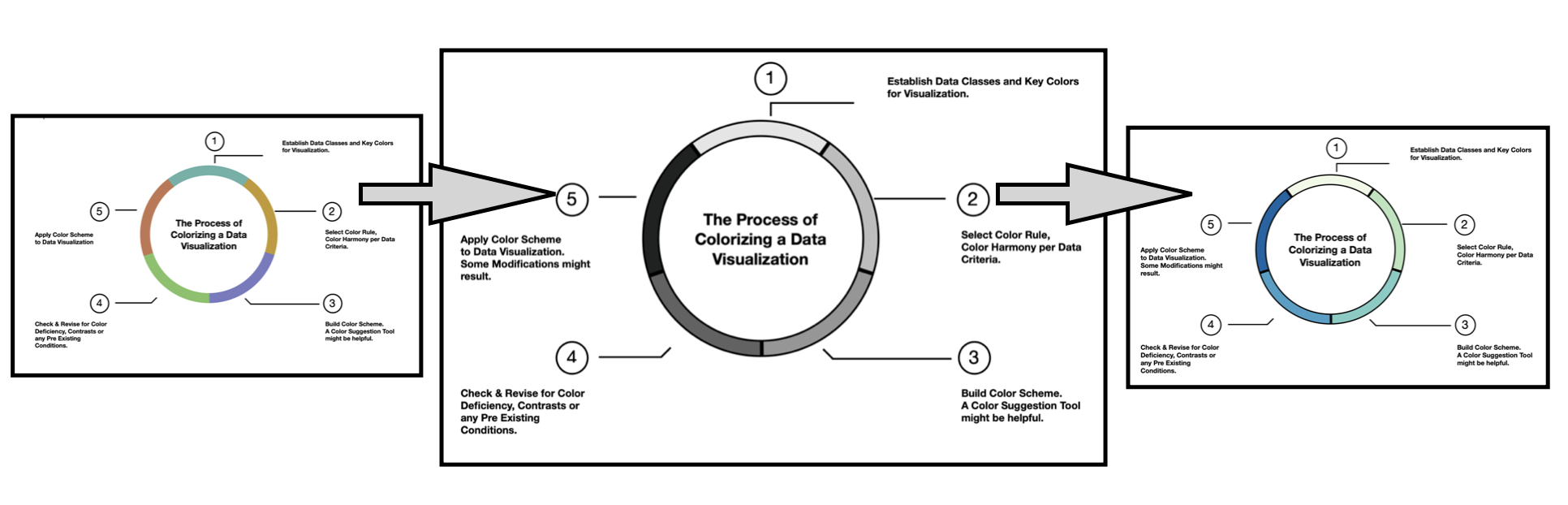
Let’s get started by looking at the original visualization.

In a previous Nightingale writing, I defined a five-stage process for colorizing a data visualization. The ring diagram of this process is shown above and the five steps are:
- Establish data classes for visualization and key color for visualization.
- Select color rule, color harmony per criteria of your data.
- Build color scheme. A color suggestion tool might be helpful.
- Check and revise due to color deficiency, contrasts, or any pre-existing conditions.
- Apply color scheme to data visualization. Some modifications might result.
I also described how I colorized this “Process of Colorizing a Data Visualization” illustration, using a five-color qualitative scheme. Qualitative color schemes use colors to label different categories of data. There are no implied magnitude differences between each of the categories. In building the color scheme, there should be no large variances in lightness or saturation of colors since that can signify importance or preference for a particular category. All colors in the scheme need to be distinctive and distinguishable from one another. I was able to achieve this for normal color vision individuals as shown above.
However, my colorization failed to address color deficiency individuals according to the online Color Blindness Simulator tool, Coblis. As noted in my prior Nightingale writings on color, humans have three types of photoreceptors or cones. Each is sensitive to different parts of the visual spectrum of light to facilitate rich color vision. A red cone deficiency is classified as Protanopia. A green cone deficiency is classified as Deuteranopia. A blue cone deficiency is classified as Tritanopia. Software, such as Coblis, simulates these color deficiencies.
As noted by Joachim Goedhart in his writing on “Data Visualization with Flying Colors”, it becomes extremely challenging to pass color deficiency simulations when considering color schemes of five distinctive colors and beyond.

Potential color deficiency concerns are addressed with the numbers one through five that correspond to the five steps of The Process of Coloring a Data Visualization diagram. This produces a double encoded visualization where the viewer can refer to the five steps of the process by either numbers or colors.
Moving into a Greyscale illustration
As noted earlier, I decided to explore creating a Greyscale presentation of my “Process of Colorizing a Data Visualization” diagram. My first step was to convert the five-color qualitative scheme to a Greyscale illustration. These results are shown below.

After looking at the results, I decided that the equal magnitude differences for each of the five steps did not work well as a final illustration. Perhaps a sequential Greyscale visualization might do better? I remembered that ColorBrewer had a Grey color scheme that might offer a solution. ColorBrewer is an online tool designed to help users select color themes for their specific mapping or visualization needs.
Applying a Greyscale sequential color scheme
I found the sequential “Greys” scheme in ColorBrewer and applied it to my ring illustration. I used the five data classes option since there are five steps in my colorizing process. Below, I show the results of the “Five-Class Greys” efforts.

Checking for color deficiency even with a Greyscale illustration
Although I have a Greyscale visualization, I decided to use Coblis to examine if there might be any unexpected color deficiency issues. The revised “Five-Class Greys” diagram passed color deficiency tests and the results are shown below.

These were definitely improved results from my initial conversion of the five-color qualitative scheme to a Greyscale. As a result, I decided to continue on my adventure by re-colorizing my ring illustration using ColorBrewer sequential color schemes.
Re-colorizing using a Red sequential color scheme
Next, I explored applying a “Five-Class Reds” single hue color scheme from ColorBrewer to “The Process of Colorizing a Data Visualization”. I show these results below.

I checked for color deficiency and the re-colorized “Five-Class Reds” version passed Coblis tests. The results are shown below.

Although the “Five-Class Reds” solution was quite adequate, I decided to explore a Multi-Hue sequential solution. I was hopeful that there might be more variance in the color transitions for the five steps of my ring diagram.
Re-colorizing using a Green Blue sequential color scheme
I selected the Multi-Hue “Five-Class GnBu” (Green Blue) sequential color scheme in ColorBrewer and applied it to my visualization. These results are shown below.

The “Five-Class GnBu” version of my visualization passed Coblis color deficiency tests. I show these results below.

I was pleased with the resulting Green Blue color variances of the five steps in my ring diagram. Happily, the solution also passed color deficiency checks.
The conclusion of my re-colorizing journey

Oh my, I went down an unexpected path while un-colorizing my ring illustration. I found another colorization approach. In color theory language, I went from a qualitative color scheme with no large variances in lightness or saturation of colors to a sequential color scheme with a systematic progression from light to dark colors. I leave it to you to decide which one you prefer. I am happy with the discoveries I made on my journey.
There are many ways to approach building color schemes for data visualization. I have shown a specific method here. For further discussion on my approaches with other color suggestion tools, please see my prior Nightingale articles as well as my 2016 book on Applying Color Theory to Digital Media and Visualization published by CRC Press.

Theresa-Marie Rhyne is a Visualization Consultant with extensive experience in producing and colorizing digital media and visualizations. She has consulted with the Stanford University Visualization Group on a Color Suggestion Prototype System, the Center for Visualization at the University of California at Davis and the Scientific Computing and Imaging Institute at the University of Utah on applying color theory to Ensemble Data Visualization. Prior to her consulting work, she founded two visualization centers: (a) the United States Environmental Protection Agency’s Scientific Visualization Center and (b) the Center for Visualization and Analytics at North Carolina State University.
- Theresa-Marie Rhyne

- Theresa-Marie Rhyne

- Theresa-Marie Rhyne

- Theresa-Marie Rhyne


