
In this writing, I discuss the similarities between a Complementary Color Harmony and a Diverging Color Scheme for data visualization. The final results can look very similar. I will use Adobe Color to create the complementary color harmony and HCL Wizard to create the diverging color scheme. My example visualization is based on my prior consulting work with creating a visualization for the correlation of large-scale molecular biological data. The final visualization results are actually a hybrid of both color themes. I will step through this specific colorization effort using my five-stage process for colorizing a data visualization.
My five-stage process for colorizing a data visualization
In a previous article for Nightingale, I defined and diagrammed my “Process of Colorizing a Data Visualization.” These steps, with my ring diagram, are noted below:

- Establish Data Classes for Visualization and Key Color for Visualization
- Select Color Rule, Color Harmony per Criteria of your Data
- Build Color Scheme. A Color Suggestion Tool might be helpful
- Check & Revise due to Color Deficiency, Contrasts or any Pre-Existing Conditions
- Apply Color Theme to Data Visualization. Some Modifications Might Result.
These steps were inspired by a technical discussion that I wrote with Georges Hattab and Dominik Heider on “Ten simple rules to colorize biological data visualization.”
Let’s examine my efforts to apply color theory to visualizing the correlation of large-scale molecular biological data by following these steps.
1) Establish data classes for visualization and key color for visualization
As noted earlier, in a consulting effort with the Scientific Computing and Imaging (SCI) Institute at the University of Utah, I was hired to apply color theory fundamentals to data visualization projects. One research effort was focused on applying mathematical modeling of DNA microarray data to predict unknown regulation of genes. The data was presented in mosaic patterns that needed to be colorized. A key objective of the project was to design a color scheme that would aid in detecting patterns for the correlation of the data. Below is an initial gray scale diagram of a typical data set. It is similar to a heatmap but it is not due to the unique positioning of Data Set #1 and #2.

The chief scientist desired to have a visual contrast between Data Set #1 and Data Set #2 to detect patterns in the results of her computational model. This resulted in two classes of data with a potential neutral zone. One of the team members had a color deficiency. This meant that one of his cones, Red, Green or Blue, did not function properly for viewing color. This immediately eliminated consideration for a Red – Green color scheme that would fail Protanopia (Red cone) or Deuteranopia (Green cone) color deficiency tests. The Blue-Yellow color scheme, that would fail Tritanopia (Blue cone) tests, was also eliminated even though this color deficiency was not a problem with the specific team member. The key colors Purple and Green were considered as potential contrasting colors.
2) Select color rule, color harmony per criteria of your data
Our chief scientist asked for a visual contrast between two data sets and a neutral area. I recalled that the layout of Munsell color cross sections had similarities to the mosaic patterns in the DNA microarray data visualizations. I used the two-dimensional cross sections of the Munsell 10 GY (Green Yellow) and the Munsell 10 P (Purple) hues to build a preliminary mock-up for this colorization effort. These results are shown below. Additional details about the Munsell Color system can be found at their website. In the Munsell Color Blog, I wrote about how Munsell cross sections helped with the colorization of the DNA microarray data visualization project.

This mock-up turned out to be a candidate for using a diverging color scheme to visualize the data. A typical diverging scheme will pair a sequential progression of two different hues that are separated in the middle by a shared light color. Both a Red Blue color scheme and a Purple Green color scheme qualify as candidates for diverging color schemes.
As reported in the “Ten simple rules to colorize data visualization,” the Red Blue scheme results in what is called chromatic distortion or aberration. The eye is unable to focus along the edges of the objects of the data set. To avoid this situation, the Purple Green diverging color scheme is preferred and chosen.
I will be using HCL Wizard to develop the Purple Green diverging scheme. HCL Wizard is based on the Hue Chroma Luminance (HCL) color space. To emphasize the contrast, it is also possible to consider two opposing colors on the Red Green Blue (RGB) color wheel. This is called a Complementary Color Harmony. I will use Adobe Color to establish the Purple and Green complementary colors. Below I show a diagram of the differences between the color spaces of RGB and HCL.

My previous writing on “Color in a Perceptual Uniform Way” describes these differences between color spaces. In this writing, I am highlighting how to benefit from the similarities of the color spaces specifically in regard to building a Purple Green color scheme. Let’s explore both of these options in the next section, Step #3.
3) Build color scheme. A color suggestion tool might be helpful.
Color suggestion tools can help define the specific colors for five or more components of the color scheme. Let’s compare the results of Adobe Color and HCL Wizard.
If I use Adobe Color, I select the “Create” option and the “Complementary” Color Harmony. I rotate the hues on the provided Color Wheel until I obtain a Purple and Green combination. These results are shown below.

I then select the “Custom” option to convert the Middle Purple #F491FF color to a White #FFFFFF color to create a neutral zone for the color scheme. . The Hex codes are specified under each color in Adobe Color. By selecting “Color Mode”, specific RGB, CMYK, HSB, and LAB can also be located. For this example, I show the RGB codes. These combined results are shown below.

If I use HCL Wizard, I can select the “Palette Generator” to locate the “Advanced Diverging” option and the “Purple-Green” base color scheme. The “Mosaic” example closely resembles the mosaic of DNA microarray data. I can also select the “Export” function to obtain specific HCL, RGB or Hex codes of my selected Purple and Green diverging color scheme of five color steps. I show the results of these efforts below.


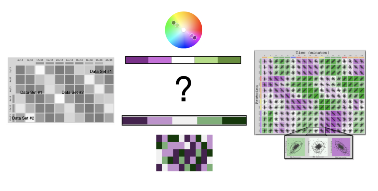
Let’s compare these color scheme solutions side by side. I show these results below.

in the keys of purple and green.
The Complementary Color Harmony provides a brighter solution while the Diverging Color Scheme provides a darker solution. The deep Purple hue of the diverging scheme could have difficulties as there is a need to have some directional diagrams of the molecular structure embedded in each square of the mosaic. The Lime Green of the Color Harmony can also be a challenge in terms of intensity for visualizing directional diagrams. Perhaps a middle ground might be desired in the final color theme solution. For now, let’s check for color deficiencies for each color theme.
(4) Check and revise due to color deficiency, contrasts or any pre-existing conditions
Adobe Color and HCL Wizard provide their own approaches to checking for color deficiencies in their suggested color themes. I can use these checks as preliminary analyses to see if a revision to address color deficiency might be necessary for either the complementary or diverging Purple and Green combinations. Let’s examine each set of tests.
For the complementary color theme, Adobe Color notes “No conflicts found – Swatches are Color Blind Safe” for their suggested Purple and Green combination. These results are shown below.

For the diverging color scheme, HCL Wizard provides Deuteranopia, Protanopia, and Tritanopia tests. The five color Purple-Green combination passes these tests. These results are shown below.

The Purple Green Color Theme from Adobe Color and the Purple Green Diverging Color Scheme from HCL Wizard both pass color deficiency checks respectively and do not need to be modified for these purposes.
(5) Apply color theme to data visualization. Some modifications might result.
The final results for the visualization of the correlation of large-scale molecular biological data with the Purple and Green color scheme are shown below. The Purple Green Color Theme from Adobe Color and the Purple Green Diverging Color Scheme from HCL Wizard are also shown underneath the visualization.

In this final solution, the Purple has been adjusted in the direction of the complementary color harmony while the Green has been adjusted in the direction of the diverging color scheme.
Let’s do a check of the final visualization for color deficiency since the Purple and Green hues have been slightly adjusted. I will use the Color Blindness Simulator (Coblis) tool for this check. These results are shown below.

Happily, the color deficiency checks indicate that a viewer with Protanopia, Deuteranopia or Tritanopia can effectively distinguish between Data Set #1 (Purple with Normal Color Vision) and Data Set #2 (Green with Normal Color Vision).
Concluding remarks

Here, I have shown the similarities between a complementary color harmony and a diverging color scheme for the specific case of Purple and Green hues. The complementary color harmony was specified in Red Green Blue (RGB) Color Space while the diverging color scheme was built in Hue Chroma Luminance Color Space. I used Adobe Color as the color suggestion tool for the complementary color harmony and HCL Wizard of the diverging color scheme. In creating the final visualization, the Purple hue has been adjusted in the direction of the complementary color harmony while the Green hue has been adjusted in the direction of the diverging color scheme. Happily, the final visualization of the correlation of large-scale molecular biological data passed color deficiency tests.
There are many ways to approach building color schemes for data visualization. I have shown a specific method here. For further discussion on my approaches with other color suggestion tools, please see my prior Nightingale articles as well as my 2016 book on Applying Color Theory to Digital Media and Visualization published by CRC Press.

Theresa-Marie Rhyne is a Visualization Consultant with extensive experience in producing and colorizing digital media and visualizations. She has consulted with the Stanford University Visualization Group on a Color Suggestion Prototype System, the Center for Visualization at the University of California at Davis and the Scientific Computing and Imaging Institute at the University of Utah on applying color theory to Ensemble Data Visualization. Prior to her consulting work, she founded two visualization centers: (a) the United States Environmental Protection Agency’s Scientific Visualization Center and (b) the Center for Visualization and Analytics at North Carolina State University.
- Theresa-Marie Rhyne

- Theresa-Marie Rhyne

- Theresa-Marie Rhyne

- Theresa-Marie Rhyne


