
I’ve worked in the field of health data visualization for about 20 years now, so I’m embarrassed to say that, before this week, I hadn’t encountered the concept of “flattening the curve.” After all, my training is in communication — not epidemiology.
As a result, this past week has been an education for me. But more importantly, as a student of health dataviz it’s been interesting to see how quickly data visualization — sprinkled with some context — brought me up to speed on this important concept. In the process, I’ve been thinking a lot about what makes the visualization on “flattening the curve” so successful — and what else we as data visualization practitioners can do to educate people on why it’s valuable to spread out and “squish down” that curve describing COVID-19 cases, so that the health care system can effectively treat all those impacted. More than that, though, this visualization also taught me about what makes a health data visualization successful, regardless of topic.
I first encountered “flattening the curve” as I was walking my dog around the neighborhood, catching up on tweets. Vox had just published a piece with the provocative headline, “How canceled events and self-quarantines save lives, in one chart.”
Those “in one chart” headlines always grab me, so I clicked. But this one left me wanting.

You see, I was on my phone — as surely many of us are when we encounter information these days — and it wasn’t worth squinting to try and read those annotations that explained the concept. The text was simply too faint. All that I noticed were two different-colored area charts. I mean, the chart looked very nice — great color palette — but it was hardly practical to my on-the-go, mobile use case. Even that important line about “health care system capacity” washed over me. I simply didn’t see it as I clicked out of the article and back into Twitter land.
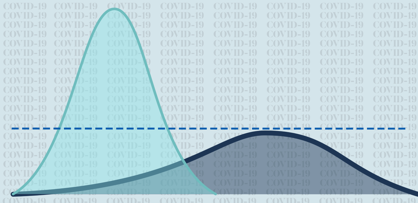
Then, as I read more about the concept and encountered charts with clearer typography, the concept of flattening the curve crystallized. For example, Stephanie Evergreen shared this tweet, where the chart has easier-to-read annotations and a headline that’s action-oriented, not generic.

Do I think the chart directly above looks as nice as the one by Vox? Not really, but it sure educated me better on the concept, as did this one from Drew Harris, a professor at Thomas Jefferson University.

Again: clear, cogent, and to the point. Which is just what we need from a visualization in a time of crisis when we need to quickly educate a public hungry for accurate information.
I’m learning, too, how you can use visualizations to expand an initial concept. That dotted line above about “healthcare system capacity” is so crucial, and it hadn’t occurred to me that there is another key reason to flatten the curve and spread out cases: The healthcare community will learn over time how to respond to COVID-19 and, with more time, research will bring treatments and therapies into play. A few squiggles of a line, including by showing that providers getting sick will negatively affect outcomes in the short term, made all this clear through this version of flattening the curve:

Finally, I realize that this concept of flattening the curve cries out for animation, so that people can see “flattening the curve” unfolding, preferably as someone explains the concept in real-time, just as ABC News did toward the beginning of this piece.
Not many of us have easy access to tools to animate visualizations, especially those on the front lines of providing necessary information (such as local public health officers). But there’s no need to go high-tech here. That local public health officer could just as easily have taken a white board and drawn out the concept, whether in front of local news cameras or presenting at a community meeting. Alternatively, here’s an animated gif that’s licensed for public distribution.
So here’s what I’ve learned about health data visualization as I’ve been educating myself, too, on flattening the curve:
- Headlines matter. Don’t go generic when we need to tell people that they need to pay attention. Use a chart headline that helps orient the reader.
- Annotations are good. I mean, with flattening the curve, you don’t even need numbers. Just make sure your explanations have clear messages in easy-to-read type.
- Know your users. For example, many of us encounter visualizations on COVID-19 while we’re on our phones — which can make it difficult to digest what we see. Keep in mind that mobile experience.
- Animations are great, but if you’re in a face-to-face setting, so is drawing out the concept live on a white board or a sheet of paper.
And, of course, when all else fails, realize that cats are key to clarification on the internet, as this redrawn version of the Vox graphic attests to, posted on Twitter by Anne Marie Darling:

My list above is just a start. I’d love to learn from others on what else we need to do to marshal visualization that make this concept of flattening the curve actionable to all.

Andy Krackov runs a consultancy, Hillcrest Advisory, to help social sector organizations in California and elsewhere communicate and tell stories with data. A decade ago, when he was a program officer at the California Health Care Foundation, he worked closely with government agencies in Sacramento and Washington, D.C. to open up public access to their data.
- Andy Krackov

- Andy Krackov

- Andy Krackov

- Andy Krackov


