
Discussing the charts in the Book Series “America & Britain”
Of all the grand, utopian plans created by modernist designers, Isotype is, perhaps, the least understood. There’s much to be told in the story of the Isotype, yet despite a great deal of academic writing, it is also common to be confused about what an Isotype chart actually is. What better way to learn more about Isotype and gain inspiration from their designs than to view and discuss the work itself?
The International System Of Typographic Picture Education (ISOTYPE) was invented by Otto Neurath in collaboration his wife Marie Neurath and Gerd Arntz. While assisted by many, this core Isotype team sought to create “educational designs by bringing dead statistics to life”. In 1925, Otto founded a museum in Vienna for educating the public on social and economic issues (Gesellschafts- und Wirtschaftsmuseum) with the motto: “It is better to remember simplified images than to forget exact figures.” After fleeing WW2 in mainland Europe, the couple co-founded the Isotype Institute in Britain in 1942.
This article — part 3 of a series on Isotype (here are parts one & two) — seeks to explain and celebrate the work of the Isotype Institute while revealing the process and design concepts used to create it. By focusing on the books published by Adprint in from 1941–48, I want to explore the techniques and mindset behind each chart and the system behind the combined series in order to inspire new information design concepts today.
The Third Lesson of Isotype: Combining Data and Diagram

By 1944, the Neurath’s had been creating Isotypes for roughly 2 decades and they had amassed a huge variety of practiced techniques to visually communicate complex information. This includes many ways for making comparisons between different types of data with an easy-to-visually understand design.
As explored in the first article in this series on “America & Britain”, Isotype charts often aggregate both qualitative and quantitative data. In this book, we see the Isotype Institute explain the differences between the two governments by combining structured diagrams with Isotype unit icons to create a greatly reduced but well-informed structure for comparison.
Our Two Democracies At Work, 1944
Images from Chris Mullen’s Fulltable, Thom White, and author’s copy.


The final book in the “America & Britain” series explores the political structures of the two countries in detail. Written by British historian Kingsley Bryce Smellie, the dust jackets sells the book for its general education: if you are British this book will help you understand newspaper items, films, and stories about America. If you are American it will do the same for you by Britain.
Each book in the series conformed to the ‘Book Production War Economy Standard’ and was subsidized by the Ministry of Information — which likely explains the expensive color printing. By the time of this printing, the Isotype charts were printed as photo-engraved zinc blocks rather than linocuts. This results in a wonderfully physical print, often creating a lightly embossed effect with the ink sitting on top of previous layers.

The book starts off with a great Isotype. “Population Born Abroad about 1930” represents the great masses of the two countries and builds off the previously established 1:3 ratio we’ve seen in other charts. Three grey rows represent the USA’s 120 million citizens, it’s green figures are overlaid into 3 rows of 19 each. The last row represents Britain, its single 40-million mass a background for only 1 green foreign-born figure and 4 red figures presumably for those born in British colonies.
We not only see a difference in the numbers between the 2 countries but also layers of context. By presenting an equal number of foreign-born over the 3 equal groups in the US the chart suggests cultural equality and highlights the concept of a nation of immigrants. There is a visual weight and equality to the top section, while the bottom shows those that stand apart from the homogeneity of the masses.

The challenge in creating an Isotype chart is understanding how to sum the data into appropriate units. Checking the numbers in the chart at the left, it’s good to know that the chart does correspond to the data. The design decision of representing the 2 countries as a 1:3 ratio — or groupings of 40 million — may not have been an obvious choice, especially as both populations need to be rounded down. But after establishing the 1:3 ratio, we can see how the Neurath’s use this design concept across charts in the entire series. Marie Neurath’s Transformation process focused not only on researching the data but also on deeply considering what ‘simple’ units could represent the comparisons in the subject matter. This doesn’t actually feel like an act of data science, but more an act of binning data points. In the end, each Isotype chart is a collection of data abstractions telling a specific story.

“Birthplaces of the Foreign-Born Population of the US” displays 2 kinds of data, the people icons representing the foreign-born US population and the cradles where they came from. Like we have seen across the Isotype system, the Neurath’s have abstracted and aggregated geospatial data by country to tell a specific story. Unfortunately, it’s not labeled with an exact date but the data likely mostly represents the great European immigration boom from the 1880s to 1920. By showing that so many British (and European) immigrated to the US, the Neurath’s build on the natural relationship between the two countries.

This map uses the same technique (icons for people and cradles from where they originate from) as it’s previous American cousin, but tells a very different story. Instead of showing a global view this Isotype map instead focuses just on the British Isles, showing how many foreign-born are from Ireland (shown in red). While showing the global map would have also been interesting, this British isle map highlights just how many were born in Ireland.

On to the Politics! This diagram of the “House of Commons” is actually more of an election record by location rather than a diagram of its constituency. On the left, it shows the representation of the boroughs (more specifically, municipal boroughs) so we see representation by London then the next three largest cities, then smaller cities across England. The heavy horizontal line toward the top separates England from the other British countries.
On the right, the isotype chart shows the representation by counties (such as Suffolk, Kent, Somerset, etc.) again split between England and other countries in Great Britain. The right side is slightly higher on the page to reflect the additional members from outside of England from Counties. My editor and friend Georges Hattab points out that the heavy shading on the left side is organized by population density like a stacked bar chart, while the rural areas are shown in green on the right.

The color of the icon represents the political party. By using Blue for the National party vs all other parties in red, it streamlines the complexity of the British political establishment, as that isn’t the focus of this chart. We also note the icons marching toward the center Big Ben illustration, representing their various constituencies in the central government.
Also interesting is the rare use of partially colored icons, such as those visible in the detail to the left. Neurath was careful to normally segment icons only on the 1/2 and seldom used a 1/4 icon (or smaller) as a cropping or partial shading. What is particularly unusual is the use of the horizontally divided icons on the top of the London section and the vertically divided on the right.
Then again, taking a step back, we see that by coloring the icons like this, we are presented with a sort of shaded ‘box’, that encompasses the icons representing the opposing parties of London. This visually tells a more general story that is easy to read — even if the individual 1/4 icon feels a bit awkward. This reminds me of a great quote by Marie Neurath in a 1974 article called Isotype where, in explaining some basic design concepts, she remarks:
“A rule should not be broken unless there is a good reason for it. And of course, often there is a good reason.” ~ Marie Neurath

One of my favorite charts from this era, this spread compares the government structures of both countries, the main difference being the influence of voters. On the American side, we see citizens — delineated by state — voting for Congress, Senate, and the President, who then appoints the Supreme court. On the right, we see the total British citizenry voting only for the House of Commons, which then appoints the Cabinet and Prime Minister while the House of Lords is appointed by the Crown.
Color plays a strong role in drawing equivalencies between the two systems. Voters and the directly elected houses are nearly the same. The Crown and House of Lords are both dark purple showing their hereditary status, and the Supreme Court is black, showing their permanent status. Combining the colors of the Senate (blue) and the House of Representatives (red) would equal the hue to that of the House of Lords (purple) which helps orient the viewer toward making a comparison. In this way, the Neuraths utilize the printing process to a conceptual end.

The American system of equal representation by both population and state is wonderfully illustrated in the map above. It shows the difference between the 2 houses by both color and shape. Senators are equal per state, serve for 6 years, and their blue icons are a bit larger and more stable. House representatives serve for 2 years and reflect representation by population, so their smaller, red, people icons also act as a map of population density like a modern-day small multiple. The icons are laid out in a subtle arc simulating the earth’s curvative, adding to the scale of the United States. The map also incorporates the design treatments we see in other Isotype maps such as the line difference to denote natural or political borders.

These matching charts explain the voting opportunities for each country. It’s a great example of how the Neuraths used the Isotype system to aggregate not only quantitative data but also qualitative information. By putting an individual icon at the center of a radius of voting options, one gets the impression almost of a fuel gauge or a board game with a rotating arm’s length. The colors and relationships that exist on the government structures charts largely carry through, simplifying two rather complicated procedures.

As an American, the House of Lords has always been a mysterious institution to me, so this diagram of “The Composition of the House of Lords” was a wonderful invitation to learn more.
The House of Lords is an ancient institution, having developed from the “Great Council” that advised the King of England during medieval times. It is a group predominantly made up of the Hereditary peerage of the United Kingdom, so most of these members are Barons, Dukes, and Viscounts— and currently only one woman, Margaret the Countess of Mar. The icons representing the hereditary look as if they are seated, their inclusion by lineage locked in place. They are joined by peers from Scotland, Ireland, and additional members of the Church of England plus several lawyers.
The rectangles below represent the political composition (or “complexion”- an odd word choice) for the chamber as of 1935, their icons reminiscent of slips of paper. By separating the structure of the House of Lords vs its politics we can see both independently from each other, just like we did in the earlier “House of Commons” chart.


The most significant American legislation before the US entered WW2 was the “The New Deal” which was a series of programs, public work projects, financial reforms, and regulations enacted by President Franklin D. Roosevelt between 1933 and 1939 as an attempt to lift the country out of the Great Depression.
The Isotype chart above is a combination of an org-chart and illustration of three of its agencies in order to explain three of its agencies to a British audience. While many of the agencies could have been explained, these three agencies, the PWA, FSA, and TVA, combine to tell a cohesive story of government relief and infrastructural development.
On the left side of the chart we see a node representing the Public Works Administration (PWA) and descending from it are illustrations representing its mission: to build roads, plant trees, build dams, invest in housing, farms, and teach better methods of Soil reclamation. It was America’s biggest construction effort up to that date, with a budget of over $7 billion which, ultimately, created the infrastructure that supported the post-war boom.

In the center of the chart, we see the node representing the Farm Security Administration (FSA) which was a multi-faceted agency, so describing it as “social services” seems a bit reductive. It is, however, the sole representation of people on this chart, and rightly so. Its agencies helped to shelter and educate almost a million farm families. The FSA’s real legacy, however, was its highly influential photography program. Artists like Dorothea Lange, Walker Evans, and Gordon Parks (among others) created a humanistic portrayal of the challenges of rural poverty through their timeless works.
The right side of the chart shows a large illustration of the Tennessee Valley Authority (TVA). It is another example of how the Isotype aggregates concepts into an easy-to-understand format. We see a single dam providing electricity to factories and houses in 7 states, represented by their corresponding labels. In reality, the TVA actually was a series of 16 hydroelectric dams and power plants that spanned the 650-mile length of the Tennessee River. By reducing the subject content to a series of icon-based illustrations, the Isotype system keeps the viewer in the same mindset for understanding the basics of the subject matter.

Otto Neurath was a socialist and had been deeply political. This chart compares the workforce of both countries and then outlines the unions, co-ops, and socialist votes per country. The main takeaway is the strong labor movement in England despite having a fraction of the workforce.
In graphic terms, each icon represents the same unit (500K people) and black units represent general trade unions on both sides. On the US side, the Trade Unions are grouped around the central figures in black but on the UK side, the alignment is a bit confusing.
Just as Marie Neurath mentioned above — they broke the rules — and we have a partial icon for the American Socialist Vote on the left. Of course, the fraction of an icon is only meant to show that it is just a very small amount in comparison to the British.

“The Verdict of Elections” is a great example of an Isotype that might have too much information packed on the page to meet its functional objectives. With so many icons in so many colors on the spread, the design overwhelms the viewer and undercuts the intended story. Isotype charts are engaging when they balance visual simplicity with conceptual complexity.

By creating a sort of ‘small multiple’ of 4 comparable cities for both countries (a total of 8), for 10 years each, including political parties, we are supposed to make comparisons between the different elections. Each row represents 100% of the vote for that year broken into 10 icon units which diverge from a central axis showing the vote results. The illustration of the state of Texas, at left, shows the strength of the vote, a quick tabulation of the vote for 1904, and asterisks highlighting three unusual election years:1912, 1924, and 1928.
While this single Isotype chart is effective to understand, it really becomes a lot of icons when representing 8 cities on the spread. Focusing on a different unit of political measure (such as the national vote over 10 years) might reduce the cognitive load and lead to a better comparison. In the end, the layout of these 8 charts ultimately reads like 2 tables, which is precisely the kind of “dead statistics” Otto frequently railed against.

“Fluctuations in Politics and Market” is an example of a complex Isotype chart that is packed with information, and also is easy to understand. The two charts are organized in exactly the same way. The date descends from the top left, starting in the second industrial revolution period when train travel, the internal combustion engine, and the telegraph were changing the world.
The next column shows icons representing political power by chief executive and party representation, then squares representing the production of “pig-iron” which is the crude ingredient in iron and steel production. Red bands representing the world wars span both diagrams for the historic context and also to align the two pages for easy comparison.
While complex, these 2 charts help to tell a more focused story of volatility in the US vs stability in the UK. The influence of American political turnover on business helps to both fuel and constrain industrial production. The massive industrial growth in the US before WW1 and the massive reduction of the great depression in 1932 are both evident. In Britain, we see much less political volatility, and far more industrial stability, but less opportunity for growth. The main story we take away is that Britain is more stable but also more constrained.

But there is a surprising amount of detail for those that want to dig deeper. On the left, we see a small cross below the icon to mark president McKinley’s 1901 assassination and in 1923 we see a cross above the icon representing Harding’s fatal heart attack in 1923. The vertical lines connecting two figures signify reelection. The US Representative design carries over from the “The Verdict of Elections” shown by diverging majority percentage, their icons, standing, and less permanent.

On the right-hand, British, page, shows a stacking of Prime Minister icons to designate general political turbulence in 1924. Then a few years later, a diagonal line connects red and blue icons referencing Ramsay MacDonald’s political party change when, on the urging of King George V, he formed the National Government which then resulted in a landslide election in 1931. Again borrowing from other Isotype charts, we see the House of Commons icons as ‘seated’, and more permanent, their icons also diverging by percentage but labeled as “for the government.”

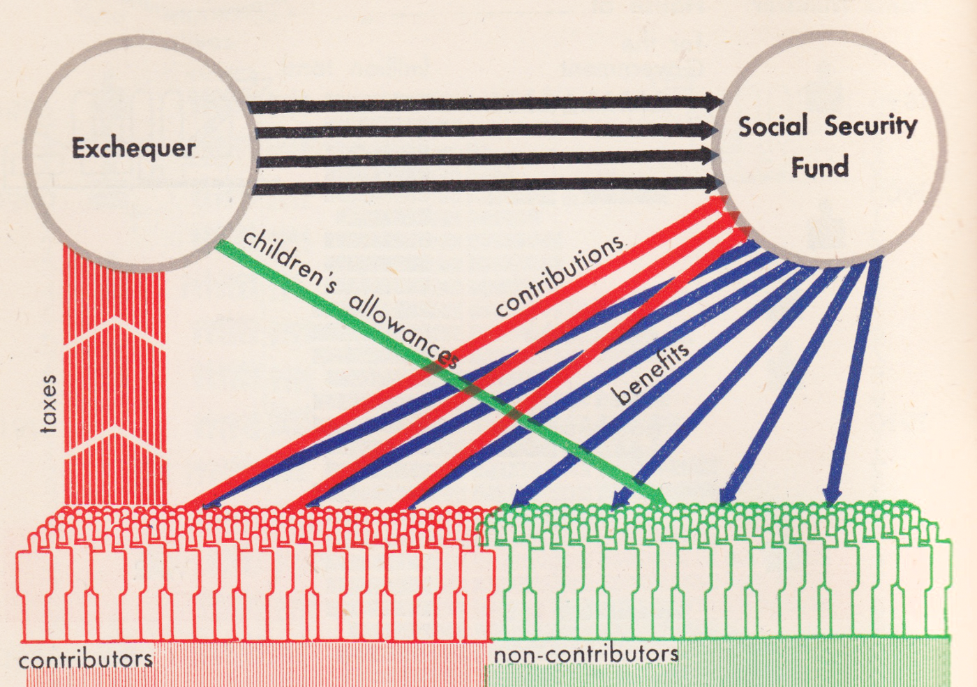
The Beveridge Report was published in late 1942, helping to found the welfare state in the UK which includes the expansion of National Insurance and the creation of the National Health Service. The ‘Exchequer’ is the name of the office as well as the process for the collection and management of taxes and revenues.
This diagram breaks the entire British population into 2 equal parts: contributors (or working people) in red and non-contributors (the unemployed, children, elderly, etc) in green. Arrows show the flow of tax revenues from the employed which flow through the Exchequer to be distributed into public services by the Social Security Fund.
Below the working people, on the far left, we have icons for working people, labeled as the employment exchange (or unemployment office). Split between both groups at the bottom is a group of icons representing the free health services all British citizens receive.

Interestingly enough, this was actually the second version of this diagram the Neuraths created in the same year. The earlier version was created for a government whitepaper called “Social Insurance” for which the Neuraths were allowed access to secret documents in order to create the diagrams. While the entities are the same in both diagrams, the grouping of the population in the earlier version feels disjointed and the overall flow is confusing.
The Neuraths regularly iterated on their design concepts, experimenting with design options to gain efficiencies in understanding. Perhaps they found a better analogy as the second version is very similar to a typical water cycle diagram, where water vapor collects into clouds which rain and flow to the sea to begin again. In this case, money flows from the working people to the social services to distribute back to the citizens creating a virtuous cycle.

“The Press and Its Readers” mirrors the same format as the first chart in this book (“Population Born Abroad about 1930”). It shows the populations of both countries in four rows for easier comparison with newspapers broken into three groups by color to represent the circulation. While the total quantity of newspapers in the US is higher, Britain has more newspapers per population. This is likely due to the smaller geographic spread and urban density of its population but also suggests that national news might have a larger influence in the UK.

The text in “Public Libraries and Their Readers” greatly helps explain the Isotype. While the US has more books than Britain and a comparable number of people who have library cards, British books circulate to more people signified by the additional red arrows on the British section.
The design of this Isotype chart shows the same four rows reflecting the 3:1 population ratio of the two countries, this time with additional city illustrations to punctuate the differences. The last line, “One-third of Americans live in areas not served by public libraries at all.” is illustrated by the lack of blue background for the rightmost American group to the far right.
This is the last book in the American and Britain series, but there are plenty of other books to explore in the continuing collaboration with AdPrint. Next up, we’ll discuss every chart from all the books in The Soviets and Ourselves. This series is of particular interest because it not only compares Britain to a very different culture but we also see the Neuraths explain some of the leftist political ideologies they embraced throughout their lives.
This series continues to be an exciting journey, if not a bit daunting, so thank you all so much for coming along with me on the ride! Major thanks to Alyssa Bell, RJ Andrews, Georges Hattab, Paul Kahn, and Elijah Meeks for the editing and continued support!!

Jason Forrest is a data visualization designer and writer living in New York City. He is the director of the Data Visualization Lab for McKinsey and Company. In addition to being on the board of directors of the Data Visualization Society, he is also the editor-in-chief of Nightingale: The Journal of the Data Visualization Society. He writes about the intersection of culture and information design and is currently working on a book about pictorial statistics.
- Jason Forrest

- Jason Forrest

- Jason Forrest

- Jason Forrest


