
Color is a major factor in creating effective charts. A good set of colors will highlight the story you want the data to tell, while a poor one will hide or distract from a visualization’s purpose.
In this article, I’ll describe the types of color palette that are used in data visualization, provide some general tips and best practices when working with color, and highlight a few tools to generate and test color palettes for your own charts.
Types of color palette
Three major types of color palette exist for data visualization:
- Qualitative palettes
- Sequential palettes
- Diverging palettes
The type of color palette that you should use in a visualization depends on the nature of the data mapped to color.
Qualitative palette

A qualitative palette is used when the variable is categorical in nature. Categorical variables are those that take on distinct labels without inherent ordering. Examples include country or state, race, and gender. Each possible value of the variable is assigned one color from a qualitative palette.

In a qualitative palette, the colors assigned to each group need to be distinct. As a rule of thumb, you should try to limit the maximum palette size to 10 or fewer colors. With more colors than this, you start to run into trouble distinguishing between groups. If you have more possible values than colors, then you should try to bundle values together, like setting the smallest categories to a single “other” category. Looping through colors multiple times is a bad idea, as this can cause confusion.

The main way of generating distinctiveness between colors is through their hues. Additional variation can be obtained by adjusting lightness and saturation, but it’s a good idea not to make the differences too large. Too much difference might suggest that some colors are more important than others — though this can be useful when used deliberately. Avoid having two colors with the same hue, but different lightness and saturation, unless the values associated with those colors are related. For example, you might have a line chart with daily readings in a light-colored line, and a weekly rolling average in a darker shade.

Sequential palette

When the variable assigned to be colored is numeric or has inherently ordered values, then it can be depicted with a sequential palette. Colors are assigned to data values in a continuum, usually based on hue, lightness, or both.

The most prominent dimension of color for a sequential palette is its lightness. Typically, lower values are associated with lighter colors, and higher values with darker colors. However, this is because plots tend to be on white or similarly light backgrounds. On a dark background, it’s common to have the reverse case, where higher values are indicated with brighter, lighter colors.
The secondary dimension for a sequential color palette is its hue. It is fine to just use a single hue for your color map, mostly varying lightness to indicate value. However, it’s worth considering spanning between two colors as an additional aid in encoding. Typically, a warmer color (toward red or yellow) will go on the lighter end, with a cooler color (toward green, blue, or purple) on the darker end.
Diverging palette

If our numeric variable has a meaningful central value, like zero, then we can apply a diverging palette. A diverging palette is essentially a combination of two sequential palettes with a shared endpoint sitting at the central value. Values larger than the center are assigned to colors on one side of the center, while smaller values get assigned to colors on the opposing side.

Typically, a distinctive hue is used for each of the component sequential palettes to make it easier to distinguish between positive and negative values relative to the center. Like with sequential palettes, the central value is generally assigned a light color, so that darker colors indicate larger distance from the center.
Discrete vs. continuous palette
Sequential and diverging palettes can be associated with data values in two different ways: either as a discrete set of colors, each one associated with a numeric range, or as a continuous function between numeric value and color.

Tools for creating palettes will generally follow the first type, while tools that create visualizations often have the capacity to build a continuous association. While it may seem automatically better to have a continuous function between value and color, there are still merits to the discretized palette.
Our ability to distinguish differences in color is weaker than that of position or length, so we are already at a disadvantage for associating color to precise values. Discretization of values can reduce cognitive load by bringing out the broad patterns in the data. In addition, we can set value ranges for a discrete palette in a way that better represents the data. If the data includes outlier values, then a continuous palette might force most of the data into a narrower value range. Using a discrete color palette means that we can create ranges with unequal size to better represent differences in the data.

One major downside of the discrete color palette is that we lose any ability to compare elements that fall in the same bin. Where there was some color difference between close values with a continuous palette (such as between Texas and California in the example above), none exists in the discrete case.
Additional tips for using color
Avoid unnecessary usage
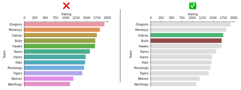
Even though color is an important part of data visualization, it’s wise to exercise restraint and use color only where appropriate. Not every chart you create will require multiple colors. If you have only two variables to plot, they will likely be encoded by vertical and horizontal positions or lengths. Color usually only comes in when a third variable needs to be encoded into a chart or if it’s a component of a specialist chart like a pie chart. However, there are cases where color can be added to emphasize a specific finding or as an extra highlighting encoding.

Be consistent with color across charts

If you have a dashboard or report that includes multiple charts, it is a good idea to match colors between charts when they refer to the same group or entity. If colors change their meaning between charts, this can make it harder for the reader to understand the chart.
Leverage meaningfulness of color
Sometimes, you can leverage how colors are perceived to enhance your visualizations’ effectiveness. If the groups that you are plotting have inherent color conventions, such as with sports teams and political parties, assigning appropriate colors can make it easier for readers to follow a visualization. You may even want to try creating custom palettes using your brand’s colors as a base.
A general rule of thumb is to avoid high levels of color saturation and brightness in order to reduce eyestrain. This also allows room for highlighting elements that are important by giving them a bolder look compared to the other elements. Similarly, the importance of gray cannot be understated to put unimportant data in the background, among other purposes.

As a final thought, it’s worth noting that different cultures can associate different meanings to each hue. For example, red might be associated with passion or danger in some Western cultures, but prosperity and good fortune in some Eastern cultures. This may not be particularly important unless findings are being presented to a broad audience, but it’s another tool to keep in mind to help make your visualizations easier to grasp.
Don’t forget about color blindness
About 4 percent of the population has some sort of color blindness, most of them males. The most common forms of color blindness cause confusion between certain shades of red and green, though there are also forms of color blindness that cause blue and yellow shades to look the same. For these reasons, it is good to try and vary a dimension other than hue alone to indicate the value associated with a color, like lightness and saturation. You can also use color-blindness simulators like Coblis to get an idea of whether your final visualization will be understandable to others and if there are potential ambiguities.

Tools for choosing colors
There are many tools online to help you select and test colors for your data visualizations. Here, I will highlight some of the simplest tools to help you get up to speed on color choices.
ColorBrewer

ColorBrewer is the classic reference for color palettes, and provides a number of different palettes of each type. Certain palettes may be questionable for colorblind safety, so be sure to check out the eye-icon above the color codes pane to check if a color set has a potential to high chance of perception difficulties (indicated by a ? and X, respectively).
Data Color Picker

The Data Color Picker is a quick and easy to use tool for generating sequential and diverging palettes. The default “Palette” tab is best used for generating multi-hue sequential palettes rather than qualitative palettes, since the interpolation between endpoints will necessarily leave out some segment of hues in the color wheel.
Chroma.js Color Palette Helper

The chroma.js Color Palette Helper is a little bit more involved than Data Color Picker with its options for correcting lightness and bezier interpolation and slightly more difficult input of color values. However, it also allows for some additional freedom in setting multiple stop-points for the algorithm to try and fit a palette to. As an additional bonus, the application also includes a color blindness simulator on the same page, highlighting the most common types of deficiency where issues may crop up.
Color Thief

There aren’t as many quick-and-easy tools for generating qualitative palettes as there are for sequential and diverging palettes. I want hue and Colorgorical are both quick for generating random palettes, but a bit more difficult to work with when you want to customize your values.
But one fun way of creating a qualitative palette is to draw inspiration from images and screencaps with appealing natural palettes. There are a few tools out there to help do this, but Color Thief is one of the easiest to work with, automatically extracting a healthy-sized palette from uploaded pictures. This doesn’t necessarily mean that you can use the extracted colors directly and in order as a visualization palette. They can be an inspirational starting point for colors that look good together, but you’ll likely need to make some tweaks and revisions to ensure that the colors you choose are effective in a visualization context.
Viz Palette

In the previous section, Coblis was linked as a resource for checking how your final visualization might look to those with color perception deficiencies. Viz Palette is a broader color palette tool you can use to check your palettes before you put together your visualizations. In addition to being able to view sets of colors in the context of example plots and under simulated-color perception deficiencies, you can also modify and change your palette’s colors immediately.
Summary
This article represents a brief overview of the ways that color can be used for effective data visualization. Different types of color palette — qualitative, sequential, or diverging — should be used depending on the kind of data mapped to color. Make sure that when color is used, that it is meaningful and used consistently, and try to attend to the issue of colorblindness to improve your plot’s accessibility.
Always try to consider your color choices carefully when presenting findings to others, as a good set of colors will make it that much easier to deliver your desired message to your audience.
Jack of many disciplines, interested in games, data, mathematics, and applying mathematics and data to games.
- Michael Yi


