
View this article en français ici.
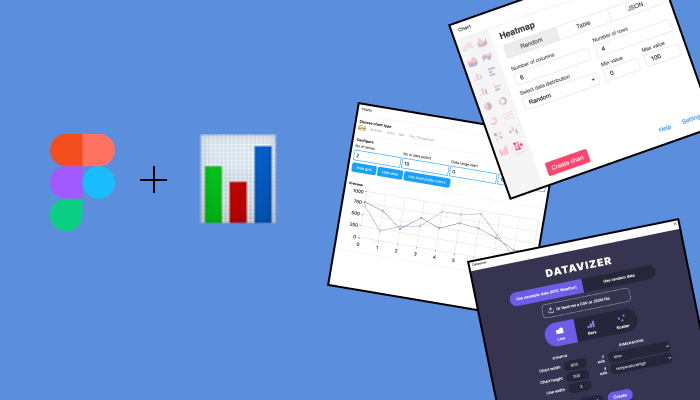
I’ve used a lot of tools in my data visualization career. I started my career mainly using Tableau. In grad school, I mostly used D3.js and had a quick blip with Looker back to Tableau. Now I’m in a more traditional designer role using Figma (our design team’s tool of choice). Being the appointed “data visualization designer,” I knew I needed Figma to work for my specific needs. I use Figma to build wireframes around data visualization-heavy products and features.
The main point of building a chart in Figma is to communicate how it should look and interact with other stakeholders and developers. If your wireframe is being passed along to developers to be built, your chart doesn’t need to be pixel-perfect compared to code but should communicate exactly what you had envisioned. While I love Figma’s features, like the integrated UI component libraries, custom palettes, prototyping, and ease of sharing work, I realized I was missing key functionality when tasked with making my first chart. I looked at the features available, like the shape tool and drawing tools, but realized it would be helpful to programmatically generate a chart with accurate data so that I’m not playing around with the pen tool for hours. Then I discovered the world of chart plugins and went through them, so you don’t have to.
Here’s what I considered when I looked at Figma chart plugins:
- Can you plug in data? Or are you stuck with a generated dataset?
- What chart elements are available?
- Is the output clean? How do the nested layers look? Is there work to do after the fact?
- How does the chart interact with the Frame (artboard)?
Navigating, Downloading and Using a Chart Plugin
If you’re new to Figma, Figma plugins are community-built extensions that range from UI kit builders to converting your design to code. Plugins are found within the Community section on the left side panel.

You’ll find all of your downloaded plugins on the dropdown toolbar. Depending on their use, you may need to have a frame selected before using it.

Below are a few of the Figma chart plugins I’ve tried.
Datavizer
I was pretty excited to find a chart plugin built by Amelia Wattenberger called Datavizer. It, of course, has a beautiful UI.

I like the option to feed the plugin with your data. It perfectly grabs the column names from your CSV or JSON file and lets you choose how you want to sort your dimensions. The two downsides are that there are only three chart types and that the generated charts don’t have built-in labelling, but that’s a preference. The frame does not determine the chart’s width and height — so keep that in mind!
Charts
Charts is another popular option for building data visualizations in Figma.

You’ll notice that this plugin has a few more chart options, but cannot input custom data, so you’re stuck with the generated data. This plugin is an excellent option for users needing a chart for their wireframes without needing a chart that reflects real data. I love the option to hide gridlines and provide a defined axis with axis labels that you can then customize. The chart will be built within the selected frame but will likely need to be resized to fit. I noticed that this line chart generated a pretty hefty amount of layers and components within components, making it quite taxing to clean up.
Chart
The Chart plugin has two options, a free version and a paid version. The paid version gives you access to more chart types (about 15 versus about three). There’s also a feature called “templates,” which allows you to input custom JSON, like rounded corners or other UI specifics that may relate to your brand. The paid version costs about USD 20, and it’s worth it if you are working with a lot of charts in Figma.

There are so many things I love about this plugin. The Google sheets integration is impressive in its comprehensibility and is such a time saver. The axis ticks are blank text holders, allowing you to decide the data range or numbers. You can import data in a few ways: randomly generated, copy and paste table format, JSON or said Google sheet integration above. The different chart types hold up well in a modern UI wireframe. The Chart plugin perfectly scales to whatever-sized frame you have, which is a huge bonus. Another bonus: The generated layers are small and manageable, which allows for easy integration with your other components.
Chart plugins are handy when trying to communicate how stakeholders interact with charts. They eliminate the pen tool dependence, and most plugin charts are customizable enough that you can adjust them to suit your brand colours or design system. I use Chart the most because it offers the most chart types and data flexibility. Datavizer, Charts and Chart are the plugins I’ve played around with, but there are likely more!
Have you used any other helpful chart plugins in Figma? Let me know!

Simone is a data visualization designer and developer at one of the world's largest clinical trial data companies. She has a Master’s in data visualization from Parsons School of Design. She’s also a proud Franco-Ontarienne, currently based in Brooklyn. Say hi on Instagram or Twitter.
- Simone Betito

- Simone Betito

- Simone Betito


