
In our professional lives, every now and then we have opportunities to share our career trajectory with different audiences. For example, we may share with our co-workers so they can get to know us better or to inspire or motivate them. Or, we may share with higher level management, or potential customers, to demonstrate the breadth of our experience.
Usually, people tend to follow a timeline approach when showcasing their career paths, as we can see in the examples below. And they are not wrong to do so: Timelines can be an effective way of displaying your career progress and highlighting the points that you think will best convey the message you want to transmit.

But when I had the opportunity to present my career trajectory to executives at my organization, I realized that those timeline templates lacked something important to me: They didn’t allow me to show the nuances of my career progression. When my career retroceded, what was happening in my personal life? Also, the timeline format depended heavily on text, which goes against best practices for building a good visualization. I knew I could come up with a visualization that better fit my needs.
So how did I do it? Let’s go behind the scenes and get started!
The Audience and Objective
I was invited to present my career trajectory to the executives of my organization in 2020, which included the Vice President, Director and all People Managers—around 30 people. This opportunity is part of an initiative to identify key talents within the organization, so the leadership team knows the technical leaders they can refer to when needed. The objective of my presentation was therefore to illustrate my career path, both outside and inside the company I was working for at the time. I wanted to highlight my skills (both soft and hard), so the audience would better understand my career progress and goals.
The Thought Process
As I noted above, the usual approach at my company for this type of presentation is to create a timeline. The visual design of those timelines may vary, but the overall idea is typically to highlight key aspects of your career, including important wins, deliverables, or promotions by year. Following best practices for presentations, we try to create a clean deck, use icons to highlight notable points, and use only the necessary text. All this typically results in interesting, beautiful, and informative slides.
You may ask: But if you like this type of presentation, why did you decide to make yours different? Well, my point is this: In this type of timeline, we focus primarily on our successes. There is nothing wrong with showing ourselves in the best light, but I wondered, if I only show my successes, how will the audience know how I achieved that level of success? I wanted instead to show the decisions I took that led me to my successes. I wanted to show what affected my career in a given year, not from a professional point of view, but from an academic or personal perspective.
With that as my goal, I followed five steps to create my visualization:
- Select the tools
- Prepare the data
- Decide on a visual
- Put everything together
- Eliminate the clutter
Step 1: Select the Tools
I selected two tools for this project: Tableau for the visualization and good old Excel for the data. Why Tableau? There were a few factors that led me to this decision:
- Tableau is rich in terms of visuals and includes features that are already compliant with accessibility standards (color palettes that are safe for color blindness, for example)
- Tableau recently added a feature called inline visualizations, which would allow me to create interesting interactivity
- I could publish on Tableau Public and share with everyone at no cost
- I could customize standard visualizations with some math
I did have other tools available at my disposal, like Power BI, Grafana, Kibana, and Excel. If I forced it, I also could have created my visualization in Figma or PowerPoint. However, in my humble opinion, I preferred Tableau with its more sophisticated visuals.
Why did I select Excel for my data? Well, are there other choices? Jokes apart, I know I could have used Google Sheets, but it did not occur to me at that time. Both Excel and Google Sheets could have served my purpose—giving me a user-friendly interface to structure my data in a table. Google Sheets even has an advantage: If I publish my data to Google Sheets and use that as the datasource in Tableau, I can update the data and refresh the visualization in Tableau with one click. By using Excel, I need to republish the dashboard every time I update the data. However, for this project, I used Excel because that was what I was most used to.
Step 2: Prepare the Data
After I selected the tools, I started to think about the data. To decide which data would be most relevant, I asked the following questions:
- What data do I want to display?
- What do I want to highlight from the data?
The answers were: I wanted to show the two aspects of my life that are related with my career—the professional and the academic. For both, I wanted to highlight one important aspect, either positive or negative, for each year of my trajectory, and related to that, the technologies and skills I learned. I wanted to show a progression, even when a particular step in my trajectory was negative (meaning that I decided to take a step backward in order to move forward later). Showing all the ups and downs of my career would provide a more complete picture of me as a professional. And this is my opinion, so take it with a grain of salt: I believe that when you show yourself in an open and honest way, by including both positive and negative points, you create a better impression because you show that all the experiences in your career have a purpose.
The table below lists the fields that I opted to include in my dataset:
| Field | Description |
| Year | The year of the event |
| Type | If it is a career or academic event |
| Image | The name of an icon that will be associated with this event |
| Company | The name of the company associated with the event |
| School | The name of the school associated with the event |
| Organization | The internal organization associated with the event |
| Job | My job title at the time of the event |
| Level | My career level at the time of the event |
| SchoolText | The text to be displayed in an academic event |
| Scope | The job scope of the event |
| Tech | The technologies related to the event |
Step 3: Decide on a Visual
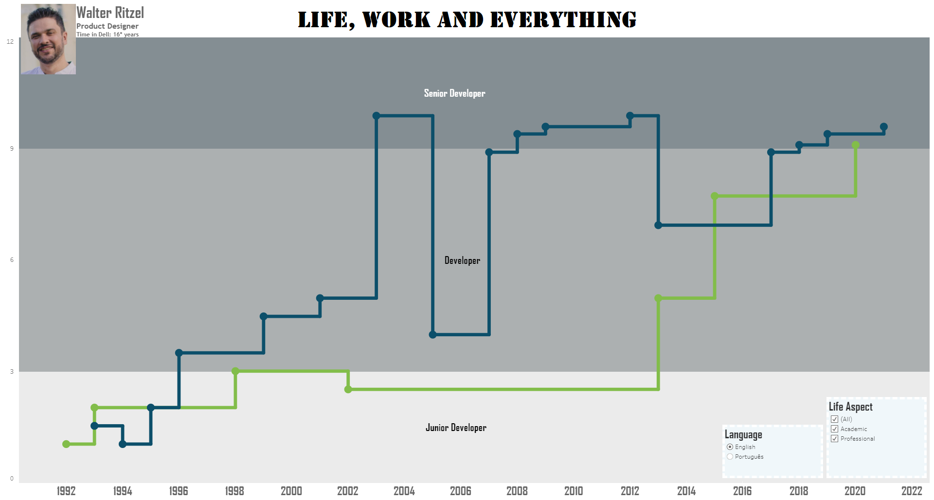
The next step in my process was to decide which kind of visualization would best show the data. I decided on a line chart with two series: one for career events and another for academic events. I would include one data point per year, from the beginning of my career until the current year. The value of each data point would represent the advancement of my career in that year (the higher the data point, the better my progress). This value would also represent seniority, falling into one of three ranges representing the junior, mid-level and senior stages of my career. To help me decide on a visualization approach, I used The DataViz Project website.
Step 4: Put Everything Together
With the data formatted and the visual decided, it was time for me to build my final visualization, shown below:

I did so by overlaying two charts: one in the background showing seniority levels (junior, mid-level and senior), and another in the foreground showing the career and academic line series.
The level (seniority) chart is pretty simple: It shows the scale that I created to represent the number of years that a professional typically stays at that level. This categorization is based on my experience: The junior and senior levels are basically half the duration of the mid level, because we can move quickly from junior to mid, but moving from mid to senior takes longer.

The series chart contains the career and academic data that I wanted to represent. I used stepped straight lines to show how each event affected my progression through professional levels.

After I created the two charts separately, I used the dashboard element in Tableau to overlay them, and voilá! I then added filters, my picture, and some labels for context.
The next challenge was to show the details for each data point. In Tableau, a tooltip is displayed when users hover over a data point, but standard tooltips allow very little formatting. For example, I cannot add images to a standard tooltip. How to create a better tooltip? I used Tableau’s inline charts feature to add iconography and formatting to the tooltip, as shown below.

The final visualization was quite satisfactory to me and impressed (as I’d hoped) the executives at my organization, because I presented something different from what they were used to seeing. My presentation was also the only one where people had questions around my progression, which helped make my presentation more memorable and gave me the opportunity to demonstrate my communication skills.
But my work did not stop there! Since I wanted to create something that would showcase my full professional profile, I also created another two charts to quantify my hard and soft skills (executives love numbers, right???). On those, shown below, I played a little with some mathematics to create circular bar charts.


Step 5: Eliminate the Clutter
In this final step, I used best practices to help create something beautiful and meaningful. Any tool used to create visualizations delivers its default charts with elements like grid lines, scales, standard colors, etc… Tableau does that, too. I knew I needed to eliminate all that “noise” to keep the focus on what I wanted to highlight. Among the things I did to reduce clutter:
- Removed grid lines
- Formatted axis scales. For example, my Y-axis includes only five markings, because it was more important to me to give a general indication of the levels rather than to allow people to evaluate specific data points.
- Added labels to the charts.
- Removed data points that were not relevant to my message.
Conclusion
When visually displaying your career trajectory, there is no right or wrong way of doing it. It is your career, and you should show what you think is relevant in a way that works for you. But after a quick search on the internet, it is clear that the default approach is a timeline. In this article, I wanted to show how I brought a little creativity into my career path presentation. You can see the final interactive version of my presentation here. I hope that you have enjoyed this idea and will use it in the future!

Walter Ritzel Paixão Côrtes is a product designer and data visualization practitioner who works solving users problems through a data-driven approach.
- Walter Paixão Côrtes

- Walter Paixão Côrtes

- Walter Paixão Côrtes

- Walter Paixão Côrtes


