
Do you ever wonder why your eyes dart to a flashy “50% OFF” sticker? or an appetite-stimulating visual of potato chips on a pack in a store before you even register the brand name? Have you ever been curious as to why some websites feel easier to use?
I posed this question to my colleagues. Their answers varied—bold colors, attractive discounts, evocative imagery, and clutter-breaking layouts. Fair enough, but what if the real insight lies beneath the surface? In the era of split-second decisions and endless scrolls, understanding what grabs attention, and what doesn’t, can make or break a design. Noticing isn’t just seeing , it’s where we look, why we pause, and what we skip—typically, the “Stop–Hold–Close” model of communication.
Design is psychology and consumer testing is at the crux of impactful design. AI is giving designers superhuman insights into what truly captures attention and it’s not always what we expect. To design effectively, we need to understand how people see while diving deeper into the unconscious mind of the consumer where decisions are truly made.
Eye tracking
Origins of eye tracking date back to 1879 when the French ophthalmologist Louis Émile Javal noticed, for the first time, that readers’ eyes do not skim fluently through the text while reading, but make quick movements—saccades—mixed with short pauses—fixations. These studies were based on naked-eye observations in the absence of a more advanced technology.
What is it?
Eye tracking is a technology that measures and records the position and movement of the human eye. These seemingly minor movements reveal powerful insights into attention and decision-making often before they’re even aware of it. An eye-tracking device, screen-based or glasses, uses infrared light to detect where the user is looking on a screen or in a physical space.

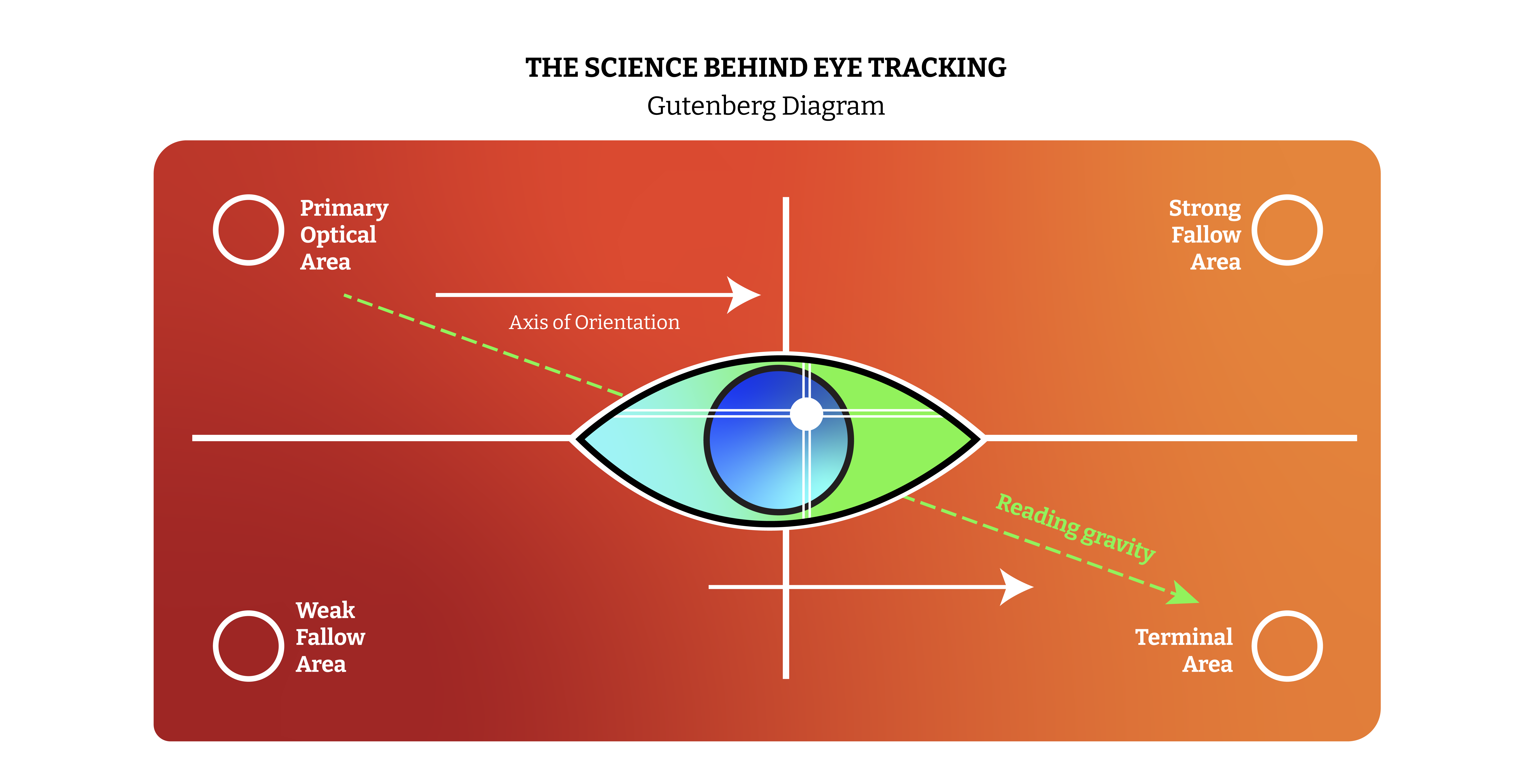
The science behind eye tracking
- Fixations — These are moments of attention. When the eye pauses on a specific element to absorb information—be it a logo, button, or headline. They are measured in milliseconds revealing what truly holds a user’s focus.
- Saccades — The silent connectors. These are the rapid eye jumps between fixations. No data is absorbed here, but the path reveals how users navigate visually from one element to another.
- Scanpaths — Think of this as the storyline of sight. A visual map showing the sequence of fixations and saccades offering deep insights into user intent, flow, and engagement.

AI tools
And finally, for the part you’ve been waiting for—the superhuman sidekick reveal.
Say hello to Dragonfly AI, Attention Insight, and many more AI tools! They’re your backstage pass into the user’s brain. You can generate heatmaps in seconds and see exactly what catches the eye and what gets ignored.
Want to design like a mind reader? Now you can!
The role of AI in the future of data communication
As data becomes increasingly abundant, the challenge lies in clear and effective communication. One of the most intuitive tools in this space is the heatmap. Heatmaps are a graphical representation that uses color gradients to visually represent data intensity. By mapping data across two axes, they offer an immediate visual summary that enables users to identify key patterns and insights at a glance.
Traditionally, consumer testing any package design is a resource-intensive process that takes days or even weeks to yield results. Insights are typically gathered manually, compiled into spreadsheets, and then painstakingly analyzed making it time-consuming. In contrast, tools like Attention Insight streamline this process dramatically. Typically colors from blue (low attention) to red (high attention) represent how users interact with a design. It helps reveal which areas draw the most focus and which are overlooked, offering powerful insight into user behavior on websites, apps and physical packaging. (In the image below)
For example, while working on a peanut butter brand’s packaging, our goal was to highlight the product name and key benefits for a mass-market audience. We used Attention Insight. Interestingly, the heatmap revealed that users’ attention gravitated heavily toward the typographic elements more than the imagery we initially emphasized. We took that insight and still retained the imagery to make the audience take a closer look at the end product. Remember, the stop, hold and close approach! In the end, we combined the insight with our design strategy reminding us how data can sharpen creative intent.

“It is true that data visualization is part data science and part art. That being said, even the most creative art is supported by theories that explain why it works.
— Michiko I. Wolcott
The process of using eye-tracking softwares is a powerful form of data visualization. It transforms raw user attention data into intuitive heatmaps that visually communicate where users are most and least engaged. Rather than sifting through numbers or spreadsheets, designers can instantly grasp insights through color-coded gradients and focus areas. This streamlines decision-making bridging the gap between analytical data and creative direction, allowing teams to iterate with both precision and empathy.
So, next time you make the brand logo a little bit smaller or add those colourful callouts, pause and ask yourself: Is it backed by data?

Sachi Mahajan
Sachi Mahajan is a communication designer with a passion for creating projects that are conceptually profound. With a multidisciplinary approach, she blends storytelling in branding, comics, interaction design and strategic thinking to explore meaning through visual symbolism and craft experiences that leave a lasting impact. Off the design grid, she’s a curious soul, always seeking new adventures that fuel her creativity beyond the screen.


