
The data visualization process is not always given due credit because after the visual is finished, it seems like it was easy to create. Just like grandma’s chocolate cake, it appears to require just a few ingredients and that’s it, wonderful! But how much time did she spend testing which ingredients to use, trying different brands, not to mention the countless attempts, and all the love in the process?
Similarly, data visualizations also go through several transformations until they reach the right solution. Understanding the problem, really empathizing with the target audience, and revealing insights are key steps to finding an optimal visual solution.
Through this article I want to show how I face this transformation process, as well as the importance of managing expectations, and that persistence is fundamental to achieving desired results.
Spotting the problem
Unemployment is always a concerning topic, especially during crises. It is a determining factor for making various economic decisions and so it is generally well tracked in many countries, including Brazil. The Brazilian Institute of Geography and Statistics (IBGE) is a great, reliable source of information, which provides vast amounts of data on the labor market and the workforce.
One of the datasets is the unemployment rate, which is the number of people active in the labor force who are not employed for at least 40 hours a week. It is noticeable that this rate fluctuates over time and that it differs between regions of the country.
In terms of visualizing this rate, there are already some tools and graphs in the IBGE website and news media, for example a pie chart that shows the proportion of employed and unemployed and a column chat with unemployment rate by region. A visualization available on the IBGE website, shown in the below image, shows a map of Brazil, divided by state, with the change of unemployment rate in relation to the previous quarter by color shades (increase, stable and decrease).

Line graphs are also widely used to represent the variation in the unemployment rate over time, as shown here:

The target audience for this project are economists, analysts and decision makers, both from the private and public sectors. The goal of these visuals is to help this audience understand the unemployment rate over the years, and explore and identify patterns or outliers in different regions of the country.
In both graphs presented above, it is possible to see the changes of unemployment rates by location or over time. However, it’s difficult to see the unemployment rate from both a geographic level and a temporal one, concurrently in the same visual.
Source of inspiration
Once I identified this problem, my next step was to find inspiration. Being exposed to a variety of data visualizations, especially those that cover unfamiliar topics, is important to create a mental library that serves as inspiration for future creations.
After analyzing several visualizations for inspiration, I chose a heat map published by The Wall Street Journal on vaccines’ impact in combating diseases in the United States.

Exploration and experimentation
The next step was to explore the data. We might have preconceived ideas about the data, so it is always good to conduct research to reduce bias. In this case, IBGE provides several tables related to unemployment rate; in some, the rate is already calculated and while others present the raw data. Given the possible need to aggregate values by time or region, I opted for raw data to enable accurate calculation and explore measures of central tendency and dispersion.
Once I had the data, I analyzed the available variables, what each of them represented and whether there was a need to add or calculate any new ones. A variable that IBGE did not provide was the regions each state belonged to. It was also necessary to calculate the unemployment rate and some other metrics.
During the exploration, I also analyzed possible seasonality and grouping effects by region. Regarding seasonality, there is a certain tendency for unemployment rates to fall as the last quarter of the year approaches, but there are significant exceptions. States belonging to the same region tend to have similar rates, however this is not always the case. These insights are fundamental for future stages of transformation and creating the visualization.
Finally, after exploring the data, I used the data to create an experimental heat map much like the one from The Wall Street Journal that had inspired me.

Think again
I was anxious to complete this project, unfortunately this heatmap does not add much value. This design shows differences in intensity depending on the state as well as the general trend of the unemployment rate growing over time, as indicated by the darker blue. However, this does not add much information, given that this trend can also be seen in IBGE’s line graph.
In this re-evaluation phase, it is important to analyze the results of the experiment, as it will not always be possible to achieve the desired outcome the first time around. This is where expectation management comes into play. You must be very calm at this time and have a critical sense to avoid any impulsive or biased conclusion.
Looking again at our target audience that wants to explore the data, their aim is usually to understand change. Consequently, I reconsidered the visualization and, instead of representing the unemployment rate, I opted for the difference in the unemployment rate from one quarter to another.

Again, not yet done. This attempt, as shown above, did not result in a visualization that could be very useful as it does not provide any patterns. After rethinking the insights from the exploratory phase, I tried using the difference in the unemployment rate between quarters to calculate the moving average. This smoothed out short-term fluctuations, considered seasonality effects, and highlighted long-term trends. I used a simple moving average based on a period of one year, that is, four quarters. This is a “slower” indicator but can be more robust for exploratory analysis. You will notice in the below images that the rolling average showed smoother curves than the original line chart.


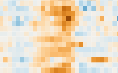
Through these transformations and after validation with economists and experts in the field, I finally arrived at a visualization that could present the unemployment rate data to the target audience in a way that included both geographic and temporal views simultaneously. Here’s what it looks like:

This graph continues to represent the difference between quarters, but the moving average is used as the unemployment rate, thus showing non-standard trends and behaviors. The visualization contextualized facts about economic, political, and health crises in Brazil and included the option of filtering states by region, allowing for a more targeted analysis.
This project was completed during the pandemic; now it is updated with the most recent available data, until the third quarter of 2023. According to the chart, the unemployment rate decreased in all states after the pandemic. This is evident by the predominance of blue shades starting in the second half of 2021. Important: This data should be analyzed with economic and market knowledge, like changes in the calculation of unemployment rates and changes in the number of active workers in the workforce, for sound conclusions.
Check out the interactive graph of the chart below by clicking here.
Conclusion
Grandma’s cake is ready! Once done, it seems like it was simple since the type of graph (heat map) and the data (unemployment rate) are trivial. What made the difference, however, was transforming the data, mixing it with a compatible graphic choice, and adding a pinch of editorial perspective to make it not only visually appealing but also valuable to the target audience. Moreover, being determined and patient to complete the project even though things didn’t turn out as expected during the process, was crucial to finally reach a solution.
I hope that the development of this visualization, as presented here, can provide insights to the creative process, both from the technical aspect of data and design, as well as the soft skill of controlling anxiety and maintaining a critical sense throughout the entire journey.

Fernando Hannaka
Fernando Hannaka is a self-taught analytics translator, whose purpose is to transform people and organizations through empathetic leadership and analytical culture. Co-author of Jornada Colaborativa books on agile leadership, scaled agile and RPA, and founder of the @visualizaçãodedados profile on Instagram.
- Fernando Hannaka


