
Mentorship holds great significance to me, and throughout my journey as an early-career journalist, I have been fortunate to have mentors in every newsroom I’ve worked in. However, I have never actively enrolled in a mentorship program offered by an organization such as the Data Visualization Society, with a specific goal in mind.
I applied for the DVS Mentorship Program’s February through May 2023 cohort. I was thrilled to be paired with Julia Wolfe, an editor for the Reuters graphics desk, as my mentor.
In my current role as a graphics reporter at Hearst Connecticut Media Group, it’s my job to make graphics. But, I wanted to use this mentorship opportunity to pursue a project that would broaden my horizons and delve into the realm of “unconventional” data visualization techniques.
Lucky for me, Julia is a pro, having previously made graphics for news organizations such as FiveThirtyEight and The Wall Street Journal before assuming her role as an editor at Reuters. She helped bolster many of my technical skills.
But, surprisingly, one of the biggest lessons I learned happened after the mentorship program wrapped up, when I showcased my project to the world and discovered that I had forgotten a critical step to making my project accessible.
The process
The mentorship program was about 10 weeks long and I spent the first few weeks pitching interesting and unusual data avenues and brainstorming ways to visualize them until I finally landed on visualizing the sex and race of Saturday Night Live hosts since the show began in 1975.
I was interested in participating in the mentorship program to focus on passion projects and not just projects for work. I knew Julia had experience with designing unconventional visualizations, which worked out perfectly, since I wanted to stray away from the types of charts and maps I create at my job.
I initially got the idea from Jeremy Singer-Vine’s newsletter “Data Is Plural.” I spent some time scrounging around his backlog of datasets from the newsletter and came across the SNL Archives, but I wanted to take the data a bit further.
So, I built my own spreadsheet to include the race and gender of each host.

It took time and a lot of research for each host to make sure I had their demographics depicted as accurately as I possibly could. I did not want to misrepresent anyone – but again, I could not readily find this data anywhere else.
To the best of my ability, I gathered this information by searching through Google, Wikipedia pages, IMDb, social media platforms, various news outlets’ reports and even using ChatGPT to cross check some of my findings.
Once I was able to build out the spreadsheet to its final form, it was then time to start sketching out ideas for the viz.
Another part of my goal for this mentorship program was to improve upon my D3.js skills. I am trying to create more visualizations with this library to add more passion projects to my portfolio and with hopes to integrate it more frequently into assignments at my workplace. Julia had shown me a data visualization by Gus Wezerek at FiveThirtyEight in which he had used D3.js to create the shapes but then exported as an SVG to bring into Adobe Illustrator to further play around with layout.
I opted to use this approach as well. I wanted to use D3.js in some sort of fashion and being able to pair it with Illustrator allowed me to still stay somewhat within my comfort zone and not take on the huge task of trying to build a data visualization from scratch in D3.js.
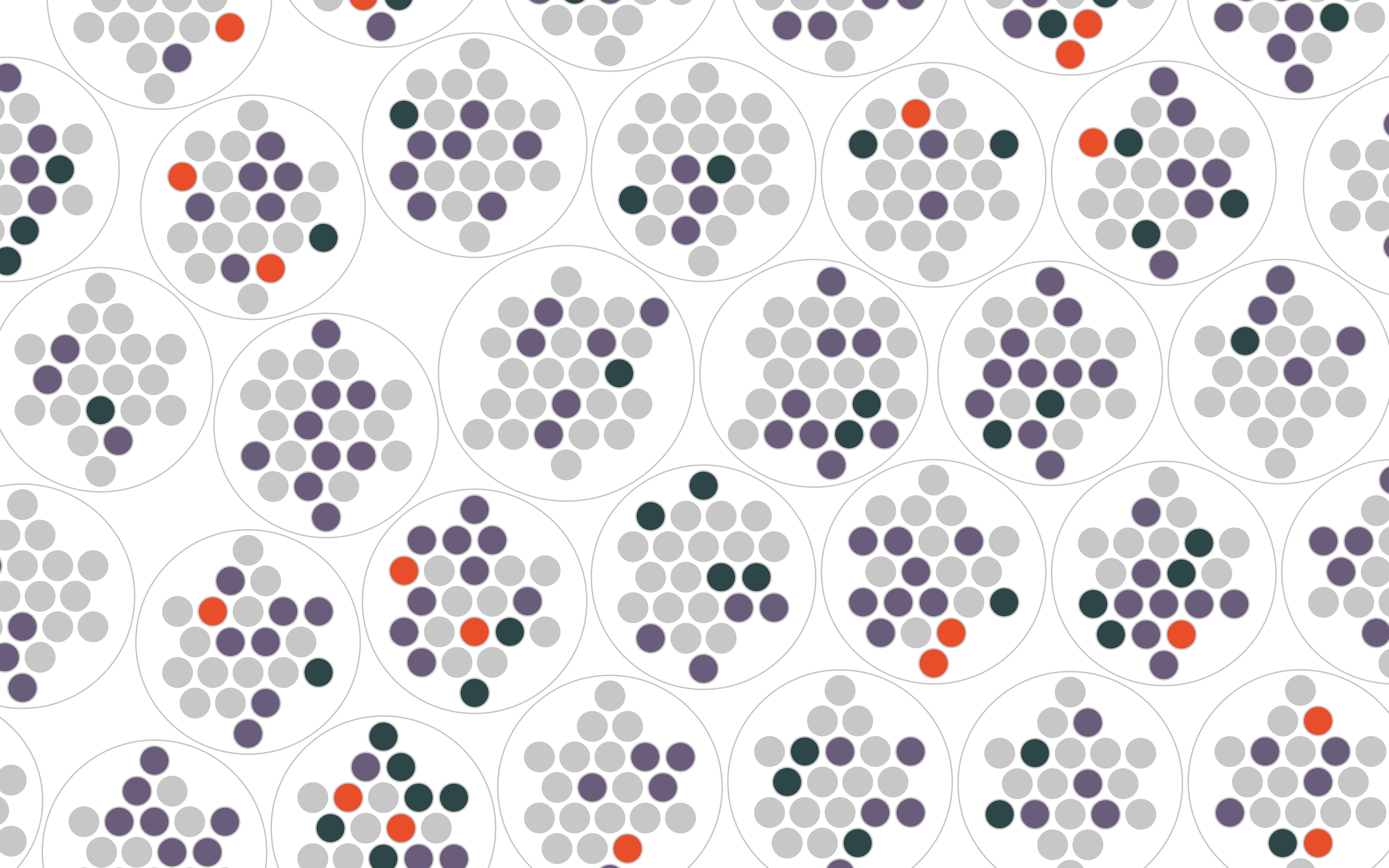
With the help of Observable Notebooks, I was able to fork @jonassonzhang’s notebook in order to create some packed circles of my own. Each circle represented an SNL season, with the circles inside being each host. I opted for colors that highlighted that SNL has only recently begun to meaningfully incorporate women of color as hosts.

I was able to get the notebook in good enough shape to export it as an SVG and bring it into Illustrator to play around with the layout.
Looking back, this was the hardest part because I wanted the visualization to be able to live alone. Normally, when I create viz, it’s embedded within an article that helps explain to readers what it’s showing.
Julia recommended playing around with the packed circles in a grid type format.

Finally, I came up with a layout that worked for me. I eventually wanted this piece to live in my portfolio so I used ai2html to create a mobile and desktop version, which you can see here.
The feedback
I was so excited to share a non-work data visualization with the world, I went to Twitter to post the final product:

I was surprised by all the feedback I received on Twitter, and thankful that people were enjoying it. There were a few comments regarding the accessibility of the visualization that made me step back and rethink my process. I had not tested for color-blindness, even though I had made sure to include alt-text descriptions (using Amy Cesal’s very helpful Nightingale tutorial). As a result, color blind audiences couldn’t see the differences in the reds, greens and purples.
For a few days I kicked myself for not doing the simple task of checking for color blindness. I had spent so much time trying to pick colors that were not like the ones I use in my day-to-day work, but it’s no wonder why newsrooms have designated color palettes.

With the new colors, the final project looked like this:

I am really glad people spoke up about the accessibility of my visualization. I brought the feedback to Julia and she assured me that it would be a good idea to update the colors, even though the visualization was already online, and sent a set that was already deemed color blind safe on ColorBrewer (pictured above).
I found it really difficult to find colors that would fit the scheme I already had but were still accessible. It was overwhelming that different color blindness simulators were showing me different results, which were hard to trust and make sure everyone could understand the visualization.
“That’s sort of the thing with a11y work as you get into it, you are considering such a wide array of experiences, some of which can be contradictory!” Julia said in a Slack message, using the shorthand ‘a11y’ for ‘accessibility’. “And that can make it feel like, ‘there’s no way I can nail this, so why try at all.'”
She said in her experience, it’s not about getting it 100 percent right for everyone every time, it’s about finding new ways to push your work to include some more people each and every time.
Prior to this program, I was relying so much on my newsroom’s color palette and forgot to think twice about my own color choices and the impact they could have on others.
Now, I make it an active point to use Spectrum, a Google Chrome extension, to check my work online. As well as other tools like Sim Daltonism when I am working in Illustrator. ColorBrewer is also a great resource for choosing ready-made color-blind friendly palettes.

Taylor Johnston
Taylor Johnston is an interactive graphics reporter with Hearst Connecticut Media Group. Previously, she was a graphics fellow at The New York Times. She has also worked for The Center for Public Integrity, The Dallas Morning News and Newsday. Taylor is from Cleveland, OH. A first-generation college student, she graduated from Ohio University with bachelor's degrees in journalism and interactive information design.
- Taylor Johnston


