
Reuters recently published a five-part special report that dives deep into how human destruction of wild areas is amplifying pandemic risk from bats. For the project, data reporters worked with specialists to develop an epidemiological simulation using disease dynamics, population size and density, regional commuting patterns, and worldwide airline traffic to understand how a contagion spill from the Amazon might prove catastrophic—a scenario scientists say could easily happen.
I had the opportunity to design and develop this visualisation for the story. Over a couple of months, I analysed and iterated on possible representations of the simulated data before settling on a globe-driven narrative. It took me quite some time to build and polish it using d3 (a data visualisation library for the web), a game rendering engine and some smart hacks!
The simulation dataset
The simulation, modelled by the data team using GleamViz – a simulator for epidemiological modelling, produced two simple datasets:
- Seedings—a list of source and target cities that the virus spread to from day 0 to day 180.
- Infections—cases estimated in every city and daily global totals.
If you are curious about how the data was generated by the simulation, you can read more about it here.

Understanding the data
Since the data included geographic coordinates, my first response was to load it up in QGIS–a geospatial analysis tool– to see what the spread of the cities looked like. It was evident that there was quite an overlap of cities—the same city turned into a transmitter once it was infected with the virus.
What does the transmission look like?
I split the seedings into source and destination datasets and ran them through the hub-spoke algorithm in QGIS to generate virus “flight paths.” Animating those paths with the QGIS Temporal Controller tool gave me an overview of what was happening over a period of 180 days.


Now that I had an overview of the data, I wanted to delve into the numbers for insights into the dynamics of the hypothetical spread. I loaded it up in an Observable Notebook—my tool of choice for data analysis beyond Microsoft Excel. I can use javascript array functions or d3-array methods to quickly transform and understand the data and then visualise insights using the Plot library.
The result, shown below, was a connected dot plot that served as a timeline for the spread. Each dot represents a city, and is coloured by country. The y-axis is the time scale—the number of days since the original outbreak. (Note that the lower values on the y-axis are early days, so the only dots are in grey, the colour of Brazil.) The x-axis is the number ID assigned to the cities for easy mapping of source and targets.

When do most seedings occur around the world?
The data showed that the outbreak starts in South America and spreads first to North America before moving to Europe, Asia, and Africa. Transmissions peak after about three months of circulation.

What do infection trends look like?
The spread of new cases follows an exponential trend as expected from a viral outbreak.

Ideating the narrative and the visuals
The primary aspect of the data was how the virus spreads over time and space. By focusing on these variables in the data, I drafted an outline, as follows:
- The virus started from Altamira, Brazil and got transmitted locally
- The virus broke free and moved to the US
- Eventually, it spread to Europe and Asia
- Cities emerged as viral hotspots
- Nearly the entire world is affected by the hypothetical pandemic
Secondary research
I looked at visualisations from Gleamviz and other sources for inspiration around epidemic visualisation. I found many geo-visualisations or network diagrams that show viral propagation.

Visual explorations and prototyping
I plotted the seedings using a d3-graph on Observable. One thing this graph doesn’t show is geography, which makes it hard to demonstrate some of the points in the narrative. It looks good though, as it visually resonates with the form of a virus.


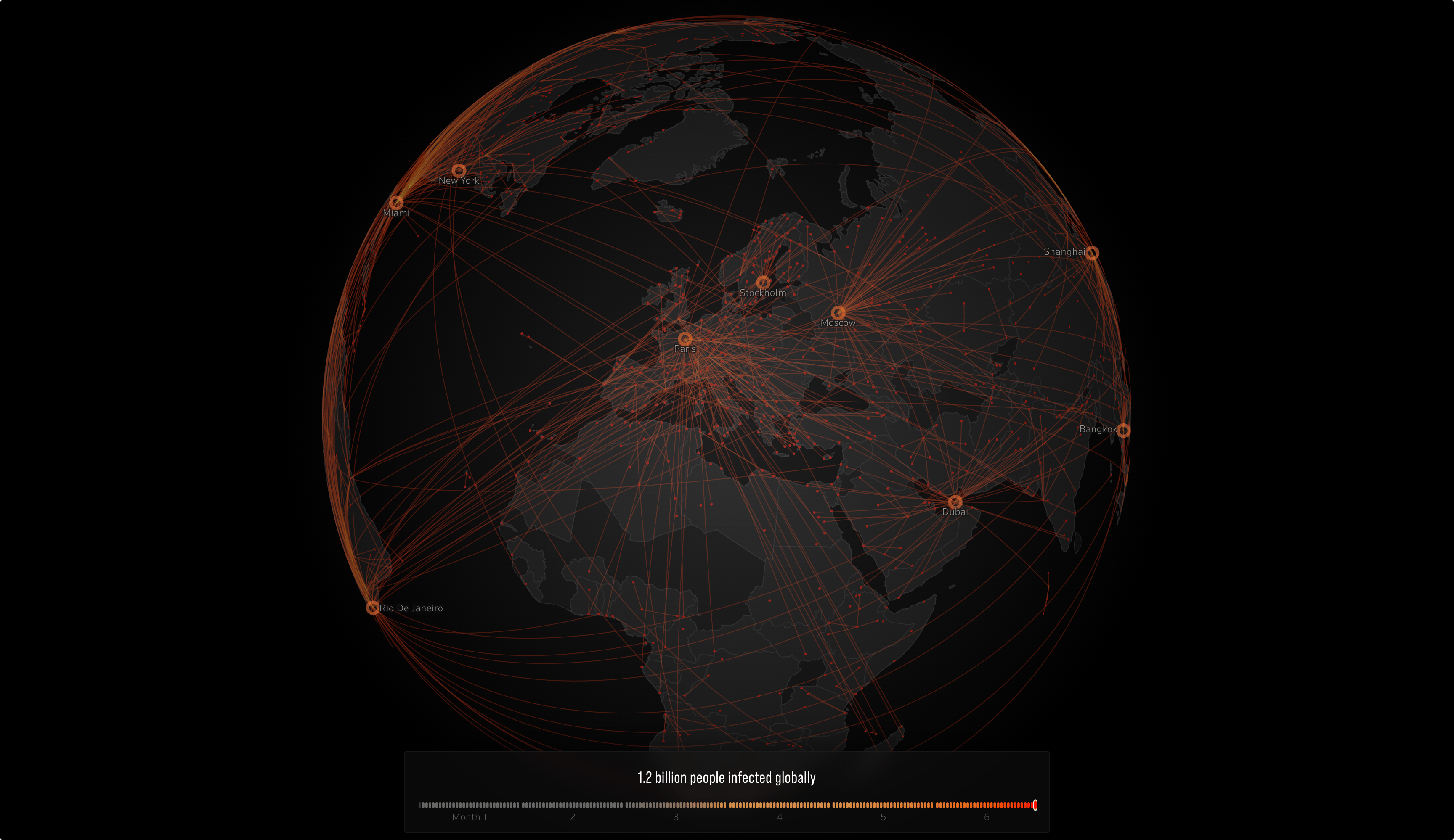
The seedings and infections work best on a globe projection because it’s familiar and can be simple yet impactful to drive the story when combined with animation and narration.

Building the globe-viz
I began building the visualisation as a standalone chart module so that I don’t have to worry about other page architecture. The first draft was easy to build from the prototype using D3.js and HTML Canvas.
With the basemap ready, I mapped the narrative outline to the features which I would need to build into the globe. This was an important step because this helped me figure out the development techniques and identify associated bottlenecks. Here were the key outline points for features of the globe:
- More than 2,000 animated lines to show seedings between cities
- Differentiated lines for local and international transmission
- Lofted flight paths for the visual effect of transmission.
- Pulsing beacons to show spread hubs and hotspots.
- Symbols vis for infections at cities.
- Text labels and interactivity for infections data.
- Globe design effects for countries and 3D aesthetic.
- Interactive features of the globe like fly to a location, spin, drag and zoom.
Making the globe “three-dimensional”
Since I was using the d3 library for drawing the globe, all I had to start was a 2D circle. However, as I was mocking up ideas, I took inspiration from illustrators–how things are made to appear 3D simply by playing with light and shade. Thus, it was just a matter of overlaying the globe with light and shadows appropriately to add depth!

Rendering the globe
As soon as I added all the seeding lines, the globe would barely zoom or rotate because a 2D HTML canvas fails to handle the render smoothly. Chrome’s FPS inspector showed the render speed drop below 10 FPS.
This was a critical point because I would have to decide how to implement the viz without having to learn a whole new 3D technology (like three.js, a 3D library for javascript) in a short time. Also, using D3 for the geometry calculations was already in my skillset and I didn’t want to test new territory without fully understanding if things would work better. As I narrowed down the cause of the issue to rendering, I started looking for ways to render my 2D composition using WebGL (a javascript API for rendering high-performance 3D graphics in the browser).
I tried P5.js (a javascript library for creative coding) but wasn’t able to get it to work with D3 paths and polygons. As I kept looking, I came across PIXI — a general-purpose fast 2D WebGL renderer, that supports WebGL.
The best part of PIXI is that it lets you compose your visuals using a scenegraph with native canvas-like contexts and renders it using WebGL. Imagine being able to draw whatever you want on multiple layers and then let the tech take care of displaying your beautiful composition–much like Photoshop or Illustrator!

Compositing a working prototype
Once I had locked in the tech aspects, I kept adding the features in a development prototype to demonstrate to my editors how different parts of the narration will eventually look. For the globe design, I chose a minimal grayscale basemap so that the blending modes applied to the lines and circles appear prominent in the visual hierarchy.
Designing for the story
As the story developed, I got a clearer idea of where the visualisation would fit in. The art direction was consolidated across all parts of the series as we started designing illustrations and other animations. The biggest change was the decision to switch to dark mode, so I had to rethink the colours and the highlighting techniques in my visualisation. We decided to do this page in grayscale with a spot colour of red.

After a few rounds of exploration, I realised that some features needed a bit more editing. For instance, I added the dots to denote cities and animated them with the lines. Also, since the visualised virus spread is a simulation and doesn’t represent actual data, we decided to pull back on the exploratory bits and focus more on solidifying and sharpening the narration.
The final narrative was compiled using our SvelteJS rig as a scrollytelling experience. As the project neared completion and we tested the visualisation on multiple devices, I optimised the geometry calculations and rendering to not spook the laptop cooling fans.
Despite having worked on many data projects over the years, it’s always a challenge because every project is unique in its own way. Besides a solid revision of high school geometry, one of my takeaways from this project was that it’s important to believe that you can tell a compelling story with the tools you already have, without being overwhelmed by the technicalities.
If you liked this story, do check out my blog where I talk about my side projects and design insights. Feel free to reach out if you have any questions!
Special thanks to Jake Spring, Grant Smith, Ryan McNeill, Allison Martell, Adolfo Arranz and Prasanta Kumar Dutta, who collaborated on this Reuters Investigates project.

Prasanta Kumar Dutta
Prasanta Kumar Dutta is an information experience designer from India, working at the intersection of design, coding, and journalism at Reuters. With a background in engineering and design, he crafts data-driven pieces that help narrate important stories visually. Several of his work has been recognized with numerous awards. He also teaches and talks about data visualization, narrative cartography, and design at eminent institutes across India.
- Prasanta Kumar Dutta


