
The digital edition of Iconographic Encyclopædia was a year-long project to breathe new life into an antique. In recent years, I’ve undertaken several of these projects but this digital edition was by far the longest, largest, and required the most commitment to complete.
A brief history
In 1844, German publisher Johann Georg Heck started compiling his illustrated encyclopedia. It contained 500 engraved steel plates with more than 13,000 illustrations covering a wide range of subjects from astronomy to zoology. He published it between 1849 and 1851 as a 10-part collection titled Bilder-Atlas zum Conversations-Lexicon. Ikonographische Encyklopädie der Wissenschaften und Künste. It was released as a supplement to Brockhaus Enzyklopädie, a German encyclopedia. Accompanying these plates was more than a million words of descriptions that described most of the illustrations. Between 1851 and 1852, it was translated to English as Iconographic Encyclopædia of Science, Literature, and Art and edited by Spencer Fullerton Baird, who would later become the first curator of the Smithsonian Institution. A third edition was released in 1979 with remastered plates printed with fine-line offset lithography, but without the original descriptions to provide context.


New data from an old source
In late 2020, the English edition caught my eye—partly because of its beautiful illustrations–but also because I thought the text and illustrations would be fascinating to visualize. Sprinkled throughout the four volumes of descriptions in the English edition were thousands of references to figures on the accompanying plate (e.g., “fig. 5” or “pl. 3, fig. 45–47”). From the beginning, I wanted to collect data about these to create something no one had seen before.


Throughout the process of designing the site and restoring illustrations, I collected a great deal of data about Iconographic Encyclopædia such as figure count, where figures appeared, frequency, which plates were referenced, word count, averages, and more. As the dataset grew, I experimented with many different ideas for minimalistic data art based on them but felt that only six made the cut, which I released as data art posters.
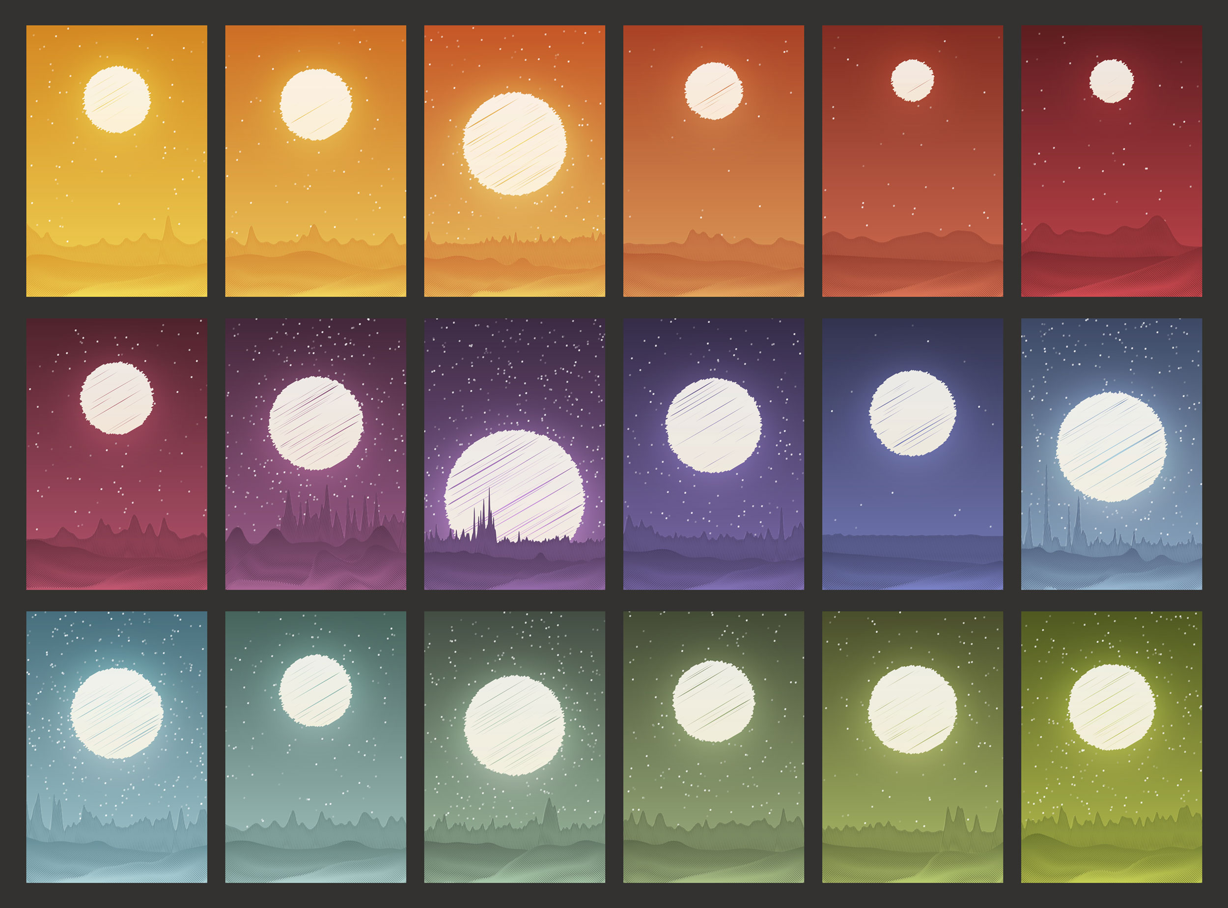
Of the six, two turned out to be my favorite—both in making them and the end results. The more intriguing of the two was a series of landscapes that I called Worlds. Worlds was an experiment like I had never tried before. I was inspired by a lot of generative art I’ve seen in recent years. I wanted to try my hand at it by creating a landscape based entirely on data from the encyclopedia.
The hills and mountains were essentially histograms of where figures occur in each subject. To add a sense of depth, I created multiple histograms layered on top of each other—each focusing on different views of the same data. The farthest was the entire range of a subject, the middle was a magnified middle portion, and the closest was an earlier portion angled slightly. The stars were based on the total number of figures referenced in the text and randomly positioned. The total number of stars was only a quarter of how many figures there were in a subject. Finally, the moon’s size and position was based on the number of characters in the description (more characters = higher and smaller). The base images were created in NodeBox after a lot of trial and error (including crashing the app more than once) and were heavily enhanced in Illustrator with additional effects for a more polished, finished product. As a final touch, all the shapes were made to look sketched as a subtle nod to the way the original engravings appeared. The result was a collection of landscapes that represented “worlds” of information driven by the data extracted from each subject.


Path was a piece was a different take on a tried-and-true method: the random walk. I’ve long been a fan of random walks, but driven by real data instead of random numbers. For this project, I thought it would be interesting to use figure data to plot a path through the subjects. The algorithm was fairly simple:
- Start at a point and draw a straight line, with the length based on the number of HTML characters between the start of the first subject and the first reference to a figure in the text (more characters between references = longer lines).
- Starting at the end point of the previous line, turn 90° clockwise if the next reference to a figure is in the same plate as the previous or counterclockwise if the reference is in a different plate.
- Draw a new line equal to the number of characters between the previous reference and the next reference.
- Repeat steps two and three for references to all figures, color-coding lines based on subject.
- Turn 90 degrees counterclockwise between subjects.
Using this algorithm for each subject produced intriguing paths—each with their own identity–that even visually related to their subject in unexpected ways. Color-coding the paths by subject also created one large continuous path with thousands of twists and turns. All of these are hard to see at a glance so I added the ability to explore the path by zooming in. This piece excited me because I would regenerate the path after each subject and never knew how it was going to turn out. I also had no idea how it would look until the entire project was complete.


I thoroughly enjoyed working on all the data art pieces for this project. I tried many others and may add more in the future because I feel there is still a lot of potential to be explored. However, there comes a point where one needs to mark it as “done” and share it with the world.
For more information, explore Iconographic Encyclopædia, its art gallery, or the blog post about how it was made.

Nicholas is a web designer and data artist. He has been building websites, data visualizations, and creating data art for more than 20 years. He creates and sells artwork based on data on a variety of topics like science, music, literature, transit, and more. His work has been featured in publications and museums around the world.
- Nicholas Rougeux


