
Discussing the charts in the Book Series ‘America & Britain’
There’s much to be told in the story of the Isotype, yet despite a great deal of academic writing, it is also common to be confused about what an Isotype chart actually is. What better way to learn more about Isotype and gain inspiration from their designs than to view and discuss the work itself?

The International System Of Typographic Picture Education (ISOTYPE) was invented by Otto Neurath in collaboration his wife Marie Neurath and Gerd Arntz. While assisted by many, this core Isotype team sought to create educational designs by bringing statistics alive through a visual language of modular pictograms. In 1925, Otto founded a museum in Vienna for educating the public on social and economic issues (Gesellschafts- und Wirtschaftsmuseum) with the motto: “It is better to remember simplified images than to forget exact figures.” After fleeing Europe as WW2 unfolded, the couple co-founded the Isotype Institute in Britain in 1942.
This article, the second in my series on Isotype (here’s part 1), seeks to explain and celebrate the work of the Isotype Institute while revealing the process and design concepts used to create it. By focusing on the books published by Adprint in from 1941–48, I want to explore the techniques and mindset behind each chart and the system behind the combined series in order to inspire new information design concepts today.
The Second lesson of Isotype: Multiple data types in a single chart
Some Isotype charts present a single data story but many of them are folding in multiple types or categories of data to create it. An obvious example can be seen both as a color change in a row of the same icon or as different rows of different icons. A definitive “rule” was not set by the team but rather becomes one of a set of approaches which are then tested with the audience for understandability.
This simple feat of calculation and grouping of the data is deceptively difficult and the Isotype Institute found many ways to incorporate various types of data in a single chart. Let’s explore this more as we look at how the Isotype Institute combined different data types in the 16 charts and maps in our next book.
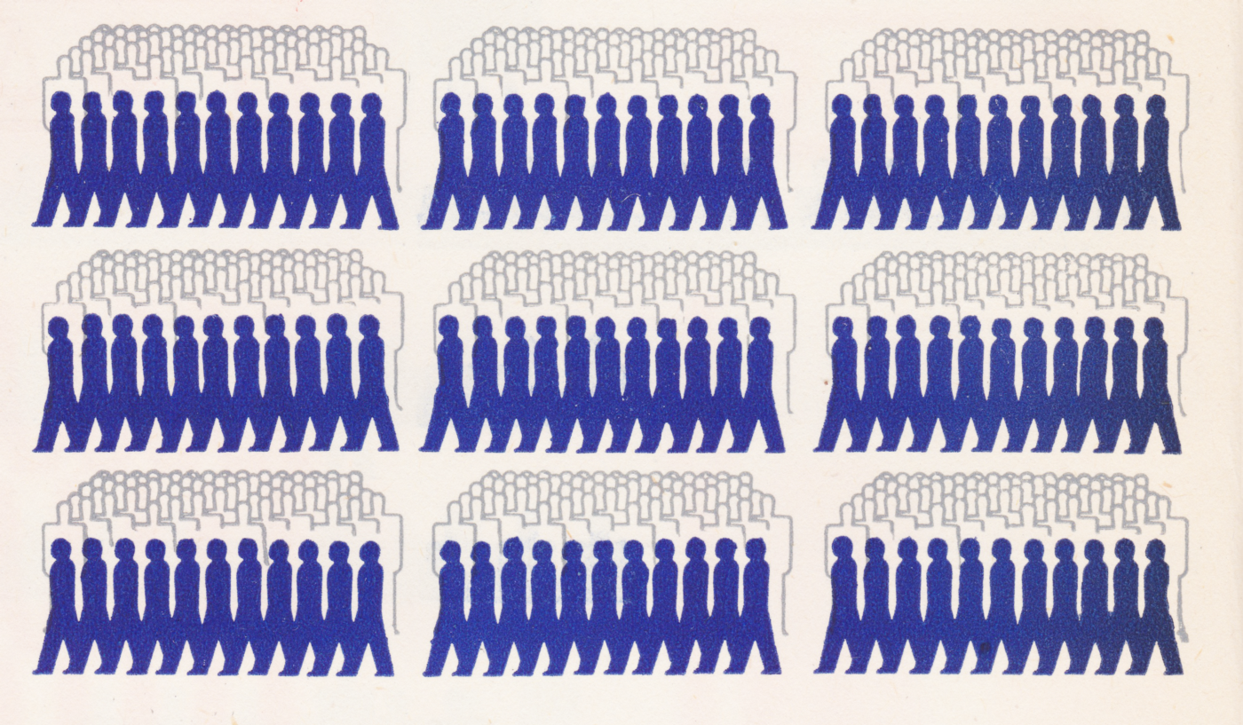
Our Private Lives, 1944
Images from Chris Mullen’s Fulltable, Ebay, and authors copy.


This book was written by Lella Secor Florence, an American who also wrote the first book in the series. It was released the same year as the last book in the series, Our Two Democracies At Work.
After comparing the geographic and infrastructural similarities of the two countries in Only an Ocean In Between, the charts in this book largely continue the story by examining the culture and people, as well as explaining some of the educational structures. Considering the charts in this book as part of the larger series shows how the Isotype Institute created a system for presenting economic data.

Like alpha and omega, the Isotype Institute starts this book with births and deaths. We see contrasting pictograms representing a ratio for societal growth for the US, Britain, France, and Germany for 1938. The fastest birth rates are in the US and Germany while pre-war France has more deaths than births. Displaying the population at the top of the chart gives some idea to how each rate might compare.
This chart is fairly straightforward, but the calculation might not be. We see two categories of data (births, and deaths) for four countries. The icon sets are not mixed, only directly compared in a layout that is reminiscent of a horizontal bar chart. Their colors are bold (red and black) which causes the red (births) to be more in focus. However, the text at the bottom of the chart cautions the reader from making too many assumptions.

“Marriage and Divorce” is another chart that compares two types of data on the same four countries. The text at the bottom tells us the red circle with a line represents a “broken ring” for a divorce. The sheer quantity of US divorces in 1935 is well beyond any comparison with the other three while Great Britain hardly has any at all due to restrictive divorce laws that didn’t change until 1969.
Grouping the icons into 10,000 inhabitants help to make comparisons between the same four countries that we see in the chart above. The summing here is a bit tricky and the populations feel a bit vague. The relatively similar quantity of “married people” doesn’t fit with our mental picture of the total populations of the four countries and the ratios for married to divorced seem to be on a 1:10 scale. That said, the proportional relationship of the design presents an easy-to-read story comparing the married to the divorced.

The Isotype Institute regularly created maps that compared the population density of major urban centers over time. These two maps, which were presented on different pages in the book, show not only how each city has grown but how wildly different their urban development evolved. The use of a simplified road map and basic colors easily shows the difference in a century. The use of bright red to denote the population makes it clear how each city has grown.

The text at the bottom points out the lack of structure in London’s urban planning. This would have been an interesting and popular subject in 1943, as the British were still reeling from the German Blitz of 1940–41. Patrick Abercrombie and J.H. Forshaw’s County of London Plan, also released in 1943 (my article on that here), were challenging British conventions by bringing a sweeping redesign of London’s urban, industrial, and transportation infrastructure.
Like other charts in the series, this isn’t the first time the Isotype Institute created this type of map by reducing features and abstracting the map for easier understanding. A similar version was crafted for the loose-leaf Gesellschafts- und Wirtschafts publication of 1932. As you can see above, that map focused less on urban development and more on the radical growth of the population over time. For the map in Our Private Lives, the Neurath’s effectively recreated the center and left panels without the icons showing the population increase.

“Urbanization of the Population” shows the ratio of urban and rural populations over a period of 80 years. The icon units depict the growth and the label explains the red icon’s unit of measure. We intrinsically understand the green population to be rural and the proximity of the red icons to the city reinforces this. This Isotype chart easily emphasizes the difference between urban and rural populations. The audience doesn’t need to fully understand the numbers to understand the comparative trends visible for each country. Doing the math is certainly possible, but the design doesn’t make it necessary.

The city illustrations on the left of the populations give us some understanding of how both areas have developed over time. After looking at this chart, artist Georges Hattab pointed out the nuance of the illustration, noting the modernization on the outskirts of both city diagrams in the design.
One of the principal differences between Isotype charts and pictograms can be their usage of alignment and grouping to aid in communication. By organizing the icons as diverging from a central axis, it shows the whole population as well the corresponding trend for each data type.
Over the years, the Neurath’s experimented with various labels and graphical elements to explain exactly what the data represents. In this chart, they have reduced the design to the bare essence, with only the title, colors, and design telling the story without any real labels at all.

An unusual map in that it combines the US and British on the same page, “Sex Distribution in 1930” breaks the US map into five regions, and a single view for Britain. Each clustered icon of red and blue people equals 5 million, with the additional blue (male) or red (female) icons representing a surplus in the gender for that region.
By summing the groups in this way, the outliers are emphasized, and the story is made clear. In Britain, there are far more women than men, and in the American west was far more male in 1930. The single sentence on the lower left side, “The farther west, the more men compared to women” applies to both maps and puts both maps into a sort of spectrum of gender surplus from east (female) to west (male).

Otto Neurath was an educator, so he understood how vital education was essential to the character of its culture. “The Young Population ages 13–20” is a visual index of children in school and in the workforce. Each page is identically designed but the difference between them is stark.
Children in Britain go to work far earlier than American children. It’s easy to understand the seated blue icons represent those in school, grey as “others” (the text suggests they are in college, a rarity at the time) while the red icons march off to work. The chart shows how few British children continue formal education after 15 and the text at the bottom points out “Less than 10% continue education after 17.”
While I have been writing primarily on the design of the charts, of equal importance is the design of the icons themselves, and this chart presents three icons that are very different in how they are read. Notice, how variations on the icon of a generic person have different meanings: seated, standing, and moving. Our natural visual intelligence reads so much into each: the seated, stable blue icon, the standing transitional grey, and the red, armless child walking away from the school. Designer and artist Gerd Arntz took great care in adding subtle details to each icon to communicate the nuance of a story without being too explicit. Each section is then aligned under additional icons representing ‘school’ on the left, and a box on the right for ‘occupation’ such as agriculture, manufacturing, and justice.

This Isotype chart acts as a follow-up story to the preceding chart by exploring the grey figures representing the “other”. In this chart, each blue figure represents 1% of a million citizens attending a University. Each mass of hollowed-out figures becomes a background population, arranged as a sort of unit comparison and silent majority fading into the background. The student icons are now active, marching off to study at the university, their color inherited from the previous chart as the blue for ‘at school.’
Like in other charts from this book series, this design creates an easy-to-compare story by summing and organizing the populations into rows of equal groups. Since the Neurath’s had already understood a general 1:3 ratio between the populations of the two countries (as discussed in “Population and Livestock”), they continue to use this design to show the relative difference in student populations, not the difference in the total quantity.
Lastly, the placement of the students and population icons conveys a very different meaning than our previous charts. By overlapping the students and group icons we read the chart as an integrated population. This meaningful detail reinforces the overall story as a cultural portrait and demonstrates how nuanced the relationship between the chart design and the overall message is.

The British employ far more private services than those in the US. By aligning the blue vs black under the explanatory icons, the point is clear. While the aggregation of commercial vs private is a bit all-encompassing, it’s an understandable division of labor, illustrated by the icons for white-collar (desk, coffee) and service industry (barber), vs maid and cook (vacuum, oven) on the right.
While the systematic nature of Isotype cleverly outlines data with an objective, Otto and Marie subtly position each chart to explain why the two cultures are similar or different. In illustrating the different educational expectations in the previous two charts, “Personal Services per 200 Population” suggests a reason for children leaving school to join the workforce is to become private servants. If we extend the story back to the chart “Sex Distribution in 1930”, we can assume many of these domestic servants are likely women due to the gender surplus. The associations and connections created across charts are essential to the educational concepts of the Isotype charts as a series.

Now the Neurath’s pivot to something a bit more fun. This map shows a scattering of natural and historic amusements. While a bit spare, it is designed to back up the claim that America is a very big place, and getting to the fun parts might take some time. Compared to the British map on the following page, we see the benefit of the smaller, older country, with more historical points of interest.
The focus of the American map is certainly a snapshot of a different time, with steamers bound for Europe and Hawaii, and trains to the bull-fights in Mexico or up to the Canadian mountains. Calling out ‘Dude’ Ranches was likely building off their popularization via the western adventures of Theodore Roosevelt.


LEFT: Challenger Inn (now the Sun Valley Inn) was a fashionable skiing destination (source) | RIGHT: Hemingway sits with two unidentified men, circa 1960 (Copyright John Bryson, source.)
Likewise, Sun Valley in Idaho was known as a popular skiing destination at the time. Centered around the picturesque Challenger Inn, Sun Valley was developed by the chairman of the Union Pacific Railroad in collaboration with Austrian Sportsman, Count Felix von Schaffgotsch. In 1939, Ernest Hemingway completed For Whom the Bell Tolls while staying there, regularly hobnobbing with Hollywood celebrities, musicians and public personalities.
Of note in the design is the use of the grey pattern-fill to define the shape of each country and indicate water. From a design standpoint, it’s a subtle way to fill space with information but not overwhelm the overall image using the Gestalt principle of closure.

England, by contrast, is relatively small and its historic and natural amusements easier to reach by its citizens. Of course, the Neurath’s were likely biased in favor of the country that adopted them after their escape from the war. The detail highlighting the Isle of Mann is interesting, considering the time both Otto and Marie spent in an internment camp there only two years before the publishing of this book.
It’s a charming map and well-considered too. It includes the ‘industrial tourism’ of the Cadbury chocolate factories in Bournville as well as the Welsh cultural festivals known as the Eisteddfod, and the worldwide home of golf at St Andrews, Scotland.

After looking at the two countries at play, the Isotype Institute now turns to transportation and communication. Despite the Great Depression in the US, Americans still owned far more cars and telephones than Britain and the Europeans in 1937. Radio sets were surprisingly plentiful in all four countries. Building off the pattern established by the first chart in this book Births and Deaths … the above chart uses a design pattern we are already used to as readers. We understand the small sample size and relative ratios for technology that represents transportation, communication, and information.

Here we see this comparison between the two countries’ national holidays. While the Americans celebrate more historical (red) and federal (green) holidays, the British observe more Christian (church bell) and sports holidays. The spelling of “Hallow-e’en” would have been archaic at the time.
As a design, it’s not my favorite, ultimately resorting to a table with a lot of duplication that we don’t find in other Isotype charts. If anything, this is an example of just how minimal and elegant other Isotype charts can be in comparison.

An oddly laid out Isotype, we see diverging icons for tea vs coffee with the center ‘gutter’ used to alight the two. Strangely breaking the system used in other Isotype charts, Switzerland and Italy are included as European allies in coffee instead of the previously used Germans and French. The Swiss dairy industry lives up to its reputation by outpacing even the Americans in the bottom diagram.
The layout shows one diverging isotype at the top of the page, and a simple pictogram at the bottom doesn’t really sit correctly on the page. The lack of an overall title, as well as the basic icons and text trailing over on the right page all play a role in making this chart feel a bit off. It’s possible there were additional circumstances that affected the design, but they remain unknown.


While it feels like the second time we’ve seen this chart, it’s actually a different metric. Not the “Population and Live Stock” that we saw in “Only an Ocean In Between,” this chart shows the meat actually consumed. Our old friends Germany and France are back again: Germany with the most pork consumption and the Brits with the most Mutton chops as well as the largest overall meat consumption.
In this chart, we have a single but complex idea. We see the same diverging design using the page fold (like the preceding chart) but unlike that chart, all cuts of meat are represented using the same icon with the data type/category mapped to color. The data for the three types of meat, in four countries, is designed to tell the story of British meat consumption.

“The Cinemas and Their Weekly Audience” reinforces the love affair with the cinema shared by both countries. While the US has more theaters, the average theater in Britain is larger. Both countries would have a sizable cinematic culture at the time, with hearty theatrical, news and industrial film production in each.

Also interesting is the inclusion of Mickey Mouse on the silver screen as Otto Neurath was a devoted fan of Walt Disney. In fact, Otto’s team in Vienna had already been experimenting with animation since at least 1929 but had actively focused on producing animated Isotypes with director Paul Rotha for the British Ministry Of Information with the film “A few Ounces A Day” since 1941. The general popularity of the cinema and the possibilities for storytelling via animated Isotype charts was extremely interesting to Otto. The Isotype Institute collaborated with Rotha on several films with an eye on establishing an animation studio until Otto’s sudden death at the end of 1945. Marie Neurath continued to work on film and animation projects for the rest of her career eventually collaborating with Peter Bradford on “The Physics and Chemistry of Water” which won the best documentary/educational film at the Venice film festival in 1965.
Neurath was convinced that the future of Isotype was film and movement. He explains in a letter to Rotha in 1942, “The point is not (for us) to make new inventions for fun only, or as an expression of an author’s ideas (we admire this kind of work very much indeed) but as part of education.”
Up next: Diagramming Information
At this point, we have discussed 34 Isotype charts by examining their context, aggregation of qualitative and quantitative data, and how they integrate multiple types of data into a single chart. Next, in the last book of this series, we will explore how the Isotype Institute explained complex governmental processes by using systematic diagrams in “Our Two Democracies At Work”.
This article comes as part of a series on Isotype and derives mainly from research on the design process created by the team at the Isotype Institute, and the life and work of Marie Neurath. My goal is to teach people about the techniques and mindset of this data-driven design team, in order to inspire new information design concepts today.
Major thanks to Alyssa Bell, RJ Andrews, Georges Hattab, Paul Kahn, and Elijah Meeks for the editing and continued support!!

Jason Forrest is a data visualization designer and writer living in New York City. He is the director of the Data Visualization Lab for McKinsey and Company. In addition to being on the board of directors of the Data Visualization Society, he is also the editor-in-chief of Nightingale: The Journal of the Data Visualization Society. He writes about the intersection of culture and information design and is currently working on a book about pictorial statistics.
- Jason Forrest

- Jason Forrest

- Jason Forrest

- Jason Forrest


