
Tiziana Alocci, an award-winning information designer and lecturer based in London, recently launched a new data art series, Necessity. To learn more about the project, her inspiration, and her process, Nightingale went behind the scenes for an interview.
Claire Santoro for Nightingale: Let’s start with an introduction. What kind of information design projects do you typically work on?
Tiziana Alocci: I’m a freelance information designer and lecturer at the University of Arts London where I teach data visualisation. I specialise in visualising data for digital products: anything that has to do with interactive sites, dashboards, apps, you name it! But a large part of my work is dedicated to visualising qualitative data and making data art. Specifically, one thing I’ve been focusing on a lot recently is the transfiguration of sound into a visual format, obviously data-driven.
Initially, these sounds were songs and music tracks that I used for commissioned works: I’m collaborating with a Berlin-based record label to design 11 data-driven album covers for their vinyl records. Now, this research focuses on visualising sounds related to my life: voices, sighs, and breathing rhythm.
How did you get the idea for Necessity? What is the meaning of the series title, “Necessity”?
Necessity is a bit of a summary of how my brain works and how my work as an information designer is not just a job but a need for survival. I have an obsessive-compulsive disorder, and I found relief in taking note of events, specifically numbers, lists, etc… Unconsciously, I translated this impulse into my work and gave it a positive meaning. The title of the collection refers to this. In this way, obsessive, disordered thoughts are given order as they are pushed into the work, with art becoming a lifeline and a necessity for survival.

Necessity is an incredibly personal – even intimate – project. Was it difficult to share it with the world?
It was tough. Many times I have been tempted to erase everything and never publish it. I am very private in my personal life and hardly let people into it. This project is a way to open up to the world and continue my personal growth to become the best version of myself. This project also led me to create artefacts of enormous emotional value, new photographs of moments that would otherwise be lost forever. This proved to be an extraordinarily therapeutic and constructive gesture for me.
What do you hope that people take away from these pieces when they see them?
I hope they can see and feel the emotions used to create these snapshots of meaning. But I hope they can also perceive these forms’ strength and visual tension, almost as if to hear their sound or melody. I like to think that I have finally found a way to express my emotions and create memories and snapshots from non-visual material. For me, it is another way of taking a photograph.

One of the pieces that I find most captivating is “The Photograph We Never Took.” I love your use of light and the intertwining circles, but I am particularly moved by the story behind it. Can you tell us about this piece and what it means to you?
This work is undoubtedly the most important work I’ve ever done; it has been something I have wanted to do for some time. However, until recently I didn’t have enough awareness and maturity to make it happen.
I don’t have many photographs of my dad and me—who passed away at the end of 2019—actually, I had only two. One of these, my favourite, I can’t find it anymore; it’s probably lost. I thought of many ways to reconstruct a photograph or a memory of us. While making Necessity, I thought that perhaps the best way to reconstruct our lost photograph was to create one. So I found the audio of an interview released by my dad, and I selected a clip of one of my public speeches.
Then the colours. My father loved the sea beyond measure; I cannot summarise his connection with the sea with words. I extracted the colours in both versions (the light and the dark one) from a photograph of the sea during the last vacation we took together. The dark colour represents the blue of the deep sea, the light one the sky on a sunny day. The visualisation of our voices – represented by the two interconnected circles – is united, crossed together in a kind of infinity sign.
The sense of completeness and peace every time I see this work hanging on the wall at home cannot be described. I am so grateful to do a job that allows me to reconstruct my memories through art.

Let’s talk a bit about the process of creating these pieces and your design thinking. For example, how did you collect the data? What design tools did you use?
The source material of each piece in the collection is audio recordings of my voice, breath, nocturnal movements, etc. I document every aspect of my day through notes, photos, sketches and audio recordings. It took years to transform this into something valuable and creative.
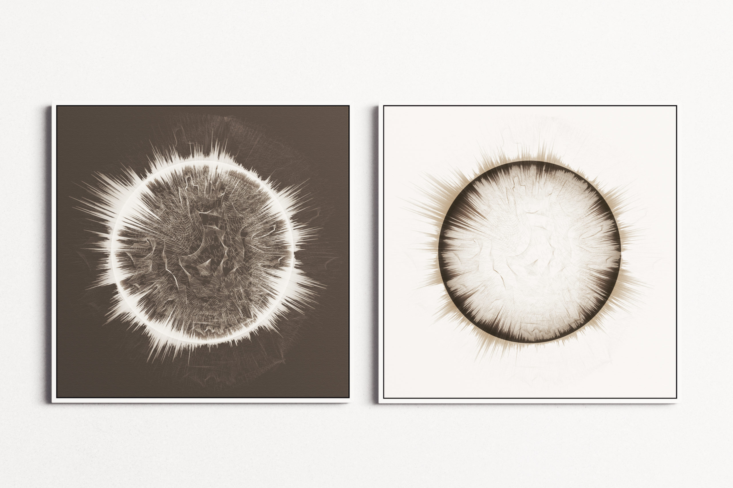
Once I collected audio material, I created the composition using audio manipulation software. Each piece is strictly characterised by a circular shape. This is a tribute to Kandinsky and his definition of the circle: “The circle is the synthesis of the greatest oppositions.”
I played a lot with transparencies, blurs, and colours to align with sounds and their emotions. Finally, I drew, mainly in Illustrator, and used Photoshop to finalise the images. The artwork was then printed in high quality on an extraordinarily tactile and textured paper to give the effect of a real and concrete sound.

Detail from Morphéus—Data visualisation of 6 hours, 46 minutes of the artist in slumber.
What was the most challenging aspect of creating Necessity for you? Do you have any insights or advice for others wanting to take on a personal data art project?
The most challenging part was publishing it. Mainly because it’s a very personal project that I wasn’t sure would be understood or received. I changed my mind a hundred times before I dared to publish it, but I’m glad I found the courage to do so. It was really healing. I’m a big advocate for personal projects; I always thought they were the right thing to do to grow professionally.
Check out the complete series at https://necessity.ink/.
- Tiziana Alocci


