
Creativity and inspiration can come from anywhere in life. For me over the past couple of weeks due to fracturing my right (drawing) arm, it has come from looking through some of the old books and magazines I have on my bookshelves. Amongst the data visualisation and art books, I have a couple of shelves devoted to nature and birdwatching books, many of them dating back to the turn of the century.
Walking and birdwatching is normally my way of relaxing, getting away from the laptop and clearing my mind. It is also my way of getting creative. Coming up with ideas and solutions for projects that I may be working on or for potential new graphics.

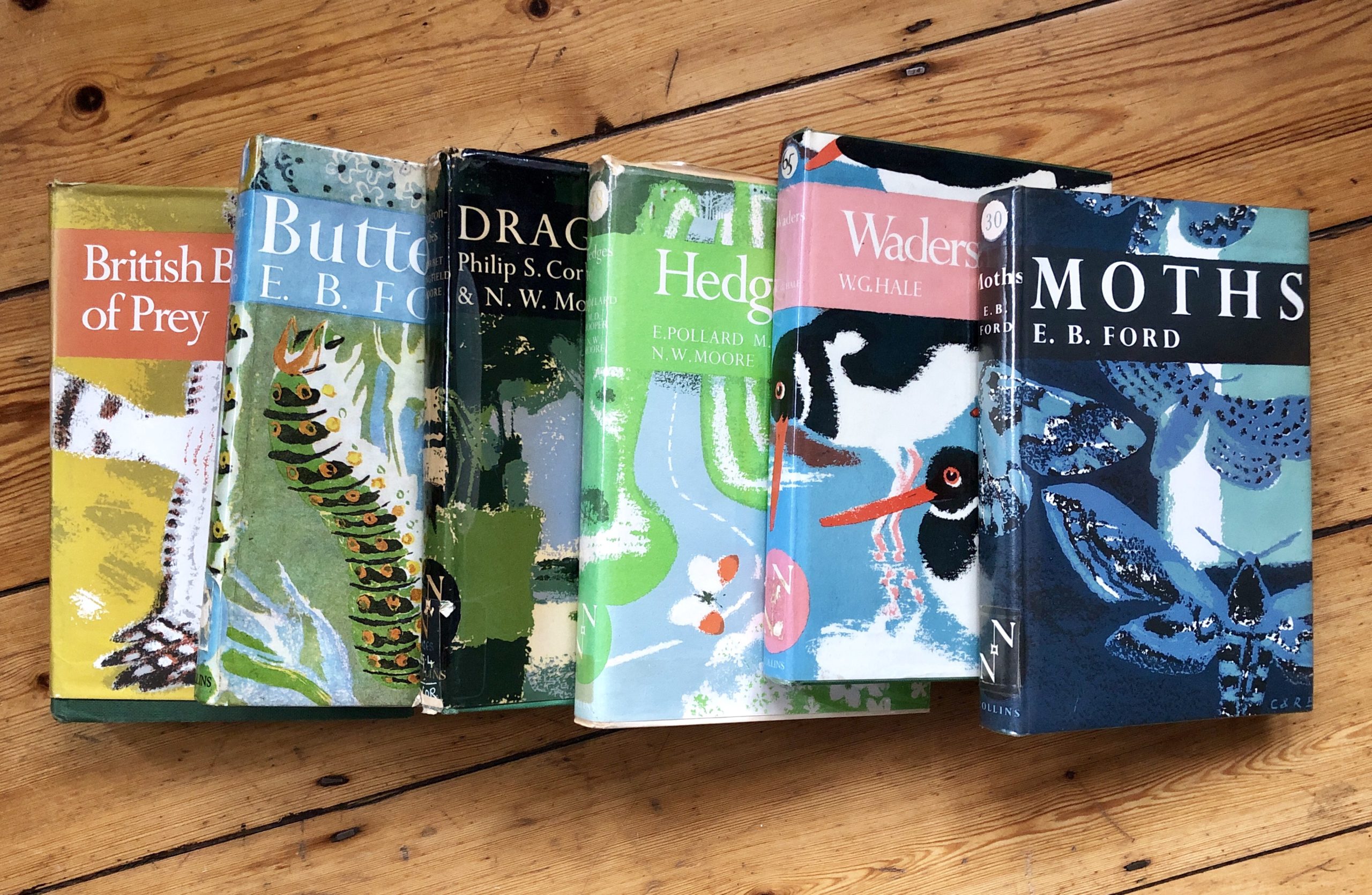
Looking through some of the books produced in the 60s and 70s, I came across some fantastic black and white hand-drawn graphics in the ‘New Naturalist’ series I have ranging from birds to moths to hedges. Each book contains a single subject and hence the scope of the graphics is limited to that. However, you can see that the expert in each case is really trying to share their knowledge with the reader in a visual and understandable way.The graphics range from simple small multiple distribution maps of the UK’s birds of prey (as seen above) to line charts showing egg thickness changes due to pesticide use. More complex graphics range from network charts through to illustrative drawings (anatomy of a dragonfly nymph — the stage of a dragonfly and damselfly that lives underwater).
Flicking through ‘Dragonfly’, a complex looking graphic stands out showing the activity pattern of a male dragonfly. It’s striking because of its shape. It looks like a pyramid drawn within concentric circles. An assortment of wavy lines and dots complete the graphic. Because of the complexity, the author has captioned the graphic with detailed ‘how to read the graphic’ text (something we should all think about when producing new, innovative or complex graphics).
When you take a closer look it’s actually a complex data visualisation based on a 24-hour clock. Showing time, position (is the dragonfly near water or away from water), activity (is it perched, cleaning or hunting) and reproductive behaviour (mating or fighting) all portrayed within the graphic. Very smart, and once you have read the caption, very clear! The more I look at this the more I admire it! All this is hand-drawn and only using black and white line work with various types of iconographic shapes.
Another from the series of books looks like a square pie or treemap type of graphic with pie charts overlaid! Sounds bad but have a look. Again it comes with a good graphic explanation. It is based on a 4-acre square field surrounded by hedges. The pie charts show the placements of traps used to catch field mice and bank voles at various times in the year. You can clearly see that, whatever time of the year, the mice can be caught everywhere, whereas the bank voles kept primarily to the hedges (edges). A clear, simple, useful black and white graphic.

In both of these examples, if done today, I would suggest a good headline and explanatory sub-text would be a useful addition, rather than the accepted caption at the bottom (something that scientific papers still need to think about). Narrative text plus pointers to areas of the graphic, but really, I think these are fantastic visuals that get the point across to the reader really well. Simple and effective. Paring back the graphic to what is needed without distraction…obviously helped by the use of only black and white and shading.
There are many more examples across the books that show the creativity needed using just back and white. You can see a couple below, all simply explaining with minimal distractions.


Inspiration and creativity can come from anywhere in life. It’s not just about looking at what is being produced now looking back at what was being produced last year, or 10 years ago (see my blog looking back at what I was producing 10 years ago http://nigelhawtin.com/10-years-ago) or even further back is so important. There have always been constraints, whether that was having to hand-draw things, lack of colour, knowledge or time.
For me, creativity and inspiration can come from the peace and solitude of walking in the countryside at 5am taking in all this world has to offer, looking through old books and magazines, traveling or finding something online that takes my interest.Look up, look down, look to the future, but don’t forget to look to the past as well — inspiration is all around us.

Information designer and visual communicator based in London, with over 30 years experience. Specialising in science, business and editorial information graphics and visualisations. I trained as a botanical and scientific illustrator and since then have been producing information graphics and visualizations. I was Graphics Editor at New Scientist for 20 years. I now run my own information design, training, and consultancy company.
- Nigel Hawtin


