
In the captivating world of workforce data visualisation, we often echo Da Vinci’s timeless wisdom: “Simplicity is the ultimate form of sophistication.” In this realm, the essence of clarity reigns supreme, often overshadowing the temptation of flashy visuals.
Imagine, if you will, an organisation navigating through the sea of data, striving to communicate effectively. The key? A design that’s as clear as a bell, ensuring insights are comprehended and accessible to all. Think of it like navigating a maze – the simpler the path, the quicker you reach the treasure.
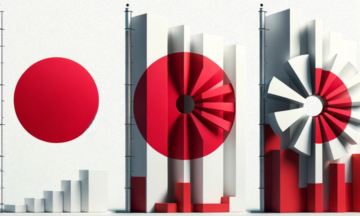
Now, let’s detour through the fascinating world of vexillology, where the Japanese flag often takes centre stage. It’s simple yet strikingly effective, much like a well-crafted chart. And while North Macedonia’s flag holds a special place in my heart, the Japanese flag’s simplicity and efficacy make it a stellar example.

Let’s delve into the parallels between the art of flag design and chart creation:
Simplicity and Recognisability: In vexillology, a flag must be simple and easily identifiable, even when fluttering high on a flagpole. This mirrors the need for simplicity in charts – data should be presented cleanly and clearly for immediate understanding.
Symbolism and Meaning: Flags are imbued with symbolism, each colour and symbol narrating a country’s identity and values. Similarly, meaningful symbols and colours in chart design can make data more relatable and understandable.
Colour Choice: Just as flags use colours to symbolically represent a nation, chart colours should be chosen with purpose. They should highlight key points or differentiate categories, aligning with corporate standards for instant recognition.
Clarity of Message: A flag’s purpose clearly conveys a nation’s identity and values. In chart design, this translates to presenting data that tells a story or conveys information effectively, focusing on critical messages like tracking new teacher hires.
Versatility: Flags must look good in various displays – on poles, draped or hung vertically. Charts, like flags, should be adaptable to different formats in print, digital displays, or presentations without losing clarity.
Aesthetics and Memorability: Resonant flags create a sense of national pride and identity. Visually appealing and memorable charts do the same for data, leaving a lasting impression and fostering trust and recognition of the information presented.
In both vexillology and data visualisation, the elegance lies in simplicity, the power in clarity, and the beauty in purposeful design. So, the next time you craft a chart or admire a flag, remember they’re more alike than you think!

Darren is a data-driven storyteller, transforming workforce strategy into positive business outcomes. His innovative approach to HR integrates technology by facilitating enterprise-wide workforce and performance analysis that generates impactful and data-rich narratives that inspire action.
- Darren Shearer

- Darren Shearer


