
Developing understanding through visualizing newborn data
Expecting parents are inundated with information about newborn health and all of the potential maladies that can befall them. One of the many categories to worry about is the baby’s postpartum weight gain. Parents are taught the baby will need to eat every two to three hours around the clock and that they should return to their birth weight after about two weeks lest they head down the path of acquiring the heart-wrenching label “failure to thrive.” To try and head off any concerning trajectories, parents are advised to meticulously track every feeding session whether nursing at the breast or with a bottle.
Cycles
Our son A was born February 26th, 2023 at 2:43 AM. One of his first experiences in life after filling his lungs with air was my partner Becca nursing him on her left side for 10 minutes. Even to our new-parent eyes, we could tell A was an “active” baby.
From that first day on, Becca would nurse A every two to three hours, and I would record the time and the feeding session duration or bottle amount on a clipboard. Each day was a churn of nursing, charting, and finding the time in between to fight the entropic state of our house. Each night we sat through late hour feedings, Becca coaxing our fitful baby to eat while I helped where I could and tried to share in the bleary-eyed routine. The clipboard chart filled with row after row of hand-written data.

As days turned to weeks, we spent many evenings standing exhausted in the kitchen straining to agree on the “strategy” for the next 24 hours. Wracking our sleep-deprived brains over the contours of the naps and nurses that happened earlier in the day (or was that yesterday?), we debated sleeping/feeding theories and strategies, our individual selective memories often retaining the details supporting our own narratives. The more exhaustion and “evidence” we accrued, the more entrenched we became in our respective realities. It would often feel like we were speaking across an experiential chasm, the specter of “failure to thrive” hanging over the gap, the clipboard with pages of detailed data sitting unconsulted on the end table in the other room.
Bloom
Despite the perpetual exhaustion, an underappreciated aspect of newborn care (at least to new parents) is how monotonous the daily work can be. Feeling a need to think about something other than surviving the next segment of the day, I started digitizing our hand-written notes and playing around with the data. My first pass at visualizing this data was inspired by the sense of sleeping and eating being completely detached from the normal rhythms of day and night. Nurses are represented through each smaller circle placed along the 24 hour ring of the day-night cycle.

Hardly intended for any sort of analysis, the inscrutable nature of the viz reflected A’s haphazard eating and sleeping schedule and the on-demand nature of newborns. By week three we were desperate for some regularity (and sleep). We started experimenting with different feeding cadences and a 2AM bottle that I would take on so Becca could get a few more hours of sleep.
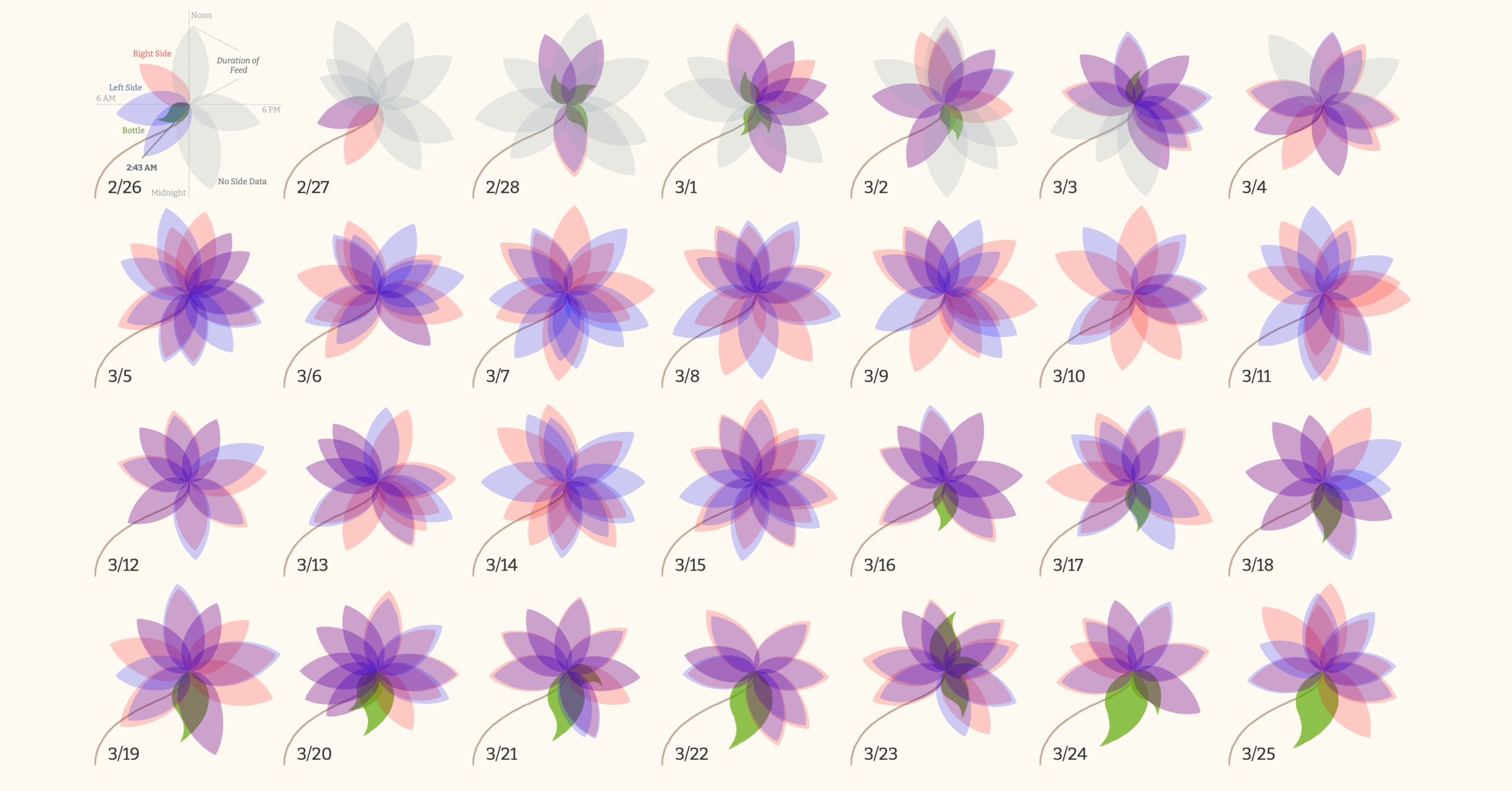
As we recorded more data, I started bringing my laptop to the late night nursing sessions, tinkering with different potential visual encodings. My second take on the data borrowed from the long lineage of flower visualizations. Each flower represents a day in the first 28 days of A’s life. The angle of the petals represent the time of day while the length of the petal represents how long he nursed or how much of a bottle he took. The color of the petal represents whether A nursed on the left or right side with purple being a result of nursing on both sides. The green leaves were bottles I’d fed A.

I was quite happy with the end product. I imagined hanging a poster version in A’s room, a colorful memento of his first month of life (and early exposure to data visualization!). I even used the visualization as part of my personal introduction while presenting at that year’s Tableau conference—my first nights away from home since A was born two months before—as a way to broadcast my new status as a proud dad. I printed out a large scale image of the viz and made plans to display it in A’s room.
But as excited I was about the viz and as much satisfaction I took from people enjoying the playful representation of that challenging first month, the viz didn’t elicit the same joy in Becca. Every one of those nurses—288 captured in the first 28 days—was a sometimes challenging, often painful, physical experience with our fussy baby. The 278 minutes a day she spent nursing every 24 hours—10.3 nurses of 27.2 minutes each or 4.6 hours—was time spent sitting in a chair, not being able to sleep or do much of anything else. The 25 bottles I’d fed A over that same time paled in comparison.
If nothing else, the flowers were a visualization of the breadth of the experiential chasm between us. The very process of the viz’s creation—me sitting on the bedside with my laptop as Becca nursed A in the rocking chair across the dark room, the screen illuminating my face as I concentrated on my creative outlet— highlighted the gulf as much as the data did. There I was, visualizing her data and flying off to proudly display my creation at a conference while she stayed up late, now alone, caring for our son.
My enthusiasm for the viz turned to guilt and I stashed the poster in my desk.
Growth
Our daughter L was born May 10th, 2025 at 5:20 AM. One of her first experiences in life after filling her lungs with air was Becca nursing her on her right side for 5 minutes. It didn’t take our now two years of parenting experience to quickly realize how much more of an “easy” baby L was compared to her older brother.
While we tracked L’s sleeping and feeding, our greater appreciation for the wide range of “normal” in babies (not to mention the immediacy of managing the day-to-day logistics of two young kids) meant the newborn developmental targets that loomed so large in A’s first few months faded to the background. Determined to make life easier for ourselves this time around, we used an app with a shared account across our phones to quickly input nursing/sleeping times which the app instantly visualized in dashboards. This asynchronous input was critical since, as Becca’s dad likes to say, one kid can run in one direction, two kids can run in three directions.
In this way, the app’s visualizations populated by our data helped knit our experience together and ensure we didn’t find ourselves looking across a reality gap like during A’s first few months. We each contributed to a single source of truth. That source of truth could be instantly consulted to refresh our tired memories. The data could be viewed in different ways—weekly vs. daily vs. aggregate analyses—to suit our different modes of thinking. In essence, the data provided us the daily calibration and validation of our individual experiences that we weren’t able to provide for each other the first time around. Standing in the kitchen each evening strategizing over the next 24 hours, we could look back on a shared reality and realign.
(To be clear, the “easy” baby factor cannot be overstated.)
As we settled into something of a sustainable equilibrium, my mind wandered back to what to do with the rich data we were collecting. Perhaps inspired by the forested parks we now regularly take A to, I revisited the 24 hour radial approach, this time aiming to replicate the rings of a tree. Each ring represents a day while the color of a given segment of a ring represents sleep time, nursing time, or awake time. The spacing between each ring has a set amount of “growth” but for any time that day that was taken by sleeping or nursing, there is 50% extra “growth”. Over time, these patterns of extra growth across the rings create L’s unique tree cross-cut shape.

Iteration
I don’t think it’s a coincidence I was drawn to natural motifs for this data. Organisms are a series of complementary and competing systems, all absorbing and adapting to the myriad inputs of their environments to produce their final shapes. I would offer that the entire practice of data visualization—the collection of data, its transformation into a useful signal, the resulting sense-making, and iteration through deepened understanding—parallels this natural drive to create meaning and growth from our encounters with uncertainty. Thriving means being able to process the unpredictable and grow from it.
My own sense-making frames the progression from a nebulous form to a field of flowers to a single sturdy tree as a reflection of Becca and my evolving understanding of the data. Eating and sleeping are, all at once, vital yet ordinary and repetitive events, the markers of our daily rhythms, and blips within the days, weeks, and years we layer one on top of another ultimately creating the shape of our lives. I can’t help but see in these visualizations a cautious embrace of a central tension of parenthood—making sense of day-to-day uncertainty against the scale of our children’s lifetimes.

Leonard Pierce
Leonard Pierce works with communities across the country helping them end homelessness through data-informed system improvement. He's passionate about advancing the role data plays in philanthropy and in solving complex social challenges. He's based in Portland, Oregon.


