
I’ve been wanting to dedicate more time to Data Art for a long time, but I’ve been thinking, planning, and preparing for a while without actually doing anything.
It was clear to me that Data Art could be approached from several angles: it could provide more creative practice for data-minded people, while also offering insight into working with data and tools for those in the art world. And pondering about these two opposing camps with different motives and skills kept me going in circles.
And one day, simply inspired by an article about the Data Garden community—where women learn to program with a focus on creating simple data art—I just posted in my channel and invited people to come together and start creating something based on data.
Surprisingly, several dozen people showed up, and I didn’t even have a plan. Some came from the data visualization field, others from illustration. So, after thinking for a few days, I started methodically posting materials on the theory and practice of data art, starting with the simplest exercises.
One of the training projects I decided to start with was creating a portrait of this small community—so-called data badges. They are quite popular in the data visualization field, often made at conferences, data visualization events, or communities.

The inspiration for this direction was probably the wonderful Giorgia Lupi and her well-known project Data Portraits (2017), but the roots of this idea may go back even further. Giorgia briefly describes this project as follows:
“For the Target space at TED 2017 in Vancouver, we developed and created unique visual portraits of participants: visual designs based on responses to simple but memorable questions, which we turned into wearable buttons to stimulate communication and connections throughout the five-day event.”

After the formation of the Data Visualization Society in 2018, they also introduced their own DVS Badges in 2019, which encoded the skills of the community members. There is an article about them on the old Medium account of Nightingale, and Amy Cesal writes about this initiative as follows:
“Every organization needs a logo. For a group of people specializing in data visualization, the logo for the society should reflect this passion.”

They were also inspired by Neil Richard’s badge project (2018), and Giorgia Lupi’s talking bouquets (2018), which used the concept of a group of elements encoding data of members of a certain group in a beautiful and unique way.

One of the recent projects by Kimley Scott also impressed me—it describes the community of MomsWhoViz, elegantly encoding data about them and creating round badges.

Deciding to do something similar, I started with copying and decided to replicate Kimley’s project for my local motherhood community. I slightly changed the questions, posted a Google form, and made the project in the same style, tweaking some elements. I used the same color palette as I’m not very confident with colors.

Working on the project was very interesting, and the girls in the community liked it. But it seemed to me that it was not entirely unique, but rather a copy of Kimley’s beautiful project. I wanted to try something more unique, so I decided to draw badges for the D&D community that I am a part of with friends. I collected the data but didn’t make any progress after that.
And here comes a wonderful opportunity—my newly acquired group of data art enthusiasts, where we can finally discuss interesting data arts, ask for advice, and share work in progress. So, for practice, I suggested to the guys to also take a small test on their skills and based on the resulting dataset, try to create data badges!
I wrote and drew simple lessons and tips to start immersing in data art with recommendations, showed examples, and suggested trying different options. I started sketching to show how to get started: I talked about the peculiarities of sketching, recommended drawing quickly and roughly to avoid getting into details!

At first, the community was not very active, members were observing each other, and the first sketches began to appear, but only two participants with an illustrator background were actively involved. People with data backgrounds remained silent for the time being.

The ideas were very interesting, but they didn’t progress any further. I even created my own small project, but the engagement in participation was low. So, I decided to find out more about the people who had gathered in my community. I looked into the closed section of the survey to see what they were expecting from the community and what experience they had, as well as any common groups and interests we shared. Then I talked to each person individually to learn what resonated with them and what they thought about such activities.

It turned out that many people couldn’t draw, some were inclined towards crafts only, some were good at working with data, code, or just data visualization. Some were interested in one topic, while others were interested in different ones. Some had quite unique hobbies and skills. Of course, I immediately started thinking about what interesting projects could be done or proposed to these people. After the conversations, I gained more ideas and understanding, and the guys became more involved. Many started sharing their projects and studying materials.

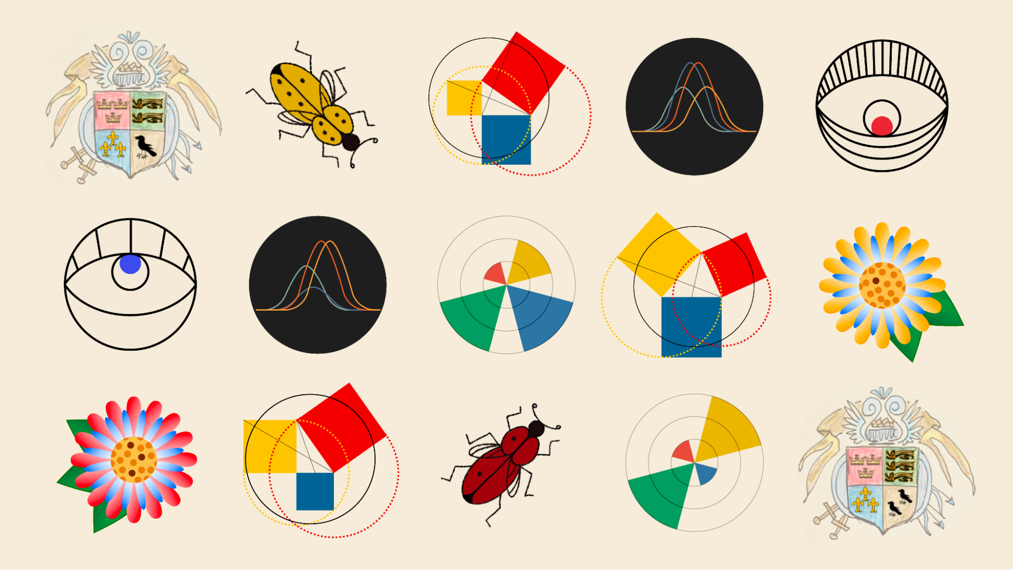
Natasha Tyulpanova created a beautiful version and experimented with several legends and types of symbols. It is incredible that she encoded the same simple data with the height of the function, the number of characters, the size and color! I do not even know which of these encodings I like more! The diamonds are great, and the graphics are very original!


Ulyana encrypted the names of the community members into the stems of the flowers—it’s not even immediately noticeable! A wonderful idea!

It’s especially great that everyone used different techniques and different shapes! Look at these adorable bugs made by Alla!

So in the end, I managed to gather a total of eight completed projects. Nadia Andrianova also actively participated, with whom we have already conducted several live streams on data art.

Nadia Andrianova has made a wonderful geometric project based on Euclidean geometry! And to make a tribute to the famous version of Oliver Byrne in narrow circles. Wow!

Now we have several more topics on the agenda:
• Friends
• Crafts
• Data encryption based on illustrations and patterns
• DVS Contest
• Favorite books
• Data art projects for charitable foundations on topics that concern us…
I hope everyone will find an interesting topic to work on. Because data art is truly a magical discipline—where you can combine any of your skills with any interesting (important) topics and create a unique project!
In such a creative company, my projects also started to progress faster—because I shared some life hacks, talked about tools, invited guests to live streams if the topic interested them. Surprisingly, my D&D project was quickly completed, and I even received help in understanding color balance (which I’m not very good at despite many years in the field of data visualization).

It’s always nice to share your work in progress, receive feedback and support, and maybe even some advice! In the beginning of the journey, criticism only hinders, but support and motivation are much needed! Yet, the advice of experienced designers often comes in handy.
Since then, the community has grown threefold, and I’m glad to have been able to gather such interesting people passionate about creativity and data in one place! Each of them brings something incredible, sharing knowledge, lessons, and ideas.
I’m very happy to have created such a small and cozy data art corner!
Thank you for reading!
Webpage of the Flowers&Numbers Community: https://eolay.tilda.ws/flowersnumbers/en
If you’re generally interested in the field of data art, I recommend checking out this telegram channel: https://t.me/dataart11
And if you also want to practice a bit with Flowers and Numbers, I invite you to join our small telegram group! https://t.me/dataart_practice
You can watch live streams on the topic of data art here: https://www.youtube.com/@datacomics


Natalia Kiseleva is an engineer and BI analyst, dataviz & BI trainer at the HSE, Moscow State University, MGPU, EU, IBI.
DataViz and Data Art popularizer, the comic artist and data artist.
- Natalia Kiseleva

- Natalia Kiseleva

- Natalia Kiseleva


