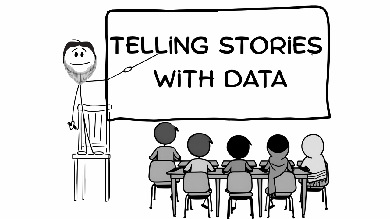
Recently, I concluded a 6-weeks intensive Data Analytics Course in our local community. I vividly remember how participants responded when I asked each to introduce themselves.
“I’m an Engineer,” one person shared.
“I’m a sophomore,” said another.
“I’m a teacher,” added the next.
Then there was a brief pause before the next participant spoke.
She said, “I’m a Homemaker…but I’d like to learn data.”
That moment of hesitation likely held the weight of self-doubt, vulnerability, and courage. And as it turns out, she became the star of the class.
I wanted to share one of the projects we did, along with her thoughtful take. It might inspire others stepping into data for the first time.
Making data relatable
When I was learning data science, I often struggled with datasets to which I couldn’t relate. I still remember the Iris flower dataset—used to teach clustering. I had to Google what “petal” and “sepal” even meant!


It felt like I was learning data science and botany at the same time.
So, when I teach, I make it a point to choose datasets rooted in the learners’ everyday lives. Since this course was held in a mosque, we used Prayer Time data. 🙂

Here’s the snapshot of the Islamic Prayer time from Fremont, California for the month of May.

Problem formulation
Problem formulation is a very important step in analysis. We need to identify what we want to solve before starting to churn the data. This helps us understand if the data we have in our hand is useful or if there’s an additional one, we need to add to tell the story.
I find the below template to be useful
I want to do (this)_______________________
in order to achieve (this)_________________
Everyone came up with their own direction. But one response stood out.
Our homemaker student said: “I want to understand how prayer times change so I can guide younger kids on which days they might try their first fast during Ramadan.”
Beautiful.

Adding a layer: Weather
Once you have defined the Problem Statement, it can further help to understand if and what additional dataset could be useful in answering the question.
She went a step further and asked, “Wouldn’t temperature matter too? Maybe kids can start with cooler days?”
She merged prayer times with temperature data—a thoughtful touch that made the analysis more interesting and useful. You would want to avoid hot days.

Data transformation
Next, we calculated the fasting duration for each day, then layered it with weather data.
Our goal? Identify the optimal days—shorter fasts, milder weather—for kids who are fasting for the first time. Something like below:

This simple analysis helped us identify the best day we could suggest for a beginner to fast.

The goal was to make data feel accessible—and using a dataset the audience was already familiar with made a big difference. It sparked their interest, and it was amazing to see them not only define their own problem statement but also identify additional datasets they could use to explore it further.
Your turn to play
I hope this gave you a glimpse into how a homemaker became a data storyteller—simply by using everyday moments and data from our daily lives.
In my book Drawing Data with Kids, you’ll find many more simple, playful activities that families can do together to explore data, ask questions, and learn in a fun, hands-on way.
Because learning data doesn’t always need a screen—just a little curiosity and a lot of crayons.

Hi there, I'm Gulrez Khan—father of 3 beautiful kids and award-winning author of Drawing Data with Kids. By day, I work as a Data Science leader, and by night, I read bedtime stories to my kids. Sometimes, the roles overlap—I'll find myself storytelling in conference rooms or teaching data concepts to my kids. It’s funny, but it works!
If you're interested in a workshop for your team or school, feel free to message me.


