
In the world of sports performance, data is everywhere. Watches track heart rates, apps monitor recovery, and race platforms log every split and second. But when all that data is condensed into a single visual, a story emerges: the numbers stop being neutral—they speak with raw emotion.
The aim was to analyse my HYROX performance, which is the fast-growing hybrid fitness event. It combines eight 1-kilometre runs with functional workout stations like sled pushes, burpees, and wall balls. The race’s structure naturally lends itself to analysis—clear segments, repeated runs, and measurable transitions. The goal of the visualisation was to explore how time, effort, and physiology interact across a physically demanding event. What actually transpired was a visualisation that was much more emotive: projecting personal emotion, or how I felt about my performance.
The challenge of condensation
Athletic data is inherently multidimensional. Time, effort, and physiology interact in ways that are complex and deeply human. Condensing all that into a single visual means facing the same challenge every visualisation designer knows too well: what to keep, what to simplify, and what to discard.
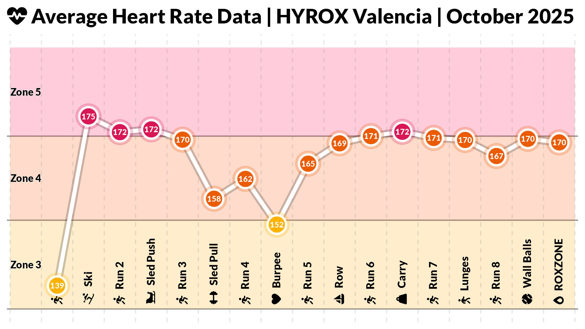
This HYROX chart condensed over an hour of physical effort into a few compact panels. Rather than presenting the bars along the conventional layout (x-axis), I shaped the visual to mirror the race’s own rhythm. As the reader moves from left to right, the reader too moves through each run and station. As the viewer follows the visual rhythm of the page and reaches the second chart from the top, they uncover time spent at each station relative to the event average—a clear indication of where momentum built or faded. Green meant faster than average, red meant slower. A cumulative line showed the overall trajectory: moments of acceleration, versus pauses of fatigue relative to the average athlete.
Design-wise, it worked. The streaks of green—for the lunges and sled pull stations—sparked a sense of pride. But as soon as I saw that one bar of deep red—the dreaded wall balls—I didn’t just see inefficiency; I felt disappointment. That’s when I realised how much emotional weight colour can carry in performance visualisation.

When color becomes judgement
It’s clear that colour can convey emotion. Warm hues suggest intensity, fatigue, or struggle, while cool tones evoke calm and control. These associations can subtly influence how athletes perceive their own performance. By using warm reds to mark high heart rate zones and difficult stations, and cool greens to indicate easier segments relative to the average, the visualisation established an intuitive “moral language”: a clear visual distinction between stronger and weaker performance that made the data instantly readable.
This raises a key design question: when visualising personal performance, are we aiming to motivate—or simply to measure? Should a chart make the athlete feel proud, or precise? The answer likely lies somewhere in between. The top chart, rendered in a calm blue gradient, remains neutral: it measures output without judgment. The chart below leans into emotion, using contrast and colour to spotlight effort and highlight moments of struggle.
Rhythm, not just metrics
The bottom half of the visualisation traced my heart rate throughout the race, capturing the ebb and flow of effort across running segments and workout stations. The rising and falling bands of orange and red felt like a heartbeat for the race itself—a pulse that mirrored moments of endurance, bursts of strain, and brief windows of recovery.
It wasn’t just data on a page; it was a rhythm you could feel. Peaks were sudden surges of intensity, while valleys were respites and recovery. Each station became a note in a composition of exertion and relief. In this way, visual structure itself conveyed effort before any labels or numbers were read. As designers, we often obsess over precision, but here, pacing and tempo communicated the human experience of performance more viscerally than any raw statistic ever could.
From metrics to meanings
What I learned from visualising my HYROX race wasn’t just where I was fast or slow, but how visualisation framed that story. Choices of colour, alignment, and context turned raw numbers into something interpretive—something emotional.
For data visualisation practitioners, that’s a valuable reminder: the goal isn’t only to display information, but to mediate understanding. The way we design a visual can shape not only what people learn, but how they feel about what they learn.

Andrew Peters
Andrew Peters is a data scientist at Pfizer with a background in building analytical tools and visual dashboards in R and Python. He previously worked as Senior Data Visualisation Specialist at the Central Bank of Ireland and as a data scientist with Leicester City Football Club, where he developed machine learning models and interactive apps for performance analysis.
- Andrew Peters


