
I stumbled upon data visualisation art quite by accident early in 2022, at a time when I was at an interesting crossroads in my life. I’m a neurodivergent woman in my 40s and my life has always been a little random, with a pretty eclectic range of projects on my CV. I had spent much of the preceding year as a European Space Agency (ESA) Astronaut candidate, pursuing a childhood dream, and had reached a point in the process where, although I was technically still in the running, it was becoming clear that my chances of progressing further were dwindling rapidly. I was also in the early stages of a second Master’s degree, and I was beginning to remember all the reasons that I had left academia after my Physics PhD. Somehow I had persuaded myself that either I or academia would have changed enough in the intervening 20 years that this experience would be different. In many ways it was, but I still was not enjoying being trapped in a narrow academic process, which really doesn’t suit the way my brain works. I was beginning to face up to the reality that I was only continuing the course because dropping out would look bad to ESA, and that was becoming less relevant by the minute.
It was at this point that Facebook popped up an advert for Frederica Fragapane’s Domestika course. “Learn Data Visualisation Design” it proclaimed, the title accompanied by a picture of her visualisation of Artists and Music Groups for Visual Data, and something about the image really caught my eye. I have never really considered myself an artistic person – frankly, I’d be lucky to manage a well-proportioned stick person! I’ve experimented with more mathematical arts and crafts of various sorts; I’ve played instruments, but never got the hang of composing my own music, and I’ve dabbled in crochet, where I’ll usually start with a pattern then go off-piste, occasionally achieving the desired effect. However I’m quite a practical person, pretty good at a bit of DIY carpentry or plumbing, have always loved good design, and I do consider myself creative in the problem-solving sense. I have often wanted to find more artistic expressions for that creativity, and something about that beautiful graph really piqued my interest. I wanted to know more, and signed up for the course without hesitation.

If you’re looking for a good introduction to data visualisation, this short online course is a great place to start. I found myself entranced by the combination of mathematical precision and artistic creativity which unfolded as the course videos progressed. I’ve worked a fair bit in science communication and put together the occasional chart or graph to make a point. On that level I was aware of the advantages of visualising data, but I had simply never considered applying a more artistic approach to colours and shapes, or that the beauty of the final image could be as much a valid aim as accuracy and clarity, being used as a tool to draw the viewer in to the story behind the image the way that I had been drawn into the course. Watching Frederika’s process unfold, I was struck by the deceptive simplicity of what she was doing. She clearly has great skill with colour choices and design elements that I lack, but at the heart of what she was doing was something that made me think …maybe I could do that….
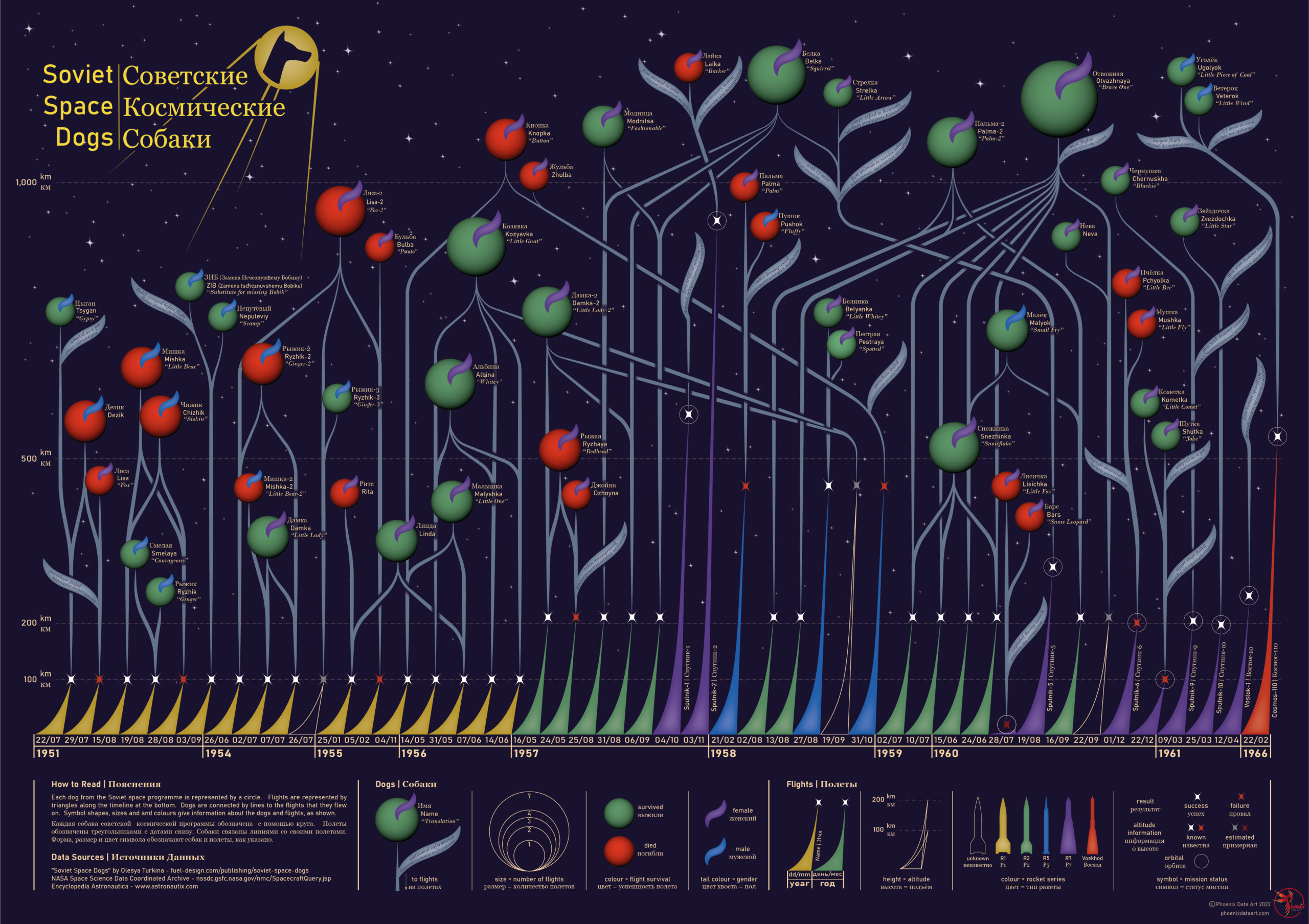
That was the spark which inspired a steep learning curve, not only about data visualisation as an art form, but also about the tools of the trade. I experimented with RawGraph and Adobe Illustrator, which were both touched on in the course, but were not programmes I’d ever used before, then set off in search of a dataset to work with. I settled on the story of the Soviet Space Dogs. I’ve been inspired by space, science, and science fiction all my life, and I am also a huge dog lover, so the idea of telling this story visually really resonated with me.
Like many space enthusiasts I know the sad story of Laika, the most famous space dog and first animal to orbit the earth, who tragically died in orbit. But I knew little of the other dogs which were part of the Soviet space program, and I wanted to tell all of their stories. I found a book on the subject that had done the hard work of collecting the data, the aptly named Soviet Space Dogs by Olesya Turkina, as well as a previous data visualisation based on the book by Duncan Geere. I supplemented this data with some additional online sources, then set about turning this information into something I hoped would be both beautiful and informative. During my preparation for the Astronaut selection interviews I had read an article about how putting boundaries on a problem can really help the creative problem solving process. I particularly enjoyed this aspect of visualising the data – not an unbounded artistic question of “what should I draw?”, rather a bounded exercise of “how can I display this data clearly, yet beautifully?”
Looking for more inspiration I found a second Domestika course by Sonja Kuijpers. One thing I appreciated greatly about both courses was that the artists talked openly about where they get their ideas, and how they pull together various visual influences, whether from the natural world or related to the data they were working on. I realised that I could do the same. I think the strong influence of that first image of Frederika’s that I saw is pretty obvious when you compare it to my final visualisation, but from Sonja’s course I got the idea to use visual elements from the book that the data came from, which inspired the colour palette and various shapes used.


While researching this project I learned a great deal more about the lives of the space dogs than I could ever fit into a single visualisation image. For example, the reason Laika’s flight had no recovery mechanism, meaning she was always fated to die during her mission, was due to political pressure to get the mission ready in a hurry so it would coincide with the 40th anniversary of the Bolshovik Revolution. While I couldn’t include all the details from the book, I picked out some key facts and have incorporated those in words alongside the main data, to add more depth to the story it tells. My interest in the space industry meant I have learned a little Russian over the years, and as the dogs’ names were given in the original Cyrillic in the book, I decided to make the project dual-language, since this data may be of particular interest to Russian speakers.
As invitations to the next round of the Astronaut selection process were being received by my fellow candidates, and it was becoming clearer and clearer that I was almost certainly now just waiting for a formal rejection, it helped more than I can say to have a project that I loved to pour my energy into. I have ADHD, and if you know anything about the condition, you may have heard of “hyperfocus,” a particularly intense state of concentration which this project certainly tapped into for me. By the time the ESA rejection email finally arrived in my inbox, my spare time was being completely consumed by “Space Dogs,” as the project affectionately became known in my household, and I was utterly absorbed in the data visualisation process, which certainly helped cushion the blow. Becoming an astronaut is a pretty long shot and on one level I didn’t ever expect to be selected, but nonetheless it was sad to receive that news, especially at an age where I’m unlikely to get another opportunity to apply, and the company of Laika and her fellow canine cosmonauts kept my mind from dwelling too much on what might have been.
Data visualisation is a hobby I have quickly grown to love, and describe to my friends as art for those of us who can’t draw, but love a good spreadsheet. I wrote this article while setting up for my first ever art show – not something I ever imagined I would be doing – in Chicago, at the 80th World Science Fiction Convention, and was delighted to sell out of the prints I took with me. I am selling prints of my art for charity, and for the Soviet Space Dogs project it seemed appropriate to find a charity supporting dogs in Ukraine. I chose Shelter Friend, who have been sharing heart-wrenching stories of dogs in need of help, and I’m pleased to be in a position to be able to donate all profits from this project, including the $350 raised at the Worldcon, to Shelter Friend. It was lovely to get the opportunity to talk to people in person at the art show about the project, and to see the different responses to it, the most common of which was that most people had no idea just how many dogs were involved in the Soviet space programme, or that so many of them actually survived. I was also excited to be featured in a podcast about Modern Art, Three Minute Modernist, hosted by Christopher J Garcia, who saw the piece at the convention and was very complimentary about it.
My second project had a much faster turn-around time than the first, as I was given a one-week deadline for a piece for a fanzine about the Star Wars film, Rogue One. I’m a huge Star Wars fan and re-watched the film for inspiration. I was reminded of just how much fuss was made in some corners of the internet over the lead character being female when the film was released, despite there actually being very few women in it overall, which seemed like a topic ripe for visualisation. I found a dataset gathered by data scientist and journalist-engineer Amber Thomas, who had previously done her own visualisation, which can be seen on her blog, which I combined with additional information from IMDB. Having become more familiar with Illustrator, I was able to pull together something which I feel conveys the main point about the scarcity of women in the Star Wars universe in a visually pleasing way in a fairly short time frame, which appeared in Issue 65 of Hugo Award-winning fanzine, Journey Planet.

I’m already thinking about my next project – I generally learn best by doing so I will be starting another project soon. Whatever I settle on, I’m looking forward to learning more about the theory and practice of data visualisation in all its forms and developing additional skills with which to explore this newfound passion. I am also excited by the idea of branching out of digital art to explore other, more physical mediums. Those carpentry and crochet skills may come in useful yet…
To see the full details of my completed projects check out my website, and to keep up to date with my next data visualisation adventure you can follow me on Instagram, Facebook, Twitter or tumblr, @phoenixdataart.
Additional images:


Phoenix (she/her) is a neurodivergent firebird with a PhD in Physics, a background in science communication, and a love of adventure. She was born and grew up in the south-east of England but has lived across the UK and beyond, and travels whenever and wherever she can.
Inspired by space, science and science fiction, Phoenix has twice applied, unsuccessfully, for the position of Astronaut with the European Space Agency, once reaching the final 400 candidates. She loves animals, especially dogs, and has provided a forever home to several rescue dogs.
Phoenix has recently begun to explore data visualisation art and her first project about the Soviet Space Dogs combined these two loves, and is being sold to raise money for dogs abandoned during the conflict in Ukraine. All her data art projects support a worthy cause - details of the charities supported can be found on the page for each project, and prints and products can be purchased via Redbubble.
Phoenix is learning Russian, with limited success, and still hopes to leave the planet eventually.
- Phoenix


