
When you, like me, have been teaching for a while, you realize there’s a fundamental paradox: no two clusters of students are alike, yet all of them merge in your mind as archetypes. There’s always the one who can do much better than what they are presenting, the one who arrives early to every class and wants to chat after hours, or the one who has crazy ideas but is never able to execute them fully. Each of them is a unique human being with particular talents and idiosyncrasies, yet they tend to share the same concerns. And with that truth comes a second: I repeat myself a lot.
Over the years, I have come up with a handful of sentences and responses I have refined and adapted to their varying degrees of stress. I have also become a better listener and learned how to pose specific questions without sounding accusatory (I hope!). So here are five conversations I have every year with my data visualization and infographics students.
1. “But I can’t draw!”
Since 2020, it has been increasingly easy to lose faith in humanity and the state of the world, but I will never lose faith in sketching. Not only does it help to build creativity, but sketching also works as stress relief and artistic expression. In each exercise, I encourage my students to sketch it out and plan it on paper before jumping to the computer like they tend to do. At first, half of them hate it and half of them love it. The ones that hate it always have the same reason: “I can’t draw!” To which I reply: “Sketching is not drawing,” adding, after a pause, that “it has been scientifically proven that sketching boosts creativity and helps ideas to flow better and keeps you focused.” What follows are their shrugs and my insistence. “Try to have fun with it,” I say. “You can use markers or paint, or even collages!” But I must put my foot down even if I want them to have fun. I make delivering sketches mandatory. At the end of the semester, they’ve developed a discipline.
Takeaway: Try not to jump straight to the computer. Think of a plan and sketch it out. You’ll see your ideas flow better.

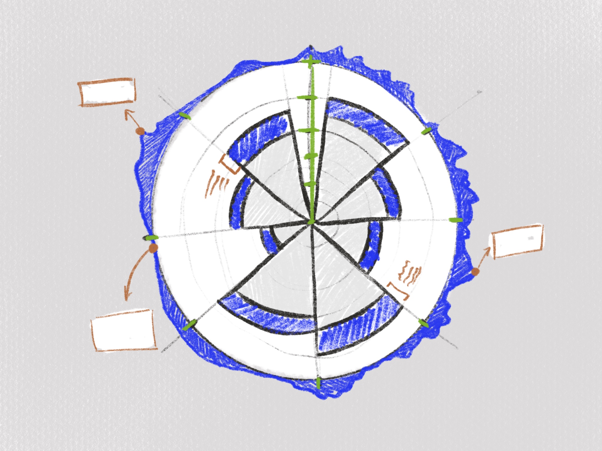
2. “I thought about making a radial bar chart…”
My students are obsessed with circular charts! I have begun to think it’s a generational thing. Or is it a visualization trend that I don’t get? Either way, they want it all: coxcombs, radial bar charts, sunburst diagrams, chord diagrams, spiral plots, and donut charts (because somehow, they already know pie charts are the devil). This is not always a problem. If they come to me with a giant circle in the middle of the page, I cringe a little, but I listen. If the student has a plan and knows exactly why that specific chart is the best for that problem and solution, then I say nothing and point them to the most appropriate tools (like RawGraphs or Flourish). What tickles my nerves is when they want to do a sunburst diagram because it looks pretty and not because they want to represent a hierarchy. In that situation, I have either failed them as a professor, or they have not listened to me. And neither is great. Next, I ask why they have made that choice and what they are trying to convey. We engage in a few rounds of interrogation until they produce a comprehensive answer. Most of the time, the sunburst was just a reflection of how the student didn’t spend enough time defining the project’s intentions and thinking about the visualization that better served them.
Takeaway: We love charts because they are pretty, but we should not choose a chart just because it is pretty. Always design with intention.

3. “Who is this for?” “I don’t know.”
Data visualization is a complicated affair. It involves making a lot of choices across different areas of expertise. When learning visualization or infographics, it can sometimes feel overwhelming to deal with many questions and elements. So I encourage my students to break each exercise into a series of small decisions. Who is this visualization for? Where is it going to be displayed? Do you need extra material? And so on. But I won’t tolerate it when they answer, “I don’t know.” In designer language, that roughly translates to “because I want to. I didn’t really think about it.” I know this because I have done it myself. However, not knowing such answers and disregarding your user when dealing with communication and information is irresponsible and disrespectful. In the best-case scenario, no one notices. Worst-case scenario: you cause someone to misunderstand your message. This may sound overly dramatic, but if you want to be a superb data visualization designer, you must always know why you make the decisions you make.
Takeaway: Designing visualizations comes with many responsibilities. Always know who you are talking to and what they need from you.
4. “I can’t find any information about my topic.”
This one is the trickiest, especially if I don’t know the student well enough. While sometimes there is genuinely a challenging subject to research, other times it is just a question of not knowing how to correctly Google search. [At the risk of sounding like a Boomer: how do students arrive at a master’s degree without knowing how to conduct proper research?] It’s essential to assess what research they have done so far. Which keywords have they searched? Which websites did they use? Did they go to the library, etc.? Suppose I can tell they have tried hard and found little. In that case, I give suggestions (often from my personal library) or advise them to shift their topic a bit to find more results (i.e., instead of looking only at Portugal, why not explore the same issue in the European Union?) or to collect their own data. If I, on the other hand, notice that the student has made one single Google search with a couple of keywords, I tell them to try again, seriously, this time.
Takeaway: Take your time with research: try multiple methods, several keyword combinations, and different sources.

5. “Did you know that…?”
This is by far my favorite. I have learned so much about so many different things since I started teaching. For example, I now know that no beauty products sold in China are cruelty-free. I was surprised that 94 percent of Italians’ genes precede the Roman empire. I heard the traditional tales of indigenous Amazonian tribes from Brazil. I was surprised to learn that using ‘they’ as a single pronoun dates back to the 1790s. And most shockingly, I was told people still play Pókemon Go!
Takeaway: One of visualization’s greatest joys is the amount of knowledge you will take with you for life. Let it seep in.
When I started teaching, I was slightly scared that after some time, it would lose its magic, that every day would start feeling the same as I started to repeat the teachings across the years. But it has not been so. Not yet, at least. And although I repeat myself a lot and have the same conversations every year, they are not exactly the same. After all, my students are always different and I’m becoming a better professor. But, if I have one last takeaway, it is this: designing visualizations is a multidisciplinary and information-rich experience that needs planning, intention, and a keen eye.

Salomé Esteves is a journalist turned communication designer turned Data Visualization-phile. She is a Ph.D. Candidate, researcher, and professor of Data Visualization and Infographics at the Lisbon School of Architecture. She is also one of the heads behind Data Visualization Lisboa and the creator of Chartbites, a pedagogical project for DataViz professionals.
- Salomé Esteves


