
Wrestling with which data fit for a design is challenging, but it’s vital to avoid overstuffing designs that end up valuing content over negative space. Designs with too much information, and not enough space, tax readers by not clearly designating where to look. Viewers end up scanning the whole image trying to make sense of it. Overstuffing can happen a lot when a design tries to do too much, like being both slides and a handout.
Data selection is not a new challenge; editing is at least as old as ancient Greece. Every single creator struggles with limiting content, but our industry gets to wrestle with a second idea at the same time, “what data do I hide.” Hiding may feel pejorative, conjuring corrupt politicians, but in this application it is crucial to success. This article will explore the functionality of hiding data for our users inside a data visualization–a functionality called tooltips.

Many data visualization software programs employ tooltips (Tableau, PowerBI, Qlikview, D3.js, Plotly). You might even know tooltips by a different name—notes or hover text. This software functionality was prominently a part of the Windows 95 graphic user interface (GUI) as well as a few other programs at about the same time. Tooltips continued to proliferate most programs, albeit often through more mundane ways like displaying long file names.
How tooltips works is direct—a user uncovers new information when they roll their cursor over an image. A small rectangle appears covering part of the original design with additional data about the image. GUI usage of tooltips is more utilitarian; giving users enough information to interact with the program and stopping. Tooltips in data visualizations, however, are complex.
The complexity tooltips provide design has always held my attention. Tooltips are about the audience responding to our work! They allow us the opportunity to make certain information accessible indirectly, only discoverable if certain actions are taken. A designer-crafted user experience aimed at setting up further audience interactions. Consider the following analogy.
We are looking to make a pond (data visualization) so beautiful the users want to skip a rock across it (interaction). If a user skips that rock across our pond (interaction) they are rewarded with circles on the water (custom information, new images, or explanatory detail). All of which guides them to more rocks (interactions) and or more time spent at the pond (longer sessions). Tooltips are one way to make the pond ripple. But how do we choose what goes into a tooltip and how do we order that tooltip to set ourselves up for success?

What to place in tooltips
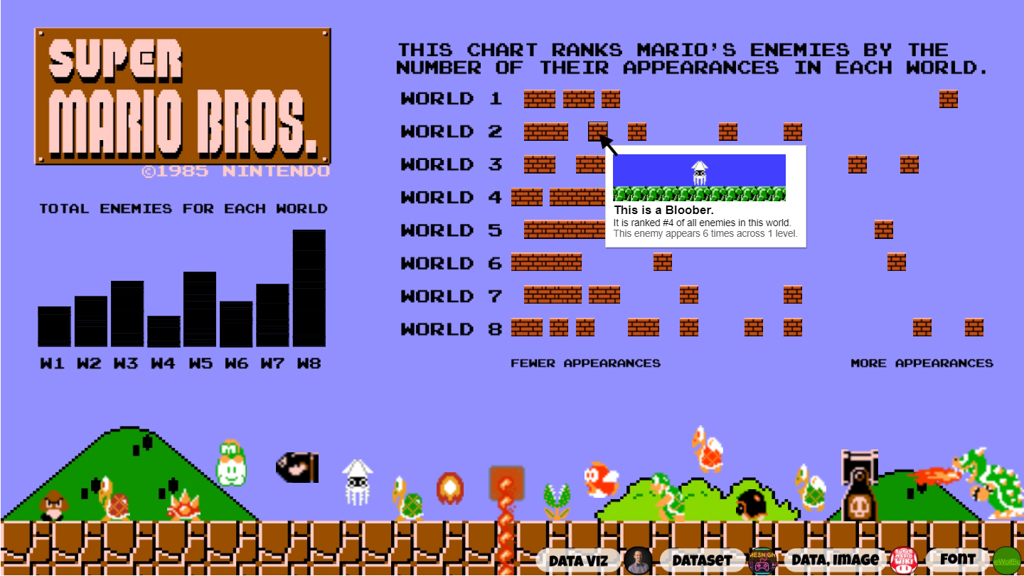
I have seen all sorts of interesting things with tooltips, from jokes to emotional resonance. Choosing what to put into the tooltip depends on the needs of any particular design. For my work at The Debruce Foundation, I tend to use tooltips to add detail or context. Again, I cannot stress enough that there are near infinite ways to use this design within a design.
Adding detail data
When thinking about detail data, it’s best to talk about a “detail” problem. The closer you are to source data the more likely you will be wedded to the idea of notes. This is because most source data that we speak about is based on some series of data insights. Unfortunately, when you master these data insights, your understanding of the underlying concepts shift. You now see the core concepts in finer detail than anyone else and are thereby prone to believe people need to understand these core concepts at your level. Spoiler, they don’t. This understanding need can manifest itself with long titles and overstuffed visuals. The answer to this problem? Tooltips for added detail.
The first step in building tooltips for added detail is getting the visualization down to one concept. Your one concept needs to be something that can be said in a sentence and its content needs to be something most of your neighbors will understand. Last year I tried my hand at building a viz around research on how U.S. counties did in crossing economic lines. As this was using research by Raj Chetty, et al I felt compelled to include a fair amount of citations, so let’s ignore the heavy citations and maps focusing instead on the title.
The title reads, “How connected are Americans across economic lines?,” and the viz includes two maps of US counties color coded by economic connectedness. I could read that title to my neighbors and I wouldn’t completely lose them. What I do lose with that short of a title is any indication of what variables I colored by, their associated range, and the unique definitions. This supportive content matters to the folks who read research (some of which I have the pleasure to work with), so what do I do about it? Rather than put that detail into the design itself, I added it to the tooltip where if a research-minded reader rolls their cursor over a county they will be rewarded with the custom content.
From a design perspective, lean on newspaper headlines. Start with the key point followed by the most needed explanatory definitions. Then have a smaller second or third paragraph that gets into second and third level concepts. No paragraph should be longer than three lines and I think you start to lose efficacy after three paragraphs. For this case I had one 16 point title that identifies which unit the reader has selected–the county’s name with their rank. Under that, a smaller font (12 point) worked through the needed subjects like definitions, remembering lightning font color as I went.
Guideline: Identify the unit selected, define what it is, and remind readers why we care. This is your chance to preemptively answer some of the toughest questions presented. Think of “Carl/Carla” in the third row pelting you with frustrating questions. By meeting their needs when you add detail via tooltips, you turn frustration into reward.

Adding context data
When thinking about context data, it’s also best to talk about a problem. If I tell you 10,000 cars drove down a street, that number is meaningless without further information. If this were a city street in the suburbs, that’s quite a lot of traffic, but if it’s the highway near a populated area the number is quite low. Further, we don’t know if 10,000 is the average or an outlier and what kind of day it was. Maybe this was the post-Thanksgiving holiday rush and the street was near a shopping complex? There are a million possible considerations.
The same kind of problem can appear in our designs. Once we have distilled our work into one topic, breaking away too many notes, that topic can become unmoored from the larger population. It loses the ability to dictate significance and designs that don’t clearly dictate significance through context are rarely remembered as they are not in alignment with the needs of the readers. The answer? Tooltips for reference.
The first step in building tooltips for added context is getting the visualization down to one concept. Same rules as above apply. Last year I also tried my hand at building a viz about Pixar actors repeating across films as a part of Tableau’s Data + Movies challenge. The focus was about showing relationships over time, which is why I laid out the movies from oldest to newest across the bottom. Pretty happy with the way it looks when one path is selected, even if it looks a bit too full otherwise.
The challenge in focusing on relationships across films in this way was that any significance due to the context was lost. That is if a person was in a popular film they might be more likely to appear multiple times. Also given this was using IMDB data, understand user vote count matter. However, adding ANY of these items would pull focus from this relationship-over-time dynamic I have set up. Meaning the tooltip needs to pick up this slack.
The first lines in my tooltips here identify and define the actor, movie, rating, as well as votes using typeface and font hierarchy. All of this helps, but the real context and significance is understanding the range and reference of how successful Pixar films have been. This is why I employed a chart in tooltip showing the top and bottom rated films. The goal being that a person could look at this evaluate if the rating information in the above component made sense. Also, I stuck with monochromatic colors here as the main image has very rich colors.
Guideline: Identify what the audience needs to properly weigh the story your design is telling. This is your chance to add nuance to readers if they hunt it down. Again keep it tight. I have found more than one visual is harder to pull off (see top image).
The next time you are building I hope you consider these examples and use tooltips as a chance to reward your readers.

Christopher Laubenthal focuses on better data use with visualizations in an organizational setting. He has experience in both for-profit and not-for-profit sectors where he increases literacy, grows culture, and builds data visualizations. Christopher is the Data Design Manager at The DeBruce Foundation, a national foundation whose mission is to expand pathways to economic growth and opportunity. Current projects include his public viz and The DeBruce Foundation’s Career Explorer Tools.
- Christopher Laubenthal

- Christopher Laubenthal

- Christopher Laubenthal

- Christopher Laubenthal


