
(Without Having to Upload Your Design File to an AI Tool)
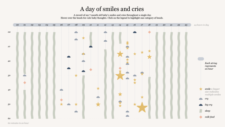
About seven months ago, I became a mom for the second time. I also recently decided to pursue information design as a profession. So, to jazz up my portfolio, I chose to combine the two. I tracked how many times my baby smiled in a single day and made a visualisation from the data, which included other variables such as cries, sleep, feeds, and the reason he was smiling or crying.
I kept stumbling over how to add the reasons for the cries and smiles to the visualisation. I initially tried categorizing the reasons and colour-coding them, but there were too many categories, and the visualisation ended up looking like a unicorn spewed all over my screen.
Then I remembered interactive data visualisations. I had seen them before and often wondered how designers made them. Do they work with someone? Do they use specialized software? Are they proficient in code? These questions kept me up at night. Well, no, actually the baby did, but I still wanted to figure out how to make an interactive data visualisation from a custom design.
To get some answers, I took my questions to Claude.
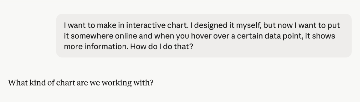
Claude first asked me some questions in return and suggested using a tool such as Flourish, Datawrapper, or Tableau, but I had already made my design in Illustrator, so that wasn’t an option.
A couple of prompts later, the solution presented itself: an SVG (scalable vector graphics).
An SVG is basically your design in code format, one that includes the names of all your layers—which, as you will see, is quite interesting.
I wanted two specific interactions in my visualisation. First, when you hover over a data point, a tooltip appears. Second, when you click on an icon in the legend, only the corresponding data points are highlighted, and the rest fade out.
Now there are two ways to do this. You could upload your SVG to Claude and simply ask the LLM (large language model) to make certain parts of your design interactive. This is by far the easiest option, but for privacy-related reasons, I felt hesitant to upload my design to Claude. Some LLMs use the images you upload for training purposes, and who knows where they might end up or how they’re really being used. I try to err on the side of caution, so I went for the second option by using a separate code editor. It’s still easy but requires some more steps. Let me break them down for you.
Step 1: Name your layers
The first step is the hardest for most designers because, for this to work, you need to properly name and structure your layers. I know, it seems impossible, but don’t give up yet.
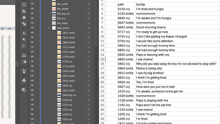
In my design, every single data point is a separate layer with a unique name that includes a timestamp and the category it belongs to. Don’t make the same mistake I did; ask Claude for proper naming conventions first. My layers all started with a number and included spaces. In SVG code, if your layer name starts with a number, an underscore is automatically added in front of it. All spaces also get replaced by underscores. So, it’s best not to start your layer name with a number and not to use spaces.
This also goes for naming your legend. In my case, I wanted each legend icon to act as a button: When you click on it, the corresponding data points are highlighted. If my data point is called “t0130_cry,” then it’s best that my button also includes the word “cry”—for example, “btn_cry.” The JavaScript code will look for all the layers that have “cry” in their name.
While I was naming my layers, I also made a list in Excel with the names of all the layers and their corresponding tooltips. You will need this later.
Then I grouped my data points together so that when you click on a button in the legend, only the data points fade, not the whole visualisation.
Once you finish your design and all your data points are properly named and grouped together, you can export your SVG.
Step 2: Use a code editor
If you do it my way, you’ll need a code editor. I used VS Code, since it’s free and easy to use, but you can also keep everything in Claude if privacy is no issue. If you do use a separate code editor and get stuck at any point, you can just ask Claude how to get unstuck.
I asked Claude to generate code for the interactions I wanted, attaching the list I made. It went something like this:
I have a data visualisation exported as an SVG. I want to make it interactive and have two specific interactions in mind.
Interaction 1: When hovering over a certain layer, display a tooltip near the cursor. Attached is a list of the layer IDs and their corresponding tooltip text.
Interaction 2: When you click a legend button (e.g., btn_cry), highlight all layers whose name contains the matching keyword (e.g., cry) within the data_points group. All other layers in that group should be faded to 50% opacity. Clicking the same button again should reset all layers to full opacity.
Generate an HTML file with a JavaScript block that handles both interactions and indicate where I can paste my SVG code.
You can also tell Claude how to design the tooltip, indicating which font and colour it should have.
I opened the SVG in the code editor so I could copy the code inside. Then I opened a new file and named it “index.html.” I pasted the code Claude gave me and the SVG code into this HTML file. I clicked Save, and there it was. Just open the HTML file and watch the magic happen. Unless it doesn’t, in which case you need to do some troubleshooting with Claude.
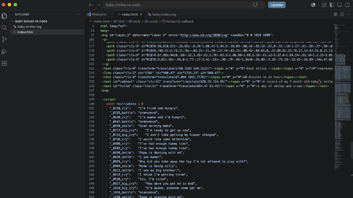
Step 3: Paste the code into your website
If it works, you can paste the full code into your website. I even asked Claude where I needed to paste the code on a Squarespace website, since that is the platform I use. If you don’t have a website, Claude can make suggestions on where to publish it.
I don’t use AI to save time. I love spending hours designing pixel by pixel and searching through data. I use AI either to streamline tedious tasks or to learn new skills. And this skill was just out of reach for me. I was familiar with code on a very basic level—I’m talking HTML and CSS—but JavaScript was still quite new to me.
This new skill opens so many possibilities, as there are many more interactions beyond tooltips and faded filtering. It’s subtle interactions like these that can elevate your design, help tell a more nuanced story, and let you cram more data into your design without making it look like a junk drawer.
You can find the interactive version of this data visualisation in my portfolio.

Cristal Fernandes
Cristal is a freelance information designer and mother of two residing in Belgium. She’s fairly new to the game of data viz, but has a lengthy background in economics and marketing. Her specialty is leaning towards interactive data design and editorial infographics.


