
A new generation of text-to-image generative models are rapidly changing what is possible in generative design. Two apps in particular, Midjourney and Dalle-E 2, have changed the nature of generative imaging by combining advances in text model generation and image model generation to create something more nuanced than previous techniques.

The concept of text-to-image is simple: a user submits a text prompt such as “Yoda drinks a beer” and the neural networks use the text to create a new image based on the associations in the language. When the concept was introduced, the results looked like a mash of uncanny valley nightmares and jpeg compression. As you can see on the left, the new models allow far more stylistic illustration of the language, determined not only by text as metadata but also by the context of where that language may appear. The many improvements in both the text models and the image models have created a whole new way to think about imaging and how we might create prompts to describe it.
There’s a whole world of ideas to explore here, but I have been interested in using these generative models to help us see data visualization designs from a new perspective. My interest in this topic began while using Midjourney – and while I think the results are better for dataviz purposes using that platform – I just gained access to Dall-E 2 so exploring the differences between the apps is equally interesting. I have a Twitter thread here that discusses my initial comparisons between the two platforms.
You begin the creative process to generate these images with the text prompt. From there you are presented with six images that you can then download or use to create more variations. The process is iterative and selecting which image to create variations from results in a sort of story. This article details my journey during a single exploratory session of about one hour using Dall-E 2.
In honor of Juneteenth, I started with the prompt “Data visualization about economic progress in the African-American community since 1886 as designed by Otto Neurath”. The six results are visually interesting but not accurate to the data, time period, subject matter, chart type, or design style of Otto Neurath.


The third variant of the first pass was at least a bit more interesting. While not even close to being an isotype, it’s a fairly accurate bar chart with photographic styling (image 1.3). The horizontal gradient at the top could be a fun design inspiration under the right circumstances.

Versions of 1.3 below created even artier styles of stacked photographic bar charts with lighted shaded backdrops. The two iterations below are particularly lovely. I’ll note again that the actual subject matter of “economic progress in the African-American community since 1886” was not recognized by the model. I suspect that Dall-E 2’s image model is trained using photographs and more recent art so it likely overrides terms with fewer results. None of the generative models seem to be able to recreate words.


There was one more version of 1.3 that I liked – the image below with the label overlapping the bars of the chart. This version seems taboo by dataviz design standards, but is it really so wrong if we measure the tops of the bars? The photo textures also seemed busier, but the tops of the bars are always dark. I dig it!

There was also a stylistic outlier in this second iteration. The version below seemed to drift away from the other charts and towards… a charcoal drawing? It is quite subtle and feels like a 1970s conceptual drawing by Robert Smithson. It is beautiful and surprisingly sumptuous.

I created two versions below left (2.2-v1) and below right (2.2-v2). I think either of these would make a handsome illustration pretty much as-is (and heck maybe you’ll see more of these gracing Nightingale in the future!) The left image reminds me a bit of a beach, and the right image reminds me of a picket fence. I don’t mind it being so literal if the subject matter fits and both have this lovely wet-media texture as if they were drawn with ink.


I wanted to see versions of the sand dune vibes (2.2-v1) so here are four takes of it below. I think all of them are interesting but I think I like (2.2-v1-v3) most of all as the diagonally stacked bar charts are amazing plus the inverse of the white over the dark background is stunning:


I also generated this version (3.1) below on my third pass. As you can see, it took the photographic bar charts and split the design into a sort of set of small multiples. The labels are chunky and what looks like area charts start to morph into high-contrast landscapes.

In the two versions below (3.1 v1) and (3.1 v2), the chart is entirely gone resulting in a grid of monochromatic images. I like the dark green on the yellowish background especially. These also feel like they wouldn’t be out of place in a 1970’s conceptual art book.


Moving back to version 3.2 – an iteration of the photographic bar chart that preceded the above images – produced a REALLY interesting graphic below. Not only do I have a design that could read as a multi-dimensional illustrative dataviz, but also has some built-in comparisons at the bottom of the images (changes in growth?) Pending the right data and communications objective, the ornamentation could be both intersting and meaningful.

Things get even more interesting in this version of (3.2) below – buildings, slope graphs, cut-away topographies, and blueprints all in monochromatic green are arranged on some kind of… stacked distribution? This is an exciting almost-punk-rock xeroxed vibe and I am totally here for it!

Below are two more versions based on the previous image (3.2 – v1) but you can see the interpolation continues to skew more graphic (and wonderfully so).
In this version (3.1-v2) the inverted V shape clefts the design into an ordered divergence. The tops of each bar are now illustrative even more than photographic, leaving ghostly remainders below. At the bottom of the image a single bar reminds me of the mid-western horizontal spans of the architecture of Frank Lloyd Wright or an Art Deco glyph. How interesting!

Version (3.1-v4) below is a Rorschach test of associations and patterns. The bars are now glued together by striated horizontal stripes to create a sort of cut-away landscape. The results make me think a bit about the speculative UX design by Territory Studios for Blade Runner – something alien and ancient.

The below image (3.1-v4-v1 …how do people name these things?) shows the chart giving way to a series of vertical slices of a landscape. The bar chart seems to have turned into the remnants of collapsing buildings along the bottom.

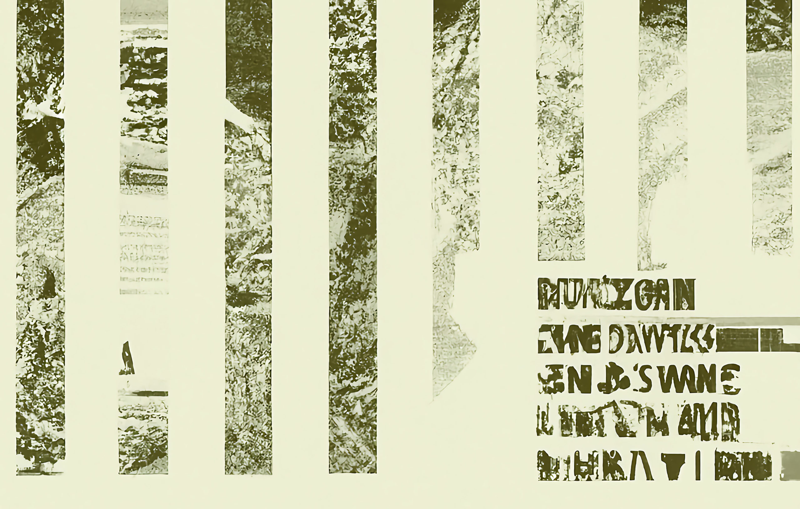
I stopped further refinement here as the chart attributes disappeared from the generative images, and that’s was really the focus of my exploration. Maybe I’ll just keep making 20 versions of a single chart one day, but until then, I’ll end this post with some other images that I didn’t cover above but are pretty fun.


These generative models have the power to help us to see how the data design could be handled totally differently, not just as a surrealist impression, but as an input into considering chart formats in a new way. While I have not tried to put these design concepts into practice yet — that will certainly be among the next steps. Let’s see how it continues to develop — I’m sure there will be more to explore!

Jason Forrest is a data visualization designer and writer living in New York City. He is the director of the Data Visualization Lab for McKinsey and Company. In addition to being on the board of directors of the Data Visualization Society, he is also the editor-in-chief of Nightingale: The Journal of the Data Visualization Society. He writes about the intersection of culture and information design and is currently working on a book about pictorial statistics.
- Jason Forrest

- Jason Forrest

- Jason Forrest

- Jason Forrest


