
Those who know me will see that I love documenting every step of my data visualization process. I believe there’s so much to learn from reflecting on what works and what doesn’t, and it helps avoid making the same mistakes in the future.
However, as I gained more experience, I discovered that clients often don’t share this enthusiasm. They tend to focus more on the insights rather than the process. Brent Dykes captures this well with his movie analogy, distinguishing between behind-the-scenes documentaries and compelling narratives.
But don’t worry if you’re passionate about sharing your process—everything is not lost. I’m happy to share that I’ve found the perfect audience for presenting the details of the data visualization process: Researchers!
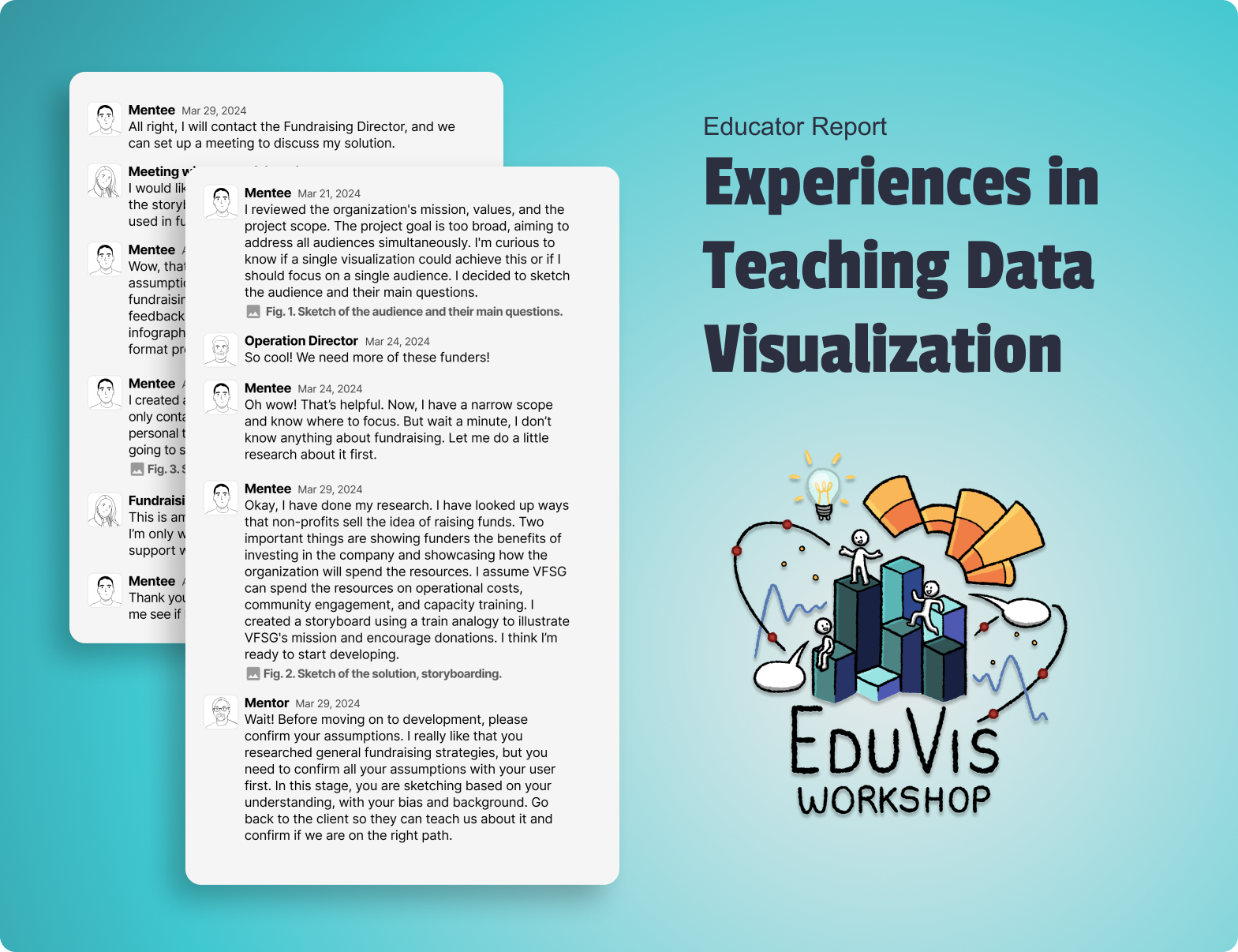
In collaboration with Kevin Ford, we built an Educational Report for the EduVis Workshop at the VIS 2024 conference. This report outlines the data visualization process using the Solution Framework in a social impact project. Each stage includes practical lessons, making it a useful guide for educational and professional settings.

Why a solution framework?
A Solution Framework is important for data-driven teams and companies as it provides a structured approach to problem-solving and project execution. Implementing a framework offers several benefits, including:
Standardization and Consistency
Ensure that all projects adhere to the same high standards, reducing variability and enhancing quality.
Efficiency and Automation
Automate repetitive tasks, freeing up time for more strategic work and improving overall efficiency.
Collaboration and Communication
Facilitates better communication and collaboration among team members, ensuring that everyone is aligned and working towards common goals.
Case study: Social Impact Project
In this case study, we aimed to test the framework outside the corporate environment by participating in a social impact project promoted by VizForSocialGood (VFSG).
Who is VizForSocialGood?
In a data-driven world, VFSG emerged as a group of data visualization volunteers dedicated to helping non-profits with their data strategies. Since 2017, VFSG has united over 700 volunteers globally and assisted 41 non-profits, including the World Health Organization, Bridges to Prosperity, Build Up Nepal, Sunny Street, and many more.
How VizForSocialGood Works?
VFSG collaborates with non-profits to define project goals and structure datasets. They launch the project on social media, providing data visualization practitioners with resources, chat support, and feedback for creating compelling visualizations. Each project typically lasts one month, concluding with volunteers submitting their projects for selection and presentation.
Visualizing the social impact of VizForSocialGood
In March 2024, VFSG decided to share their own data with the goal of seeking help from volunteers to demonstrate tangible benefits and changes brought by the organization. They aimed to encourage continued support and engagement from the community, potential volunteers, and partners by illustrating the value and impact of these projects. Additionally, they sought to motivate the audience to support future projects by volunteering, partnering, donating, or spreading the word about VizForSocialGood.
In the following chat logs, you’ll see the practical implementation of each project stage, guided by the Solution Framework. These conversations between the mentor and mentee provide insight into the iterative process, challenges faced, and insights gained.

Understanding the problem
Before diving into the data, it’s important to understand the audience and their questions. Identify their primary concerns and the top issues on their minds.
◻️ Who’s the audience?
◻️ What are their questions?
Mentee Mar 21, 2024
I reviewed the organization’s mission, values, and the project scope. The project goal is too broad, aiming to address all audiences simultaneously. I’m curious to know if a single visualization could achieve this or if I should focus on a single audience. I decided to sketch the audience and their main questions.

Operation Director Mar 24, 2024
So cool! We need more of these funders!
Mentee Mar 24, 2024
Oh wow! That’s helpful. Now, I have a narrow scope and know where to focus. But wait a minute, I don’t know anything about fundraising. Let me do a little research about it first.
Sketch ideas
Validate assumptions and involve the client in the ideation process.
◻️ Confirm the problem
◻️ User co-owners
Mentee Mar 29, 2024
Okay, I have done my research. I have looked up ways that non-profits sell the idea of raising funds. Two important things are showing funders the benefits of investing in the company and showcasing how the organization will spend the resources. I assume VFSG can spend the resources on operational costs, community engagement, and capacity training. I created a storyboard using a train analogy to illustrate VFSG’s mission and encourage donations. I think I’m ready to start developing.

Mentor Mar 29, 2024
Wait! Before moving on to development, please confirm your assumptions. I really like that you researched general fundraising strategies, but you need to confirm all your assumptions with your user first. In this stage, you are sketching based on your understanding, with your bias and background. Go back to the client so they can teach us about it and confirm if we are on the right path.
Mentee Mar 29, 2024
All right, I will contact the Fundraising Director, and we can set up a meeting to discuss my solution.
Meeting with Fundraising Director Apr 05, 2024
I would like to hear any ideas and the context around the storyboard and discuss how it could potentially be used in the fundraising plan for VFSG.
Mentee Apr 05, 2024
Wow, that meeting really helped me. I confirmed my assumptions and provided more insights about the fundraising strategy. The director also provided feedback on my sketch, and we decided that a short infographic would be more effective than a long-format presentation for this audience.
Mock up and prototype
Develop a more robust solution focusing on usability. Share prototypes with the client for feedback without emphasizing the numerical details at this stage.
◻️ Dirty real data
◻️ Confirm the solution
Mentee Apr 08, 2024
I created a new sketch. This one is easier to digest and only contains the most important information. As a personal touch, I kept the analogy of the train. I am going to share it with the Fundraising Director.

Fundraising Director Apr 10, 2024
This is amazing! I love your creativity and approach. I’m only wondering if there was a way to include how support will help change lives/global reach.
Mentee Apr 10, 2024
Thank you for your feedback! That’s a good point. Let me see if I can incorporate that without redundancy.
Harden the data
Automate data collection, processing, and presentation. Ensure the final dataset is coherent and reliable.
◻️ Proper data sources
◻️ Automate: What is the plan or procedure for future updates?
Mentee Apr 10, 2024
I started working on the data model and wrote the functions to calculate the main indicators. This step was efficient since I had defined all the necessary data in the prototype.
Mentor Apr 10, 2024
Exactly, that’s why you need to define your solution before moving to development. It can be messy to program and figure out all the variables at the same time. Also, it makes it easy to build a process to automate and facilitate future visualization updates.
Develop content
Construct the interface while adhering to best practices in data visualization.
◻️ Build interface
◻️ Best Practices
Mentee Apr 11, 2024
I finished the solution. I used Figma for the prototype, Procreate for sketches, and Tableau for the visualization. I am going to share it with the client for their feedback.

Testing
Conduct comprehensive testing with the target audience and data visualization experts.
◻️ Beta testing
◻️ Test outside Audience
Mentor Apr 11, 2024
Make sure you also get feedback outside of your audience. Why don’t you share the visualization with the Elevate DataViz community?
Mentee Apr 11, 2024
You were right. I received valuable feedback from both groups. From the VFSG community, I received feedback on copywriting. From the Elevate community, I received feedback about the placement of the Donate button. The original position didn’t align with how our eyes followed the infographic. Now, it’s in a better position where everyone can spot it easily.

Presentation
Present the finalized solution to stakeholders, emphasizing both the process and the tangible impact of the project.
◻️ How to communicate the insights?
◻️ What metrics to highlight?
Mentee Apr 17, 2024
They really liked the final version and want us to present it in the live presentation. However, I’m still thinking about the Fundraising Director’s comment: “How support will help change lives/global reach.” I haven’t shown something more tangible.
Mentor Apr 17, 2024
In my company, to show the impact of our visualizations, we calculate how much analyst time we save annually through our work. We could track the hours volunteers spent on the visualizations and use a factor of freelancing charge for that time. If there are 20 participants, 20 projects, 20 hours for each individual, and $120 an hour, participants have donated $960,000 in data visualization design and analysis.
Mentee Apr 17, 2024
I like that idea. We should mention it in our presentation.
Final Presentation Apr 19, 2024
Conclusion
In the end, it’s not just about the visualizations we create but the actions they inspire and the impact they have on our clients. By implementing the Solution Framework, we have created an effective data visualization and contributed to improving processes that support the organization’s mission. This case study highlights the importance of structured frameworks in driving social impact through data visualization.
VizForSocialGood May 2024
This work has inspired VFSG to convert volunteer time into hours and financial metrics. Now, we use these metrics in fundraising communications. This approach demonstrates the broader impact of their volunteers’ efforts and enhances their ability to communicate their value to potential funders.
VizForSocialGood May 2024
Together, our volunteers have contributed 11,000 hours and over $1 million worth of consulting and analytical services to 40+ non-profits worldwide.


Victor Muñoz
Victor is an Information Designer who creates data-driven solutions for small businesses. With a background in Information Security, he specializes in transforming complex information into clear, actionable insights and guiding clients through informed decisions. As an active volunteer with Viz For Social Good, Victor contributes to closing the analytics gap for mission-driven organizations. His interests lie in projects that promote positive social impact, ensure security and privacy, and prioritize personal well-being.

Kevin Ford
Kevin Ford is a Senior Manager of Business Intelligence at Discover where he designs interactive visuals and data environments for the credit management, marketing, operations, and finance departments. He has 9 years experience in Data Visualization and 20+ years experience in Business Intelligence largely in financial services. He is also a co-leader both the Data Visualization Society’s Chicago Affiliate and Chicago’s Tableau User Group.


