
This project has a sad beginning. I was at a networking event in the Netherlands on April 20, 2018, when a colleague said: “Avicii has died.” As a long-time Avicii fan, the news hit me right in the heart.
Avicii’s musical innovation
If you know a song by Avicii, it’s probably “Wake Me Up.” It’s hard to imagine, but this song used to be hated. Avicii introduced the track at Ultra Miami in 2013. At the time, headliners of house music festivals would end with big, bombastic, heavy, house music. Avicii decided to do otherwise, by combining softer vocals and soul melodies. It took courage to do something like this. In his posthumous biography, you can read that the audience’s first reaction wasn’t nice. It took the world a few months to embrace this new sound.
Exploring Avicii’s lyrics with data analysis
Back in 2018, I was working as an analyst in digital marketing but was very interested in different technologies such as Google Cloud’s natural language analysis. This, paired with my interest in Avicii’s music led me to the question: What could I find if I did a text analysis of Avicii’s lyrics? The Swedish DJ was actively involved in songwriting–something most EDM artists don’t do. I started by analysing the sentiment in his first three releases: True, Stories, and Avīci (01).
The most outspoken (highest magnitude) song is “Liar Liar” from his first album, True. The second release, Stories, is the most positive overall, with more songs going further right. His third release, Avīci, turned out to be the most balanced.
I got all sorts of reactions when I discussed the results with friends and colleagues. But, the one that stood out to me was judging the value of any of this: How could a machine say something about such a personal thing as music? I get that. Music is a personal thing. Not only do lyrics mean something different to each person, but the moment you listen to it can also impact how you feel about it.
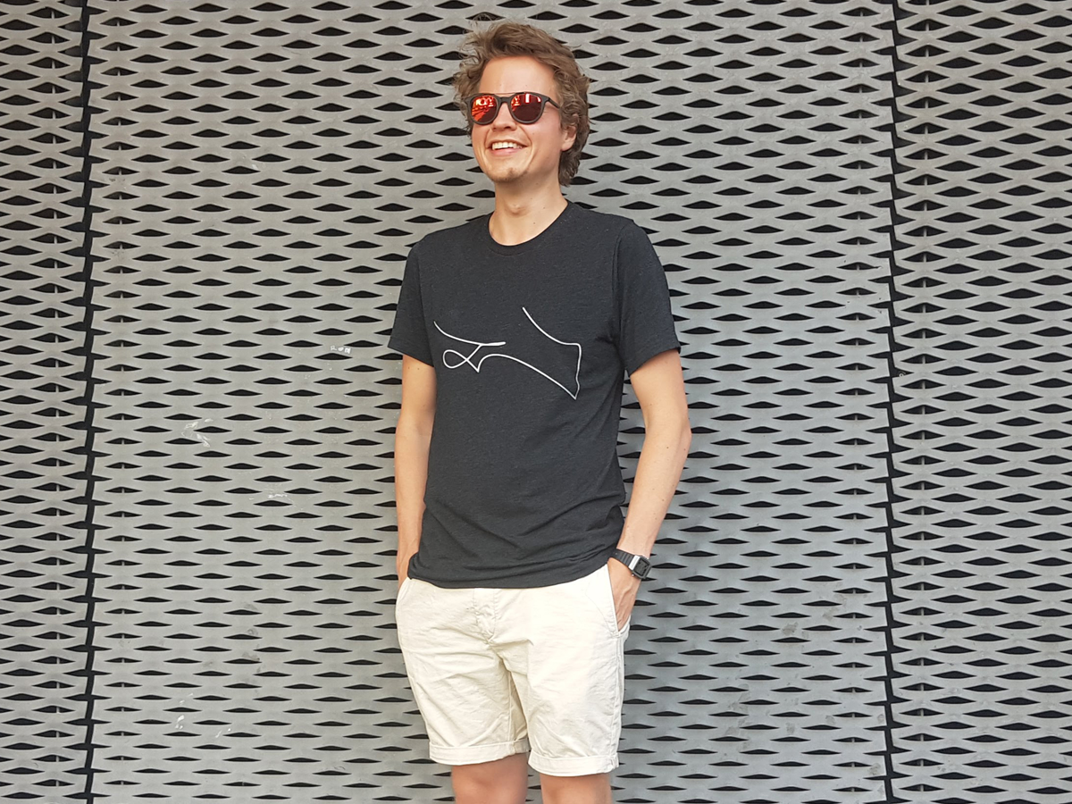
So, instead of refactoring the analysis, I moved into a creative direction. I coloured the dots according to the album covers (black for True, pink for Stories, and yellow for the ep), hid the axes, and printed the chart on a T-shirt. This was the first milestone in the project. I had a personal, wearable, and unique T-shirt from one of my favourite artists.
Stumbling into data art
In the summer of 2019, Avicii’s posthumous album was released. I analysed the lyrics once more. As you can see, the release feels balanced, making it similar to the late ep Avīci. But by this time, I was tired of the existing design. I had seen too many scatterplots (I had made prints of various other artists at this point).
This made me think of other ways to visualise the data.
This is what I call a beautiful line. I love this image for a couple of reasons. First of all, it looks like there is a “T” in there and Avicii’s real name is Tim. Second, I like how the line goes off into the top left. This gives it a very signature-like feeling. Combine that with the T and it starts to resemble an actual signature. And all this is the result of nothing but code. I printed this on a T-shirt as well. It’s a T-shirt I wear often, so much so that I had it reprinted because the first one was worn out.

The biggest compliment to my work
I like to invest in knowledge sharing when I work on a project. I try to do this in various ways. I created a public GitHub repository for this project, wrote blog posts, and gave multiple talks.
It’s because of knowledge sharing that I received this message:
Hi Erik – I wanted to get in touch with you about your Avicii TIM project. Thanks!
Want more info? Of course! But I never would have guessed what the person would ask next:
[…] I wanted to ask you if you would be okay with me getting a tattoo of your final line graph […]
A tattoo of my project? Of course, you can! About a year after making the visual, I received the greatest compliment for my work.

What came next
The project has stayed with me since I started working on it in 2018. The T-shirt remains to be a great conversation starter. I often wear it to talks and events. This, combined with my knowledge sharing, has led to other highlights besides the tattoo. These include:
- Winning a Silver Punch Card prize at Superweek 2019
- Giving Data Art Workshops at Fontys University of Applied Sciences (The Netherlands)
- Someone visualised and engraved wedding vows into wedding rings
- I am currently teaching 10-to-12-year-olds about data analysis, visualisation, and art using the project
Avicii’s lesson
I never set out to design T-shirts and tattoos, but somehow, that happened. I know that doing something new is more about the willingness to start moving than knowing where you are going. As I began freelancing in January 2023, I now try to dedicate more time to things I believe in. Now, having the time to pursue my motivations brings me back to where it all started.
I watched the Avicii documentary “True Stories” about a week before his death. In it, Tim decides to stop working with his long-time manager. He wants to perform less and focus on what he likes to do: make music. It feels like I slowly start doing the same. I try to focus on doing what I like and see where that will take me.

Erik is a freelance data analyst based in Tilburg, The Netherlands. He spends part of his time helping small businesses with the adaption of a data driven practice. He also dedicates time to personal data projects so he can freely develop the skills he thinks are valuable to him.
- Erik Driessen


