
The relationship between nature and the city is often framed as a tension—wilderness versus concrete, animals versus humans. But what if we looked at Los Angeles differently? What if we saw the city as a shared habitat where humans and wildlife navigate the same streets, highways, and neighborhoods together?
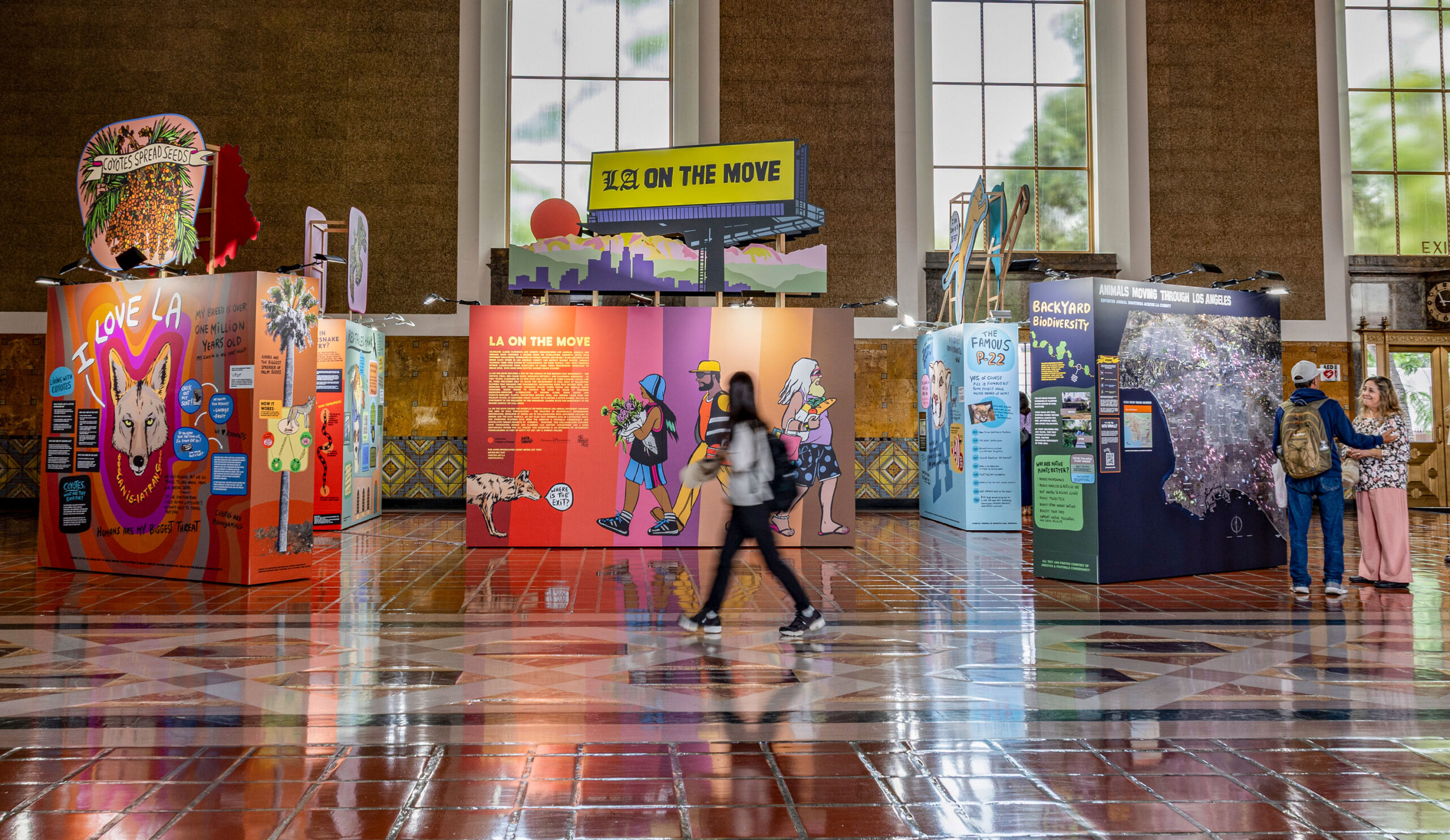
“LA on the Move”, our exhibition organized by Metro Art at Union Station in Los Angeles, California, opened in October and will remain on view through next year. Through larger-than-life graphics, a massive 3D map, playful character designs, and even animal sounds, we’ve created an immersive experience that asks Angelenos to see themselves reflected in the lives of coyotes, mountain lions, monarch butterflies, red-tailed hawks, and california kingsnakes.

From City Animals to Union Station

The seeds of “LA on the Move” were planted at ArtCenter College of Design, where we first encountered the City Animals class taught by Santiago Lombeyda and Ivan Cruz. “It was a topic I hadn’t really thought about before,” Jen recalls. “The interaction of humans and animals in LA County—it was super intriguing. The more we got to know the projects and the students, the more excited we became.” Then there was a chance to have an exhibition that pulled together a lot of these concepts and also showcased the student work, created in association with Metro Arts at Union Station. From there it just started rolling”.
The final projects from the City Animals class focused on speculative projects that explored how Angelenos could redesign their homes, backyards, and neighborhoods to better integrate with the natural world. Jason explains, “The projects that the students did were really about how people in LA could think about the intersection of the built environment—their homes, their yards, their backyards—with the natural world”. From there, we led two intensive workshop sessions with the students, working side by side to visualize ecological data in bold, accessible ways that were displayed in the ArtCenter student center for the following month.
From there, we were connected with Arroyos & Foothills Conservancy, a non-profit organization focused on preserving and restoring natural open spaces and wildlife habitats. They became an essential partner, sharing datasets on animal sightings, migration patterns, and habitat corridors across LA County as well as expert advice and access to Southern California’s environmental researchers.
The research process: Data meets daily life
“I think the first thing that we did, and what we always do, is begin with research,” Jen explains. “but in time, we leaned on the expertise of our friends at Arroyos & Foothills Conservancy—they were incredibly helpful. The other part, I think that’s very important, is collecting anecdotal information when you’re talking to people that live in Los Angeles about their experiences”.
For us, stepping away from the data is essential. “It’s important to step away from the facts and the figures, and start talking to people because the experience that Californians have with wildlife is completely different than a New Yorker’s,” Jen says. “You can’t just go about your business like a city dweller and ignore nature in California. It’s integrated into your day-to-day experience”.
Los Angeles, we discovered, is extraordinary in its biodiversity. Jason notes, “Los Angeles has such a unique environment. And what we found is that it’s actually one of the three areas in the world that is considered a biodiversity hotspot“. This became a cornerstone of the exhibition—LA isn’t just a city with some nature on the edges; it’s where wildness lives alongside urbanity in remarkable, sometimes precarious, ways.

Five animals, five stories
We chose to focus the exhibition on five species: coyotes, pumas (mountain lions), red-tailed hawks, california kingsnakes, and monarch butterflies. Each animal became a character in the larger narrative of LA residents navigating neighborhoods, dating scenes, commutes, and survival just like the humans around them.

“One of the first things that you drew was the coyote that says: ‘I love LA.’ That’s one of the featured images in the show,” Jason recalls. For Jen, this illustration became a statement of intent: “A human says, I love LA—and we all know this phrase—but animals live there too. What’s their role in this? So, we wanted to make sure that the animals and humans get equal time in this show”.
The personification of the animals was deliberate and humorous. Jen explains, “The more you learn about animals, how they’re mating with other animals, for instance, you think about the LA dating scene, and then you think about animals, which have some funny crossovers. As we have these neighborhoods in a city, they also have their neighborhoods.” Jason chimes in, “For example, a monarch butterfly says, ‘Hey babe, let’s overwinter in Mexico’—a line that could just as easily come from an Angeleno planning a winter getaway…” Jen adds, “And the monarch is saying like, I’ve got a really busy schedule.” Jason elaborates: “They have this multi-generational migration habit where up to five generations of butterflies will go from Central Mexico all the way up to Nova Scotia and Southern Canada and then back again. And they do this over five different generations. Even more remarkable—five generations later they’ll return to the same tree”.
The California kingsnake became another favorite. “Well, it’s not an LA Dodgers hat. Thank you very much,” Jen jokes, describing the snake’s illustrated headwear. “It’s a Los Angeles hat”. The kingsnake’s ability to live almost anywhere—from woodland to wetlands to suburban basements—made it a perfect symbol of LA’s adaptability. As we say, “you live in my backyard.”
Navigating the hard truths

While humor runs through the exhibition, we didn’t shy away from difficult realities. Rattlesnakes, for instance, posed a design challenge. “I made this drawing. When you might be on a hike, you may encounter a rattlesnake. And this is frightening, right?” Jen recalls. “There was like a discussion about making the rattlesnake so it wasn’t so intimidating, which was funny because I was like, well, a rattlesnake is intimidating and very scary, and you can’t really take animals and smooth out all the rough edges, right? Because that’s not what they are”!
The story of P-22, the famous mountain lion, underscored the fragility of human-wildlife interactions. Jason reflects, “Take the story of P-22—a famous mountain lion that was known around the Mount Wilson Observatory. And eventually, through a series of interactions with humans (and despite best intentions) he dies”. The exhibition addresses this directly, including data on rat poison’s devastating impact on mountain lions and the importance of hazing techniques—like carrying a can filled with coins—to maintain healthy boundaries.
“Even though we anthropomorphized the animals, we shouldn’t forget the fact that there are negative results of some of our interactions with the animals. We should be mindful of that”.
Making data visible and inviting
One of our core practices is taking complex datasets and transforming them into visuals that invite exploration rather than intimidation. “Part of what we do is find information and basically make it much more understandable to the general public and to ourselves,” Jen explains. “Like rat poison killing pumas, right? We made this diagram so that we have the data there, but you can just see it more clearly”.
A standout piece in the exhibition is the massive chart “Animal Species at Risk in California”, which visualizes 930 species by class and phylum, showing which are extinct, endangered, or imperiled. Working with data visualization collaborator Paul Buffa, we transformed this overwhelming dataset into the shape of a California poppy—the state’s native flower.
“If I saw this information in spreadsheets, I would be very intimidated because it’s just a lot of information,” Jen admits. “But since we put it into this California poppy, which is a native plant, it invites you over to explore it. You don’t have to look at every single detail, but it is fascinating”.

The wall also includes a Sankey diagram comparing California’s at-risk species to global standards—revealing that California has considerably more species in danger. And the bar chart showing imperiled species? “It literally towers over your head. It’s about seven and a half feet tall, so we wanted it to have a physical relation to how you encounter the data”.

The iconic title wall: Observing Union Station
The exhibition’s title wall features three illustrated characters walking across a vibrant gradient backdrop—each carrying something that subtly references animal behavior. Jen describes how these characters emerged: “We were standing in Union Station, and I could see people walking through, going from the trains to the entrance, and it gave me this idea about what kind of people would be walking through LA and walking particularly in Union Station”.
The older gentleman carries a bag of groceries, echoing how animals travel to forage and transport food. The young woman holds a bundle of flowers, referencing seed distribution—how seeds attach to animal coats or are eaten and deposited elsewhere. “All said and done, the more time you spend with the exhibition, you know every element is intentional and thought out and has a relationship to the information that we learn as we go along,” Jen explains.

The massive 3D map: Placing yourself in the data
Perhaps the most captivating element of LA on the Move is the enormous 3D map, created in collaboration with Julian Hoffmann Anton. This wasn’t just a cartographic exercise—it became a months-long process of negotiation, expansion, and refinement.
“Every project we do, we discuss a map component,” Jen says. “And sometimes we have time to do it, and sometimes we don’t because what starts as a simple map becomes very complex. It’s because a map is political. You can’t leave anyone off because they’ll notice”.

Initially, the map focused narrowly on downtown LA and Union Station. But through conversations with Metro Arts staff and community input, it expanded dramatically—eventually encompassing all of LA County and parts of Orange and San Bernardino Counties. “We were pushed and pushed on the map, but that’s not a bad thing. It’s a much more inclusive map, so when visitors come to Union Station, they can find themselves”.
In addition to showing every detail of the city, the map tracks sightings of all five featured species across the region, revealing fascinating patterns. Mountain lion sightings appear surprisingly far south of downtown; California kingsnakes cluster in parks and mountains but occasionally show up near Marina Del Rey; while coyote sightings may reflect research centers as much as actual populations.
“I’ve never seen a map of this scale, physically, of this detail,” Jason marvels. “It’s an extremely detailed 3D rendering of the entire metro area”. And because it wraps around a corner, visitors can find neighborhoods that might have been cropped out of a conventional map. Jen describes a photograph of a man pointing to the side panel: “He’s finding himself, which we wouldn’t have had in our original idea”.


Adding Sound: Activating the Space
For the first time in a Data Vandals project, we incorporated audio. “I pushed for this because we wanted to activate the space as much as possible,” Jen says. “We’re dealing with walls, and we wanted ways to expand these rectangles out”.
Visitors can hear the sounds of pumas, coyotes, and hawks. “I thought, okay, if I’m walking through Union Station, what is it like to hear some of these animals?” Jen explains. The sounds are surprising—sometimes beautiful, sometimes unsettling. Jason describes, “The mountain lion has lots of really low growls, more aggressive than a purr, and I found those to be unsettling”. Coyote calls also sound strange and a bit frightening, but these sound elements ground the exhibition in sensory reality, reminding visitors that these are not cartoons but living, breathing neighbors.


Iconic cutouts and LA signage culture
Atop each wall, we placed large cutouts of the animals lifted high on Sintra board to add height and visual drama. Jason says, “We wanted them to refer to the history of the Hollywood back lot, even the Hollywood sign itself.”
Jen reflects on LA’s distinctive signage culture: “I think the signage is very different from anything you ever really see on the East Coast; in New York we don’t have that kind of sign culture and I find it fascinating and really attractive”.


The billboard aesthetic also responds to Union Station’s architecture—a stunning 1930s Art Deco space with soaring ceilings and intricate tilework. “Union Station is so gorgeous, you want to try to do it justice. Something that iconic, you worry that whatever you do is going to be overwhelmed”. To honor the building, we photographed the tile floors and extracted colors to integrate into our palette, creating a dialogue between the historic architecture and our contemporary street-style graphics.
As the exhibition settles into its year-long run, we hope it becomes a recurring destination; a place where commuters pause for five extra minutes, where families return to discover new details, where Angelenos see their neighborhoods reflected in a 3D landscape populated by shared species.
“I just want people to enjoy it and have fun with it and see themselves in the data,” Jen says. “It’s so fun to see the different types of people, and I feel like I could draw those people and put them into the exhibition. It reflects a lot of our intentions”.
Jason hopes for depth and revisitation: “I’d love that the exhibition is very detailed; you can return to it over and over and learn something new each time that you revisit it”. And Jen adds with a laugh, “I hope it brings us back to California again and again – we love LA “!


“LA on the Move” is on view at Union Station through 2026.
For more information: https://datavandals.com/la-on-the-move.

Jason Forrest is a data visualization designer and writer living in New York City. He is the director of the Data Visualization Lab for McKinsey and Company. In addition to being on the board of directors of the Data Visualization Society, he is also the editor-in-chief of Nightingale: The Journal of the Data Visualization Society. He writes about the intersection of culture and information design and is currently working on a book about pictorial statistics.
- Jason Forrest

- Jason Forrest

- Jason Forrest

- Jason Forrest


