
How will “prompting” change the way we experience the world? The Artificial Worldviews project is looking to find out. This research initiative is exploring the boundaries between artificial intelligence and society. Recently, Artificial Worldviews researcher Kim Albrecht inquired GPT-3.5 about its knowledge of the world in 1,764 prompts and mapped out the results.
Check out our Project Page for more information.
The advent of Large Language Models (LLMs) has revolutionized natural language processing and understanding. Over the past years, these models have achieved remarkable success in various language-related tasks, a feat that was unthinkable before. After its launch, ChatGPT quickly became the fastest-growing app in the history of web applications. But as these systems become common tools for generating content or finding information—from research and business to greeting cards—it is crucial to investigate the worldviews of these systems. Every media revolution changes how humans relate to one another; LLMs will have a vast impact on human communication. How will systems such as ChatGPT influence the ideas, concepts, and writing styles over the next decade?
Using ChatGTP to Generate Data
To grasp the situation, I started by methodically requesting data from the underlying API of ChatGPT (GPT-3.5 Turbo) about its own knowledge. The OpenAI Application Programming Interface (API) structures calls into two messages: the user message and the system message. While the user message is similar to the text you enter into the front end of ChatGPT, the system message helps set the behavior of the assistant.
For the project, I designed the following system message:
You are ChatGPT, a mighty Large Language Model that holds knowledge about everything in the world and was trained on a massive corpus of text data, around 570GB of datasets, including web pages, books, and other sources.
The initial user message was the following:
Create a dataset in table format about the categories of all the knowledge you have. The table should contain at least 30 rows and 10 columns. Pick the dimensions as they make the most sense to you.
I called these requests six times with six different “temperatures”: 0, 0.2, 0.4, 0.6, 0.8, and 1. The temperature determines the randomness of the responses. (A temperature of 0 means the responses will be the same for a given prompt while a temperature of 1 means the responses can vary wildly.) The resulting data file from the six API calls consisted of 31 fields and 425 subfields of knowledge.
From this initial dataset, I designed a recursive algorithm that requested data about fields of knowledge and their subfields, including the humans, objects, places, and artifacts within these categorical systems.
The core dataset was requested from the OpenAI API in 1,764 requests over the span of three days. Humans and objects were requested separately in all fields and subfields (425). Each of those 850 calls was made twice: once with a temperature of 0 and once with a temperature of 0.5. All requests in the visualization were made to the GPT-3.5-Turbo API. The number of returned items per request varied between five (‘Linguistics’ and ‘Travel Budget’) and 40 (‘Mythology’) rows of data. Due to this inconsistency, some fields hold more items than others. The user message was always the same, asking for the most important humans, objects, places, and artifacts for each field and subfield. So, for example, to get the most important “humans” in the field of “Art” and the subfield of “Film,” the message looked like this:
List the most important humans in ‘Arts’ in the field of ‘Film.’ List their name, kind, category, description, related things, and importance (0 – 100) as a table.
The final dataset contained over 18,000 objects, items, humans and places. Reading through the dataset feels in between reading an encyclopedia, a strange short story from Jorge Luis Borges and a dada artwork. It is a vast dataset containing entries from ‘Hair follicles’ to ‘Demonic Possession.’ Trivia is mixed with essential figures and moments of history, facts and fictions intermingle. I am still wondering if GPT ‘hallucinated’ something within the dataset. Thus far I have not found anything within the dataset that does not reference a concept that exists in our world, but there might be.
I am understanding the data as the following: The generated data does not represent an unbiased picture of the knowledge inherent in GPT-3. Instead, it is a confluence of three forces: first, a representation of how the LLM handles the request; second, a perspective on the underlying textual training data; and third, a reflection of the political sets and settings embedded within the artificial neural network.
Visualizing the ‘Knowledge’ of ChatGTP
To visualize the data I tried various methods all based on the same two-fold process: turning text into numbers (text-to-vector) and reducing these numbers into two dimensions that can be visually represented on an x-axis and a y-axis (T-sne, LDA, and UMAP). The results of these experiments have been rather unsuccessful.
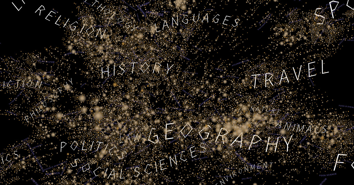
In a second approach I calculated network similarities. The dataset consists of four layers. The first two layers are the field (31) and subfields (425) categories of GPT’s knowledge. The third layer consists of 7,880 items representing the core dataset of the project, including people, objects, places, etc. that GPT-3.5 named in the API requests with a full description. The fourth layer consists of 24,416 items that GPT-3.5 named as related items to the core items of the third layer.

To calculate a network structure from the data I connected fields to subfields, and objects and humans connect by co-mentions in multiple fields. Thus, in the resulting map, objects and humans cluster together by similarity.

One intriguing problem was the positioning of the text within the visualization. The question I had was: How to find the best position for the labels of fields and subfields? After various trials I came up with the idea of using a regression analysis to position the text. Regression analysis is a statistical method that shows the relationship between two or more variables. For each field and each subfield I calculated the polynomial regression curve and positioned the text onto this line.
Due to the network structure of the visualization some fields and subfields had outliers that distorted the regression too much. To account for this I removed the 5% most outlying points from each of the calculations. As the x and y positions of the points do not contain relationships between a dependent variable and an independent variable, conducting a regression analysis is not particularly meaningful. However, to position the text and display their positional relationship to one another, the technique worked well.


The unforeseen finding
My research questions have been manifold and only deepend throughout the process of working with the data and the visualization. The project prompts a deeper inquiry into the nature of artificial intelligence, its boundaries and political constraints.
First, I found myself intrigued by the possibility of probing this novel method as a means to understand AI systems. What can we learn from the iterative and methodical requesting of data from large language models? Is it a mirror reflecting our human intellect or an entity with its own inherent logic? Second, we are interested in questions that pertain to the dataset itself: What are the biases of the system? Are there fields that stand overrepresented or underrepresented, and what does that signify about our collective online text corpus? How diverse will the dataset be, and what can that diversity teach us about the breadth and limitations of machine learning? But investigating all these questions within this article would lead to a book length article and thus I am constraining myself to the one finding I was mostly intrigued by.
One of the most striking features of the dataset is simply counting the number of times GPT named things. The bar chart shows the most frequently named items in the dataset.

First of all, the entire list of the most named things consists only of humans. Secondly, the list is led by Rachel Carson and Jane Goodall. Rachel Carson is known for her book Silent Spring (1962) and for advancing the global environmental movement. Jane Goodall is considered the world’s foremost expert on chimpanzees. An American marine biologist and an English primatologist and anthropologist are the two most named figures within the project.
In comparison, the Pantheon project ranks people, among others, by the number of Wikipedia language editions and count of article clicks. In this ranking, the first female is Mary, mother of Jesus, at rank 33 (accessed on 7th of August 2023). Muhammad, Isaac Newton, and Jesus are the top-ranked figures within the Pantheon project. To make sense of these perhaps counterintuitive ranking results, it is important to note how the data was generated. Fields and subfields were requested through 1,764 API calls. Rachel Carson was listed 73 times within the 1,764 calls. For a person, object, place, etc., to be named frequently, GPT-3.5 needs to name it in as many combinations of categories and subcategories as possible. Thus, high-ranking results from spreading into many categorical systems.
So far we do not know why and how a marine biologist, writer, and conservationist (Rachel Carson), the world’s foremost expert on chimpanzees (Jane Goodall) as well as a Kenyan social, environmental, and political activist (Wangari Maathai) became so central in the map. Leonardo da Vinci, Charles Darwin, Albert Einstein, Alan Turing, Elon Musk, Galileo Galilei, Karl Marx, William Shakespeare, Winston Churchill, Carl Sagan, Sigmund Freud, Mahatma Gandhi, and Nelson Mandela are all named less frequently than these three women.
The question becomes: Are Rachel Carson and Jane Goodall individuals whose research spreads especially well? Research that transcends fields and categories? Or is something else happening here? There are a number of possible explanations. OpenAI may set certain parameters that lead to these results. Or, prompt engineers could be pushing certain perspectives to become more visible or, maybe, GPT-3 “cares” a lot for the planet and the environment. At this point, this is hard to say and would need a much deeper investigation than these preliminary findings.
- The dataset can be viewed and downloaded here. Anyone is welcome to use the dataset. Feel free to reach out to Kim Albrecht with questions, comments, analysis, or visualizations based on the dataset.
Artificial Worldviews is a project by Kim Albrecht in collaboration with metaLAB (at) Harvard & FU Berlin, and the Film University Babelsberg KONRAD WOLF. The project is part of a larger initiative researching the boundaries between artificial intelligence and society.
Feel free to reach out to Kim Albrecht with questions or comments kim@metalab.harvard.edu.

Kim Albrecht
Kim Albrecht visualizes cultural, technological, and scientific forms of knowledge. His diagrams unfold and question the structures of representation and explore the aesthetics of technology and society. Kim is a Professor at the Film University Babelsberg Konrad Wolf, principal at metaLAB (at) Harvard, director of metaLAB (at) FU Berlin, and an affiliate of the Berkman Klein Center for Internet & Society Harvard. Kim holds a Ph. D. from the University of Potsdam in media theory and exhibited, among others, at Harvard Art Museums, Four Domes Pavilion Wrocław, Ars Electronica Center, Cooper Hewitt, Cube design museum, ZKM Center for Art and Media Karlsruhe, Kaestner Gesellschaft, The Wrong Biennial, Istanbul Contemporary Art Museum, and Kunsthaus Graz.
- Kim Albrecht


