
I first heard of Stephanie Evergreen in 2012 when I finished my graduate studies and moved to Atlanta, GA. Our company was bringing her in for a data visualization workshop and I had no idea what data visualization was, but I thought if I could learn a new way to do a bar chart, I would be in good shape.
Welp, I learned amazing things about chart junk, evil pie charts, and getting rid of formatting faux pas. My mind was blown. Thus began my love affair with data visualization. After the workshop, I signed up for Stephanie’s blog and bought her books. I searched on the internet for data visualization examples and spent time learning the how-tos and how-not-tos. However, I only retained a little bit of the information – it was hard to look at real case studies at the spur of a moment and determine the right chart/graph for the audience.
2013-2017
I practiced data visualization on my own, using Stephanie’s books, and Googling data visualizations and other experts in the field. (I wish I could share my most current data visuals since I am super proud of them, but I work with sensitive data and I am unable to share information that is not publicly available.)

October 2018
Fast forward to October 2018 and Stephanie was opening spots for the Evergreen Data Visualization Academy. Now I was married, just had a second child, and had just returned from maternity leave with some serious sleep deficits. At work, I had been trying to improve my presentation skills, Excel charts, and layouts/design in my work as a research scientist for a consulting firm. Besides research, evaluation, training, and technical assistance, my work involved client-facing communications and reports, and our company was eager to innovate when distilling complex information into digestible findings. The Evergreen Data Academy seemed like a great way to keep on task while I set my own path learning which data visualization to use and when. With my boss’s blessing, I signed up for the Evergreen Data Academy. I spent my first year in the Academy focusing on Excel tutorials. Stephanie matched me to a buddy, A, and we started meeting monthly to focus on specific tutorials.

The Academy assumes you have basic Excel skills, but each tutorial comes with both a write up of the steps, as well as a video tutorial of the exact clicks you need to make to get to your final destination. Stephanie rates each tutorial with a Rockstar level ranging from 1 to 10 (10 being most challenging).
I found it helpful to print the tutorial text to reference, and then watch the video, take notes, and apply the examples to my Excel template and worksheet.
If I had a work deliverable that could use a similar new visual, I would try applying the steps to that Excel file. For me, it always took a few tries to get the visual to stick in my mind – how to create it, when to use it, and the best way to disseminate it. Anytime I had questions, I posted a question in the comments section at the end of the tutorial and Stephanie would always respond within 24 hours, if not sooner. I could also email directly and ask her questions. Sometimes these questions were answered during her Office Hours when someone had a similar query and responding in a larger forum cleared up the confusion for more than just myself.
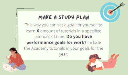
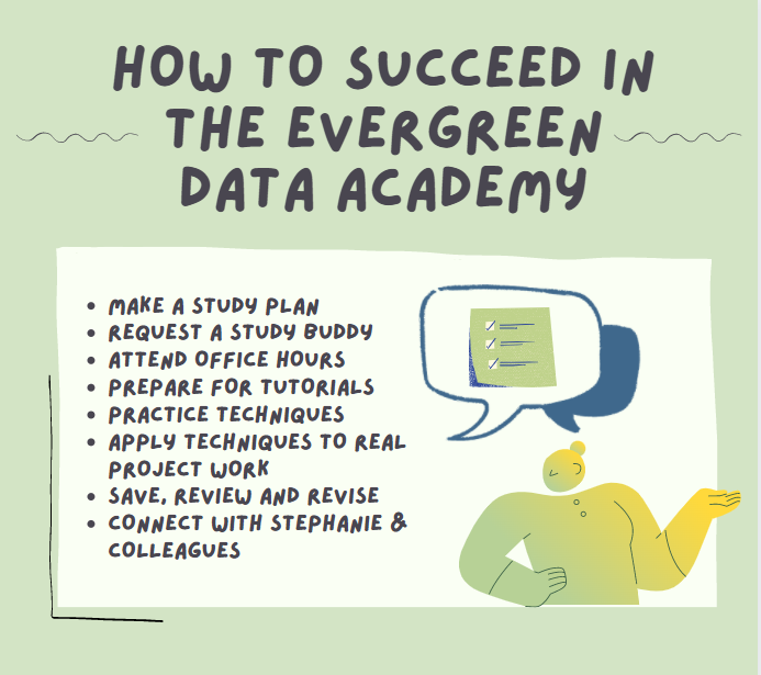
I recommend beginning the Evergreen Data Academy with a plan of action. This training works best for those who are self-directed and have the flexibility to train asynchronously. I initially began the Academy by looking at tutorials relating to the data analysis I was conducting at that time. When Stephanie connected me to my buddy, we assigned ourselves specific tutorials that we were curious about and met monthly to evaluate each other’s progress.
This put me on a schedule. By early 2019, my colleagues were starting to seek me out to create visuals for them. I still felt only tentatively knowledgeable about data visualization. I made it one of my performance goals at work to include data visualization principles in my designs and visuals, wherever possible. I conducted brown bag tutorials for my company’s data visualization workgroup to share my knowledge. This also served as a time to learn from my colleagues and discover which visuals worked best for the types of projects we did. Some colleagues in my division were starting to recognize that my Excel skills and PowerPoint design were unique and helpful to the work. Together, we proposed an idea to our company leadership using data visualization and we were granted internal funding to pursue it.

October 2019
My data visuals were becoming crisper, clearer, and more professional looking, and my supervisor could tell it was helpful to my colleagues to have someone like me being trained in data visualization. I was fortunate to secure funding to renew my membership for another year, and shortly thereafter, I found a new work position within my company on the Data Team for a large child welfare and education project. Here, I could really dig into the data and spend most of my time being creative with the data analytics.

However, I also needed to learn Tableau for my new position and utilize that software for data visualization. Fortunately, the Evergreen Data Academy was expanding its tutorials from Excel to Tableau, R, and more recently, Google Sheets. Stephanie had a Tableau expert on staff, Alicia Bebenek, who was available to troubleshoot Tableau issues. While Excel was more familiar to me from the beginning and I was able to intuitively work through the data visuals and figure out the mechanics, it took me longer to get into Tableau.
At the same time, in early 2020, I began an online certificate in data visualization to build a stronger foundation of statistics, art, graphic design, and business principles when applied to data visualization. I started off the year and certificate program with a class in statistical foundations for data visualization.

March 2020
Oh yeah, pandemic. This was a hot mess. I was in the last couple of weeks of my first class at NYU and the world halted. Our kids came home from daycare and watched Frozen 2 non-stop on Disney+. I only showered every three-to-four days. Thankfully, Stephanie’s Academy was all virtual and my self-studies did not have to stop as long as I had the energy to keep going at alternative hours. I finished my first certificate class and decided to pause on the certificate until things were more stable at home.
Despite having our children at home, and the occasional naked cameos and shouts of “wipe my butt, mommy!”, we somehow survived (I’m still not sure how, those months were a blur). Thank goodness companies out there like the Data Academy and Tableau recognized a need for people to continue to train and learn emerging skills in a pandemic. At the time, Tableau offered 90 days free e-learning and I utilized that to jumpstart my Tableau knowledge. I fit the Evergreen tutorials in between my work on other project deliverables–15 minutes here, 20 minutes there. When our daycare opened back up in the summer, I signed up for my second class at NYU online and chose a Tableau-specific course to further boost my skills.

I also started meeting with my Data Team co-workers bimonthly to discuss the best types of data visuals that worked for the child welfare data. I was able to rely on my knowledge from Stephanie’s training and research to back up the work and visuals we recommended to our clients. It was nice to have the research behind each visual to further support the work we were doing.
I was able to train my colleagues in data visualization principles, and I also learned data analysis principles from them. While I was unable to meet my new coworkers in person, I was still able to make a difference in my work virtually. Teaching the concepts to other helped instill the information more concretely in my head as well.

Through my online certificate, I was exposed to additional data visualization experts, learned the history of the practice (did you know that data visualization has been around since caveperson days?), and explored the Tableau side of data visualization.
Spring/Early Summer 2020
George Floyd, Ahmaud Arbory, Brionna Taylor… Wait, what? What year is this? This was 2020, why is racism still occurring? There was/is still a lot of work to do here.
Stephanie took note of these major earthquakes in our world shaking us awake to the still existing racism in our society. She began offering more nuanced tutorials on data visualization and demographics and her most recent blog entries have focused on equality, being inclusive with data, and being mindful of terminology. In June 2020, she posted one of my favorite blog posts, How to Not Host a Manel. She also shared her own missteps using “ableist language” in her blog post, My Cringe-Worthy Choices, talked about the 4 Charts That Fight for Equality, and schooled us with A Masterclass in Data Storytelling. Finally, she listened to feedback from her Academy members to make changes to the Data Academy website more inclusive. These have been implemented over the last year, culminating in a revamped website in June 2021 (more on this later!).
At work, I applied for a role in my company as an employee community network leader to help others (and myself) learn how to be more inclusive of race, gender, sexual orientation, and disability. Being deaf, I knew firsthand the discrimination that my peers have experienced. I knew the microaggressions she referenced that needed to stop. But, being a white female, I also knew I had ingrained beliefs in myself that needed to be acknowledged and further explored.
October 2020

My new team definitely valued my burgeoning Excel and Tableau data visualization skills. When the time came to renew my subscription, I proposed that this next year would be a deeper dive into Tableau with some work in R. My colleagues agreed that I should renew my membership and continue learning. R is more code-focused and takes more time to learn. I took some introductory tutorials in the Academy, but again felt that a more solid foundation in learning R would need to come from external sources. I have not yet been able to take those additional tutorials with my other classes and commitments. I have so many tutorials bookmarked on LinkedIn Learning, Udemy, and Coursera for that one day when I somehow magically have time to just train and learn. I think I need a month-or-longer training sabbatical to plow through everything. With R, I feel I will have to rely heavily on the written steps, the video, and repeat several times before it will make sense.
When my original buddy had to end her subscription, Stephanie set me up with a new buddy. I actually still meet up with A, but I knew I would find it easier to stay on track with my current and future tutorials if I had someone to hold me accountable. The first new buddy Stephanie set me up with broke up with me on the first date (I get it, she was too busy! We all are.). The second buddy stuck, though we have not met as often as I did with A, and, by comparison, I have found that meeting more often makes a big difference.
May 2021
In May, Stephanie sent out a notice that she was revamping the Data Academy website to be more intuitive. Personally, I had always found the pre-May 2021 website intuitive and easy to use. The tutorials were organized by type of information and the overall message you wanted to communicate (e.g., when a single number is important, one or two numbers over time, etc). However, one of the things that I had wondered was whether the Excel, Tableau, or R lesson would be easier for the specific tutorial. I am learning all of these software types and it’s helpful to know when one of these software types might be easier to create versus another. I appreciated that Stephanie listened to member feedback regarding that issue and made changes reflecting that suggestion. There is now an initial landing page for each data visual to compare the tutorial levels by the format you choose. My other favorite site revision is changing the wording of her levels from “Ninja” to “Rockstar” to reduce stereotyping.
I will admit, it has taken me time to figure out how to navigate the new layout, but I watched her “re-orientation video,” and it makes a lot of sense.

June 2021
The Evergreen Data Academy is now unlimited for current members. I will not have to renew this year, yayyyyy! One of my biggest worries was that I would not be able to renew my membership again if my company felt I had learned enough and could not justify the membership. How would I remember everything? How would I ask questions? Talk with others? Now I do not have to worry about that, which is fantastic!
Future
In the next year, I am looking forward to continuing to work through tutorials in Tableau and R. Yes, there are still many tutorials to do and much more to learn. While Stephanie feels that the number of new tutorials available on her Academy will eventually level out, I am grateful to be able to continually return to the website to walk through examples in her current and past videos and tutorials, and ask questions.
The past three years in the Evergreen Data Academy have taught me so much about data visualization. I have learned to ask my audience more questions about the data and information they want to see and understand better. I have learned about colors, fonts, and styles that are best suited for specific audiences and visuals. I have learned and I am still learning about inclusivity and equality in data. The Evergreen Data Academy may not be the only learning website to gain knowledge and skills about data visualization, but it has been the best one for me to learn the pros/cons of certain data visuals, meet others in the data visualization community, expand my creativity, and grow my skills in an organic way from Excel, to Tableau, and now R.

Julia Schaeman is a Senior Research and Data Scientist at ICF with over 15 years of experience as a researcher and technical assistance provider; she specializes in data visualization. She recently completed a Certificate in Data Visualization through New York University, and she holds a Masters of Public Health from the University of Arizona and a Bachelors Degree in Public Health from University of North Carolina at Chapel Hill. Her current work focuses on child and adolescent health and the risks associated in child welfare and maltreatment. Her past work experiences have focused on community health, chronic disease and obesity prevention, substance abuse, international health, and HIV/AIDS prevention. She enjoys training her colleagues and other teams in data visualization techniques and crafting data visuals to enable her clients’ greater understanding of the child welfare landscape. She also serves as a co-chair for ICF’s Diverse Abilities Employee Community Network (ECN) to increase awareness about disabilities in the workplace.
- Julia Schaeman


